
Step into the colorful world of interior design with a cheeky nod to the past. We’re diving into the vibrant palette of the 1980s, a time when boldness reigned supreme.
While some colors hold nostalgic charm, others are best left in the photo albums. Let’s explore nine hues to steer clear of and six contemporary shades that breathe fresh life into your spaces.
1. Avoid: Neon Pink
Neon pink screamed for attention in the 80s, and it still does—but not in the best way. It’s like a party crasher who won’t leave. Opt for subtlety by dodging this eye-straining hue.
Consider how it clashed with everything, even itself. Swap this headache-inducing shade for something gentler on the eyes.
Neon pink might work for a retro costume party, but for your living room? Not so much.
2. Avoid: Electric Blue
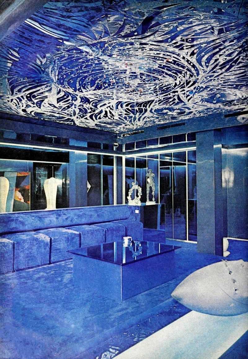
Electric blue, the color of 80s nightlife, felt like a permanent strobe light. It’s jarring and overwhelming, much like a caffeine overdose.
It dominated spaces, leaving no room for relaxation or warmth. Consider the tension it brings into a serene environment.
For a calmer vibe, steer clear of this shocking hue and opt for more soothing blues.
3. Avoid: Lime Green
Lime green had its moment in the 80s, an era of bold choices. Today, it feels like a lime in a soda—too fizzy and intense.
It brightens nothing, instead overwhelming your senses. Its punchy presence leaves no room for subtlety.
Ditch this overpowering hue for something that whispers rather than shouts.
4. Avoid: Burgundy
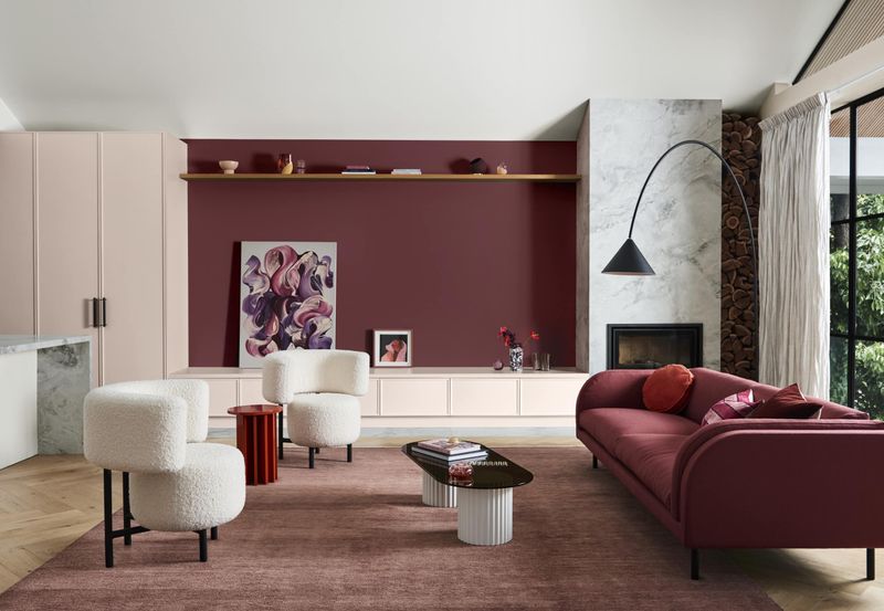
Burgundy, once the darling of 80s interiors, now feels like a heavy vintage coat. It’s dark, moody, and a tad too serious.
In large doses, it weighs down a room like an unwelcome fog.
Replace this bygone relic with a lighter, more inviting shade that lifts instead of drags.
5. Avoid: Mint Green
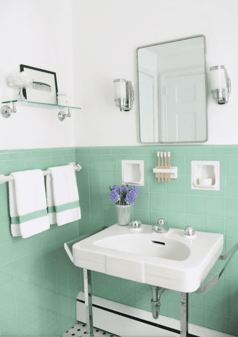
Mint green, a pastel darling of the 80s, feels like toothpaste for your walls. It’s too cool, too clinical.
It lacks the warmth a home should embrace, leaving spaces feeling sterile.
Trade mint green for a hue with more depth and character to enhance your interiors.
6. Avoid: Peach
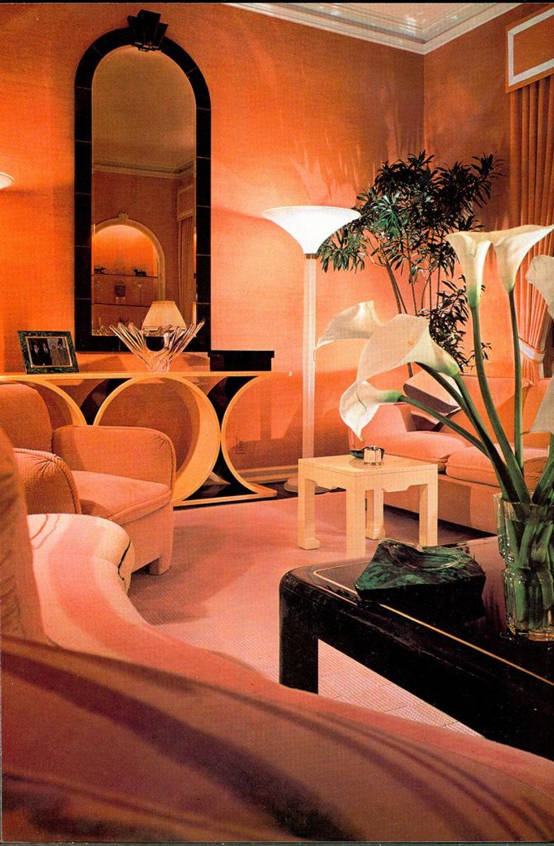
Peach, once a soft whisper of warmth, now feels like a dated voice from a forgotten story. It’s overly sweet and doesn’t age well.
It tends to fade into the background, lacking the punch or elegance needed today.
Choose a color with more modern flair to breathe life into your decor.
7. Avoid: Mauve
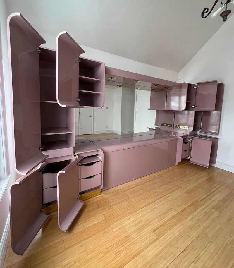
Mauve, the romantic hue of the 80s, now feels like an old romance novel—faded and dusty. It’s tired and lacks vibrancy.
Its muted undertones make spaces feel drab rather than dreamy.
Refresh your palette by replacing mauve with something that sings rather than sighs.
8. Avoid: Canary Yellow
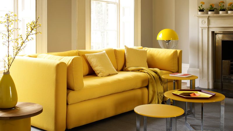
Canary yellow, an 80s attempt at sunshine indoors, now feels like constant shouting. It’s overwhelming and hard to relax around.
It fights for attention, overshadowing everything else in the room.
Opt for a calmer yellow that whispers sweet nothings instead of screaming.
9. Avoid: Royal Purple
Royal purple, once a symbol of 80s opulence, now feels like an over-the-top costume. More theatrical than practical, its richness is too demanding, making it hard to find balance or serenity.
Pick a more muted hue that embraces rather than overpowers.
10. Instead: Warm Terracotta
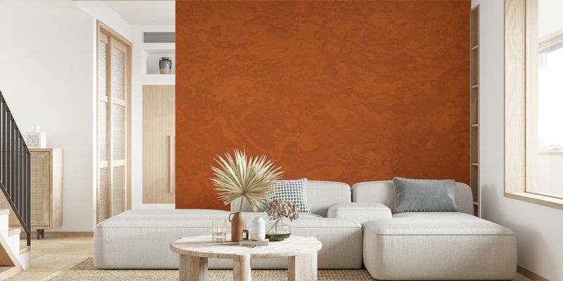
Warm terracotta, like a gentle desert sunset, offers a cozy embrace. Earthy and inviting, it’s perfect for creating a relaxing atmosphere.
Rich, natural hues add depth and elegance, making spaces feel grounded and harmonious. Terracotta serves as the serene antidote to neon’s chaos.
11. Instead: Soft Mustard
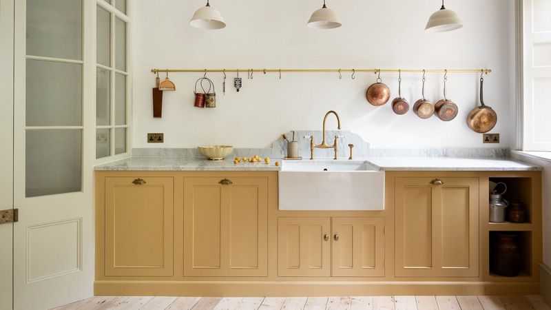
Soft mustard, like a sunbeam on a lazy afternoon, adds cheerful warmth without overwhelming.
Chic and sophisticated, its subtle glow brightens spaces with a gentle touch, creating a welcoming and lively environment. A far cry from canary’s blare, mustard’s mellow tone is a modern delight.
12. Instead: Cool Sage
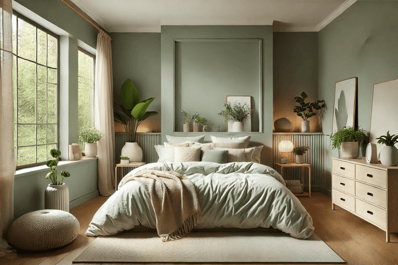
Cool sage, reminiscent of a tranquil garden, soothes and refreshes. A gentle whisper of green that calms the senses, its muted elegance blends seamlessly with various styles, adding a touch of nature indoors.
Sage’s subtle sophistication offers a welcome escape from lime’s intensity.
13. Instead: Deep Navy
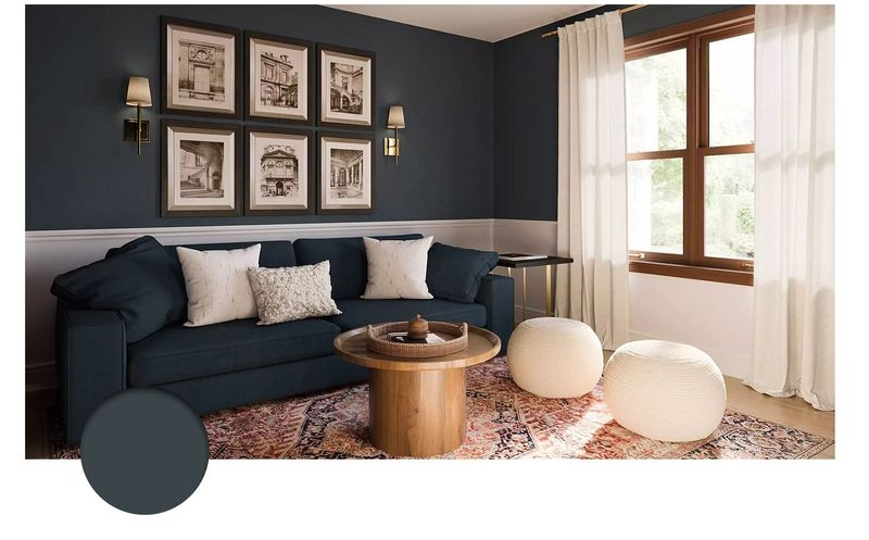
Deep navy, like the night sky, exudes timeless elegance. Bold yet soothing, it’s perfect for creating a sophisticated backdrop. Rich depth enhances spaces, offering a classic contrast to brighter accents.
Navy’s poised allure serves as a stylish successor to electric blue’s chaos.
14. Instead: Blush Pink
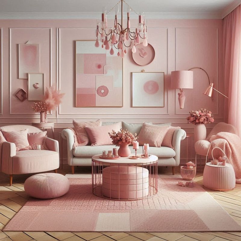
Blush pink, gentle as a whisper, brings a touch of romance and warmth. Soft and inviting, it’s not demanding. This delicate hue complements a variety of styles, adding a fresh and modern twist.
Blush pink’s tender glow serves as the perfect antidote to neon’s harshness.
15. Instead: Creamy Beige
Creamy beige, like a warm embrace, wraps spaces in comfort and luxury. Neutral yet rich, it offers timeless appeal.
This versatile shade provides a perfect backdrop for personal expression, adding sophistication and warmth. Beige’s subtle grace serves as a refreshing counterpoint to mint green’s chill.