9 Unappreciated Paint Colors Designers Always Use in Kitchens (And 9 They Say To Stay Away From)
When it comes to kitchen colors, most folks play it safe—white walls, gray islands, maybe a bold navy if they’re feeling wild. But here’s the secret: the best designers are working magic with shades you’d never expect. Think muted olives, chalky blues, or soft terracottas that add instant charm without hijacking the room.
On the flip side? Some colors are total kitchen killers—too harsh, too loud, or just plain dated. In this guide, we’re serving up 9 low-key stunning shades designers love, plus 9 they won’t touch with a ten-foot stir stick.
If you’re ready to rethink your color game, grab your swatches—because your kitchen’s about to level up.
1. Mellow Mustard
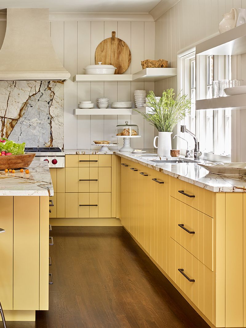
Did you think mustard was just for hot dogs? Think again! Mellow mustard brings a dash of warmth to any kitchen, creating an inviting atmosphere. This gentle yellow hue pairs wonderfully with natural wood elements, adding a touch of retro charm.
Picture your morning coffee surrounded by this cheerful color – it’s like sunshine in a can! If you’re looking to add a bold yet cozy vibe, this is your shade. Mellow mustard not only brightens up the space but also complements a variety of kitchen styles, from farmhouse to modern chic.
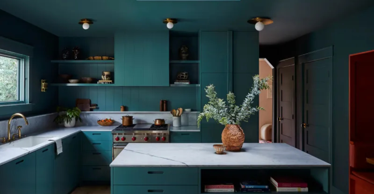
2. Teal Temptation
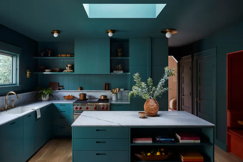
What if the ocean could fit into your kitchen? Teal Temptation delivers that coastal vibe without the sand. This rich, calming color adds depth and sophistication to any space, making it feel like a serene retreat.
Teal pairs beautifully with metallic accents, such as stainless steel or brass fixtures, enhancing its luxurious appeal. Whether your kitchen is large or small, this versatile shade adapts effortlessly, adding a splash of elegance without overwhelming the senses.
3. Blush Blush
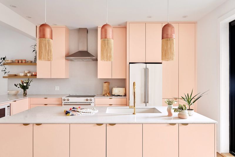
Who says pink is only for nurseries? Blush brings a soft, sophisticated touch to kitchens, creating a cozy and elegant ambiance. This delicate shade harmonizes well with metallics like gold or rose gold, adding a touch of glamour.
Just imagine cooking amidst walls that create a gentle pink glow, making every meal feel like a special occasion. Blush is perfect for those looking to add a subtle hint of color without overpowering the room. It’s a charming choice for modern and traditional kitchens alike, offering a fresh take on neutral tones.
4. Sage Serenity
This soothing green is perfect for those who crave a connection with nature. Sage Serenity invites the outdoors in, giving your kitchen a fresh, earthy feel. Pair it with natural wood and herbs for a look that’s both calming and invigorating.
The muted tone works well in various kitchen styles, providing a neutral backdrop that’s anything but boring. Sage green is like a breath of fresh air, making your culinary space a tranquil and welcoming environment.
5. Coral Charm
Is your kitchen ready for a vacation? Coral Charm is the vibrant touch that brings a tropical flair to your cooking space. This lively hue energizes the room, making it feel like a permanent getaway. Coral pairs well with whites and neutrals, allowing its boldness to shine without clashing.
It’s perfect for those who love a punch of color and a bit of fun. Entertaining guests in a kitchen like that would feel as lively as a beach party.
6. Moody Mauve
Looking for a touch of drama? Moody Mauve offers a sophisticated edge to kitchens, with its deep, mysterious tones. This rich shade balances warmth and elegance, creating an intimate atmosphere that’s perfect for culinary creativity.
Mauve pairs beautifully with dark woods and luxurious textures, like velvet or leather, for an upscale look. If your kitchen is your stage, let Moody Mauve set the scene for memorable meals and conversations.
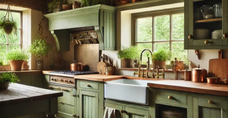
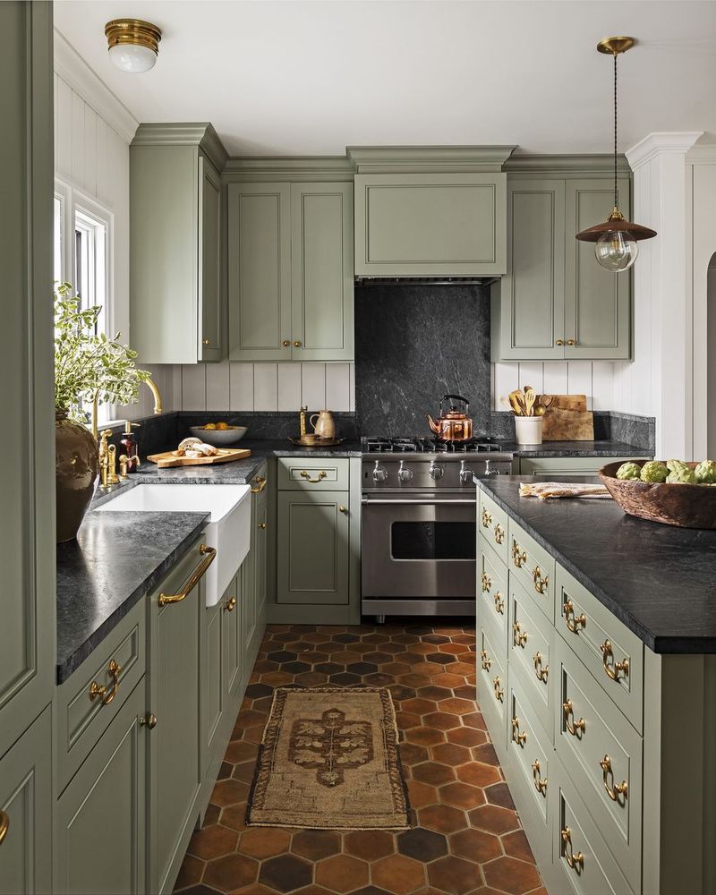
7. Olive Opulence
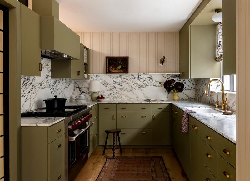
When life gives you olives, paint your kitchen! Olive Opulence exudes a rich, Mediterranean charm, turning your kitchen into a haven of warmth and hospitality. This timeless hue pairs well with brass fixtures and wooden textures, enhancing its elegant appeal.
Imagine family dinners in a setting that feels as inviting as an Italian villa. Olive green’s depth creates a cozy yet sophisticated ambiance, perfect for those who appreciate a touch of luxury. It’s a versatile shade that complements various styles, from rustic to modern.
8. Periwinkle Whimsy
Have you ever seen a color that just makes you smile? Periwinkle Whimsy does just that, with its lighthearted blend of blue and purple. This playful shade adds a sense of joy and creativity to any kitchen, making it the perfect backdrop for culinary adventures.
Periwinkle combines beautifully with pastels and whites, creating a whimsical and dreamy atmosphere. Whether baking a cake or hosting brunch, this color makes every moment feel magical. Let Periwinkle Whimsy inspire your kitchen to be a place of happiness and delight.
9. Neon Green Splash
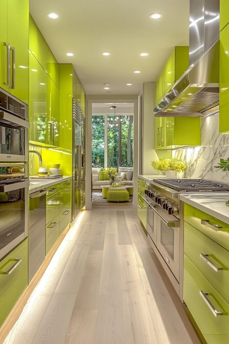
In the world of kitchen design, neon green stands out – and not in a good way. This overpowering hue can steal the spotlight for all the wrong reasons, making the space feel more like a nightclub than a kitchen. Imagine your morning coffee under a neon glow; it’s not the serene start you’d wish for.
Designers often steer clear of this color as it can clash violently with most kitchen appliances and decor. Instead, opt for more subdued tones that bring harmony and balance. Neon green may work at a rave, but in a kitchen, it’s an assault on the senses.
10. Banana Yellow Burst
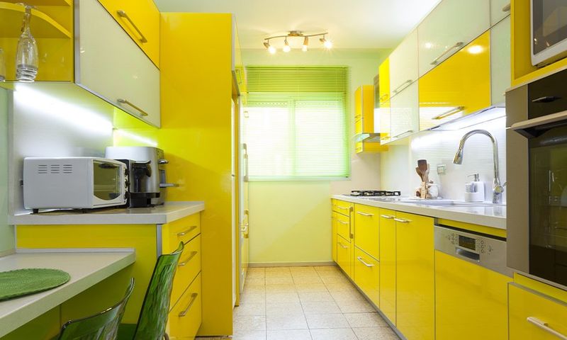
Banana yellow might remind you of sunny days, but in a kitchen, it’s often a recipe for visual overload. This bright hue can be overwhelming, especially in smaller spaces, reflecting light in all directions.
Bright yellows can create an unsettling ambiance, making cooking and dining less enjoyable. Designers suggest avoiding this shade as it tends to clash with common kitchen materials like stainless steel or marble.
11. Gothic Black Enigma
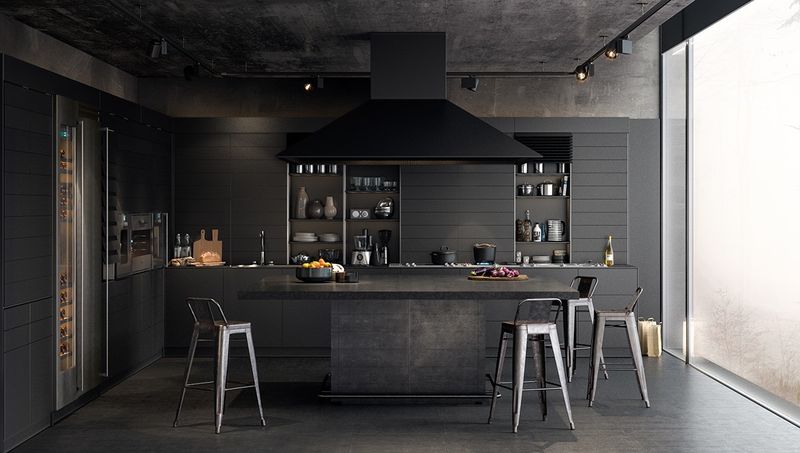
While black can be chic and sophisticated, an all-black kitchen can feel more like a dungeon than a culinary haven. The oppressive nature of this color can absorb light, making the space feel cramped and unwelcoming.
Designers often avoid this hue for kitchens as it lacks the warmth needed for a cozy environment. It’s important to balance black with lighter, contrasting colors to prevent the room from feeling claustrophobic.
12. Electric Blue Shock
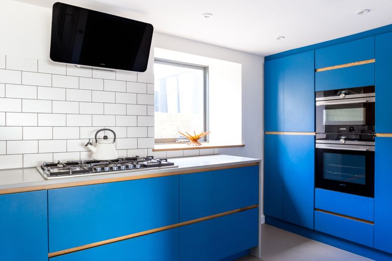
Yes, electric blue is bold and energetic, but in a kitchen, it can feel more like a shock to the system. This color can overwhelm the senses, creating a jarring experience rather than a calming cooking haven.
Electric blue might suit a modern art piece, but it often disrupts the comforting vibe you want while enjoying a meal.
13. Fiery Red Inferno
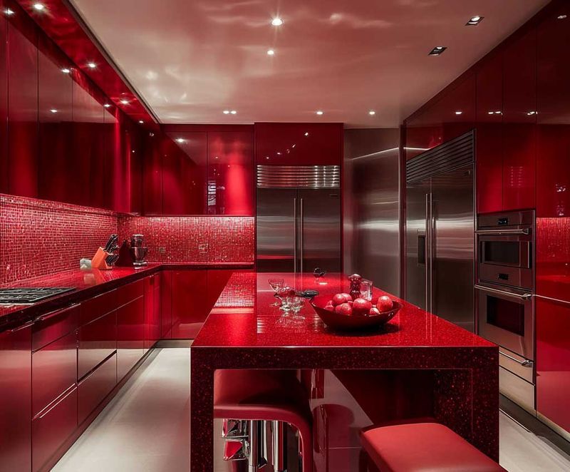
Known for stimulating appetite, too much red in a kitchen can be overwhelming. This intense color can create a sense of urgency, making it hard to relax and enjoy your meal.
A few accents can add warmth, but a full red kitchen might feel more like a furnace. Instead, balance red with neutral tones to create an energetic yet harmonious environment.
14. Industrial Gray Gloom
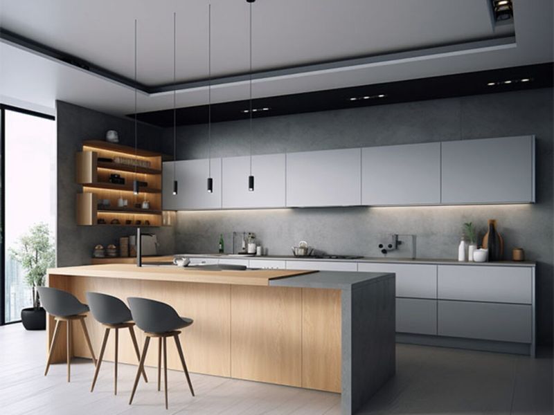
Industrial gray might evoke images of modern lofts, but in kitchens, it often translates to gloom. This color can make a lively space appear cold and uninviting, especially in larger areas.
If you’re aiming for a warm, cozy kitchen, designers warn to avoid this shade. It easily dominates the room, leaving it feeling stark and unwelcoming. Instead, consider combining gray with warmer tones to create a more balanced atmosphere.
15. Psychedelic Purple Haze
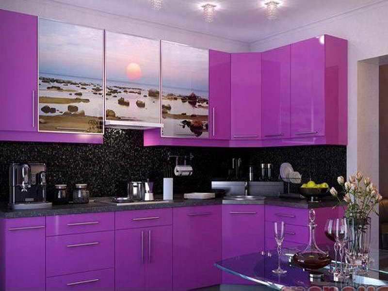
If you’ve ever thought about going bold with psychedelic purple in the kitchen, it might be worth hitting pause. While purple can ooze creativity and a hint of luxury, this electric shade tends to overwhelm rather than inspire.
Instead of focusing on your recipe, you’ll likely find yourself trying to visually process the chaos. Most designers steer clear of it for a reason – it rarely plays nice with other styles and can feel like a sensory ambush.
16. Bright Turquoise
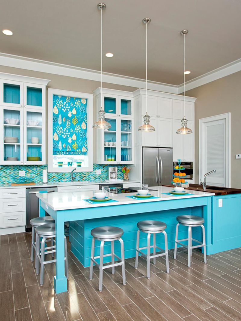
Turquoise walks a fine line, and the bright version doesn’t always land on the right side of stylish. In a kitchen, it can clash with metal finishes, compete with wood tones, and generally feel like you’re trying too hard to channel a tropical beach bar.
It’s one of those colors that gets old fast. Dial it down with a soft teal or dusty aqua for a more timeless, soothing approach.
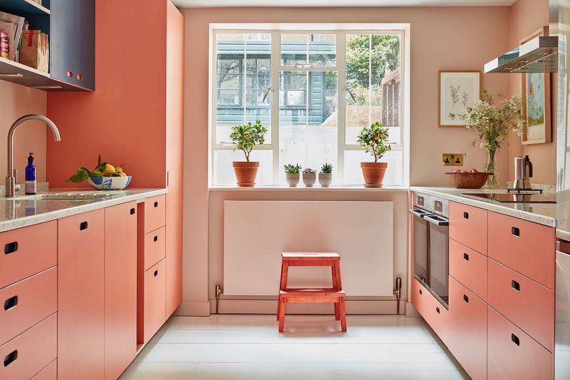
17. Warm Terracotta
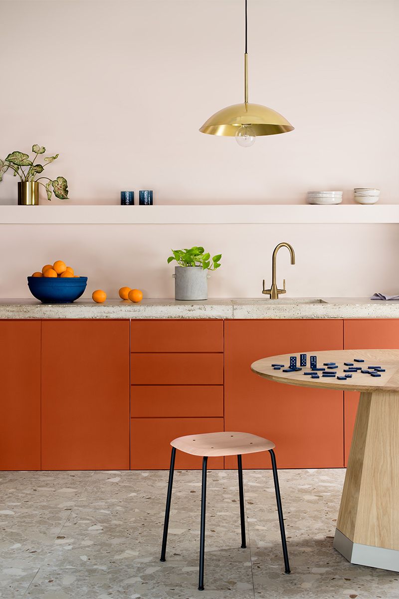
Warm Terracotta brings an earthy charm to kitchens that few colors can match. Its rich, clay-like tone provides a perfect backdrop for both modern and traditional decor styles.
While it complements neutral palettes beautifully, it pairs exceptionally with greenery, enhancing the room’s natural feel. Known for its versatility, Warm Terracotta is a designer’s secret weapon for creating inviting, timeless kitchen spaces.
18. Overbearing Orange
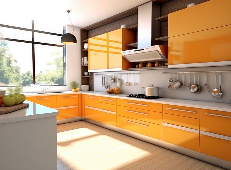
Overbearing Orange is a color to avoid in kitchen spaces due to its overwhelming intensity. While it might seem like a lively choice, its aggressive tone often leads to a feeling of chaos and discomfort.
Designers often steer clear of this shade, opting for more subdued tones that provide a calming and cohesive environment instead. Avoiding this hue can lead to more serene and inviting spaces.