
In the ever-evolving world of interior design, color trends come and go like fleeting fashion. This year, we’ve seen certain hues fade into obscurity while others rise to take their place, painting your living spaces with fresh, vibrant energy.
Join us on a colorful journey as we bid adieu to shades that have overstayed their welcome and embrace the vibrant newcomers that promise to transform your living room into a stylish sanctuary.
1. Out: Millennium Grey
Once the darling of modern design, millennium grey now feels as drab as a cloudy day. What was once seen as sleek and chic has become a ubiquitous backdrop lacking personality.
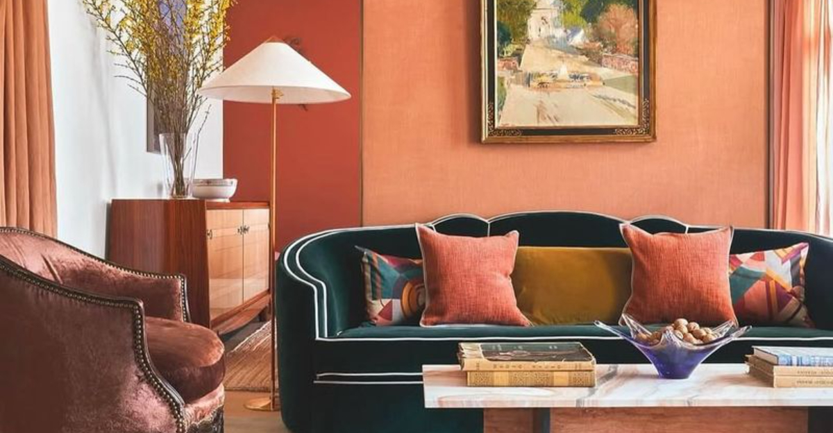
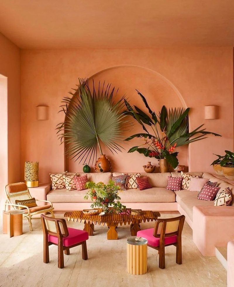
2. In: Warm Terracotta
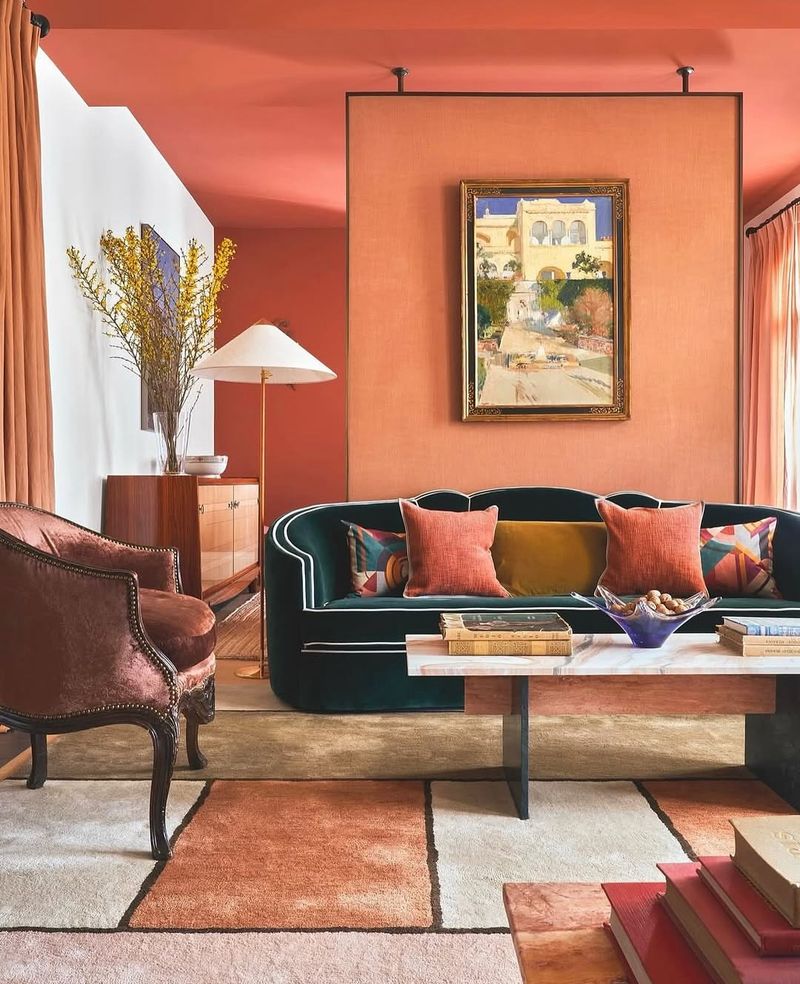
Evoking the warmth of a Mediterranean sunset, warm terracotta radiates comfort and style. It’s the color that whispers cozy evenings and intimate gatherings.
3. Out: Stark White
Stark white, once synonymous with minimalism, now feels as inviting as a sterile hospital room. Its lack of warmth and character has led it to fade into obscurity.
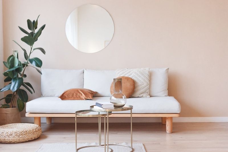
4. In: Soft Blush
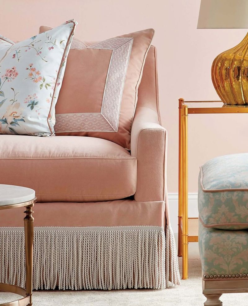
Soft blush is the silent star of living room palettes, adding a touch of elegance and warmth. It’s the subtle hue that transforms spaces into romantic retreats.
5. Out: Navy Accent
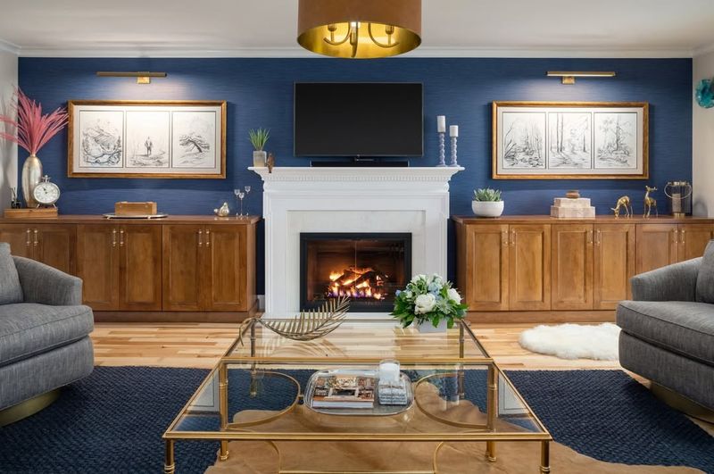
Navy accent walls once commanded attention, but have now become cumbersome and heavy. Their dark presence is finally taking a backseat to lighter alternatives.
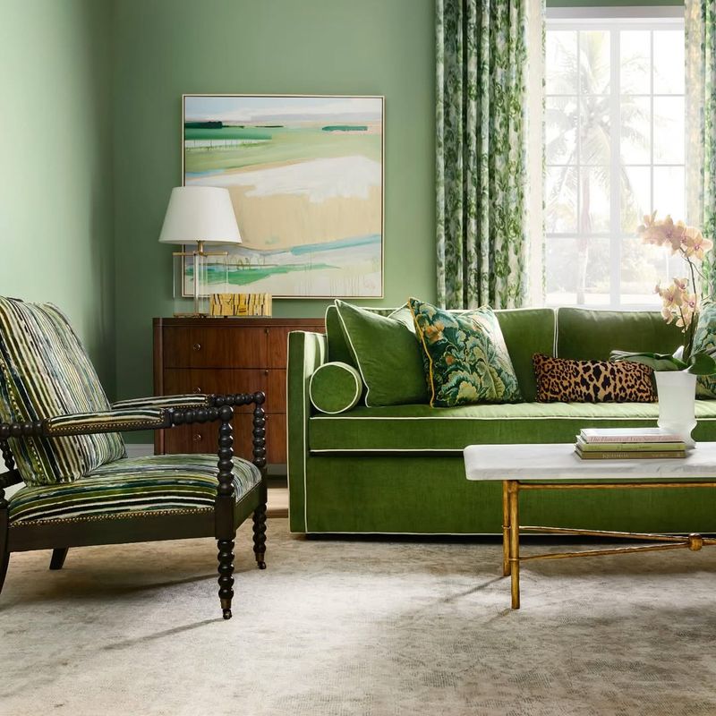
6. In: Earthy Sage
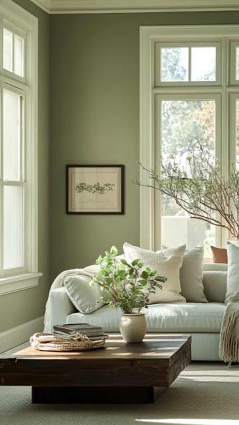
Earthy sage emerges as a breath of fresh air, offering tranquility and balance. This soothing color invites nature indoors, creating a haven of peace.
7. Out: Greige
Once hailed for its neutrality, greige now feels as uninspired as it sounds. It’s the color equivalent of vanilla ice cream with no toppings.
8. In: Rich Ochre
Rich ochre floods the room with golden warmth, creating a vibrant and sophisticated atmosphere. It dances in the sunlight, casting a joyful glow.
9. Out: Dusty Teal
Dusty teal once brought vintage charm but now feels tired and outdated. It struggles to keep up, leaving behind a sense of bygone eras.
10. In: Bold Coral
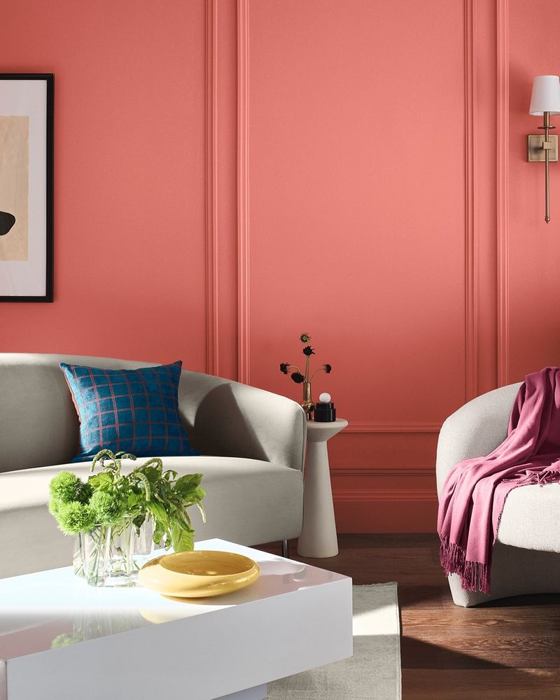
Bold coral bursts onto the scene with its vivacious energy. It commands the space, making a statement with its lively and spirited presence.
11. Out: Avocado Green
Avocado green, a relic of the retro era, now feels like a culinary throwback best left in the past. It’s the epitome of kitsch over class.
12. In: Deep Forest Green
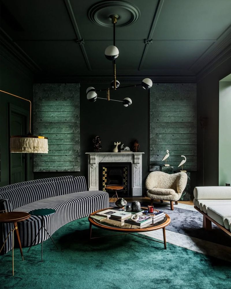
Deep forest green envelops the room in a cloak of sophistication and mystery. It’s the color of rich textures and warm, inviting spaces.
13. Out: Chalky White
Chalky white offers little more than a blank canvas, now devoid of vibrancy and life. It’s as exciting as watching paint dry.
14. In: Warm Taupe
Warm taupe exudes coziness and sophistication, wrapping the room in its comforting embrace. It’s a versatile hue that adapts beautifully to any style.
15. Out: Cool Mint
Cool mint, once refreshing, now feels as sterile as a dentist’s office. Its chilly hue fails to inspire warmth or character.
16. In: Vibrant Marigold
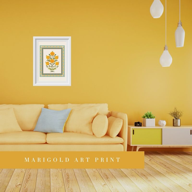
Vibrant marigold beams with positivity, bringing a sunny disposition to any space. Its cheerful hue captures the essence of joyous living.
17. Out: Steel Blue
Steel blue, once cool and sleek, now feels industrial and unwelcoming. Its cold presence leaves rooms feeling more like warehouses than homes.
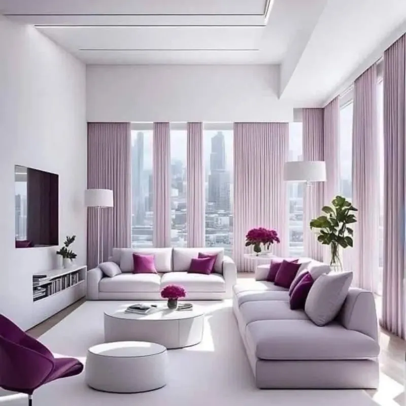
18. In: Soft Lavender
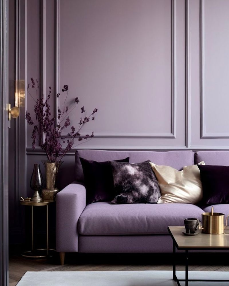
Soft lavender enchants spaces with its dreamy and calming aura. Its whimsical presence turns rooms into serene retreats.
19. Out: Beige
Beige, the old standby, now appears more bland than ever. It’s a color that’s become synonymous with safe and uninspired choices.
20. In: Honeyed Almond
Honeyed almond offers warmth and elegance, enveloping rooms in its inviting glow. It’s a hue that whispers sophistication with every brushstroke.
21. Out: Pale Lilac
Pale lilac, once whimsical, now feels more suited for nurseries than adult spaces. Its lackluster hue fails to captivate modern sensibilities.
22. In: Velvet Plum
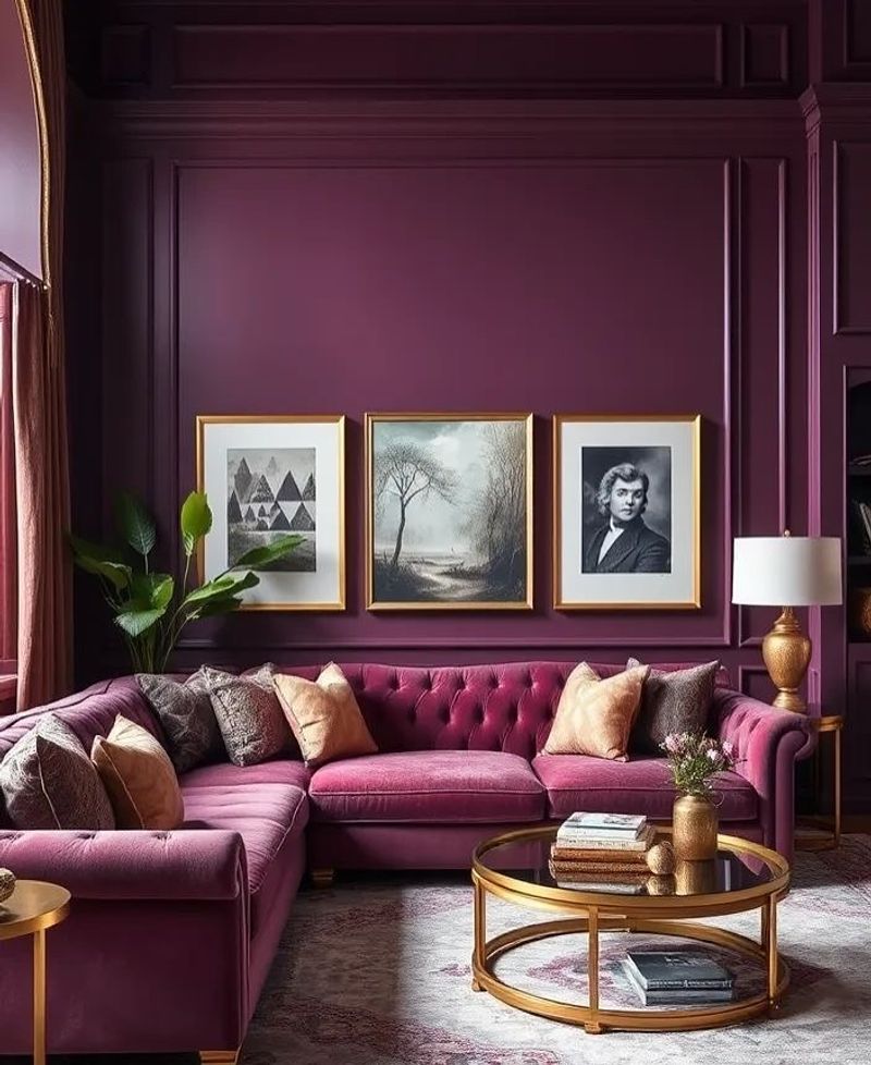
Velvet plum oozes opulence and drama, wrapping the room in its rich, regal embrace. It’s the color of luxury and bold statement pieces.
23. Out: Lemon Yellow
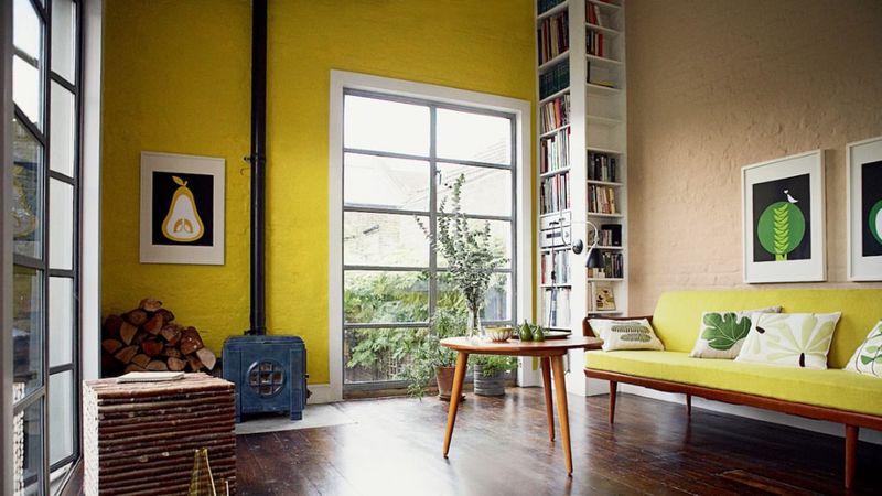
Lemon yellow, once a burst of sunshine, now feels overwhelming and jarring. Its bright intensity no longer aligns with contemporary tastes.
24. In: Moss Green
Moss green brings the tranquility of nature indoors, creating a serene and harmonious living space. Its earthy tone invites relaxation and reflection.
25. Out: Salmon Pink
Salmon pink, a relic of the 80s, now feels as dated as shoulder pads. Its presence in modern decor feels forced and out of place.
26. In: Midnight Blue
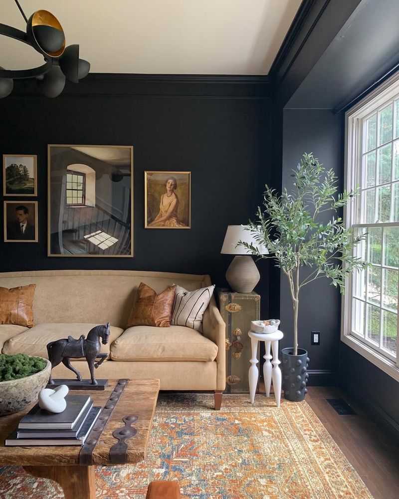
Midnight blue cloaks rooms in mystery and sophistication, setting the stage for dramatic interiors. It’s the perfect complement to luxurious textures.