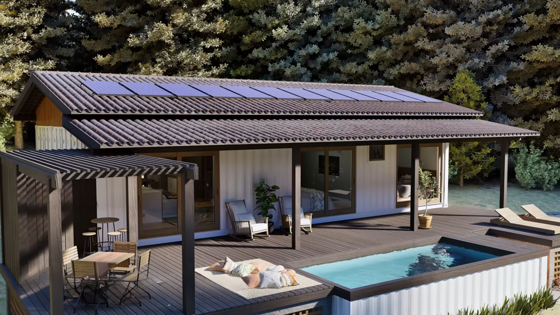
Ten years ago, having a three-bedroom home with spacious common areas, all made of shipping containers was considered impossible.
I don’t know a single designer who wanted to try out their luck with building such houses.
Fortunately, we already live in the future and today, container houses aren’t just an innovation; they’re becoming an affordable luxury for everyone seeking a home.
And this one right here is all about tell me you’re rich without telling me you’re rich.
The Exterior That Makes You Wonder If It’s Really A Container House
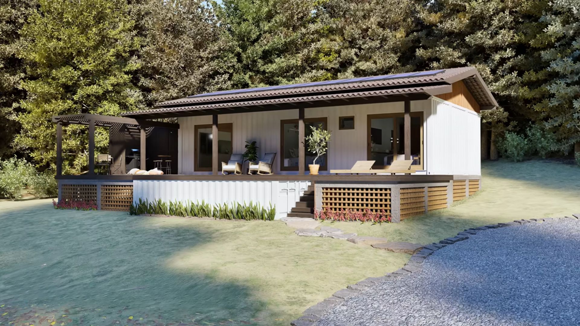
I had to take another, closer look, because I really thought this was a normal, traditionally-built house.
What gave it away is the elevation made to hide the container with the pool and those corrugated walls kept to maintain the container vibes. Everything else speaks of luxury.
Your Version Of An Infinity Pool
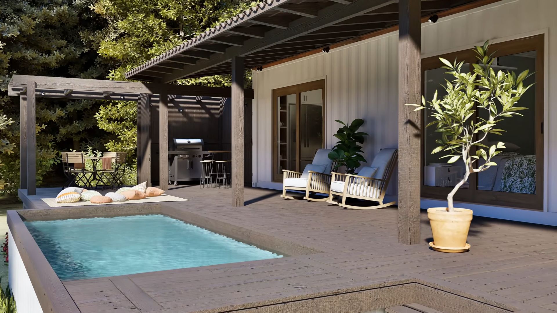
The house is quite spacious on the inside with its three bedrooms, but the outside space doesn’t fall behind either. The designer came up with the idea of installing a pool in one of the containers and leveling it up with the front patio.
It almost looks like a version of an infinity pool!
Promising A Lot Of Great Things
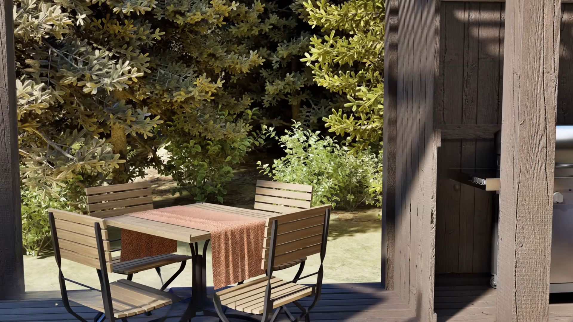
What I appreciate is that there are plenty of seating zones outside as well as a grill that promises lots of fun parties for friends and family.
This house is already promising a lot. I bet things only get better inside.
Modern And Etno Vibes
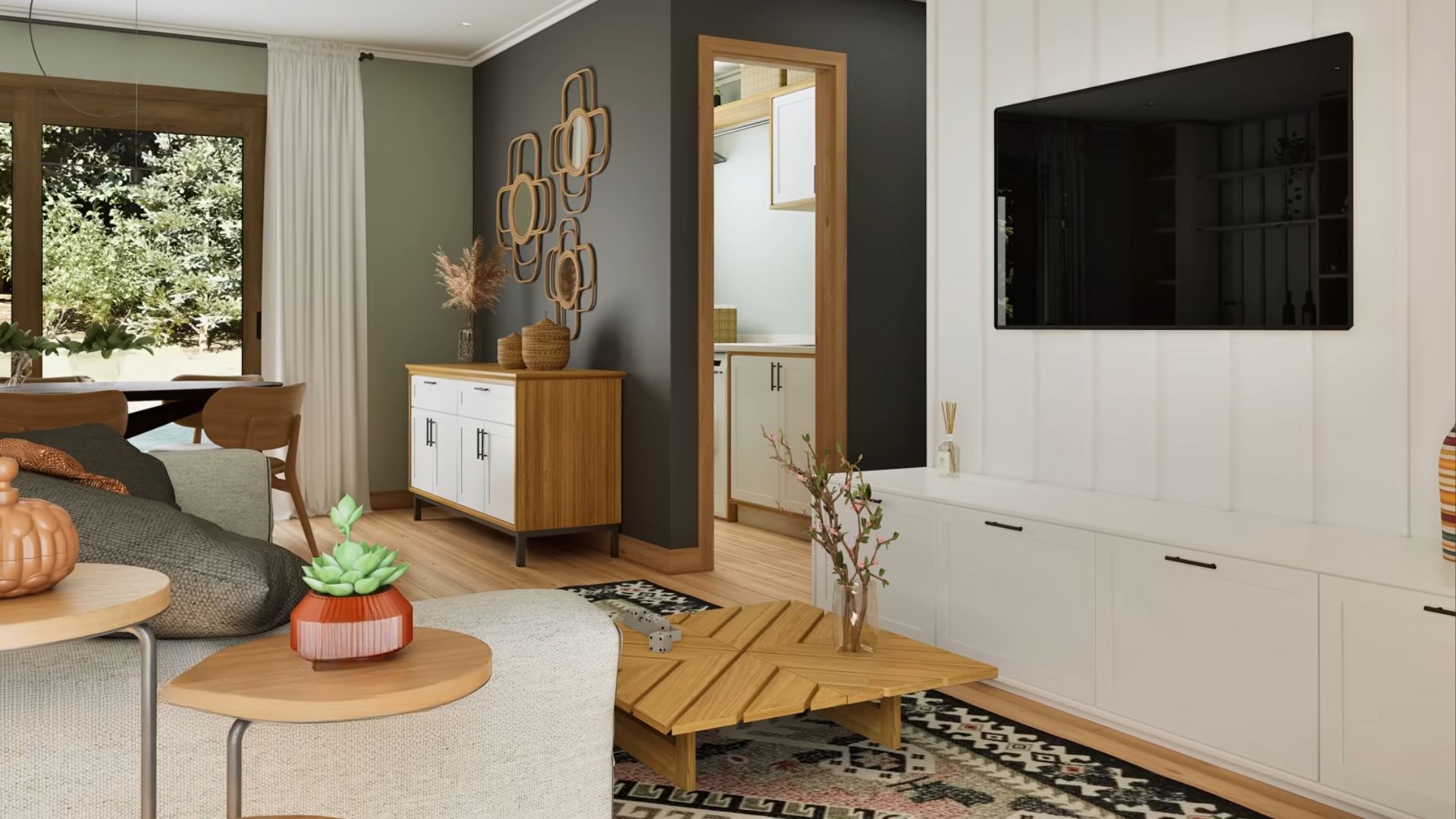
By the looks of the living room area, they really do!
Of course, as with every modern house these days, the common area is an open concept with a perfectly blended kitchen, dining room, and living room.
The living room is muted luxury with lots of different styles entwined: the colorful etno rug, the shabby chic white wood panels behind the TV, the modern design of the coffee table… They all work out together better than I thought they would.
There’s Always Room For Studying
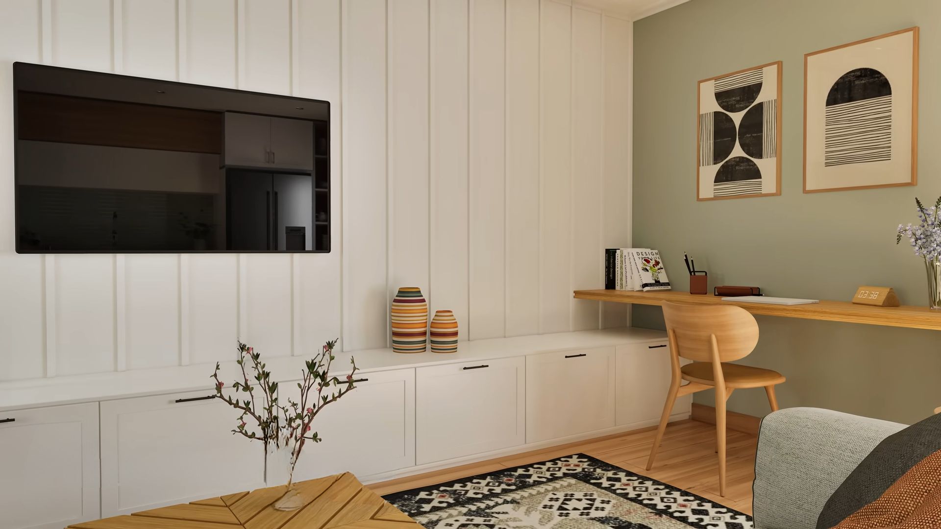
The living room also doubles as a study with a little office corner. This is one great example of maximizing space usage without making the room feel crowded. In my opinion, this is so much better than adding another armchair or some accent side tables.
The room is already beautiful as it is, so better make it functional.
Subtle Luxury Is Everywhere!
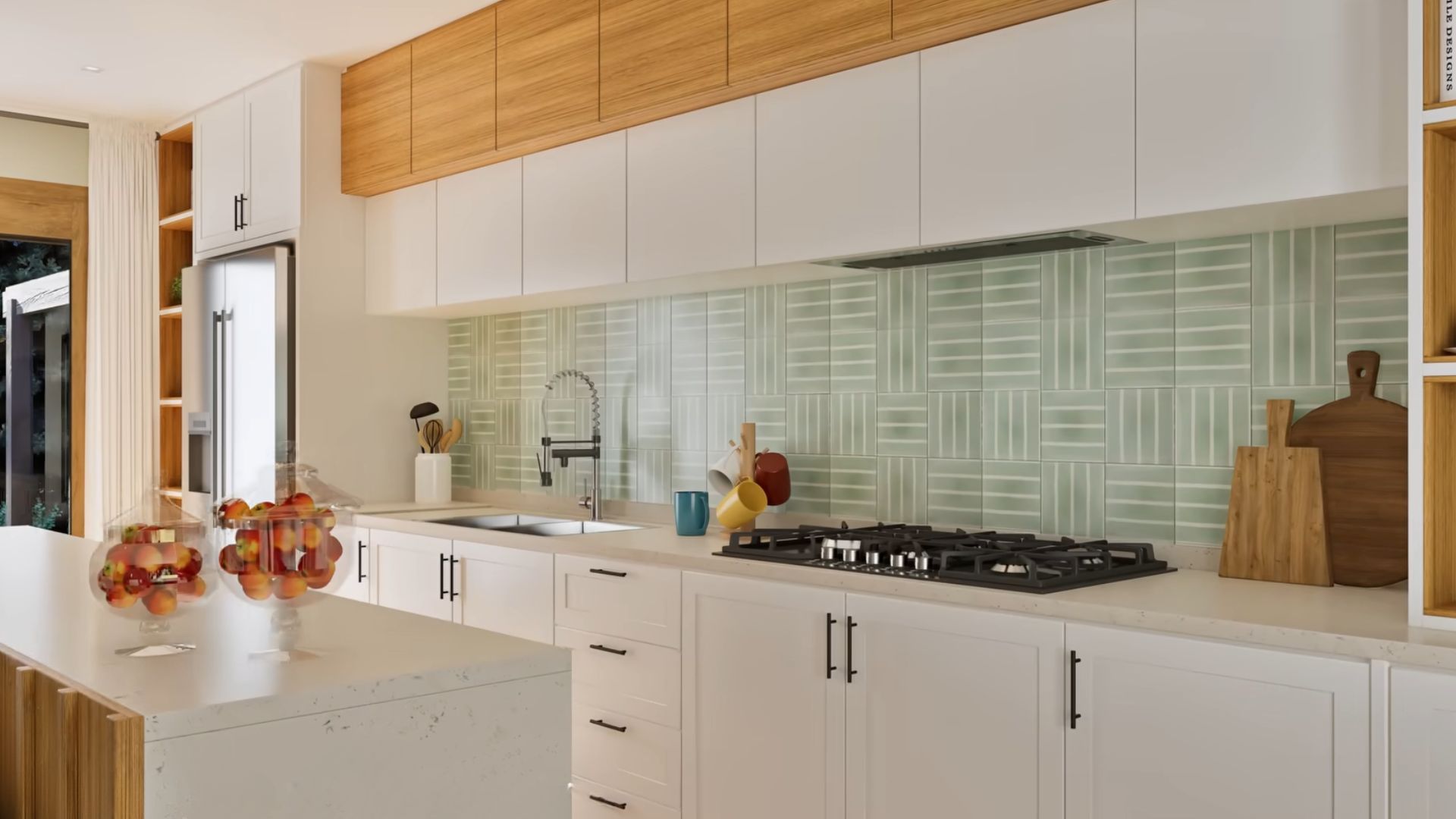
,Speaking of beauty and functionality…
This is, by far, my favorite kitchen design for the past four to five years. I love it so much, I had to have the same one in my apartment.
The combination of kitchen cabinets in two different sizes and colors is what makes this kitchen so unique. When you combine it with an interesting backsplash such as this one, as well as with a kitchen island in a different, marble pattern, you get a combination to die for!
Whoever designed this kitchen had functionality on top of his mind, followed by the wow factor and that subtle luxury that seems to be hiding in every corner of this container home.
The Bar I NEED
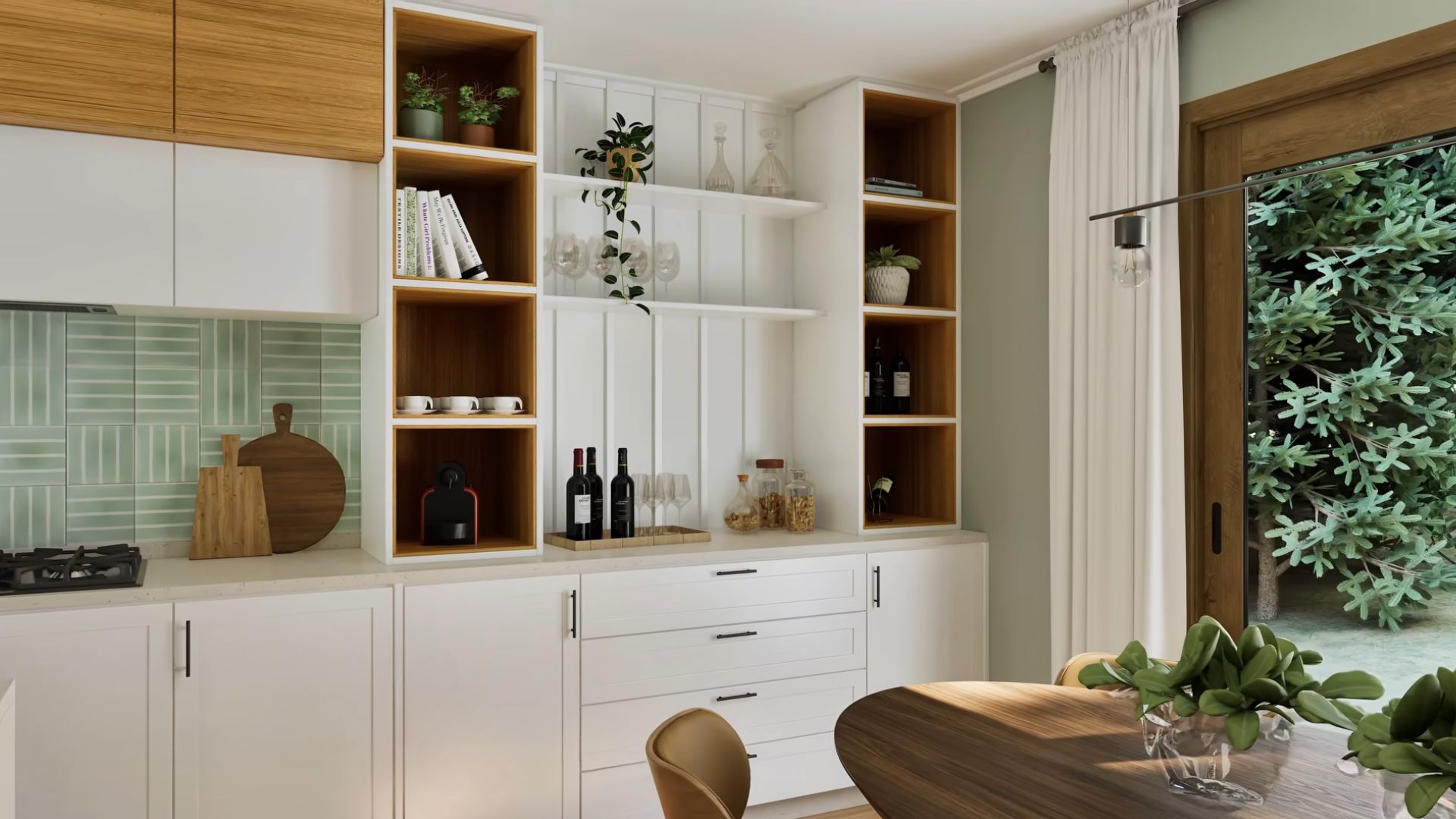
And it keeps getting better and better!
Right adjacent to the kitchen is the dining room with a bar and shelves that seem to be a part of the kitchen ensemble. You don’t see such additions in most houses and I love it even more because of it. The uniqueness doesn’t seem to fail in here.
The Accents You’re Gonna Love
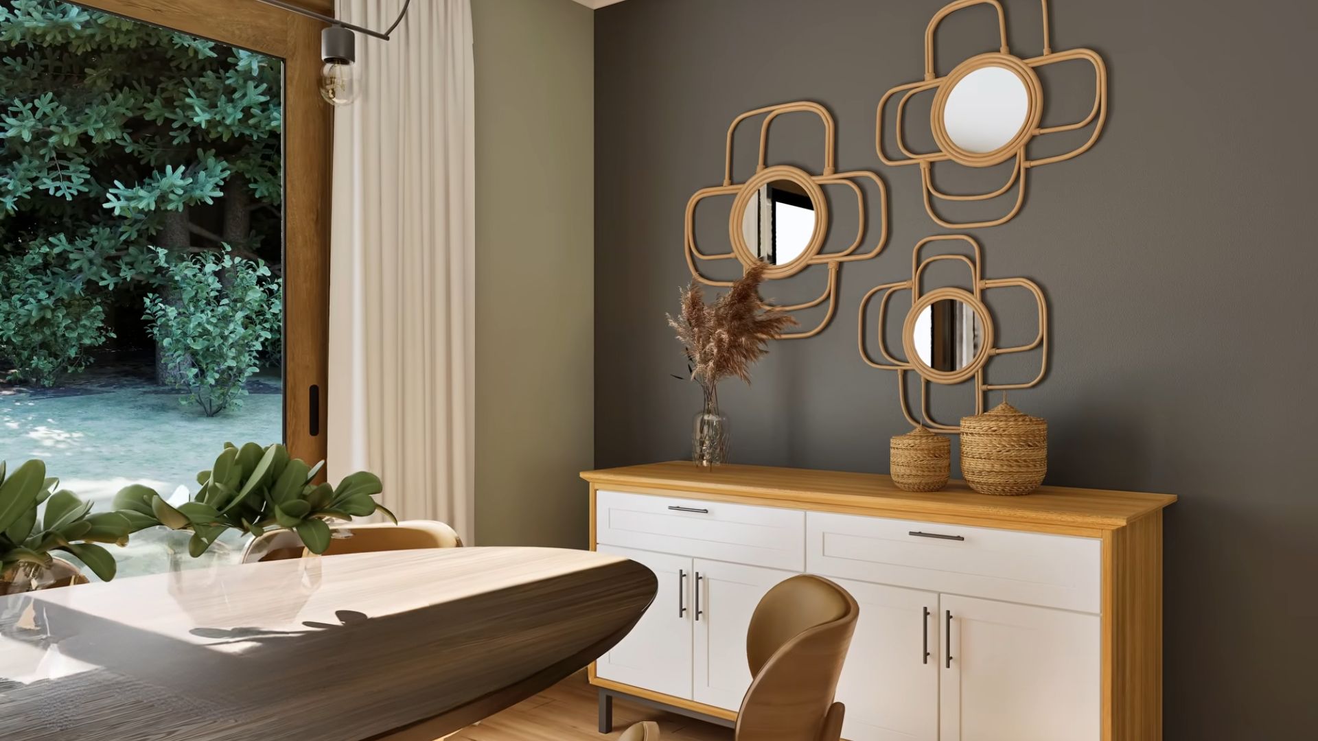
The dining area features one stunning oval table with classic wooden chairs.
Right opposite the kitchen bar wall is an accent wall painted grey, with a pretty cupboard and some interesting mirrors resembling flower shapes. It’s an absolute stunner piece and I bet it will bring so many compliments!
Everything And Even A Lovely Vanity
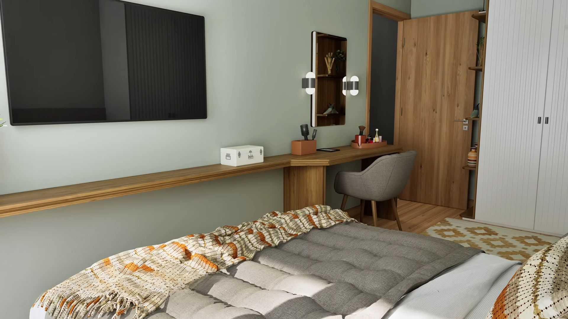
Stepping outside the common area, there are three more rooms waiting to be shown. The first one is the master bedroom with a comfy bed, lots of closet space, and even a lovely vanity. All in all, the room is super simple and elegant, with some colorful twist that make everything interesting.
The Light Blue That Relaxes The Eyes
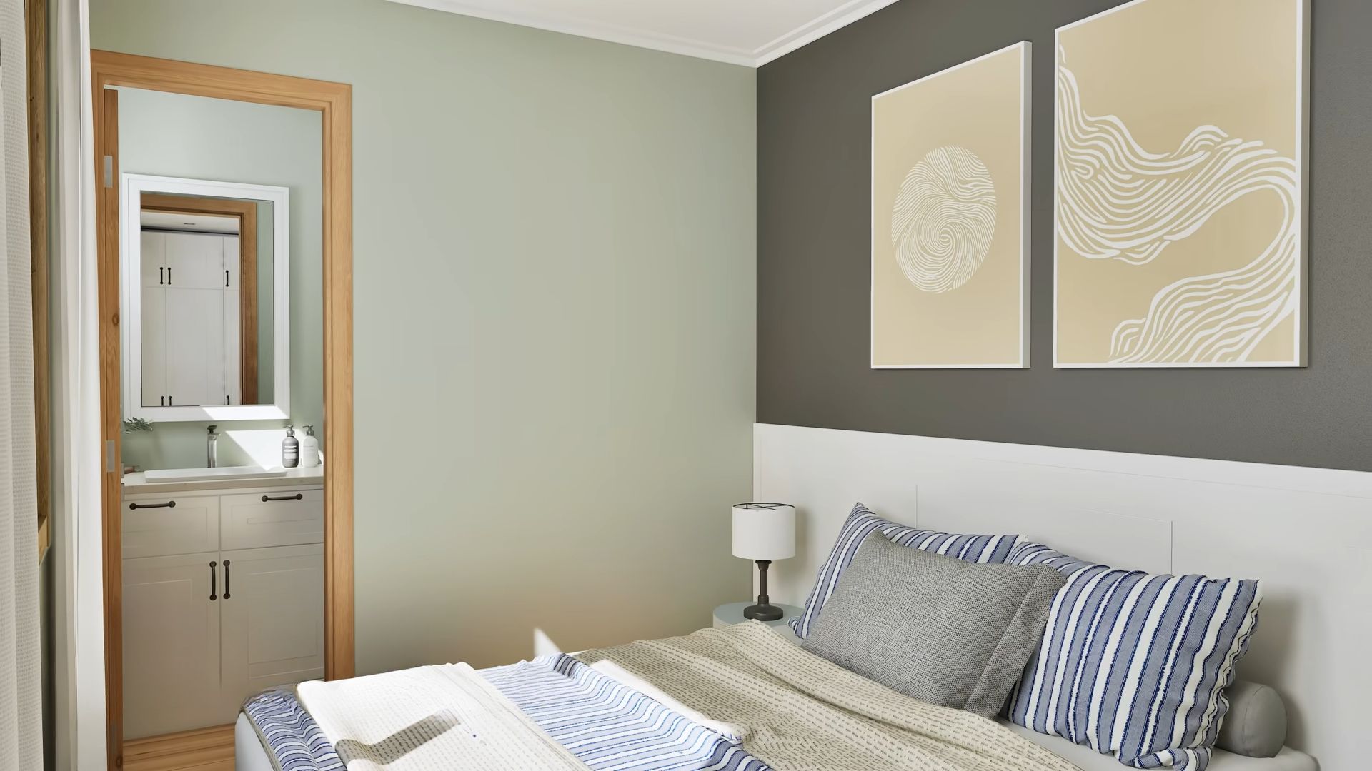
The other two bedrooms are pretty similar.
Both bedrooms feature different colors. In here, the blue is a dominant one accompanied by light grey and they create such a sophisticated energy.
Paradiso Verde
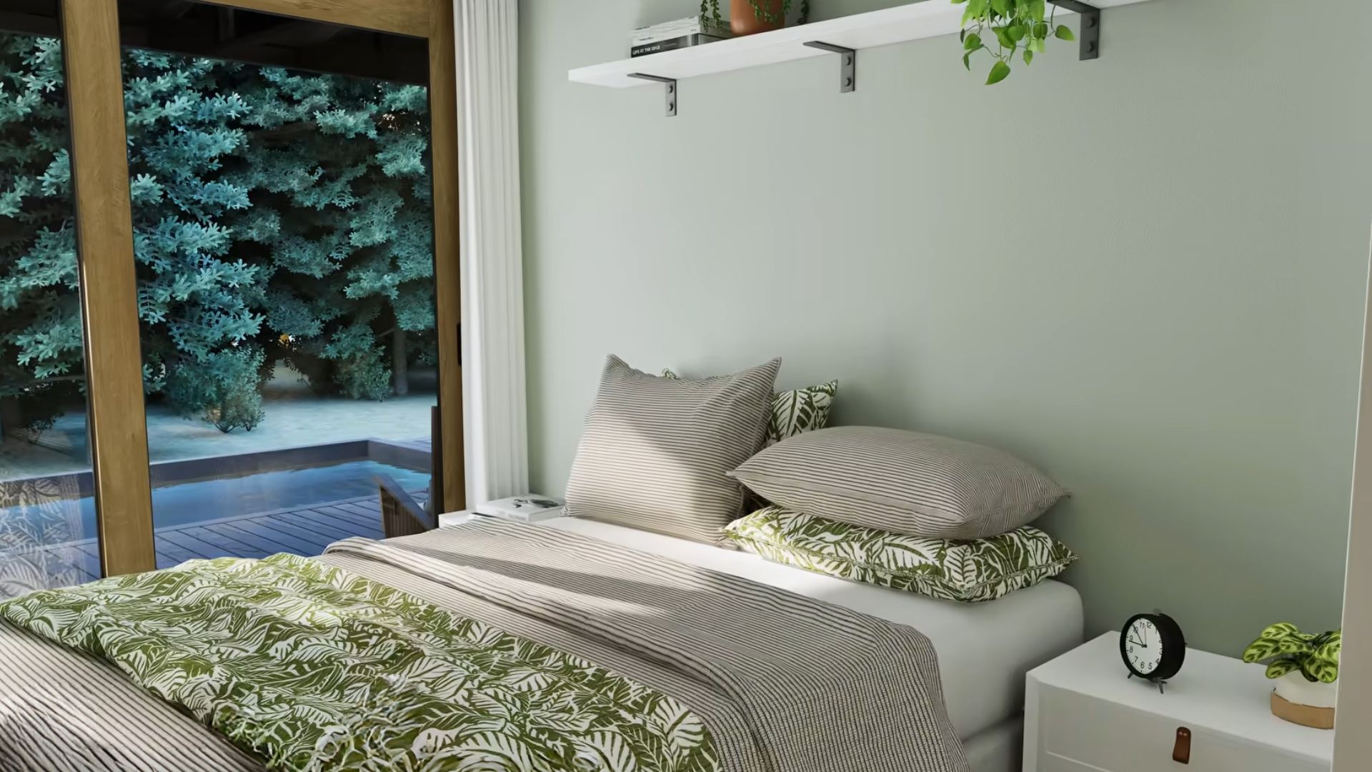
The last bedroom is paradiso verde with the prettiest subtle green on the bed and on the accent wall behind it. This light-colored combination works so energizing and refreshing, a perfect way to describe a bedroom where you wake up after a long night of sleep.
Another Green Paradise
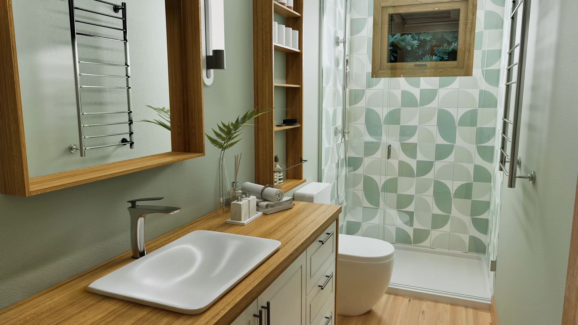
Finally, the main bathroom…
This is another green paradise combined with wood elements that make you feel like you’re entering a rainforest, not an ultra-modern bathroom.
I absolutely love everything about it, from the seemingly flat sink to wood elements, and incredible green tiles in the walk-in shower. This bathroom is an all-star and it looks like it knows it.
You know how they say if I win the lottery, I wouldn’t tell, but there would be signs?
Yeah, that’s absolutely the vibe of this container home.
