The other night, my partner finally had a crazy idea that I loved:
Buying out old containers, repurposing them, and turning them into liveable homes.
Finally!
After all these years of trying to make him get me one of those babies, he finally agreed. Now all I have to do is plan my little sanctuary. I just know after a couple of containers, the next one would be mine, thee-hee.
All jokes aside, this got me thinking: what do people who aren’t designers or architects do when they want a tiny house? Surely, some of them lack ideas or they can’t draw, right?
Well, they probably check out house renders on YouTube or similar websites.
These two, I have found right here, look like a great basic idea for newbies that could be upgraded to the point of luxury.
The Before…
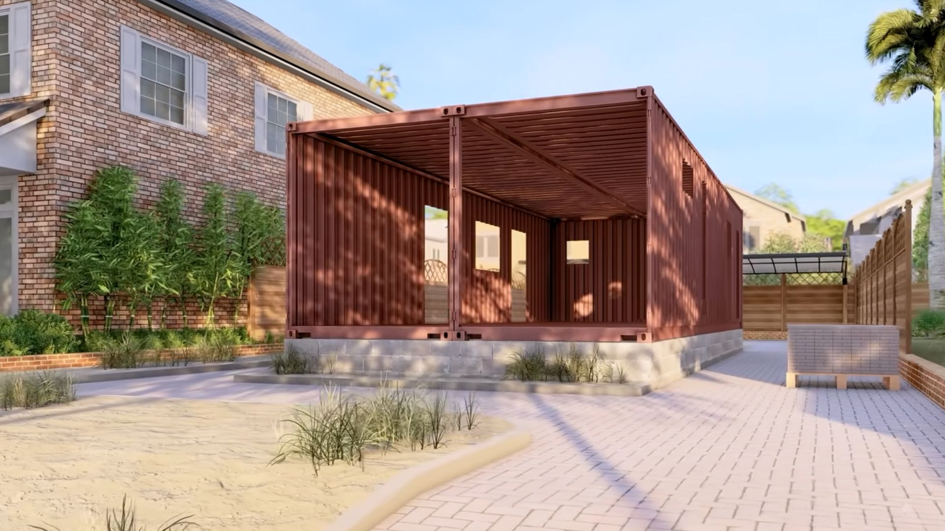
What I have before me are two studios in two 40-foot containers, side by side. Each studio is roughly 320 square feet and perfect for a young couple or a single person looking for a snazzy nest.
These two went from a metal skeleton…
… And The After!
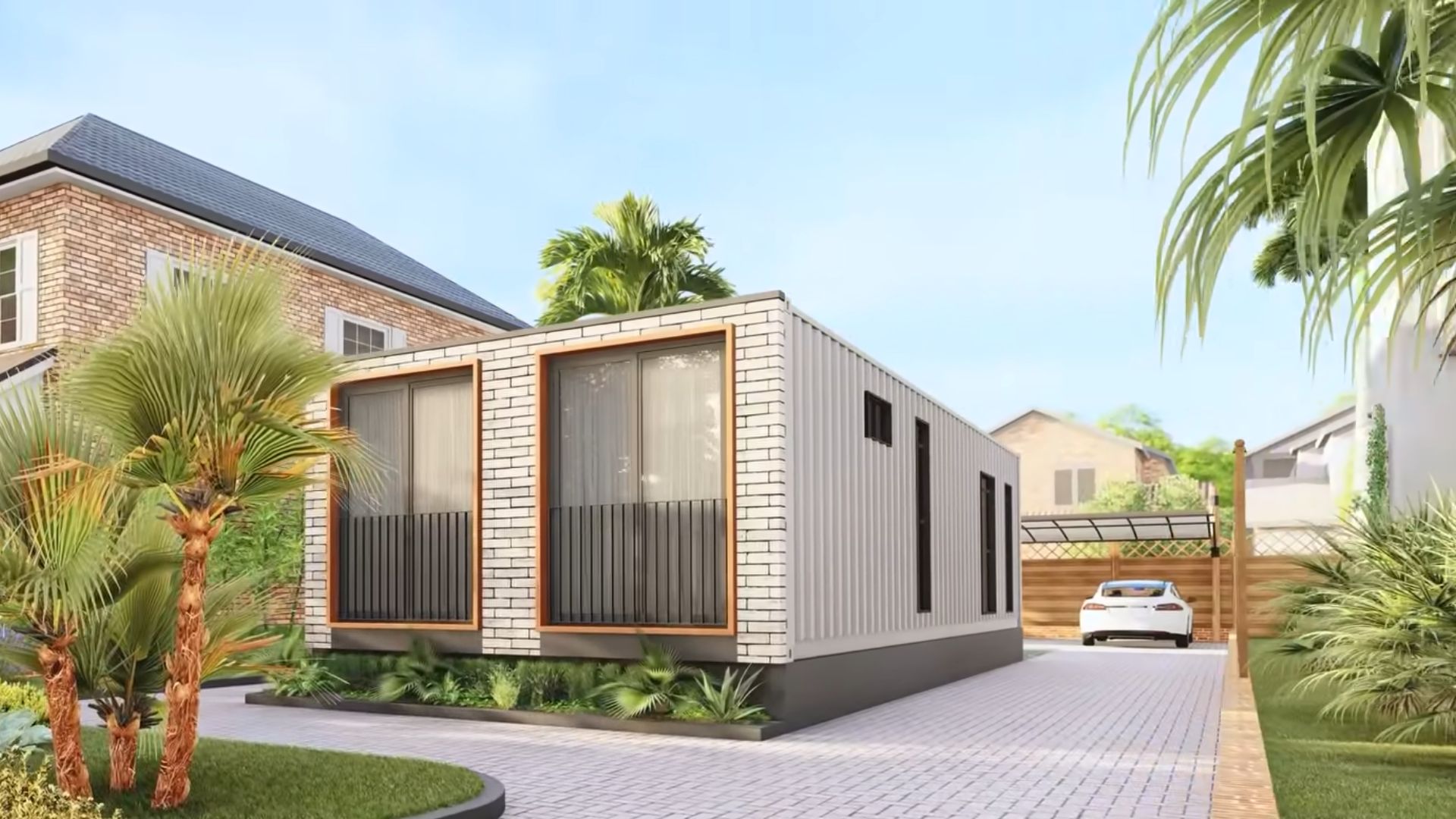
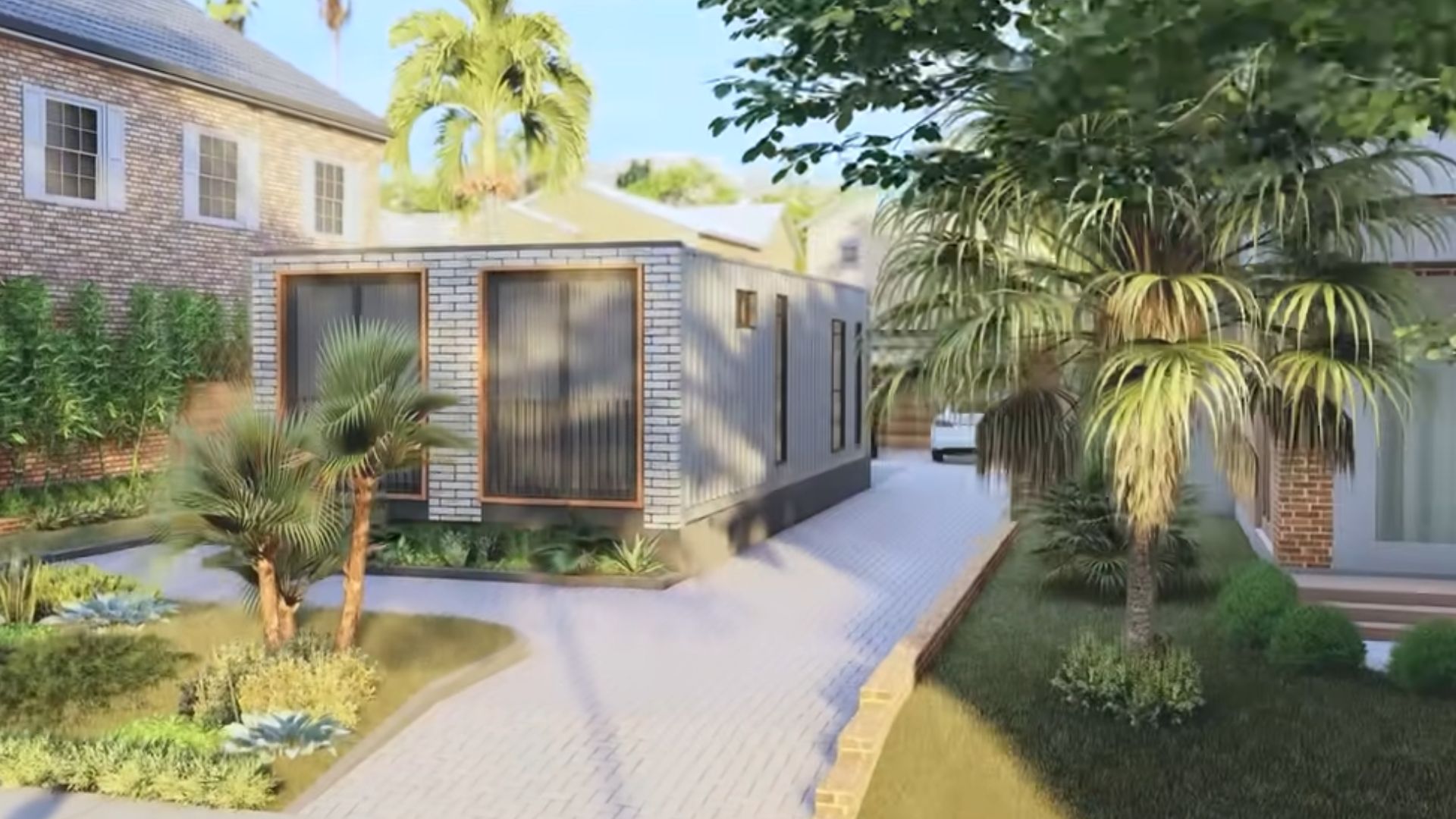
… to this! A picture-perfect scenario!
The first studio integrates three main areas in the house during the day, the kitchen with the dining room, and the living room.
Keep in mind that this is just a program render, not a real home, so some elements might not be too realistic. Still, they paint a perfect picture of how one tiny container home could look.
Don’t You LOVE The Cappuccino Shade?
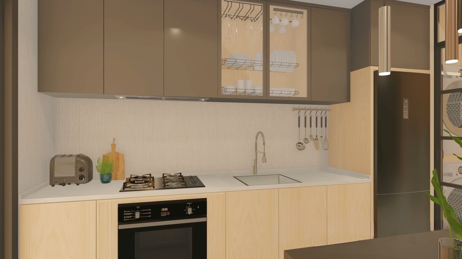
An earthy color palette prevails in the kitchen, and I absolutely adore the cappuccino shade. It’s an evergreen color in my mind, something I always recommend when the client can’t decide which shade to pick.
Being able to fit a fully functioning kitchen into a container home is amazing! This instantly gives me the feeling of being home.
The Open Concept That Leaves No Room For Unnecessary Trinkets
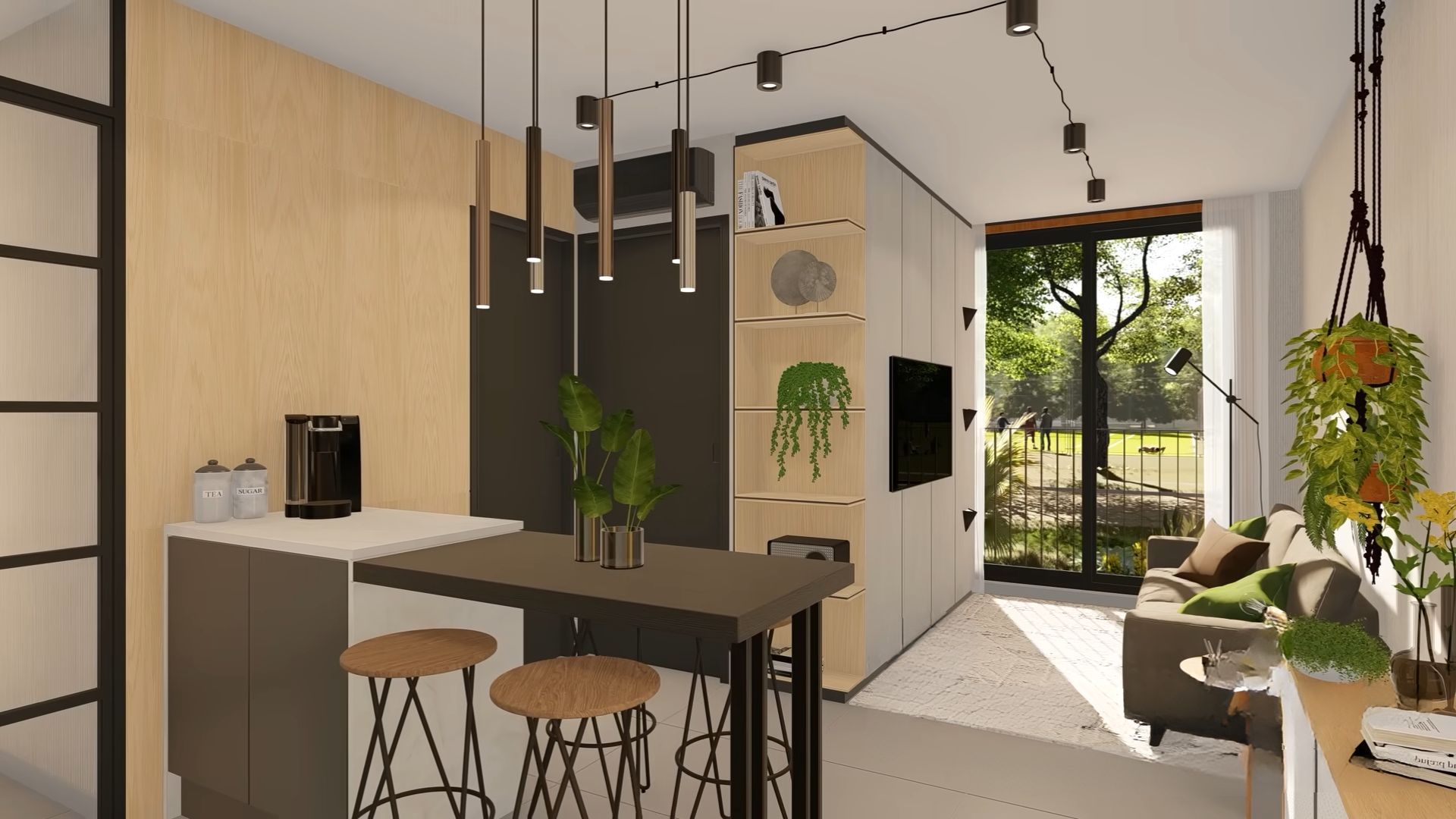
The studio continues with the small dining area which can also serve as the kitchen island. For me, having this sort of addition means extra workspace for baking. And it sure comes in handy when friends come over!
The entire place is an open space decorated in a contemporary style. One of my favorite points is those open glass shelves where you can store all your favorite memories.
Bring In The Green
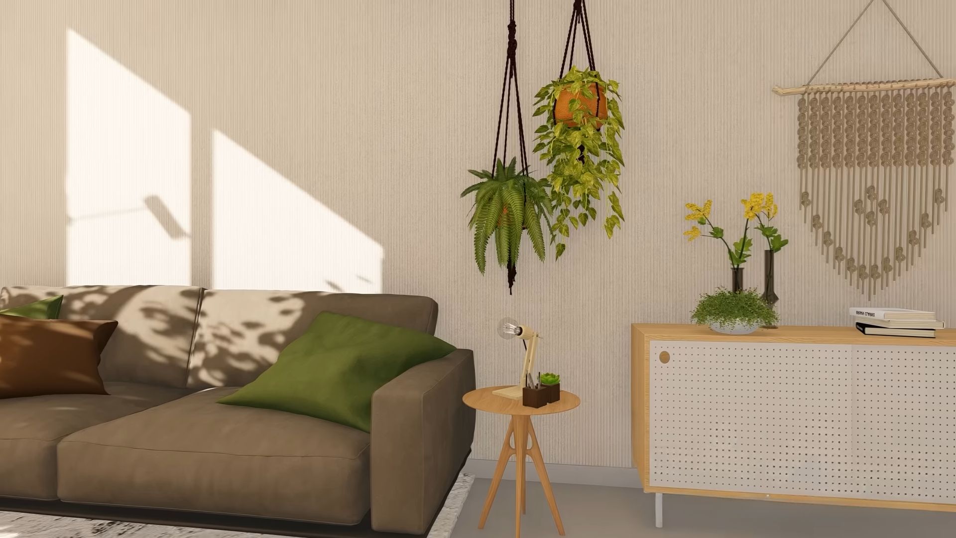
Throughout the room some green details and plants elevate the space, making it appear brighter, and closer to nature. The sofa is neutral, a shade of brownish-grey, and it goes so well with green throw pillows!
Normally I don’t overuse green in the interior too much, but I gotta admit that sometimes there’s no other option.
A bit of boho, a sprinkle of vintage, and there you go: your ideal living room is there! Boho details aren’t tacky! I don’t know why people don’t like them. For me, they have a soul!
Such A Harmonious Bedroom
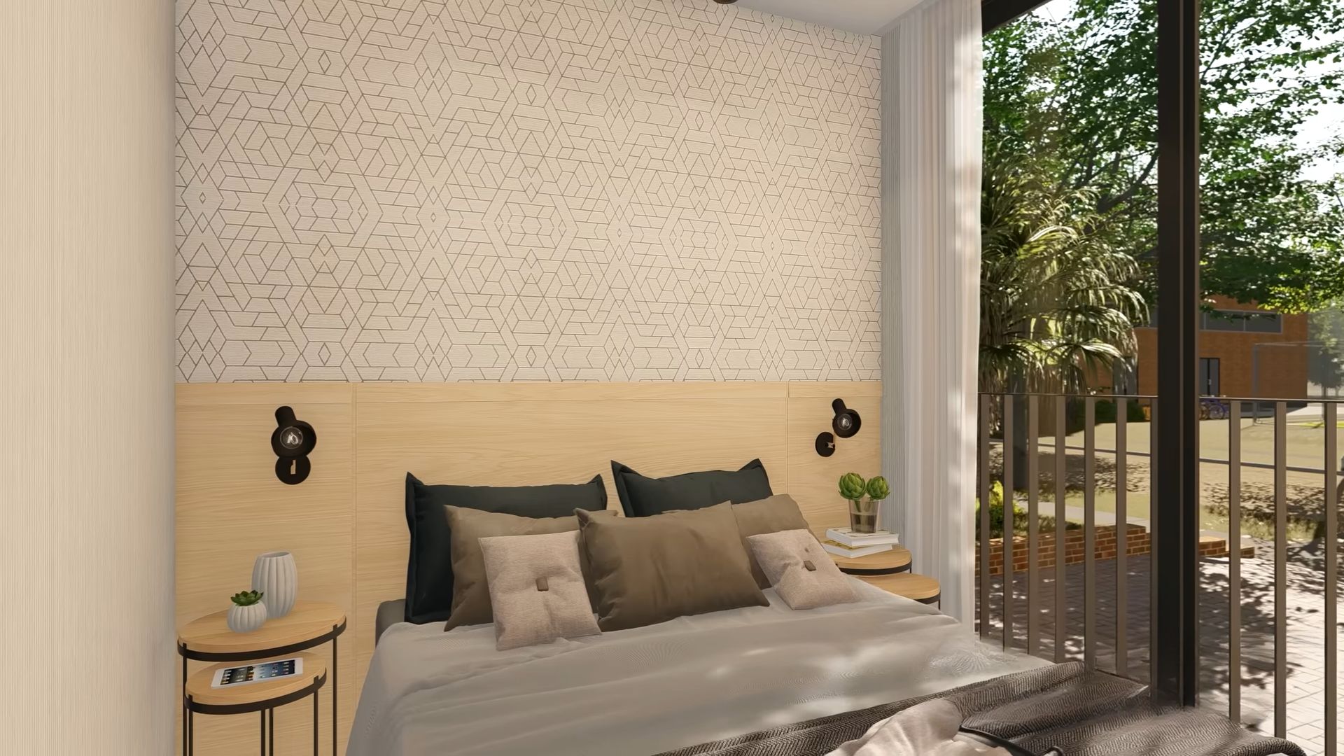
The beautiful and eye-soothing brown shades continue in the bedroom too. It’s a rather small one with just the bed and the closet opposite it.
One of the biggest advantages of this room is the picture window on the right, letting in lots of light, and offering the best view first thing in the morning. I don’t like dark bedrooms. I love it when the sun wakes me up!
The bedroom is totally my cup of tea with stylish round nighttables and texturized wallpaper. What can I say? I love details, bring them in!
It’s The Sink That Bought Me
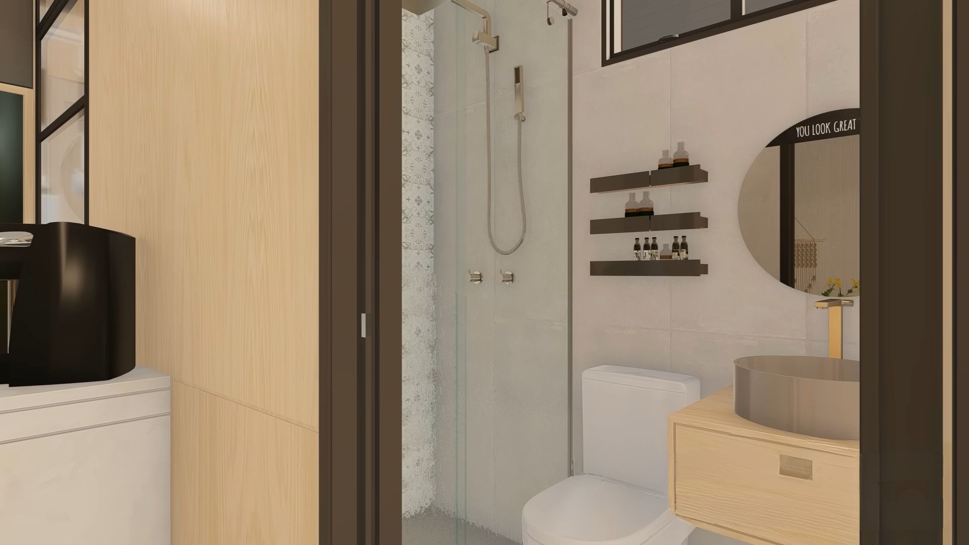
The tour of the studio finishes in the bathroom which is, again, small, but functional. There’s a walk-in shower on the left, and probably the most beautiful sink shape AND shade, ever. I have the same one in white in one of my bathrooms and it’s a stunner!
What’s That In The Middle Of The Second Studio?
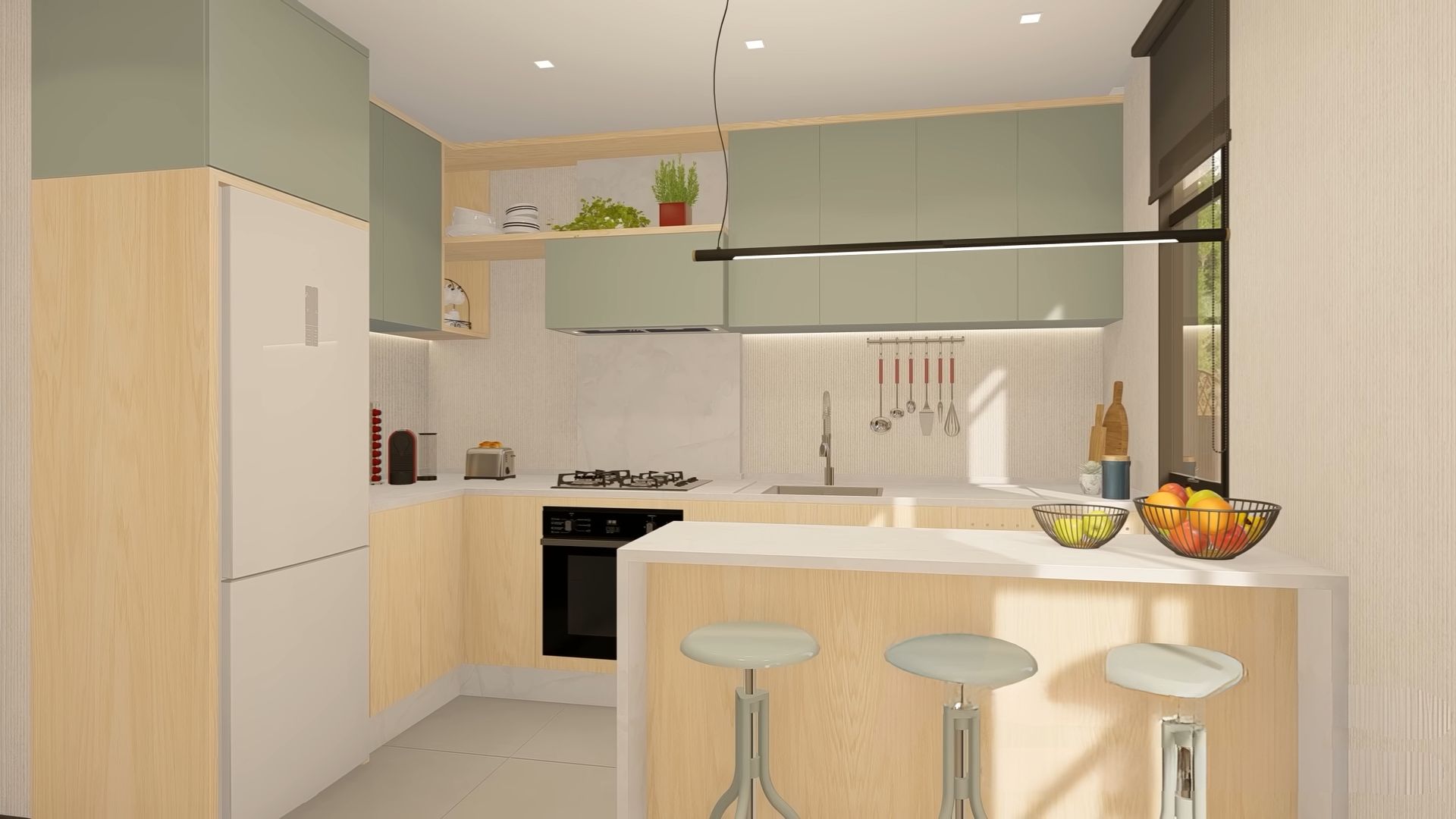
How about we hop into the other container studio for a surprise?
As soon as you walk into the second studio, you’ll notice that the kitchen is much bigger than the first one. There’s a traditional kitchen island with bar stools on the other side.
Instead of going with the same colors, the designer decided to choose light wood, white, and light green, almost grey shade for the space. The combination seems to work nicely together and I get the feeling of a bright and inviting room.
Functionality Over Fashion
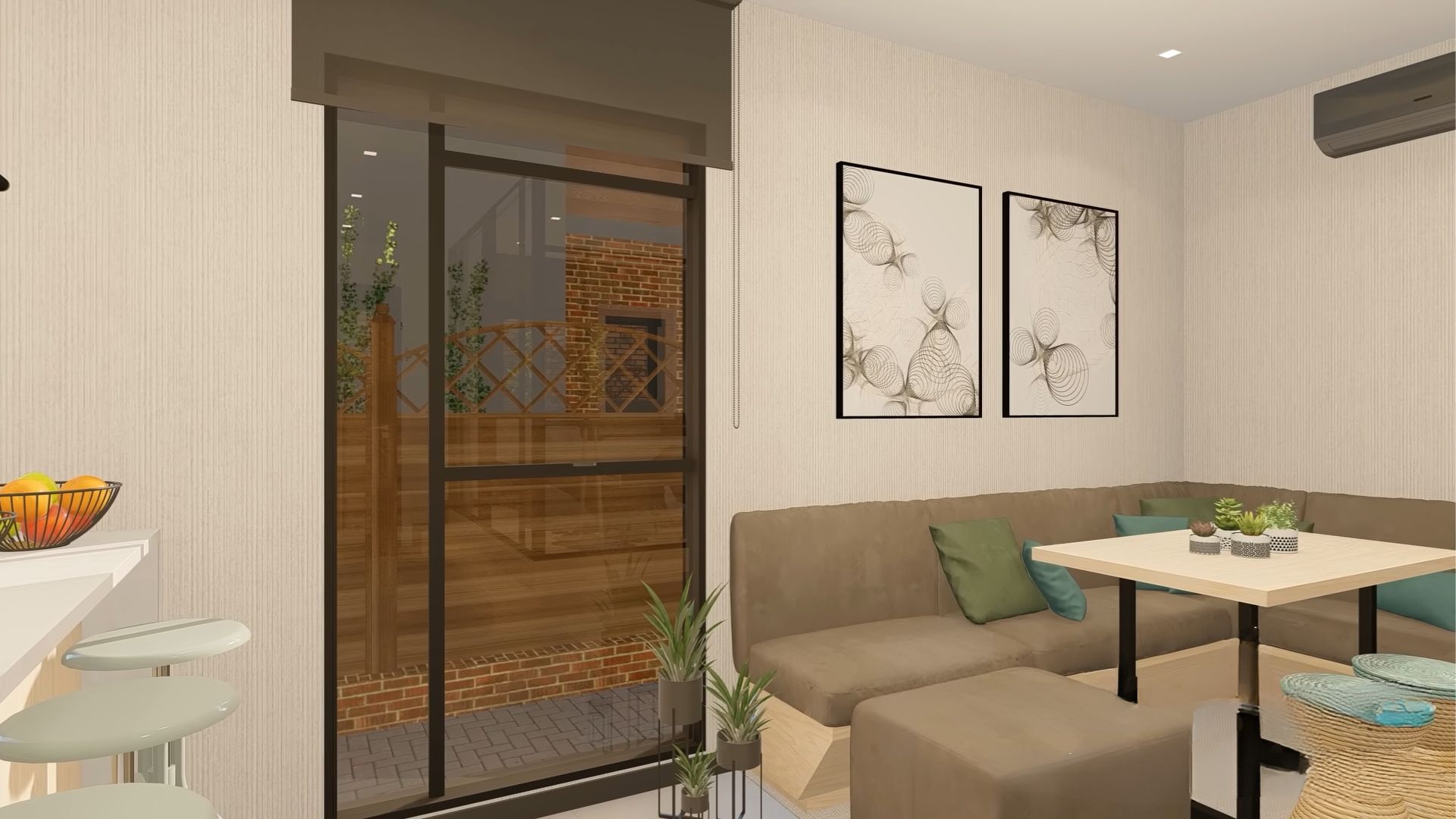
The second studio also comes with a bigger dining area. It’s a corner sofa with additional stools that can fit lots of people. Think of it as a dining room/ living room, a place where people hang out around a delicious meal and refreshing drinks.
To be honest, I prefer this functionality over sofas and tiny coffee tables any day.
Here’s To Elegant Simplicity!
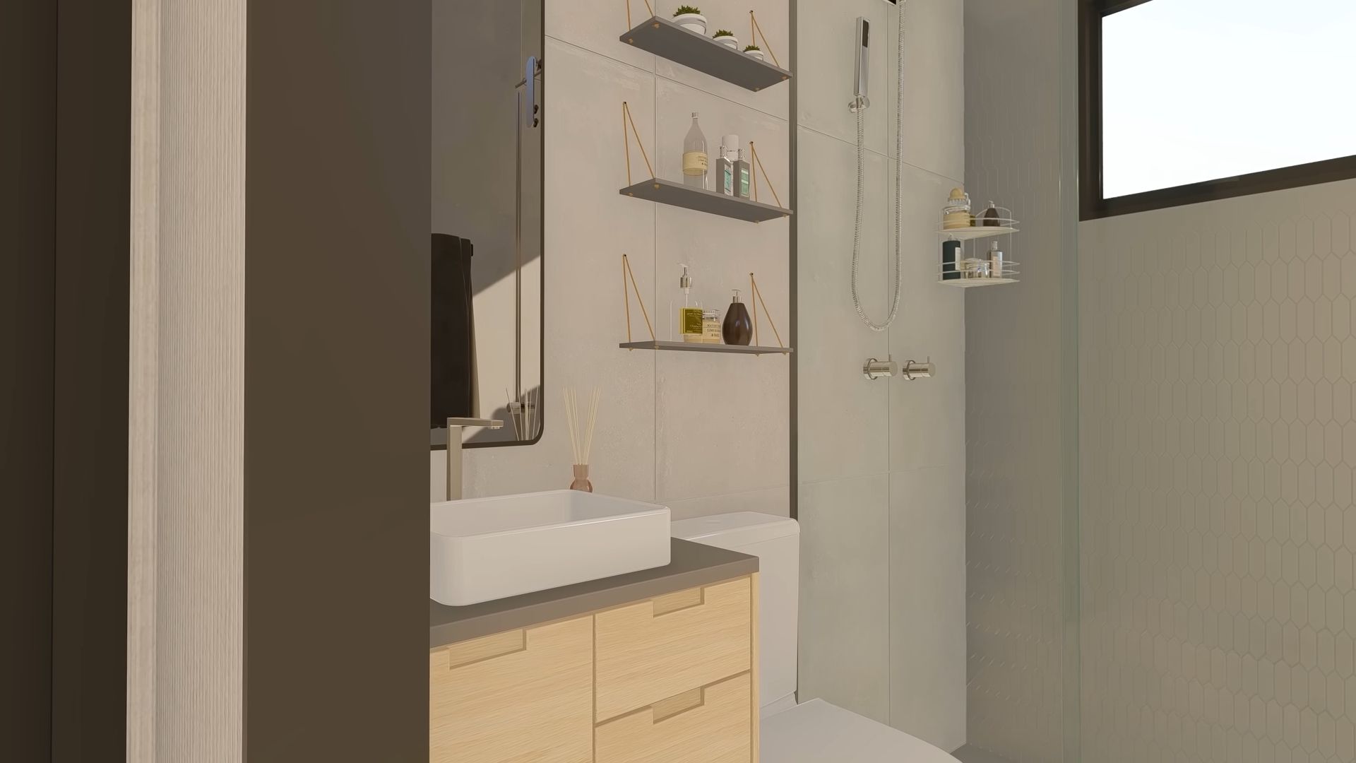
Of course, I can’t forget the bathroom in this studio either. It’s classic, elegant, and simple. Most importantly, it’s effective. Although there aren’t many details, the bathroom still looks like some high-class posh lady came in and did it the way she likes.
The Grand Reveal
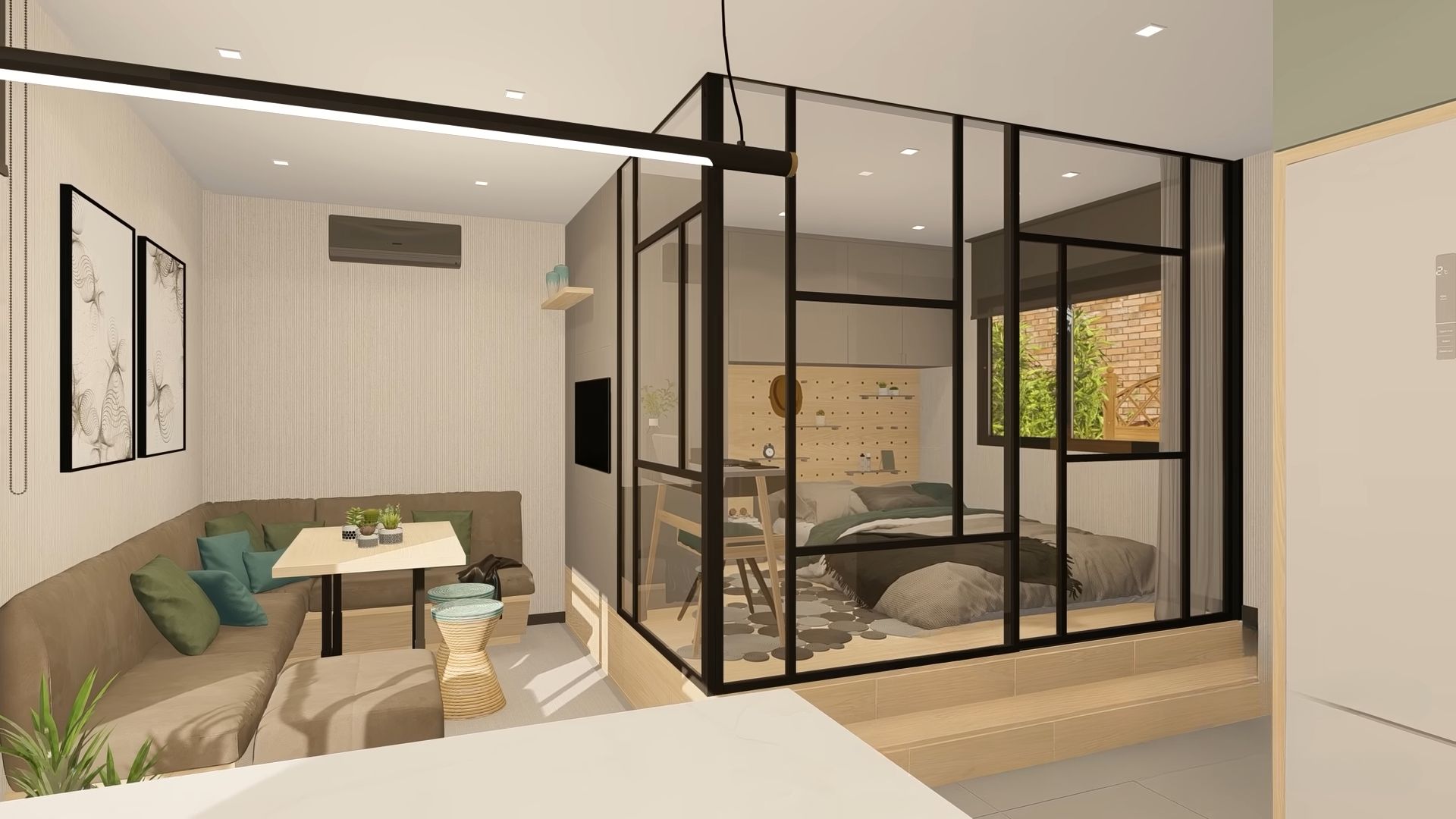
And now… the grand reveal!
The bedroom! The surprise!
No, there’s nothing wrong with your eyes. There IS a bedroom cubicle in the middle of the living room.
Using sound-proof panels and black steel frames, the designer decided to do something unusual: put a bedroom inside the box.
Naturally, no one would be around when you sleep, so this kind of arrangement not only does make sense, but it’s super creative and futuristic. If you ever forget to make the bed and guests are at your doorstep, just close the curtain around the cubicle.
Check Out The Headboard
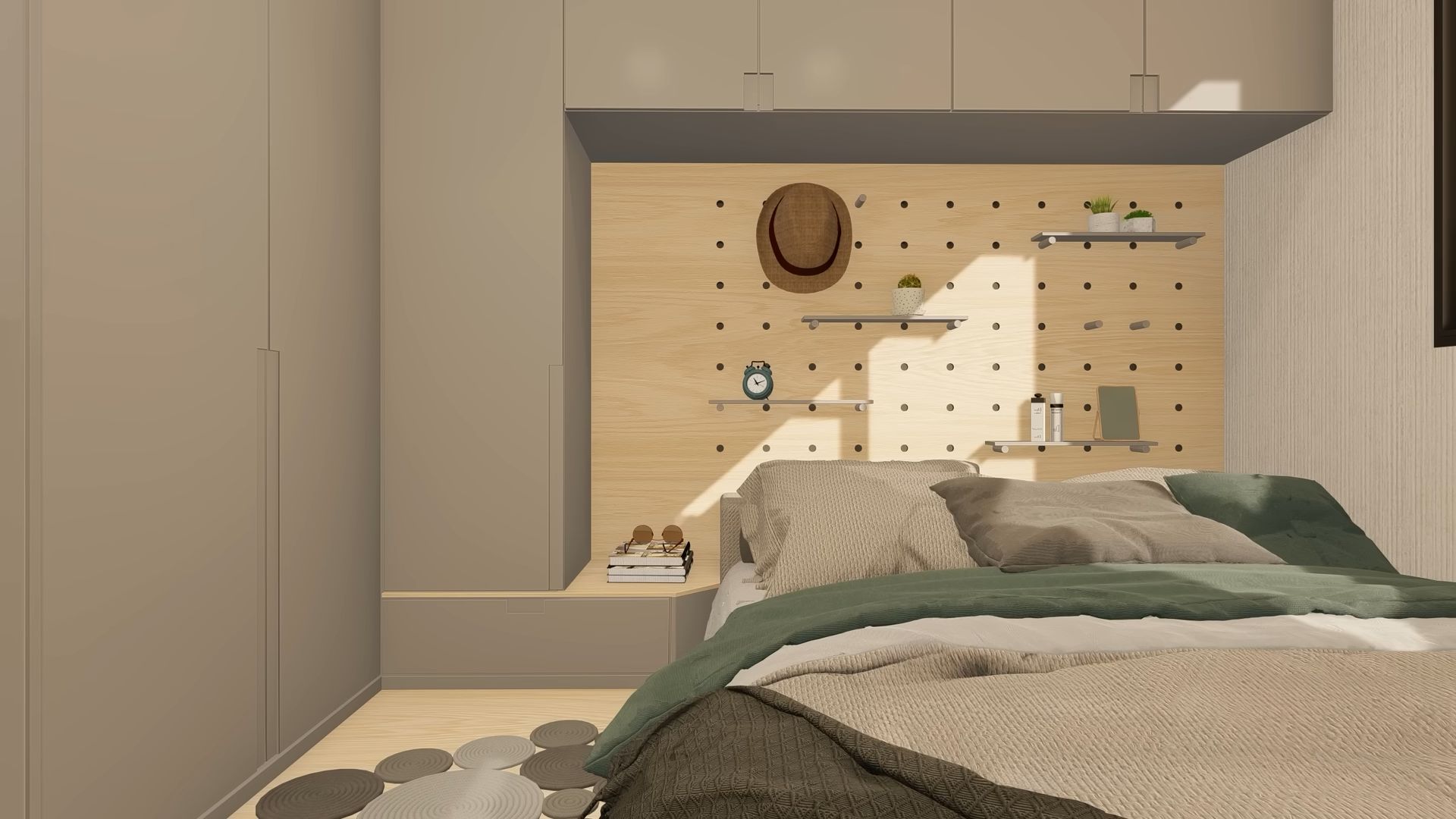
The bed itself is a cozy cloud with a closet behind it and some built-in nightstands. However, my favorite part of the entire bedroom is the headboard imagined as a bulletin board with shelves and spots where you can hang your things.
It’s such a cool idea, something I’ve never seen before used in this context.
A Little Extra In The Back
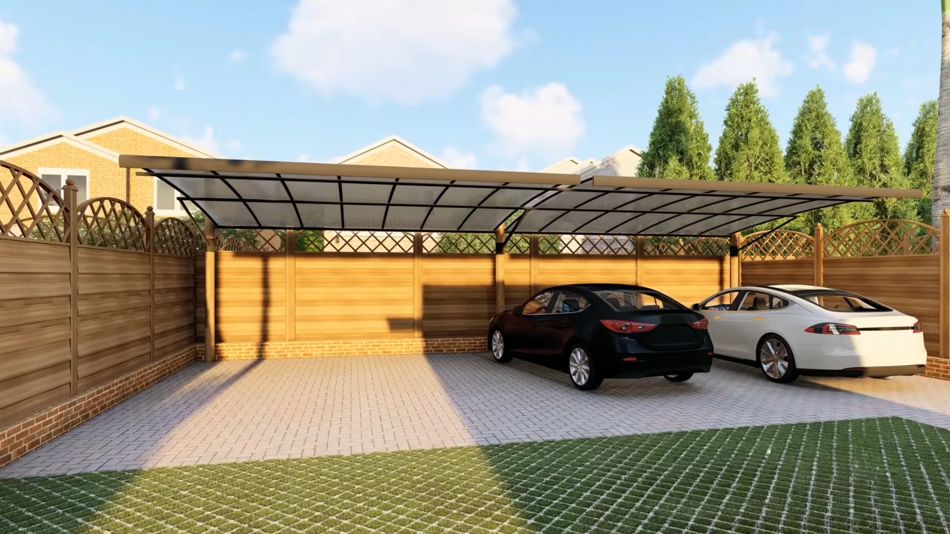
And they even come with some yard space in the back! Even a two-car garage is here too!
Wow!
I hope whoever is building a container home comes and checks out these two studios. They’re fantastic solutions for beginners, user-friendly, and welcoming.
Whether you pick a traditional option or go with a surprise element that is the bedroom cubicle, you won’t go wrong.
