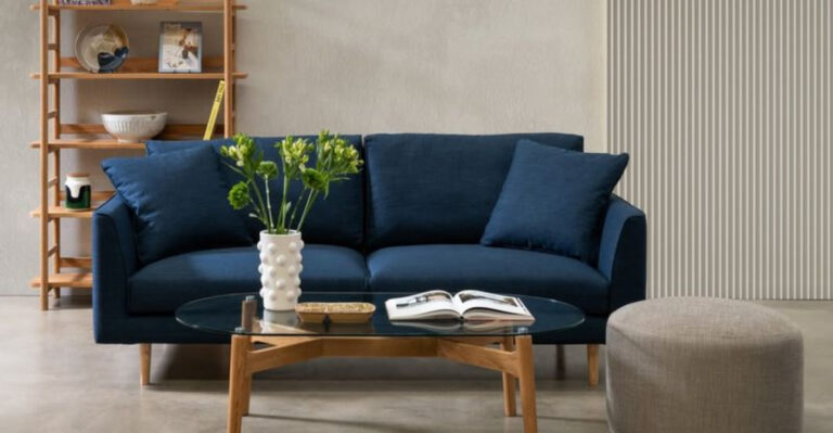
30 Paint Colors You Should Never Use In A Living Room
Choosing the perfect paint color for your living room can be a daunting task. While some hues may seem appealing at first glance, they can quickly turn your cozy space into a design disaster.
Whether it’s too bold, too bland, or just downright bizarre, certain colors are best left out of your living room palette.
Here’s a helpful guide to help you navigate the tricky world of paint colors, ensuring your living room stays vibrant and inviting without any regrettable choices. Let’s explore 30 shades that might just be the worst decision for your living space!
1. Neon Green
Ever walked into a room and felt like you needed sunglasses indoors? Neon green will do just that! This intense color might be perfect for a nightclub, but in a living room, it overwhelms the senses rather quickly.
Instead of encouraging relaxation, it can create an environment that’s more energizing than calming. Imagine trying to settle in with a book or enjoy a cozy evening with that glaring shade assaulting your eyeballs.
Opt for softer greens if you love the color but want to maintain a serene and inviting atmosphere. Save the neon for where it truly belongs: the party zone!
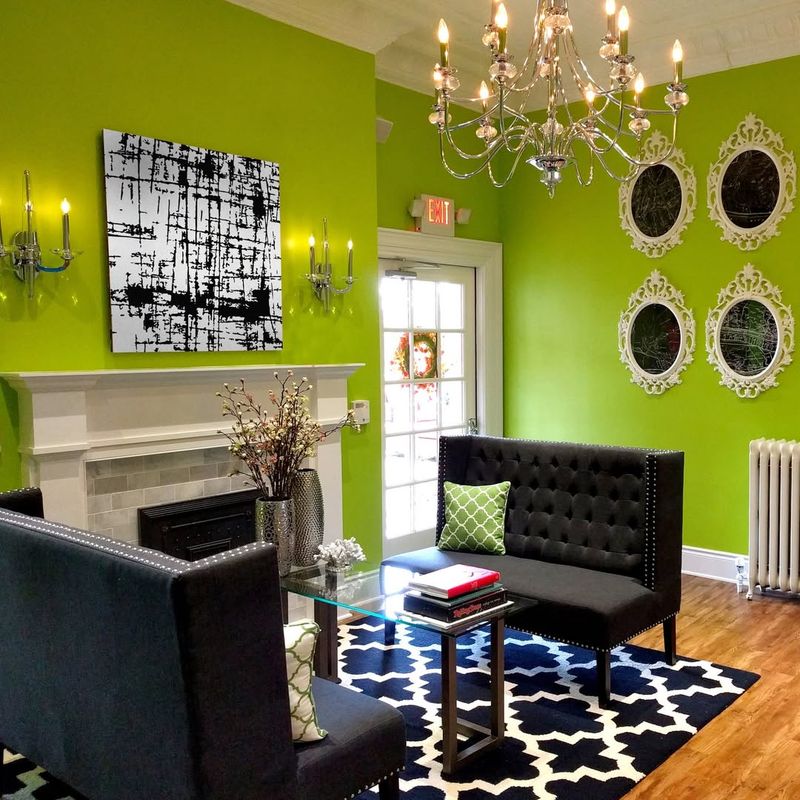
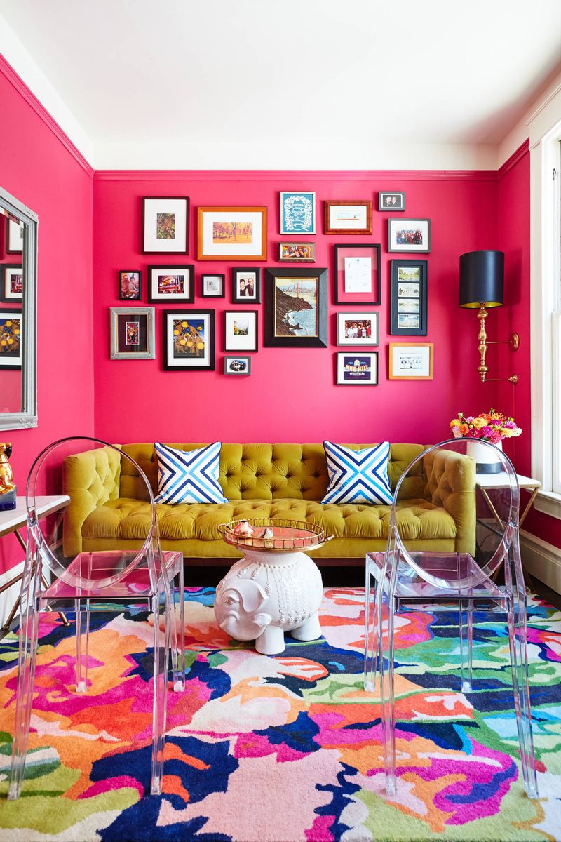
2. Hot Pink
Feeling daring? Hot pink might sound like a playful idea, but it’s best reserved for Barbie’s Dreamhouse. This bold color can easily overpower your living room, making it feel more like a candy shop than a cozy retreat.
The intensity of hot pink can be jarring to the eyes and might not pair well with your existing furniture and decor.
While pink accents can add a touch of youthful fun, an entire room drenched in hot pink will likely leave you and your guests with headaches. Consider soft blush tones for a more subtle and chic vibe.
3. Jet Black
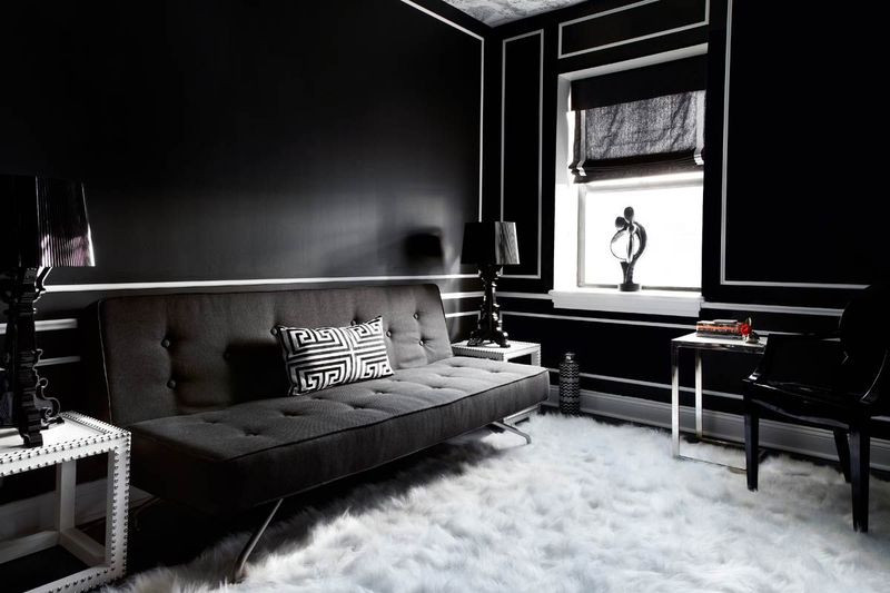
Thinking of channeling your inner goth? Jet black might seem ultra-chic, but it can make your living room feel like a cave.
Black absorbs light, creating a gloomy atmosphere that’s more suited for a dungeon than a welcoming space. It can also make the room appear smaller and more confined, which isn’t ideal for communal areas.
If you’re drawn to a darker palette, consider deep charcoal or navy as alternatives. These shades maintain the drama and sophistication of black while providing a lighter, more livable environment. Let the light in and keep the shadows at bay!
4. Sunflower Yellow
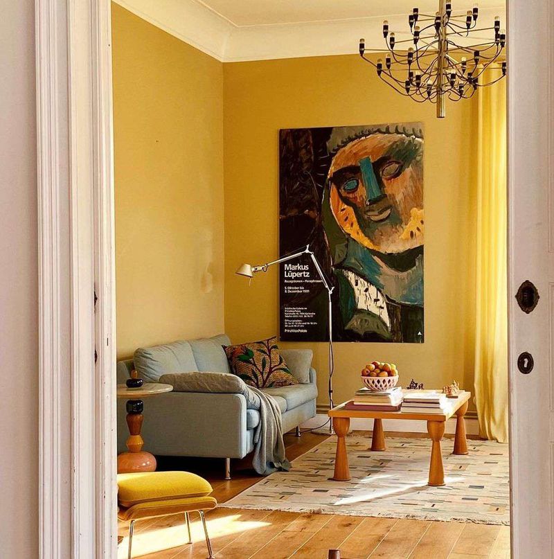
Sunny days are wonderful, but sunflower yellow on your walls? Not so much. This color can be overwhelmingly bright, especially in a space that receives ample natural light.
What seems cheerful at first can quickly become a strain on the eyes, making relaxation a challenge. While yellow is known for its uplifting qualities, it’s best used in moderation.
Small accents or accessories can provide the warmth and brightness you desire without overwhelming the senses. Keep the sunshine outside and opt for softer shades that won’t leave you squinting indoors.
5. Electric Blue
Fancy a trip to the future? Electric blue might give you that vibe, but it can also make your living room feel like a sci-fi movie set.
While this color is energetic and modern, it’s not the most inviting choice for a space meant for relaxation. The starkness of electric blue can clash with other elements in your room, creating a disjointed and uncomfortable ambiance.
If you love blue, consider softer hues like sky blue or teal, which can offer tranquility without sacrificing style. Avoid the space-age feel and keep your living room warm and welcoming.
6. Lemon Lime
Craving something zesty? Lemon lime might sound refreshing, but it’s better suited for a drink than your living room walls.
This vibrant shade can create a chaotic and overly bright environment that’s hard to unwind in. The combination of yellow and green tones can be jarring and may clash with various decor styles.
If you’re drawn to citrus-inspired colors, try softer pastel versions that offer a hint of zest without overwhelming the senses. Keep your living room a place where you can relax, not feel like you’re inside a fruit bowl!
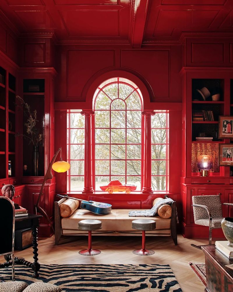
7. Fire Engine Red
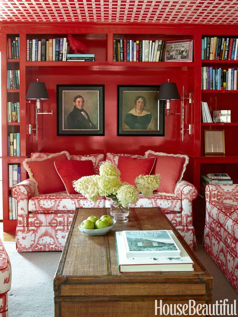
Ready to sound the alarm? Fire engine red is a bold choice, but it can easily become overwhelming in a living room.
This intense color often evokes feelings of urgency and stress, which isn’t ideal for a space meant for relaxation. While red can symbolize passion and energy, on your walls, it might just make you feel like you’re in a perpetual state of emergency.
Consider using red as an accent color rather than covering entire walls. A few strategically placed red accessories can provide the vibrancy you desire without turning your living room into a fire hazard!
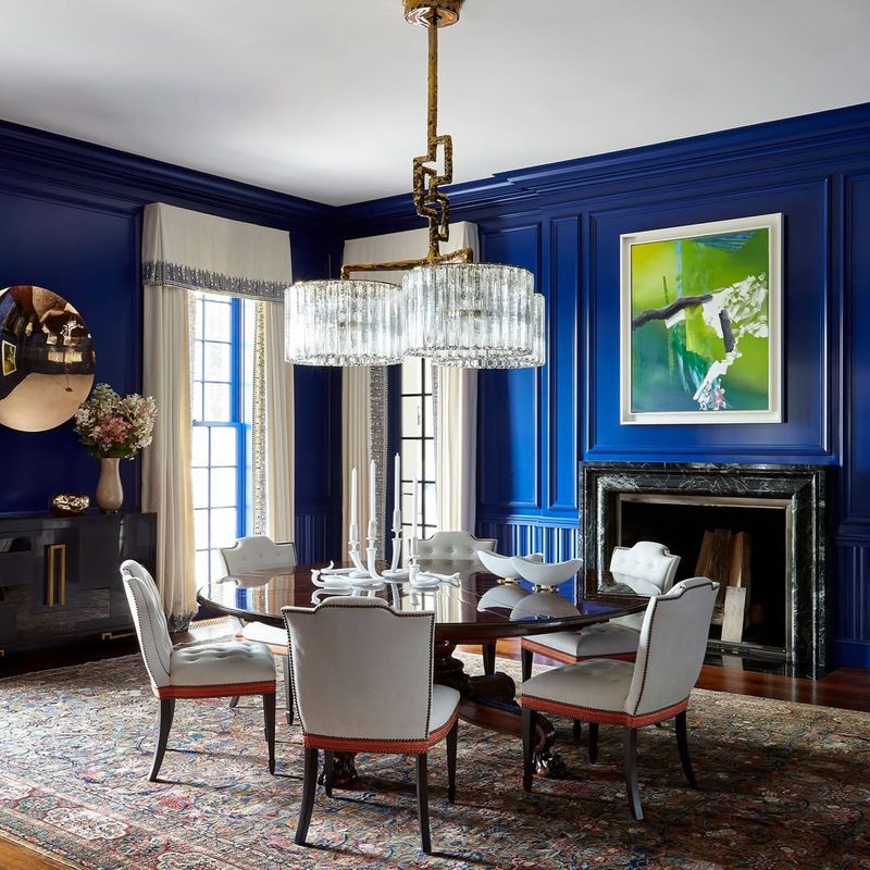
8. Cobalt Blue
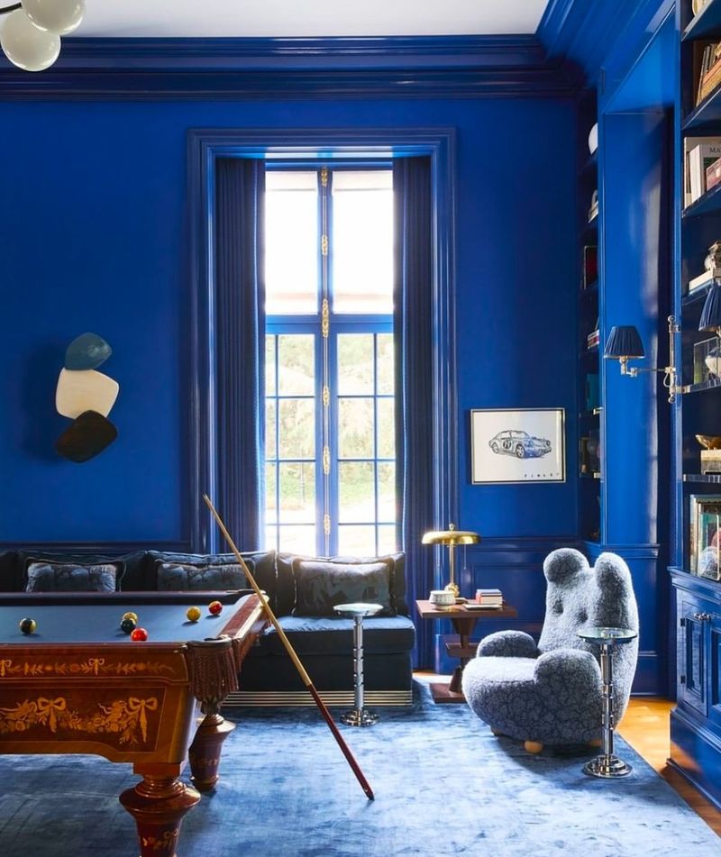
The allure of cobalt blue is undeniable, but it can quickly become overpowering in a living room setting. This deep and intense shade might work well in smaller doses, but on walls, it can create a heavy and tense atmosphere.
Cobalt blue is known for its boldness, which may clash with other elements of your decor, making the room feel disjointed and uncomfortable.
If you’re drawn to blue, opt for lighter, softer shades like powder blue or soft aqua, which offer a calming effect without sacrificing the vibrancy that makes blue so appealing.
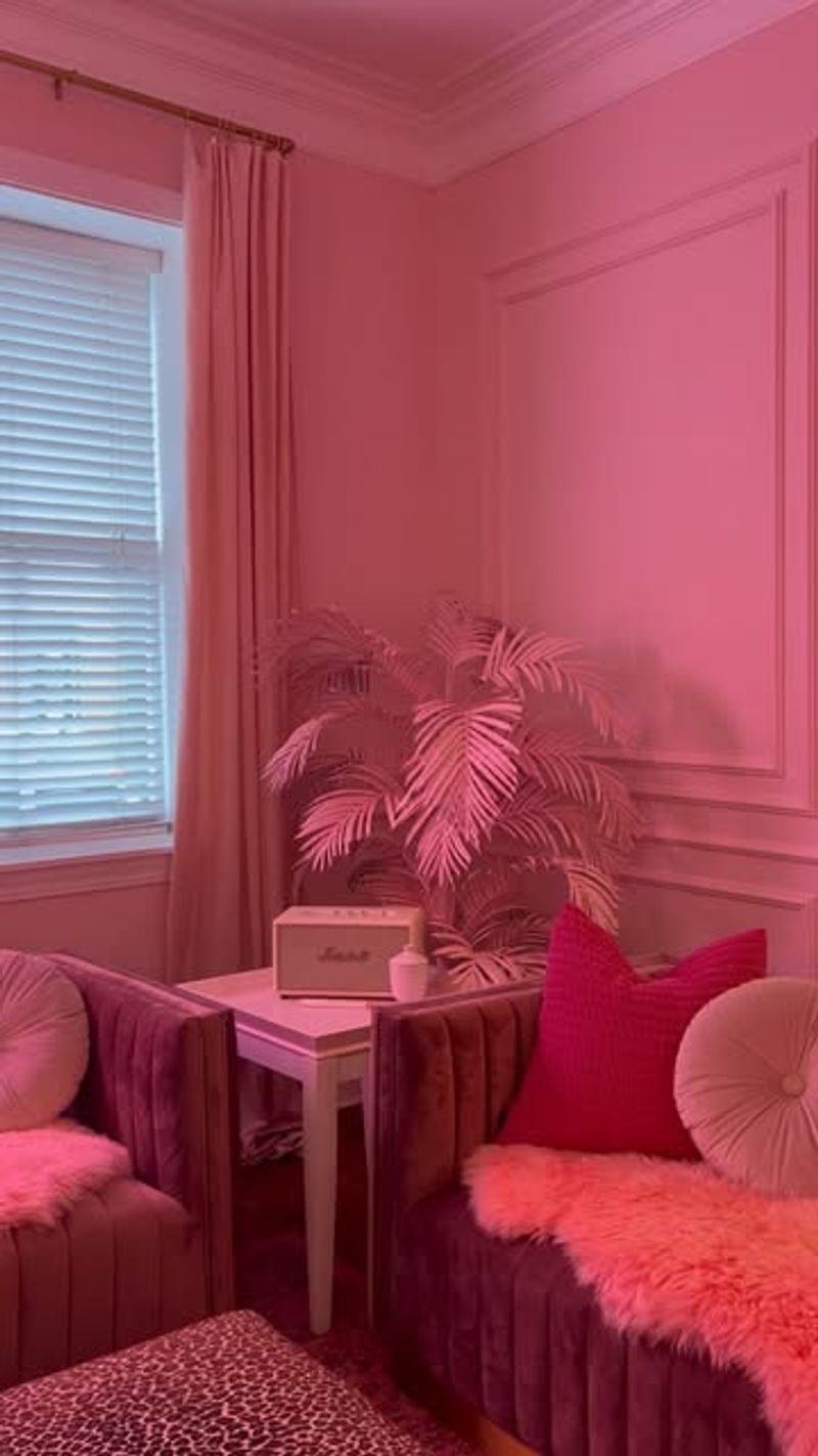
9. Pastel Pink
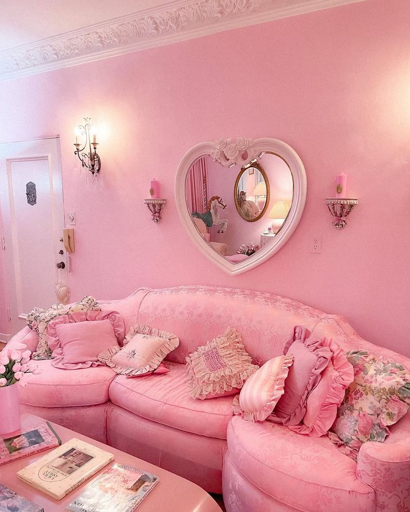
Think pastel pink is the epitome of charm? Think again! While this color may seem sweet and inviting, it can easily turn your living room into a saccharine overload.
Too much pastel pink can make the space feel more like a nursery than a sophisticated gathering area. It may also clash with other decor styles, limiting your design options.
If you love pink, consider using it in smaller doses or as part of a patterned design. This approach allows you to enjoy the gentle charm of pink without overwhelming your senses or sacrificing style.
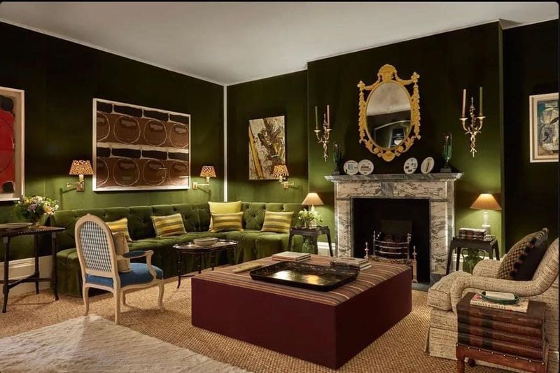
10. Olive Green
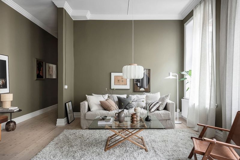
Fancy a Mediterranean vibe? Olive green might seem like the perfect choice, but it can easily make your living room feel dated and dull.
This earthy hue tends to absorb light, making spaces appear smaller and more confined. While olive green can be rich and sophisticated, it’s better suited for accents rather than dominating the entire room.
Pairing olive with neutral tones can create a balanced look that maintains the warmth without overwhelming your space. Keep your living area fresh and inviting by using olive as a complementary shade rather than the main event.
11. Peach Fuzz
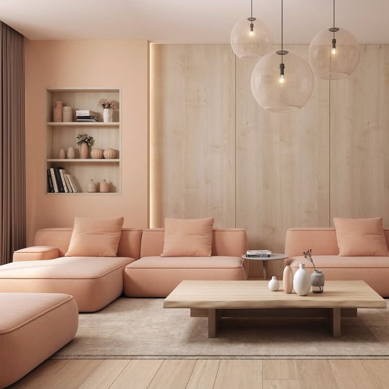
Peach fuzz might conjure images of sweet, juicy fruits, but on your walls, it can quickly turn into a decorating nightmare.
This soft, pastel hue can wash out a space, leaving it feeling bland and uninspired. While peach tones can add warmth, they often lack the depth needed to create a dynamic living room environment. Instead, consider using peach as an accent color, or pairing it with bolder shades to add contrast and interest.
A well-balanced color palette can keep your living room lively and engaging without the risk of peachy overload.
12. Magenta Madness
Are you ready to embrace the madness? Magenta is a striking color, but it can easily become overwhelming in a living room setting.
This vibrant hue commands attention, often clashing with other design elements and making the space feel chaotic. While magenta can be a fun choice for accents, covering entire walls may leave you and your guests feeling dazed and disoriented.
To incorporate this bold color without the chaos, consider using it in accessories or small decorative pieces. Let magenta be a pop of personality, not a full-blown assault on the senses.
13. Ash Gray
Thinking of going gray? Ash gray might seem like a neutral choice, but it can easily make your living room feel cold and unwelcoming.
This muted shade often lacks the warmth needed to create an inviting atmosphere, leaving the space feeling more like a corporate office than a cozy home. While gray can be sophisticated, it’s important to balance it with warmer tones or textures.
Consider pairing ash gray with soft, warm accents to create a comfortable and appealing environment. Don’t let your living room become a gray area; bring in warmth and life!
14. Chartreuse
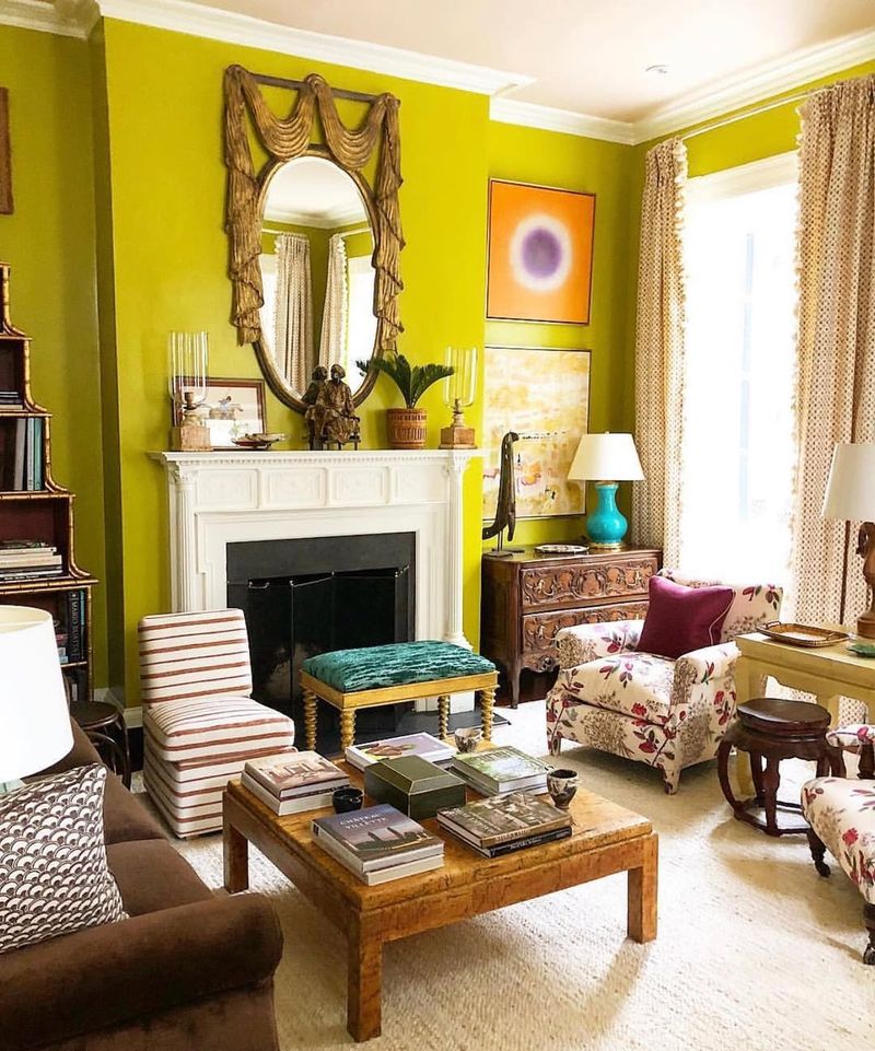
Ever wanted your living room to stand out for all the wrong reasons? Chartreuse is the way to go! This bold, yellow-green hue can be visually jarring and difficult to pair with other colors.
The intensity of chartreuse can easily become overwhelming, making relaxation a challenge. While it might be an exciting choice for accents or eclectic designs, covering entire walls in this shade can lead to a chaotic atmosphere.
If you love the vibrancy of chartreuse, incorporate it in smaller, controlled doses to maintain balance and harmony in your living space.
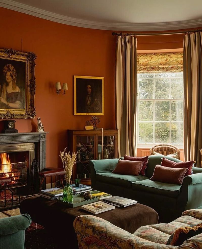
15. Burnt Orange
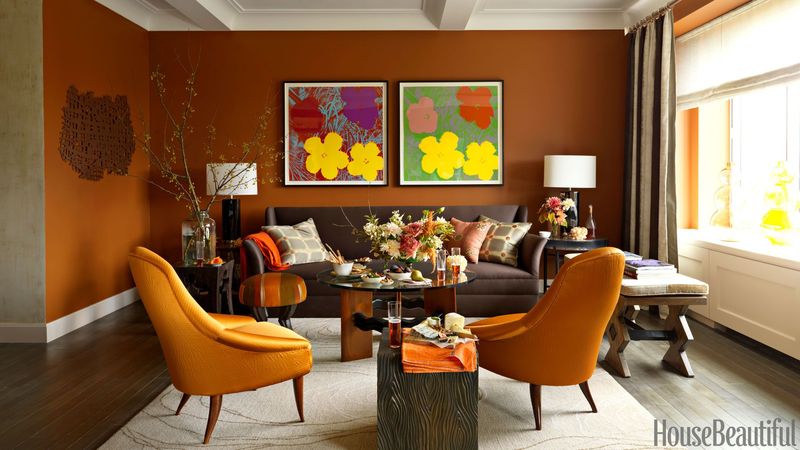
Looking to add warmth with a dash of spice? Burnt orange might sound appealing, but it can quickly make your living room feel heavy and outdated.
This deep, earthy hue can dominate a space, leaving it feeling cramped and uninviting. While burnt orange can add richness, it’s better suited for accents or smaller design elements. Pairing it with lighter, neutral shades can help balance the heaviness and create a more open, welcoming atmosphere.
Keep the spice in your decor, not on your walls, and opt for a lighter, more versatile color palette.
16. Bubblegum Blue
Bubblegum blue might bring back fond childhood memories, but it’s not the best choice for a sophisticated living room.
This playful shade can make the space feel more like a playroom than a relaxing retreat. The whimsical nature of bubblegum blue may clash with more mature decor elements, limiting your design options.
If you’re drawn to blue, consider using it in softer, more subdued tones that maintain a sense of elegance and tranquility. Let your living room be a place where you can unwind and enjoy grown-up style without compromising on color.
17. Coral Crush
Are you dreaming of a beachy vibe? Coral crush might seem like a perfect choice, but it can quickly become overwhelming in a living room setting.
This vibrant hue can clash with other design elements, creating a kitschy, over-the-top atmosphere. While coral can add a pop of color, using it in moderation ensures it doesn’t dominate the space.
Consider incorporating coral in accessories or accent pieces to maintain a fresh, breezy feel without going overboard. Keep your living room stylish and sophisticated by balancing vibrant hues with neutral tones and textures.
18. Mustard Yellow
Fancy a touch of vintage flair? Mustard yellow might be tempting, but it can easily make your living room feel dreary and mismatched.
This deep, muted hue can overshadow other design elements, creating an unbalanced and heavy atmosphere. While mustard yellow can add character, it’s best used as an accent rather than the main color.
Pairing it with lighter, complementary shades can help maintain a more open and inviting environment. Ensure your living room remains a welcoming space by using mustard yellow sparingly and thoughtfully, avoiding a design clash.
19. Mint Green
Mint green might evoke thoughts of refreshing ice cream, but on your walls, it can quickly turn into a decorating faux pas.
This pastel hue often lacks the depth needed to create a dynamic living room environment, leaving the space feeling flat and uninspired. While mint can add a touch of freshness, it’s best used in smaller doses or paired with bolder shades to add contrast and interest.
A well-balanced color palette can keep your living room lively and engaging without the risk of minty overload. Keep your space flavorful, not flavorless!
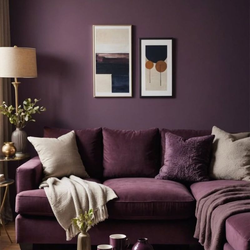
20. Plum Passion
Eager for a touch of opulence? Plum passion might sound inviting, but it can easily make your living room feel heavy and overdone.
This deep, luxurious shade can dominate a space, leaving it feeling cramped and uninviting. While plum can add richness, it’s better suited for accents or smaller design elements. Pairing it with lighter, neutral shades can help balance the heaviness and create a more open, welcoming atmosphere.
Keep the opulence in your decor, not on your walls, and opt for a lighter, more versatile color palette.
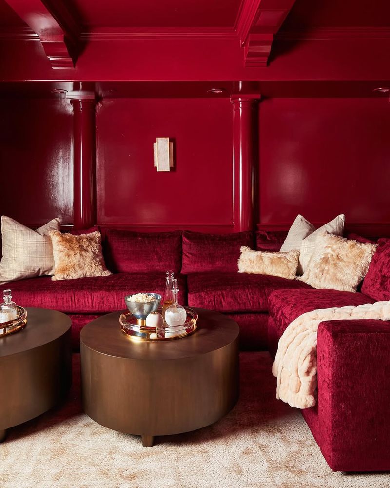
21. Burgundy Bliss
Looking to bask in elegance? Burgundy bliss might seem like the way to go, but it can quickly make your living room feel too formal and stifling.
This rich, regal shade can overpower a space, creating an atmosphere that’s more suited for a banquet hall than a cozy retreat. While burgundy can add depth and sophistication, it’s best used sparingly or as part of a larger color scheme.
Pair it with lighter, complementary tones to maintain a balanced and inviting environment. Let your living room be a place of comfort, not constraint, by avoiding burgundy overload.
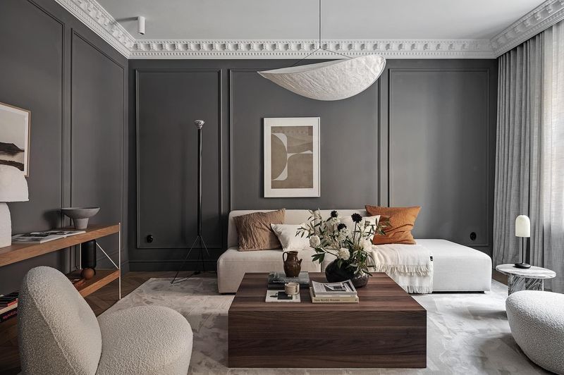
22. Slate Gray
Thinking of sleek and modern? Slate gray might seem like the perfect choice, but it can easily make your living room feel stark and lifeless.
This deep, muted hue often lacks the warmth needed to create an inviting atmosphere, leaving the space feeling more like a corporate office than a cozy home. While slate gray can be sophisticated, it’s important to balance it with warmer tones or textures.
Consider pairing slate gray with soft, warm accents to create a comfortable and appealing environment. Don’t let your living room become a gray area; bring in warmth and life!
23. Icicle Blue
Dreaming of a winter wonderland? Icicle blue might sound refreshing, but it can quickly make your living room feel cold and unwelcoming.
This icy shade can dominate a space, leaving it feeling more like a freezer than a cozy retreat. While blue can add a sense of calm, it’s best used in warmer, softer tones to maintain a welcoming atmosphere.
Pairing it with warmer, neutral shades can help balance the chilliness and create a more inviting environment. Let your living room be a place of comfort, not coldness, by avoiding icicle overload.
24. Moss Green
Fancy a touch of nature? Moss green might seem like the perfect choice, but it can easily make your living room feel aged and musty.
This deep, earthy hue can dominate a space, leaving it feeling cramped and uninviting. While moss green can add richness, it’s better suited for accents or smaller design elements. Pairing it with lighter, neutral shades can help balance the heaviness and create a more open, welcoming atmosphere.
Keep the nature in your decor, not on your walls, and opt for a lighter, more versatile color palette.
25. Eggplant Purple
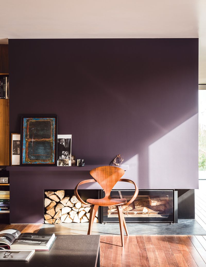
Eager for a touch of drama? Eggplant purple might sound enticing, but it can quickly make your living room feel mismatched and overwhelming.
This deep, dramatic shade can dominate a space, leaving it feeling cramped and uninviting. While eggplant purple can add richness, it’s better suited for accents or smaller design elements.
Combining it with lighter, neutral shades can help balance the heaviness and create a more open, welcoming atmosphere.
26. Crimson Red
Craving a touch of passion? Crimson red might seem like the way to go, but it can quickly make your living room feel heavy and overdone. This deep, passionate shade can dominate a space, leaving it feeling cramped and uninviting.
While crimson red can add richness, it’s better suited for accents or smaller design elements. Pairing it with lighter, neutral shades can help balance the heaviness and create a more open, welcoming atmosphere.
Keep the passion in your decor, not on your walls, and opt for a lighter, more versatile color palette.
27. Seafoam Green
Dreaming of a coastal escape? Seafoam green might seem like the perfect choice, but it can quickly make your living room feel clichéd and uninspired.
This pastel hue often lacks the depth needed to create a dynamic living room environment, leaving the space feeling flat and uninspired. While seafoam green can add a touch of freshness, it’s best used in smaller doses or paired with bolder shades to add contrast and interest.
A well-balanced color palette can keep your living room lively and engaging without the risk of going overboard with the coastal theme.
28. Terracotta
Longing for a touch of the Southwest? Terracotta might seem like the perfect choice, but it can easily make your living room feel heavy and outdated. This deep, earthy hue can dominate a space, leaving it feeling cramped and uninviting.
While terracotta can add warmth, it’s better suited for accents or smaller design elements. Pairing it with lighter, neutral shades can help balance the heaviness and create a more open, welcoming atmosphere.
29. Royal Purple
Craving a touch of regal elegance? Royal purple might seem like the way to go, but it can quickly make your living room feel heavy and overdone. This deep, luxurious shade can dominate a space, leaving it feeling cramped and uninviting.
Although royal purple can add richness, it’s better suited for accents or smaller design elements. Mixing it with lighter, neutral shades can help balance the heaviness and create a more open, welcoming atmosphere.
30. Fuchsia Frenzy
Feeling bold and adventurous? Fuchsia frenzy might sound like a daring choice, but it can quickly make your living room feel overwhelming.
This vibrant hue commands attention, often clashing with other design elements and making the space feel chaotic. While fuchsia can be a fun choice for accents, covering entire walls may leave you and your guests feeling dazed and disoriented.
To incorporate this bold color without the chaos, consider using it in accessories or small decorative pieces. Let fuchsia be a pop of personality, not a full-blown assault on the senses.