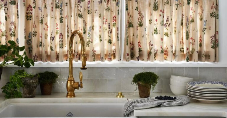
10 Paint Colors to Never Use With Oak Kitchen Cabinets, And 12 That You Should
Avoiding the wrong paint color can mean the difference between a cozy kitchen and a chaotic clash. Oak cabinets bring rich, warm tones to a space—but not every shade plays nice with them.
In this guide, we’re calling out 10 paint colors that tend to fight oak’s natural charm. Whether you’re refreshing the kitchen or updating a bath, knowing what not to pick is just as important as the perfect shade.
Keep oak looking timeless—not tired—by steering clear of these common color missteps.
1. Bright Orange
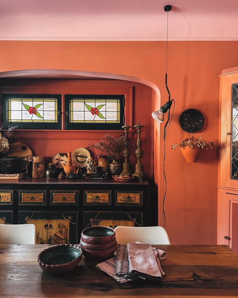
When it comes to pairing colors with oak cabinets, bright orange is a no-go. Though oak has a warm undertone, the intensity of bright orange can overwhelm the natural beauty of the wood. In a kitchen or bathroom, this combination may create an unsettling atmosphere.
Instead of highlighting the elegant grain of oak, bright orange competes for attention, making the space feel chaotic. Consider replacing bright orange with softer, earth-toned hues that complement rather than clash with the charm of oak. Your cabinets deserve to shine.
2. Neon Green
Using neon green as a backdrop for oak cabinets can be jarring. Oak’s subtler tones clash with neon green’s vibrancy, creating a visual discord. In small spaces, this high-energy color can become overwhelming, detracting from oak’s textured allure. It’s essential to choose paint colors that enhance rather than compete.
Opt for a more subdued, nature-inspired green if you’re aiming for harmony. This way, your oak cabinets will stand out beautifully, and the overall ambiance will be more inviting and cohesive.
3. Hot Pink
Hot pink might be fun, but it’s not friendly to oak cabinets. The boldness of hot pink overshadows the subtle elegance of oak, turning your space into a sensory overload. Moreover, this bold choice may limit your decor options, forcing you into a narrow style path.
Instead, think of muted pastels or soft blush tones that can accentuate oak’s warm hues without overpowering them. With a gentle color palette, even the smallest details of your oak cabinetry can be appreciated.
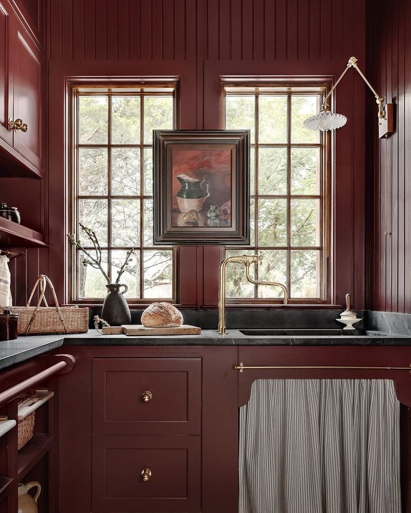
4. Jet Black
While jet black might seem elegant, it often creates too stark a contrast with oak cabinets. The rich, dark tone can make the room feel smaller and more enclosed, overshadowing the warm glow of oak. If you’re aiming for a modern look, consider charcoal gray instead.
This alternative maintains a sleek vibe but softens the impact, allowing oak’s grain to be the centerpiece. There’s beauty in balance, and choosing the right shade ensures both modernity and warmth coexist in your space.
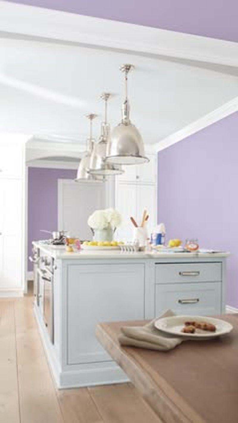
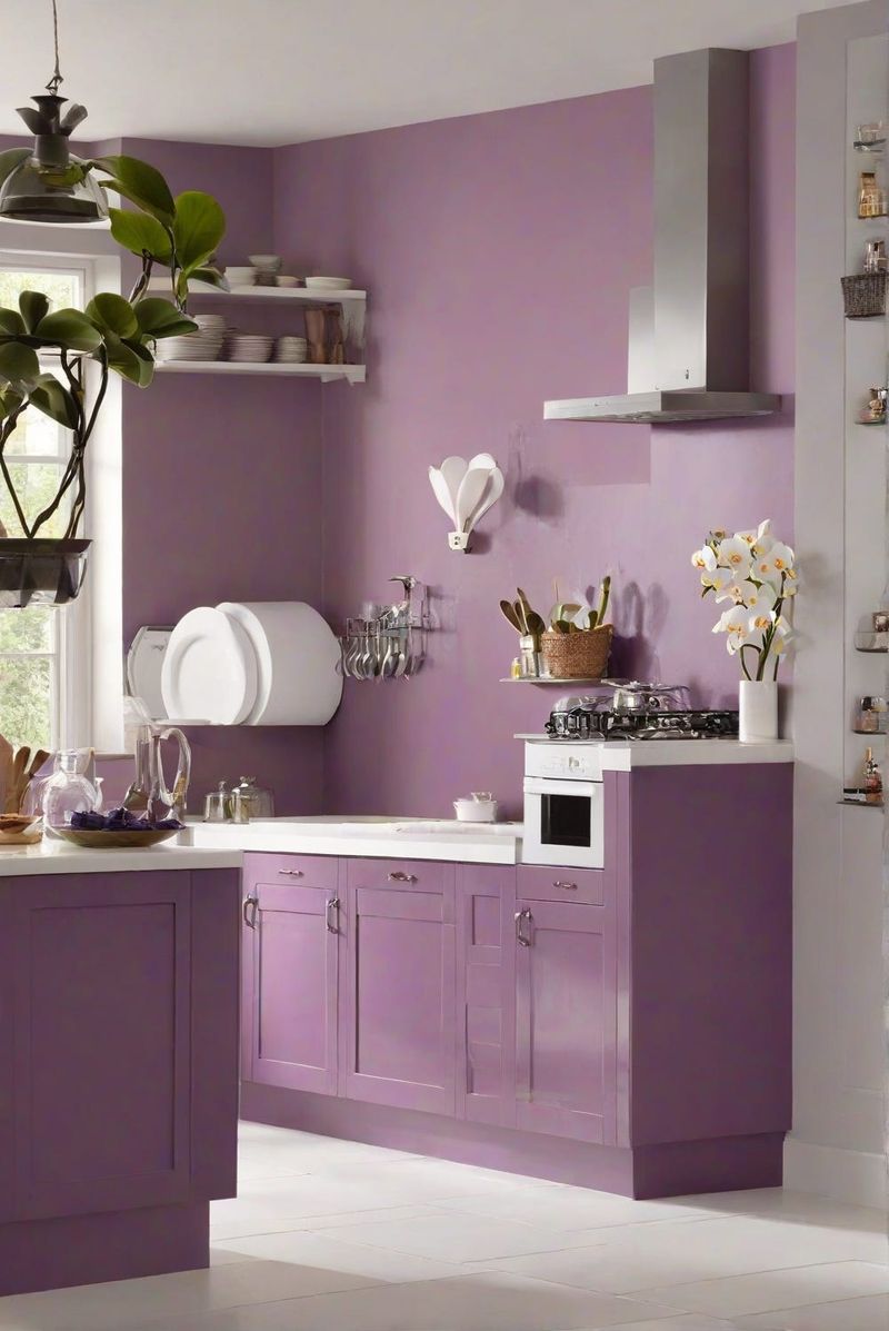
5. Vivid Purple
Vivid purple and oak cabinets rarely find harmony. This striking color can clash with oak’s warmth, resulting in a mismatched appearance. The boldness of vivid purple tends to dominate the space, leaving little room for oak’s subtle textures to shine.
Instead of vivid purple, explore softer lilac or lavender tones. These alternatives will let your oak cabinets breathe, adding a touch of elegance without overwhelming. By choosing wisely, you’ll create a space that feels both vibrant and inviting.
6. Crimson Red
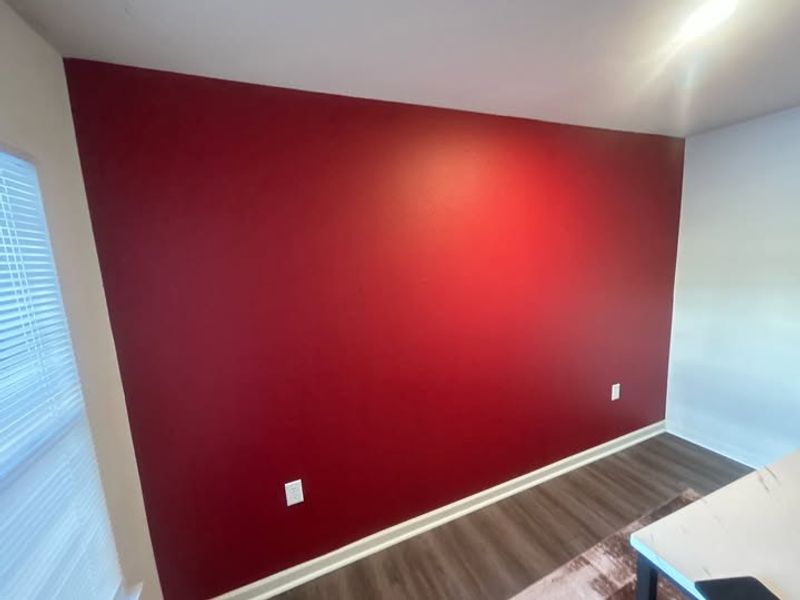
Crimson red, with its intensity, is a challenging companion for oak cabinets. This deep hue tends to overshadow oak’s natural appeal, transforming the atmosphere into something more dramatic and less inviting. If you’re drawn to red tones, opt for a softer terracotta or muted brick.
These hues complement oak’s richness, enhancing rather than eclipsing its beauty. By focusing on colors that meld seamlessly with oak, you’ll craft a space that’s both stylish and cohesive, where every element works in harmony.
7. Electric Blue
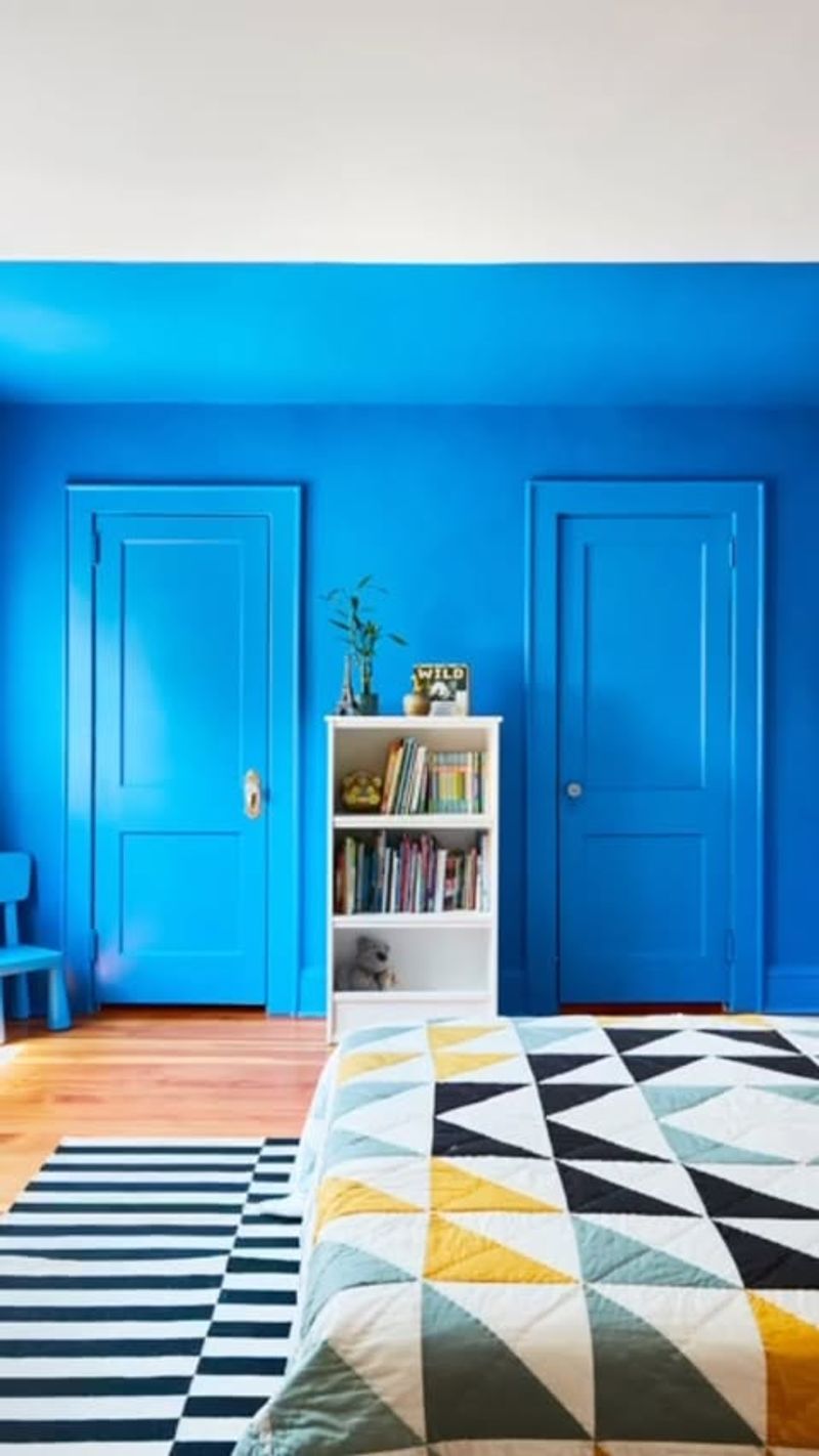
Oak cabinets and electric blue paint often clash, leading to a disjointed look. The intense vibrancy of electric blue can overshadow oak’s natural warmth, making the room feel unbalanced. If blue is a favorite, consider using a more muted or pastel blue.
Such shades provide a calming background that complements rather than competes with the wooden features. This thoughtful choice ensures that your space remains stylish and serene, highlighting the beauty of oak cabinets while maintaining a modern edge.
8. Sunshine Yellow
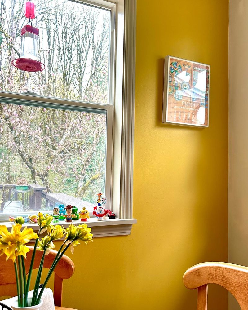
Sunshine yellow, though cheerful, can overwhelm oak cabinets. The bright intensity can distract from the oak’s unique grain and create a jarring visual experience. Instead, try incorporating muted yellows or golden hues that echo the natural tones of the wood.
These quieter shades will bring warmth and cohesion to your space, allowing the oak to take center stage without being overshadowed. In this way, your design will feel more intentional, striking a balance between vibrancy and harmony.
9. Turquoise
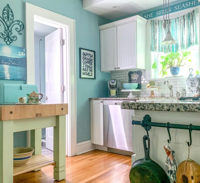
Turquoise, while beautiful, can clash with oak cabinets. The cool undertones of turquoise often conflict with oak’s warm palette, leading to a discordant look. If you’re drawn to blue-greens, consider a softer teal or seafoam.
These hues offer a soothing contrast that enhances oak’s natural beauty rather than detracting from it. By choosing a complementary shade, you ensure your space feels cohesive and welcoming, allowing the unique character of your oak cabinetry to become a focal point.
10. Chocolate Brown
Chocolate brown might appear a safe choice, but it can make a space feel heavy when paired with oak cabinets. The deep, dark hue can overshadow the lighter tones of oak, resulting in a less inviting atmosphere.
For those who love earth tones, consider a lighter taupe or beige. These alternatives work harmoniously with oak, brightening the space and adding depth without creating a somber mood. By opting for these lighter shades, you allow your oak cabinets to shine in their full glory.
11. Soft Lavender
A subtle touch of soft lavender can bring a refreshing vibe to your kitchen. It’s a hue that complements the warm tones of oak without overshadowing them. With oak cabinets, this color adds a hint of sophistication and modernity. The gentle purple undertone is perfect for creating a serene environment.
Lavender pairs surprisingly well with stainless steel appliances, adding a contemporary feel. Consider using lavender accents in your decor to tie the look together. Add lavender flowers or cloths to echo this color choice. This combination is versatile, suitable for both traditional and modern styles.
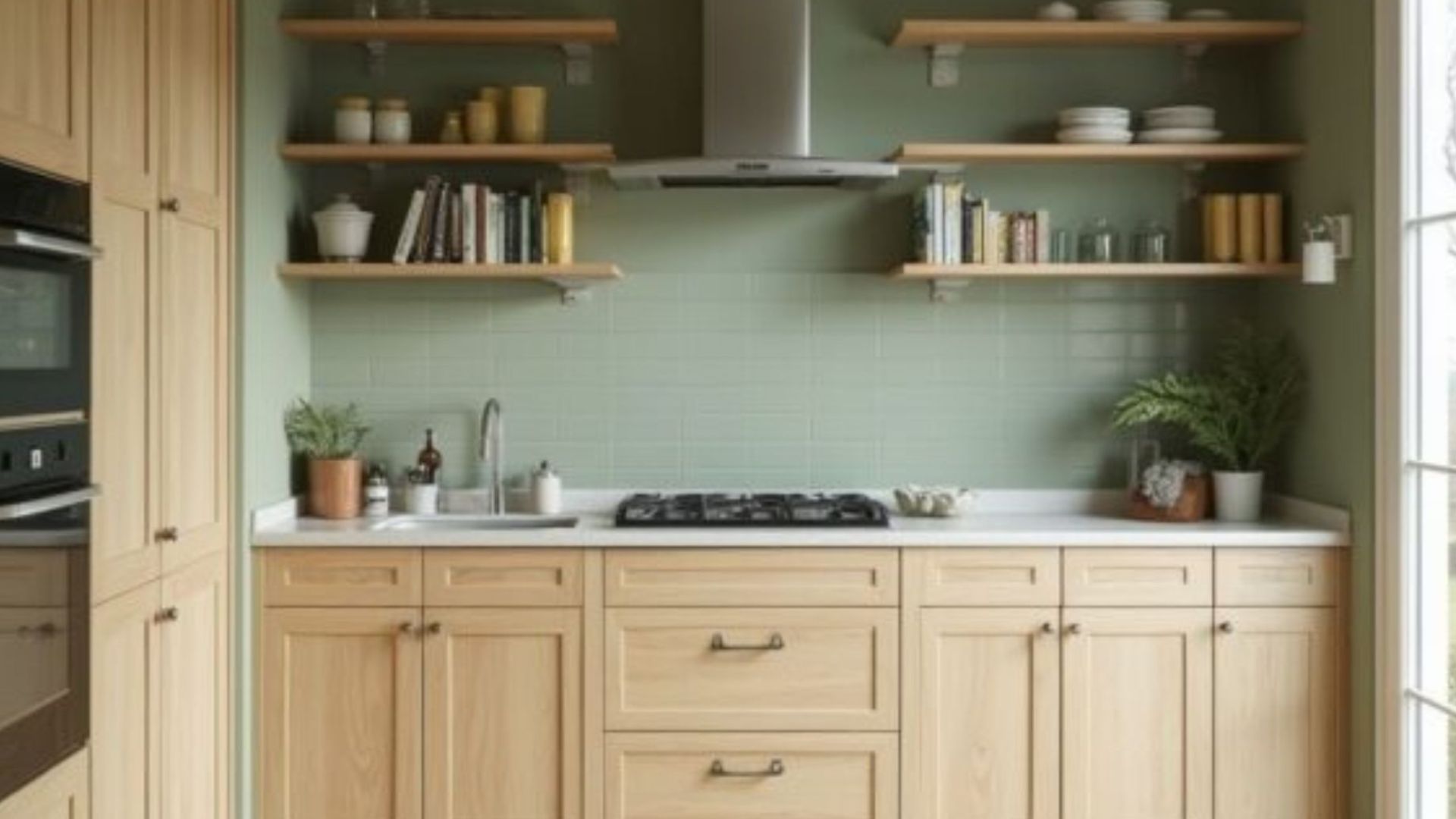
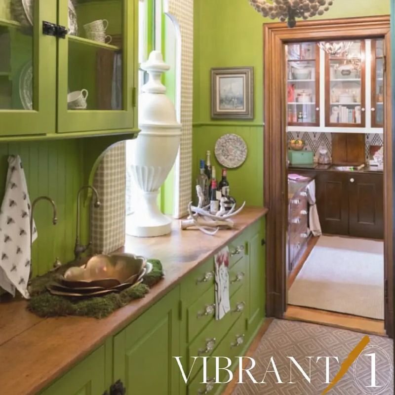
12. Olive Green
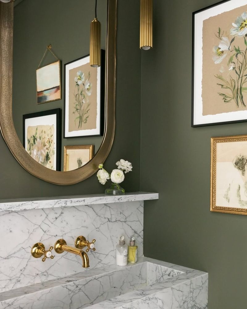
Olive green is a natural choice that enhances the earthy tones of oak cabinets. This rich, muted shade infuses warmth and depth into any space. It exudes a timeless elegance that feels both modern and classic. The color’s muted nature prevents it from overwhelming the space. Consider incorporating olive green in tiles or backsplashes for a cohesive look.
Olive works beautifully with brass or copper fixtures, enhancing the overall aesthetic. Pair it with natural materials like stone or wood for a harmonious look. This color choice ensures your oak cabinets are always highlighted elegantly.
13. Slate Gray
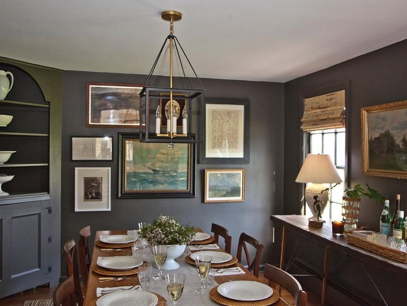
Slate gray offers a sophisticated backdrop for oak cabinets. This neutral color creates a calming environment while highlighting the natural beauty of wood. Its subtle elegance is perfect for a modern kitchen design. The gray tone allows oak cabinets to pop without being overpowering.
Consider using textured gray tiles or countertops to add interest. This color works well with white or black accents for a crisp look. Ideal for those who love a minimalist style, slate gray provides versatility in decor choices. It remains an enduring favorite for its chic and understated appeal.
14. Pale Peach
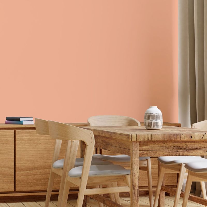
Pale peach is an unexpected yet delightful choice for pairing with oak cabinets. This soft, warm hue brings a touch of elegance and lightness to any room. It complements the golden undertones of oak beautifully. The gentle color helps to brighten spaces, making them feel more open and inviting.
Consider using peach in textiles or decor for a cohesive look. Pale peach pairs beautifully with natural materials like wicker or bamboo, enhancing its warm appeal. This color creates a soothing, tranquil environment, perfect for bathrooms or cozy kitchen corners.
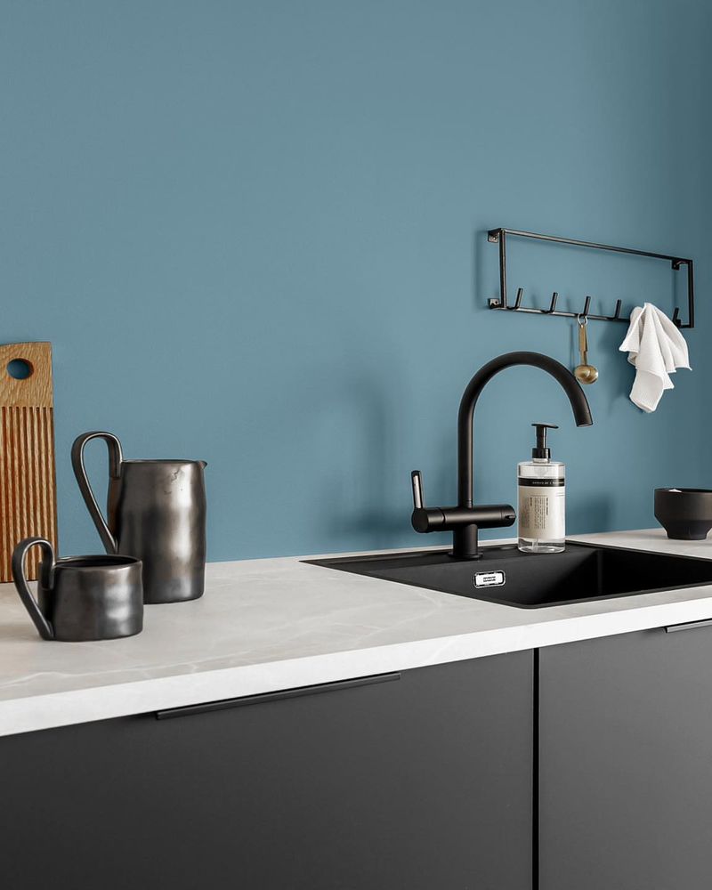
15. Dusty Blue
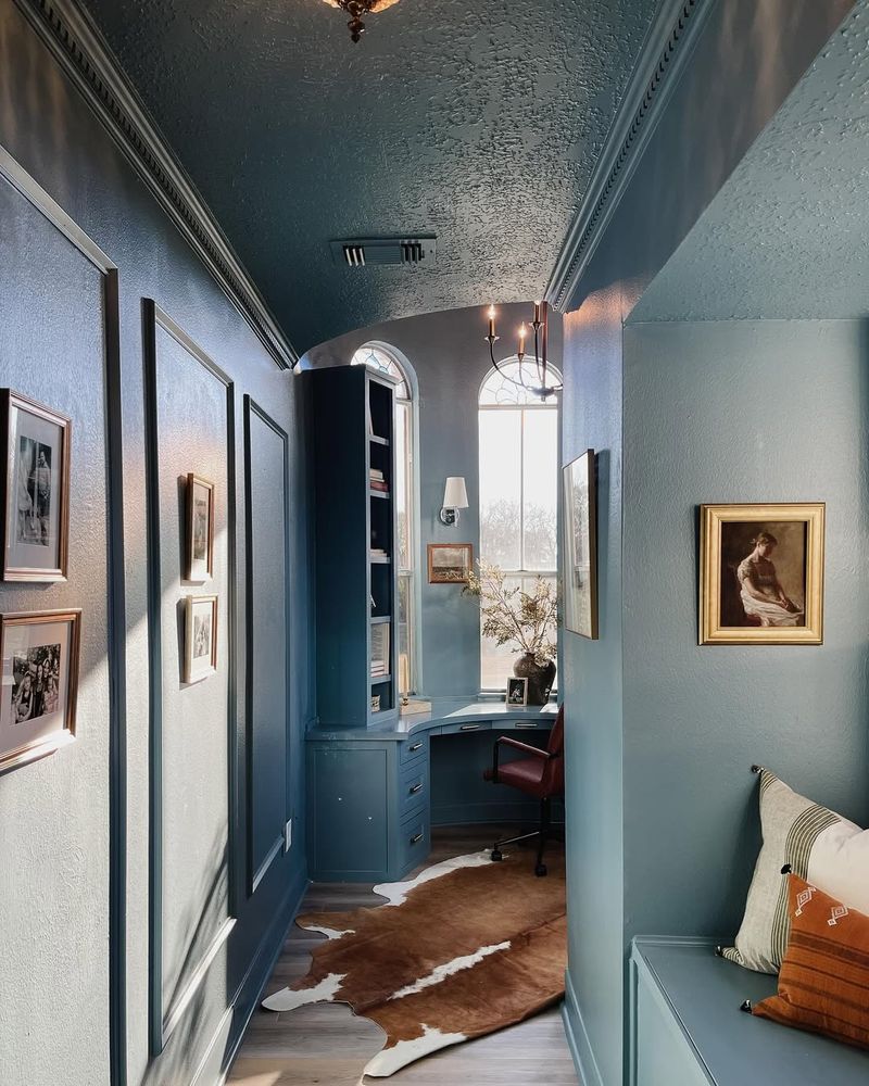
Dusty blue provides a calming contrast to the warm tones of oak cabinets. It’s a color that invokes a sense of peace and tranquility. The soft blue hue enhances the natural grain of oak, creating a balance of warmth and coolness.
Dusty blue is perfect for coastal or cottage-inspired designs. It pairs well with white accents, bringing a fresh and airy feel to the space. Consider adding blue-tinted glassware or decor to echo this hue. This color choice allows for creativity with nautical or vintage themes, making it a versatile option for any home.
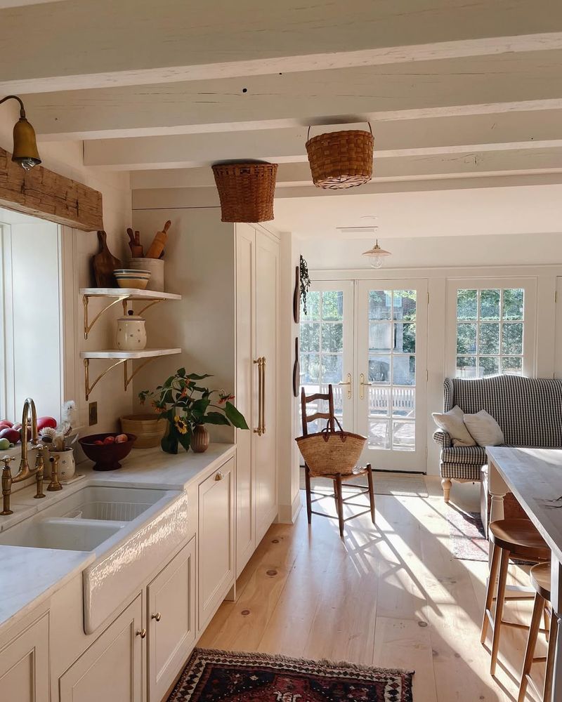
16. Creamy Beige
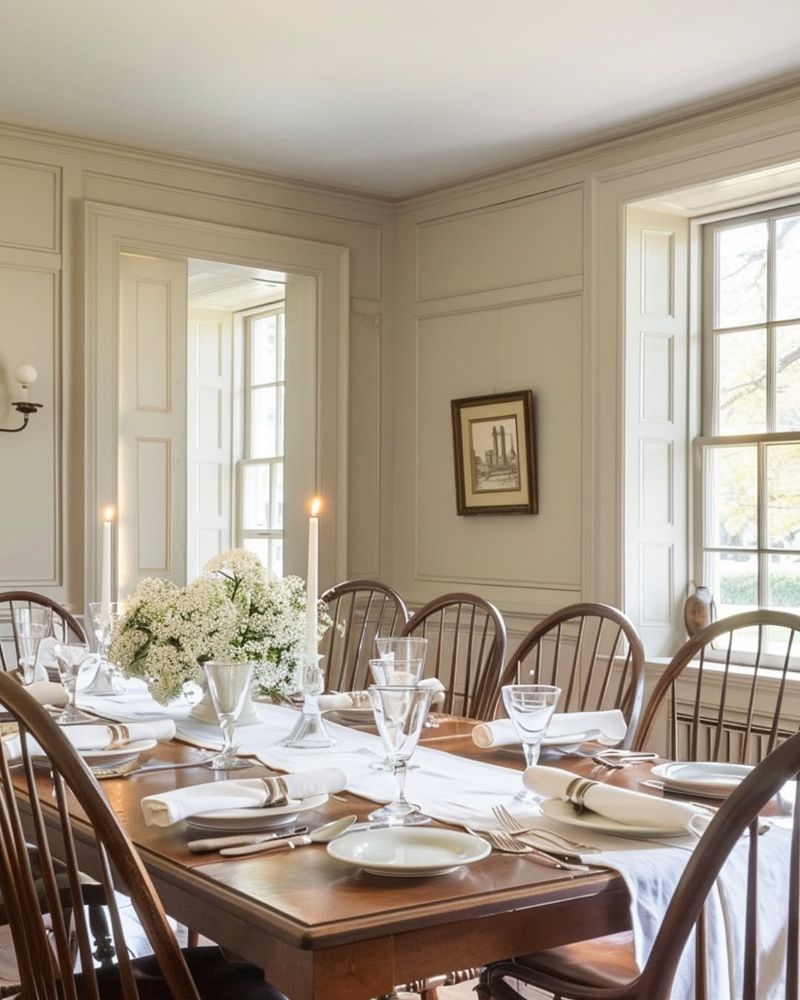
Creamy beige is a timeless classic that harmonizes perfectly with oak cabinets. This soft neutral color offers a clean backdrop, allowing the cabinet’s rich tones to stand out. Beige exudes warmth and coziness, ideal for creating an inviting kitchen atmosphere.
Pair it with wooden or rattan accessories for a cohesive look. The simplicity of beige allows for bold decor choices elsewhere. Consider using colorful artwork or utensils to add personality. This color option offers versatility and elegance, making it a perfect choice for those who favor a classic, timeless aesthetic.
17. Warm White
Warm white is a versatile choice that adds brightness and clarity, enhancing the natural beauty of oak cabinets. This color creates a clean, airy space that feels open and welcoming. The subtle warmth in the white complements the golden hues of oak beautifully.
It serves as a perfect canvas for showcasing unique decor elements. Consider using warm white in tiles or countertops for a cohesive look. This color works beautifully with a variety of styles, from modern to traditional. Warm white ensures a timeless appeal, perfect for enhancing oak cabinetry.
18. Muted Teal
Muted teal is a bold yet harmonious choice for oak cabinets. This deep color adds a touch of elegance and intrigue to any space. It complements oak’s rich tones without overwhelming them. The teal color brings a refreshing vibrance that feels modern yet timeless.
It pairs wonderfully with natural elements like wood or stone. Consider using teal in accessories or tiles to echo this hue. Muted teal offers a dynamic backdrop for creative decor choices. It’s perfect for those who love a bold, artistic flair in their kitchen design.
19. Sunset Coral
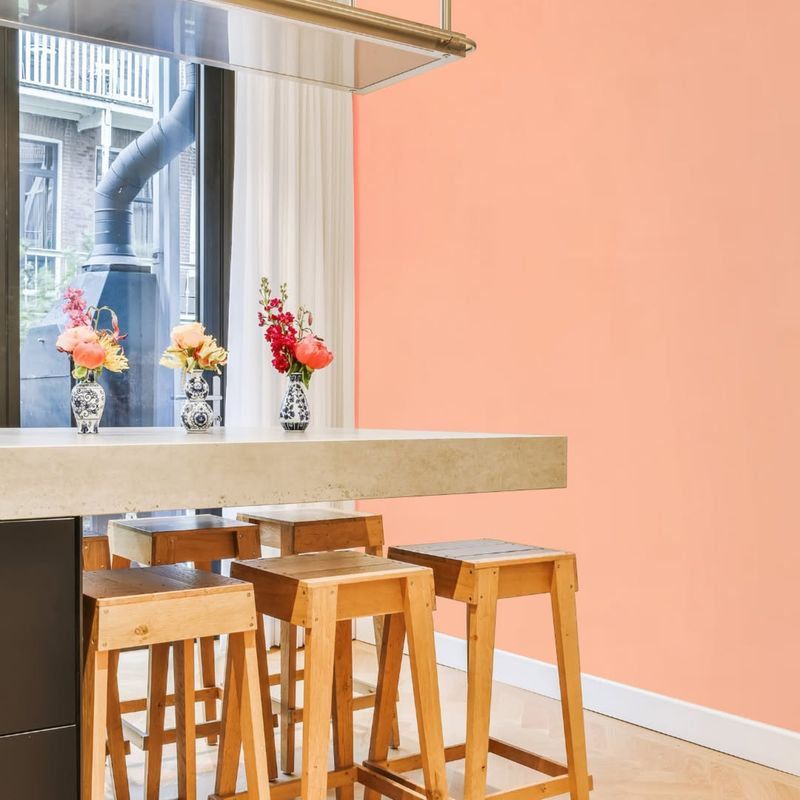
Sunset coral offers a cheerful and lively touch to oak cabinet settings. This vibrant color enhances the warm tones of oak, creating a cozy and inviting ambiance. The coral hue adds a playful element that feels fresh and contemporary.
It works well in both kitchens and bathrooms, providing a splash of color that enlivens any space. Pair sunset coral with soft textiles or gold accents for a chic look. This color choice encourages bold decor, like patterned curtains or artwork. Sunset coral is ideal for those seeking a lively, energetic feel in their space.
20. Misty Lilac
Misty lilac is a gentle, ethereal color that pairs beautifully with oak cabinets. Its soft, muted tone adds a touch of elegance without overpowering the wood’s natural beauty. This shade creates a calm and relaxing atmosphere, perfect for kitchens or bathrooms.
Misty lilac pairs well with neutral or pastel decor, adding a subtle charm. Consider using lilac in small accents to enhance its presence. This versatile color is ideal for those who desire a soft, romantic touch in their home. Misty lilac ensures your oak cabinets remain the focal point.
21. Soft Sage Green
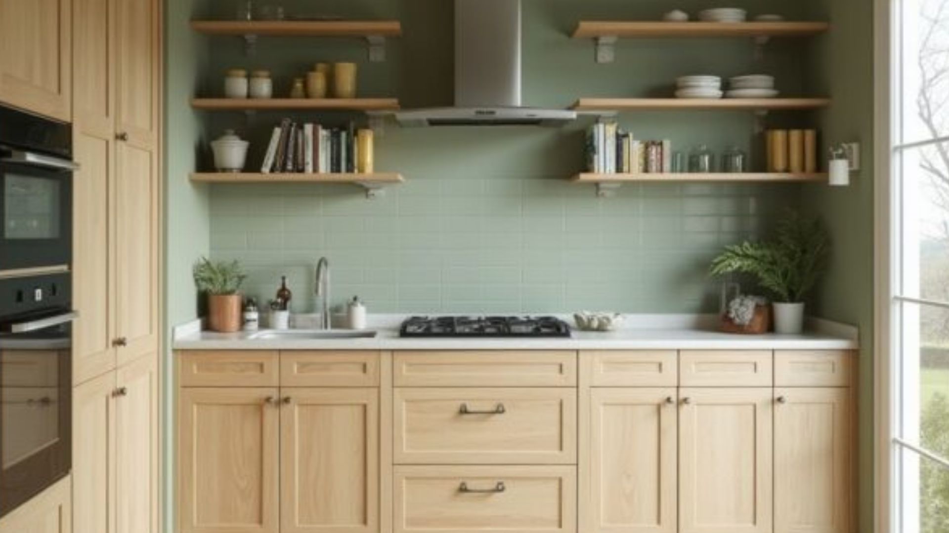
Soft sage green is a timeless choice that brings a touch of nature indoors. Its muted, earthy tones complement the golden hues of oak cabinets, creating a serene and balanced kitchen environment.
This color works particularly well in spaces aiming for a rustic or farmhouse aesthetic, adding a gentle contrast without overwhelming the natural wood grain.
22. Warm Taupe
Warm taupe offers a sophisticated blend of gray and brown, making it an ideal backdrop for oak cabinetry. This neutral shade enhances the richness of the wood while maintaining a modern and clean look.
It’s versatile enough to suit various design styles, from traditional to contemporary, and pairs well with a range of accent colors and materials.