
Creating a cohesive home environment often hinges on the artful flow of color throughout your spaces. As we journey through each room, the harmony of hues has the power to either soothe or energize us, welcoming us into a space that feels thoughtfully designed and personal.
Let’s explore 24 vibrant secrets that will guide you in achieving a seamless color flow that resonates with warmth and style. Each tip promises a fresh perspective, ensuring your home tells a story that is uniquely yours.
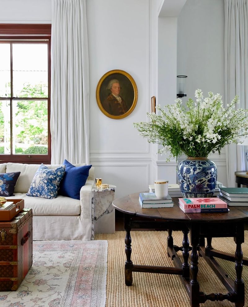
1. Monochromatic Magic
Have you ever wondered how a single color can transform a space? Embrace monochromatic themes to create a soothing atmosphere. By layering different shades of one hue, you can add depth and interest without overwhelming the senses.
A soft sky blue wall can lead into accents of deep navy in your cushions or rugs, guiding the eye gently across the room. This technique creates a harmonious balance that feels both intentional and calming, perfect for a restful bedroom or a tranquil living area.
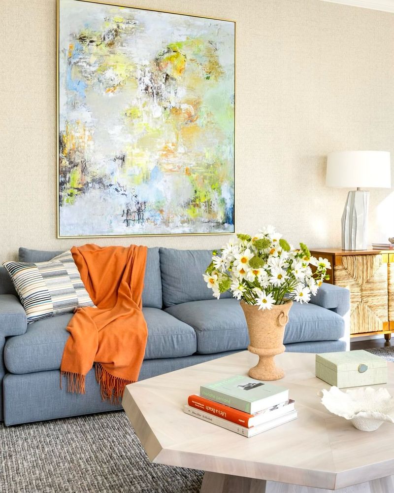
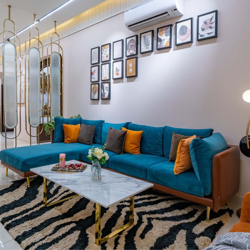
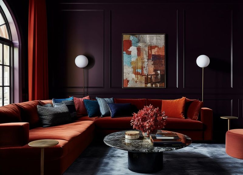
2. Complementary Pairing
Color theory isn’t just for artists. Utilizing complementary colors, such as blue and orange, can enliven your home effortlessly. When these opposites on the color wheel meet, they create an appealing contrast that can make any space pop.
Consider painting an accent wall in a bold hue while balancing it with complementary decor pieces. This dynamic interaction not only energizes the room but also draws attention to architectural highlights, making it a great choice for living rooms or creative spaces.
3. Analogous Harmony
If subtlety is your style, analogous colors offer a seamless blend that whispers rather than shouts. By selecting hues that sit next to each other on the color wheel, such as green, blue, and teal, you create a naturally pleasing look.
In spaces like kitchens, these colors can work together to produce an inviting and fresh ambiance. Their close relationship ensures an easy transition from one element to the next, crafting a space that feels both cohesive and organic.
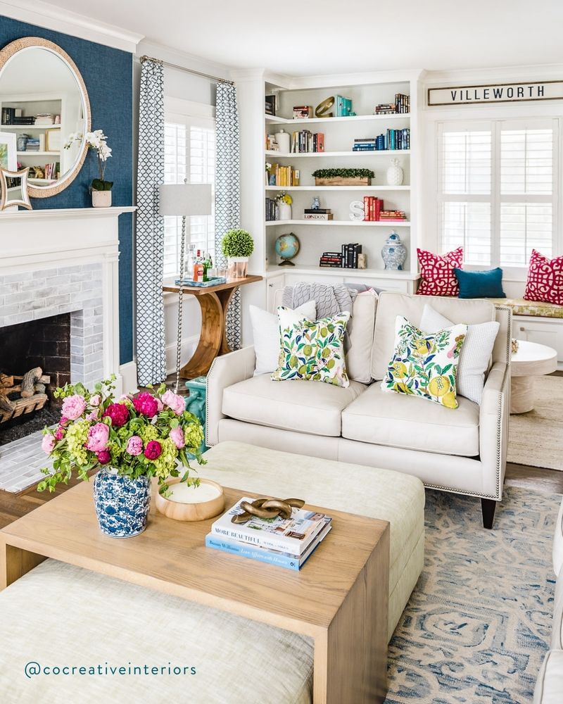
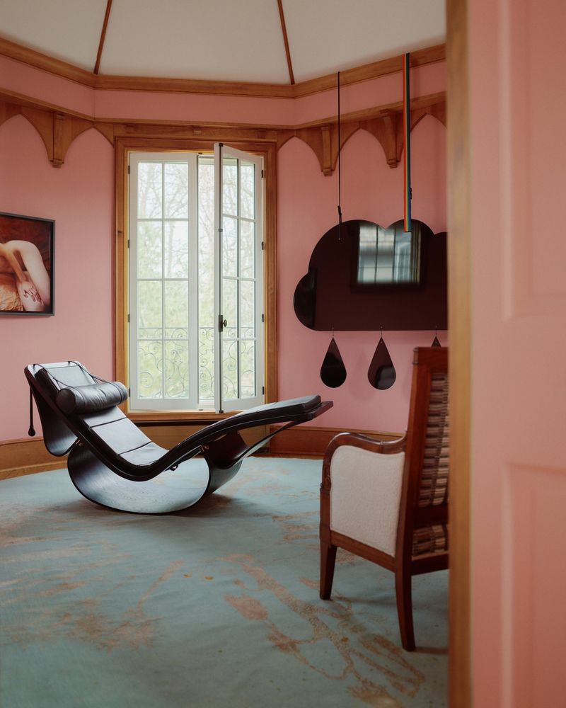
4. Accent with Bold Hues
Sometimes, a splash of boldness is all you need to create visual interest. Introducing bold hues as accents can turn an ordinary room into an extraordinary space. Imagine a neutral dining room with pops of vibrant red in the chairs or tableware.
These strategic bursts of color can draw focus and create a lively atmosphere without overwhelming the overall design. The key is balance; ensure the bold shades enhance rather than dominate, making the space feel dynamic yet cohesive.
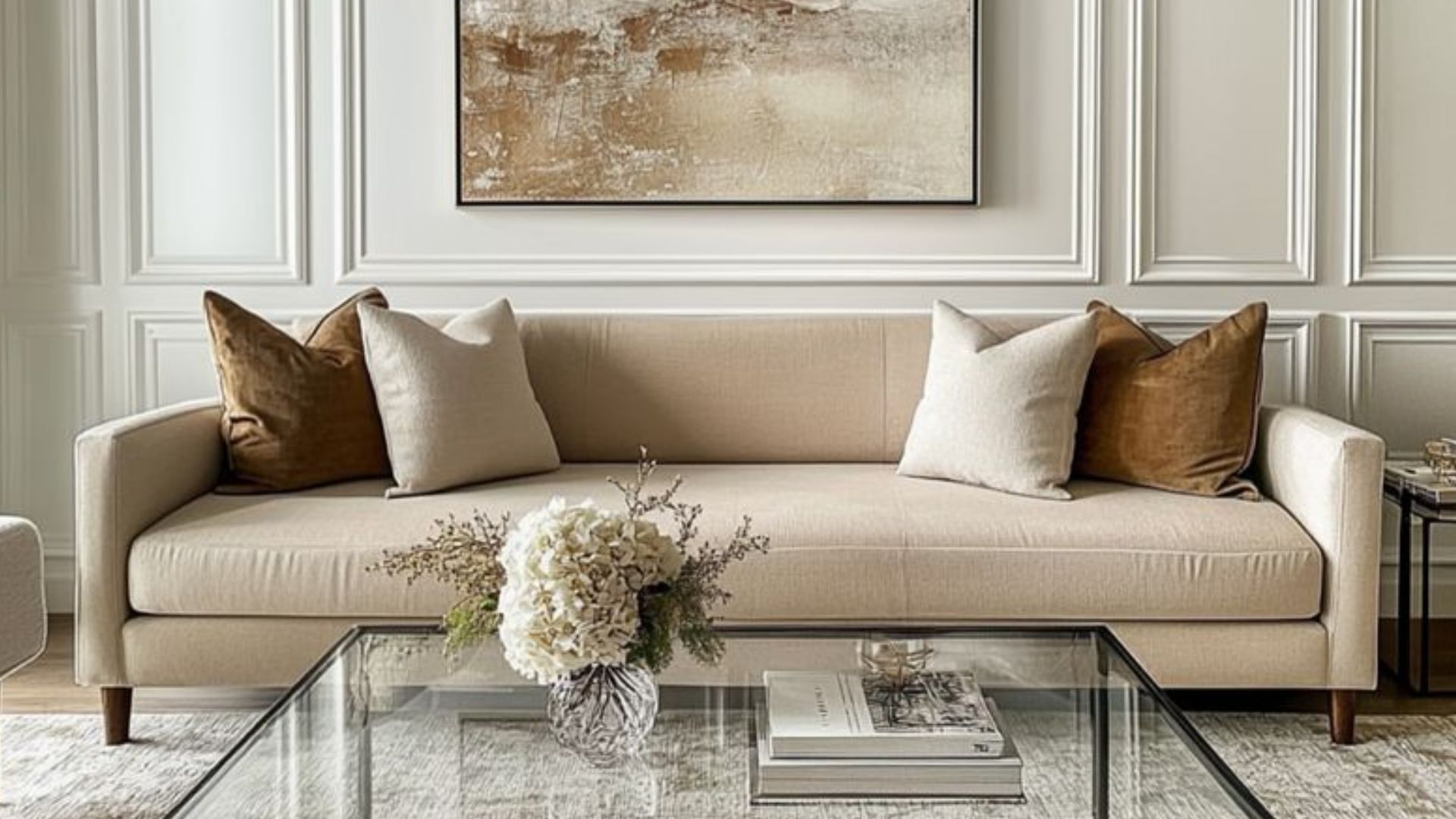
5. The Power of Neutrals
Neutrals have an underrated charm. These versatile colors serve as the perfect canvas for any design, offering a sophisticated and timeless appeal. Think of a living room with a soft grey wall, complemented by cream-colored furniture.
Such a palette allows for easy integration of other colors, either through art or decorative elements, ensuring a cohesive look. Neutrals provide flexibility, letting you change accents with the seasons while maintaining a serene and harmonious environment year-round.
6. Color Zoning
Open-plan homes can benefit from color zoning, a technique that uses different palettes to define distinct areas. This approach helps create a sense of purpose and differentiation within a single expansive space.
Consider a cozy nook painted in warm hues for intimate gatherings, contrasted with cooler tones in the main living space for relaxation. By delineating spaces through color, you craft an organized flow that guides movement and activity naturally, enhancing both function and aesthetics.
7. Nature’s Inspiration
Nature never fails to inspire with its perfect palette. Incorporating earthy tones and organic prints can infuse your home with a sense of tranquility. Envision a bedroom where muted greens, browns, and creams come together with botanical motifs.
These elements draw the serenity of the outdoors inside, crafting a retreat-like atmosphere. Whether it’s through furniture, textiles, or wall art, the calming influence of nature can transform your space into a peaceful sanctuary.
8. Seasonal Changes
Why not let the seasons guide your color choices? By altering your home’s palette to reflect the changing seasons, you introduce a dynamic and fresh energy into your environment.
In winter, opt for deep, cozy hues, while spring invites refreshing pastels and lively patterns. This approach not only keeps your space feeling new but also allows you to celebrate the beauty of each season. Small changes in accessories or soft furnishings can make a big impact.
9. Textures and Patterns
Textures and patterns are your secret weapons in the quest for cohesion. They offer a unique way to play with colors, adding layers of interest without drastically altering the palette.
Imagine a bedroom where soft, textured throws and patterned cushions in complementary shades create a visual feast. This method brings depth and richness to your color scheme, allowing for personal expression while maintaining a unified look that feels both elegant and approachable.
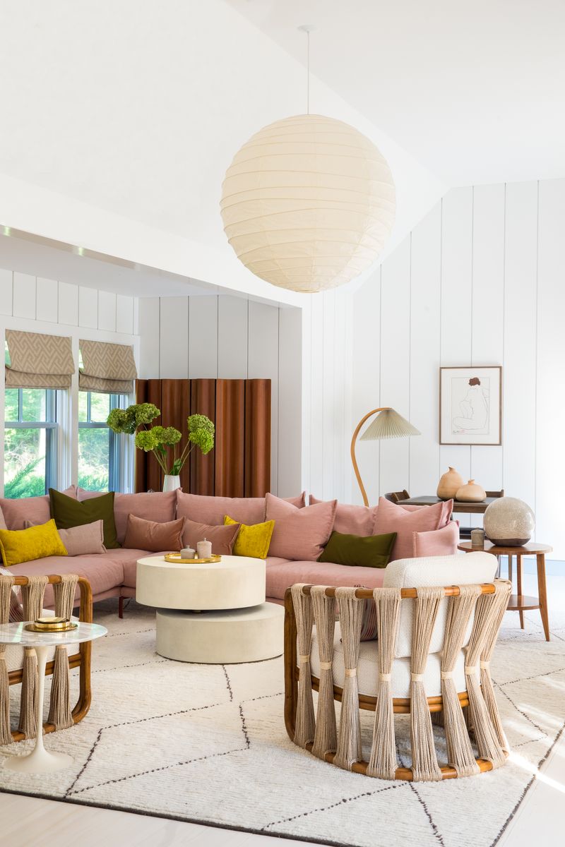
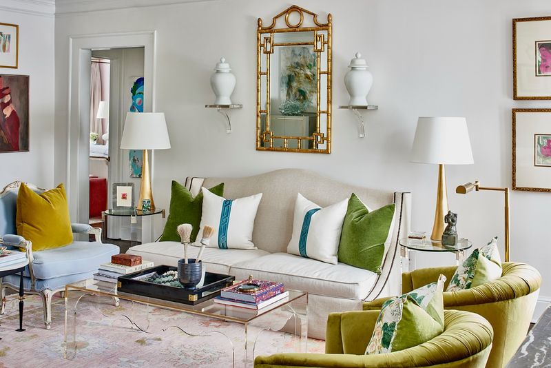
10. The 60-30-10 Rule
Ever heard of the 60-30-10 rule? It’s a designer’s secret to achieving perfect balance. Allocate 60% of the room’s color to a dominant shade, 30% to a secondary color, and 10% to an accent hue.
In practice, imagine a living room where soft cream dominates, complemented by 30% of deep blue in the upholstery, and 10% of gold accents. This formula ensures a harmonious and balanced look, providing a structured yet flexible framework for decorating.
11. Lighting’s Impact
Lighting can transform how colors appear, influencing the mood and feeling of a space. By using a mix of lighting sources, you can highlight different hues and create a dynamic atmosphere.
Picture a living room with warm overhead lights complemented by softer table lamps that cast an inviting glow. This interplay not only enhances color depth but also adds layers of ambiance, making your home feel cozy and welcoming. The right lighting can breathe life into your design choices.
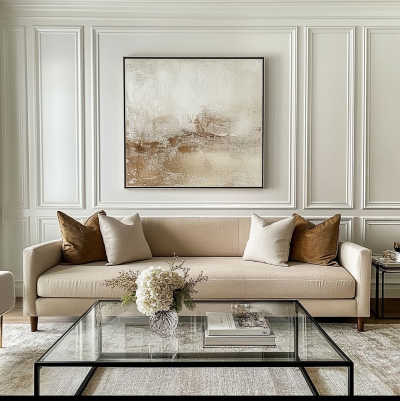
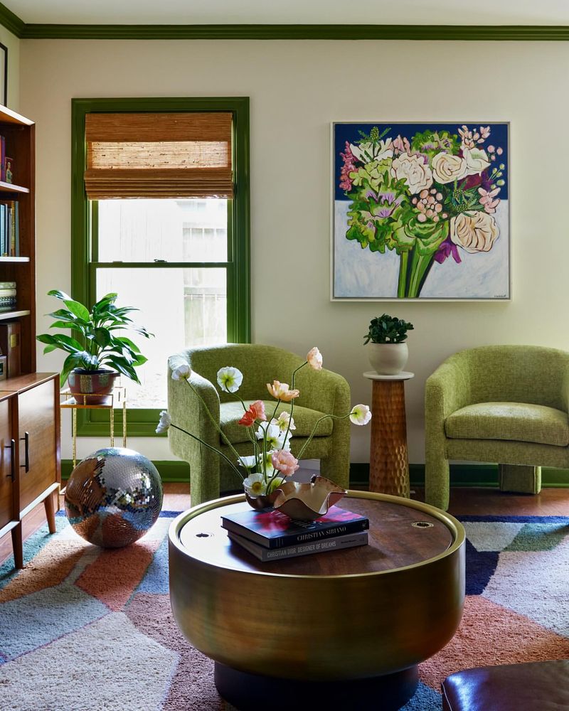
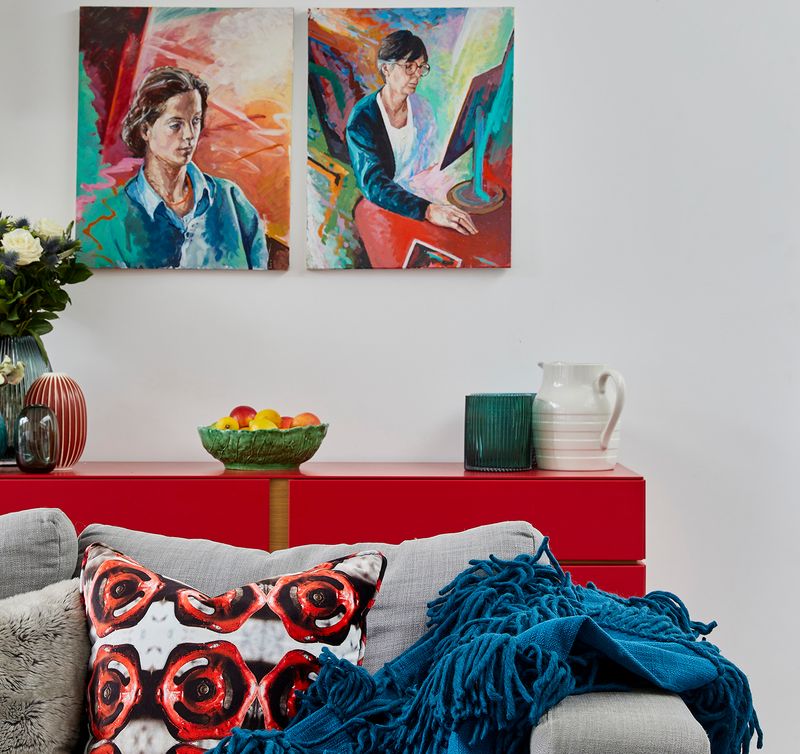
12. Art as a Color Anchor
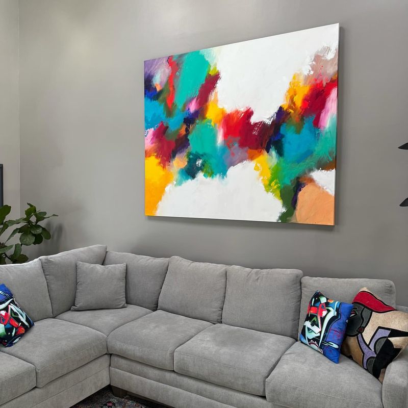
Art can be a powerful anchor for color schemes, offering a focal point around which you can build your decor. Choose a piece that resonates with you and let it guide the room’s palette.
Imagine a vibrant abstract painting in your dining area setting the tone for complementary hues in your table settings and upholstery. This approach personalizes your space, infusing it with character and ensuring a cohesive and curated look that feels uniquely yours.
13. Personalized Palette
Your home should reflect who you are. Crafting a personalized palette allows your space to tell a story that’s distinctly you. Start by identifying colors that resonate with your personality.
In a home office, perhaps you choose calming blues and energizing yellows to foster creativity and focus. This thoughtful selection ensures that the environment not only looks cohesive but also feels right, supporting your lifestyle and personal preferences in a harmonious blend.
14. Outdoor-Indoor Transition
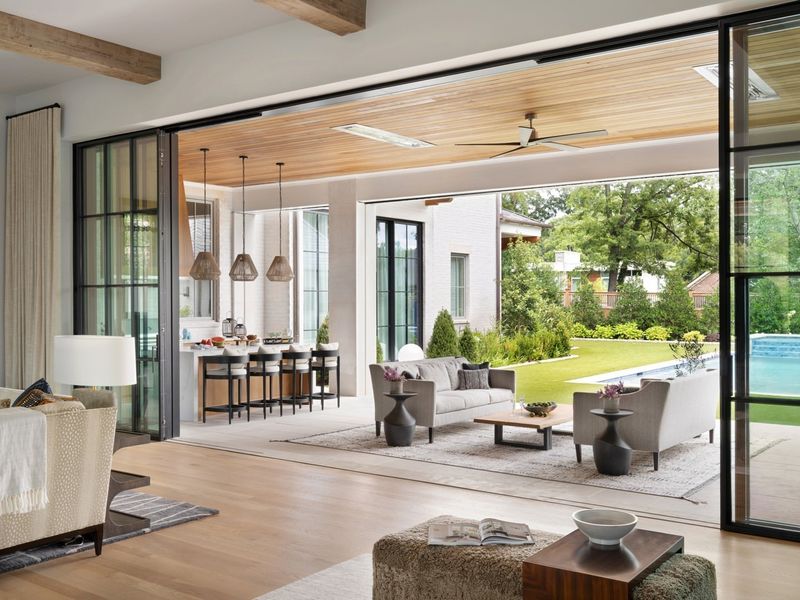
Blurring the lines between indoor and outdoor spaces can create a harmonious flow that extends your living area. Incorporate colors found in your garden or surrounding landscape into your interior design.
Imagine a living room where earthy browns and lush greens mirror the patio’s natural tones, making the transition between spaces feel seamless. This approach not only enhances the connection with nature but also brings a cohesive and calming ambiance to your home.
15. Themed Rooms for Fun
Why not inject a dose of fun into your home with themed rooms? This approach allows for creativity and personalization, especially in children’s spaces.
Picture a child’s bedroom decked out in a superhero theme, with bright blues, reds, and yellows bringing the story to life. Themes can guide color choices, ensuring a cohesive look that’s both exciting and organized. It’s a playful way to make individual spaces memorable and engaging.
16. The Art of Restraint
Sometimes, less truly is more. Embracing a restrained color palette can bring an elegant simplicity to your home. Choose a few muted tones and let them speak for themselves.
Consider a minimalist kitchen where shades of white, grey, and black create a clean, sophisticated look. This approach highlights the beauty of simplicity, allowing you to appreciate the form and function of your space without distraction. The result is a serene and orderly environment.
17. Mixing Vintage with Modern
Mixing vintage pieces with modern aesthetics can create a unique and cohesive design. By carefully selecting colors that blend these styles, you achieve a well-curated look.
Imagine a living room where a retro chair’s mustard yellow pops against sleek, modern grey walls. This fusion not only adds character but also ensures a balanced flow between different design eras. It’s an exciting way to express individuality while maintaining harmony across your home.
18. Color Blocking Techniques
Color blocking is a bold technique that can define and enliven spaces. By using large, contrasting blocks of color, you create visual interest and delineation.
Imagine a hallway where vibrant sections of teal and orange guide the way. This method not only adds energy but also helps in organizing spaces visually. Color blocking is particularly effective in transitional areas like hallways, where it can make a statement without overwhelming the senses.
19. Floor to Ceiling Color
Extending color from floor to ceiling can create a cohesive and immersive environment. This technique envelops the room in a single hue, making the space feel larger and more connected.
Consider a study where a deep forest green wraps around you, fostering a sense of calm and focus. The continuity of color draws the eye upward, enhancing the room’s verticality and creating a unified look that’s both striking and serene. It’s a bold choice for those seeking harmony.
20. Repetition with Variation
Repetition with slight variations is a clever way to build coherence across spaces. By repeating a color theme yet varying its application, you maintain interest without monotony.
Imagine a dining area where the repeated hue of soft coral appears in different textures and patterns, from tablecloths to wall art. This approach keeps the palette unified while adding visual intrigue. It’s a sophisticated method for achieving balance, ensuring each room feels both connected and distinct.
21. The Impact of Contrast
Contrast can make a bold statement in your home, emphasizing key elements and adding drama. By pairing dark and light hues, you create a striking and contemporary look.
Picture a bathroom where crisp white tiles meet deep charcoal accents, creating a sleek and modern space. The interplay of light and dark not only catches the eye but also highlights architectural details, ensuring a dynamic and engaging design that feels fresh and exciting.
22. Cultural Influences
Cultural inspirations offer a rich source of color ideas, infusing your home with global flair. By drawing on colors and patterns from different cultures, you create a space that feels worldly and intriguing.
Imagine a living room inspired by Moroccan tones, where vibrant oranges and royal blues interplay with intricate patterns. This cultural infusion adds depth and warmth, celebrating diversity and craftsmanship. It’s a way to tell a story through color, ensuring your home is both cohesive and captivating.
23. Using Color to Evoke Emotion
Colors wield the power to influence emotions, making them a key component in creating spaces that resonate personally. Selecting hues that evoke desired emotions can enhance the atmosphere significantly.
Envision a meditation room where calming blues and whites promote relaxation and clarity. This thoughtful choice of colors supports the room’s purpose, encouraging tranquility and focus. By aligning color with function, you create an environment that nurtures well-being, ensuring your home feels both cohesive and emotionally supportive.
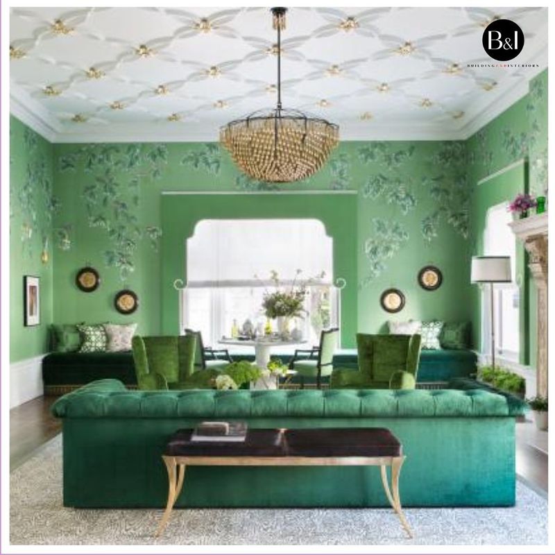
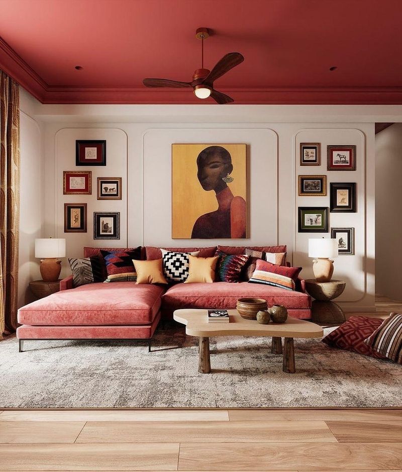
24. Creating Depth with Shades
Playing with different shades of a single color can add depth and dimension to a space. This technique allows for a rich, layered look without introducing new colors.
Imagine a library where varying shades of green create an enveloping atmosphere, from sage on the walls to emerald in the upholstery. Such depth fosters a cozy and inviting environment, encouraging relaxation and focus. This method ensures a harmonious flow while adding interest, making each area feel both dynamic and cohesive.