When I think of kitchen renovations, the countertop is where creativity meets functionality. But just because something was the toast of the town a decade ago doesn’t mean it’s still sizzling today.
Designers and trendsetters have weighed in, and I’m about to spill the beans on 30 kitchen countertop colors that have fallen out of favor. Ready to give your kitchen a fresh look? Let’s explore these outdated hues together!
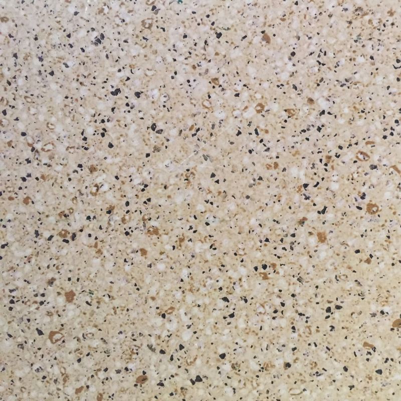
30. Speckled Beige
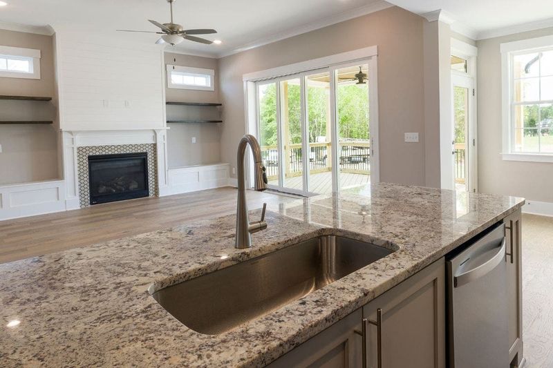
Speckled beige countertops once embodied practicality with a neutral palette. However, they’ve aged like a mullet at a modern-day party. Designers believe this color, reminiscent of a latte gone cold, lacks the sophistication today’s kitchens crave.
The specks were intended to camouflage stains, but they now scream old-school. Those tiny dots blend into a sea of outdated style, making any kitchen appear stuck in the early 2000s. Looking for advice? Swap them out for something sleeker and more contemporary, like a solid tone.
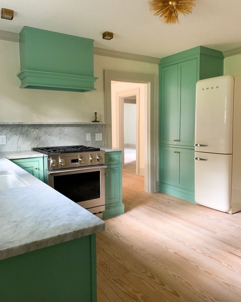
29. Mint Green
Mint green countertops were all the rage in your grandma’s prime. Nostalgia aside, this pastel has lost its charm in modern kitchens. Once considered refreshing, mint green now feels more like a faded photograph.
Designers find it hard to match with today’s trendy hues. The cheerful vibe has its merits, but it doesn’t align with the sleek lines and bold colors that dominate current styles. If it’s memories you want, consider small mint accents instead of dominating your space with this outdated shade.
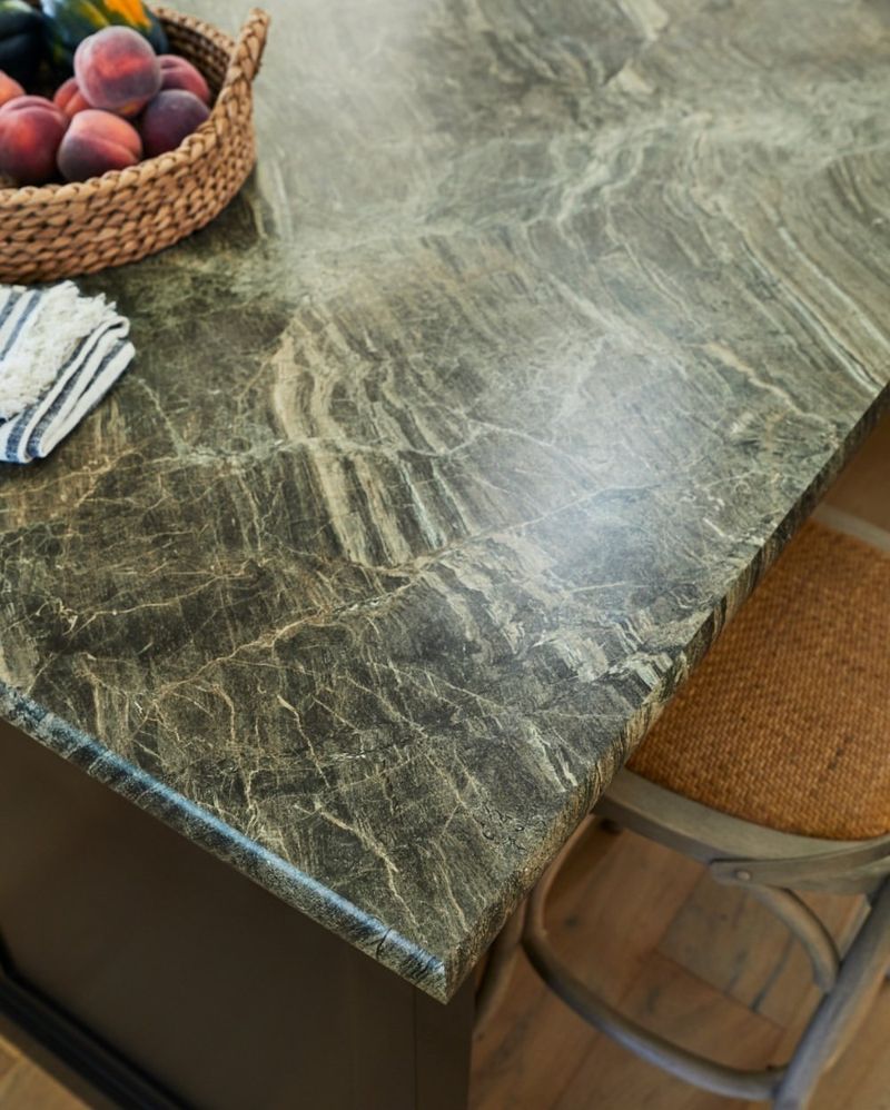
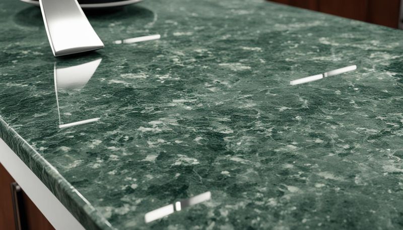
28. Dark Forest Green
Dark forest green was once seen as a bold choice, adding depth and mystery. Now, it can turn your kitchen into an eerie forest rather than a cozy gathering spot.
The color absorbs light, making spaces feel smaller and less inviting. Designers suggest that this hue doesn’t play well with brighter, airy tones that are currently favored. If your kitchen feels like a cave, it might be time for a change. Swap it for something that brings in light and cheer.
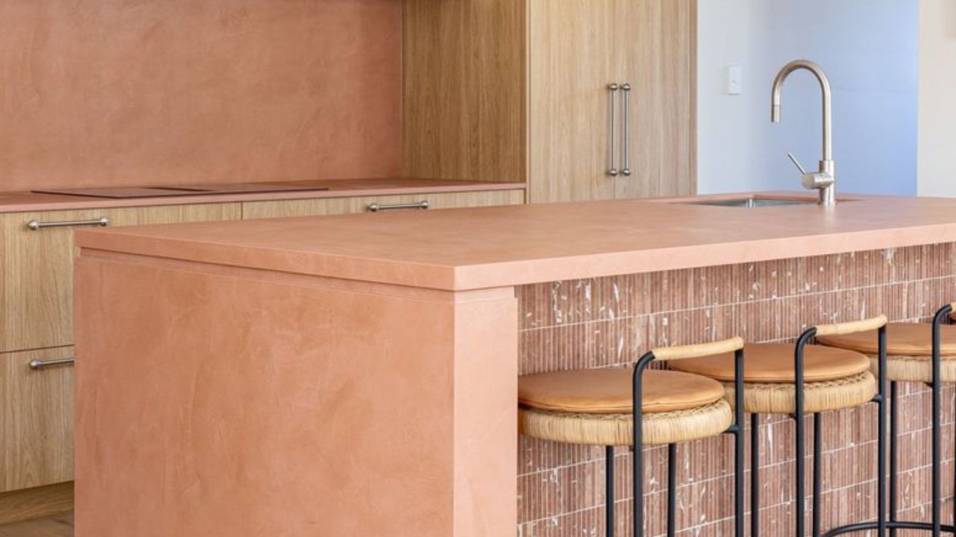
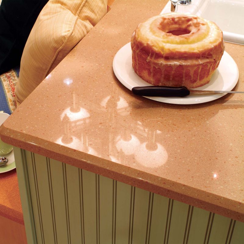
27. Peach
Peach countertops harken back to the vibrant 80s, but today they’re a bit too retro for comfort. Once paired with floral wallpaper and wood paneling, they now clash with contemporary minimalist designs.
While peach offers warmth, it struggles to pair with the crisp whites and grays that dominate modern design. Its sun-kissed glow feels outdated, making it hard to create a cohesive look. Designers recommend opting for more neutral shades that offer flexibility with various décor styles.
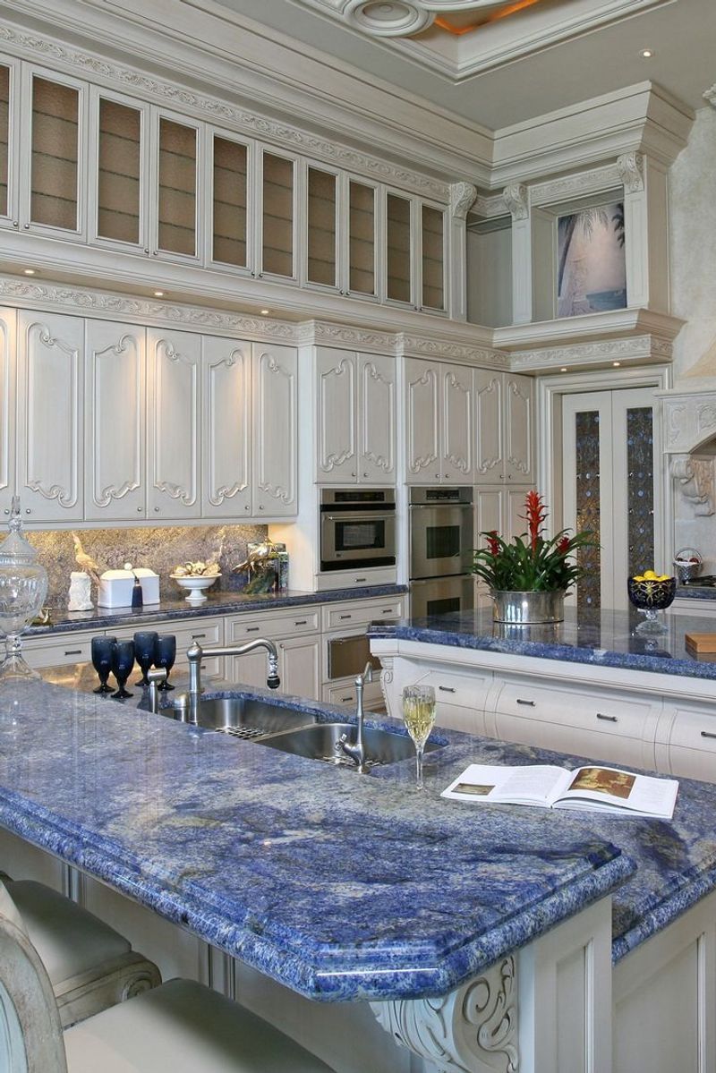
26. Coral
Coral countertops might remind you of a beach getaway, but in a kitchen, they’ve lost their allure. What once was a bold statement now feels out of sync with the natural tones that are trending.
The vibrant pink-orange hue is challenging to coordinate with today’s soft, earthy palettes. Designers agree that coral can feel overpowering and limit design choices. If you cherish that tropical vibe, consider softer, subtler accents that won’t overwhelm your kitchen’s aesthetic.
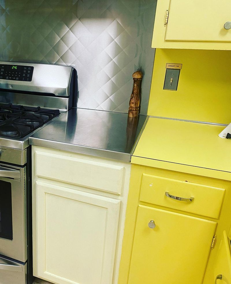
25. Canary Yellow
Canary yellow is undeniably cheerful, but in countertops, it can be a bit too much. This bright hue was once used to make kitchens feel sunny and warm, but now it can feel like an overstatement.
While yellow can energize a space, it often clashes with the muted tones that are currently in vogue. Designers suggest a more subdued palette to create harmony and balance. If you love yellow, try using it in smaller doses, like in accessories or accent walls.
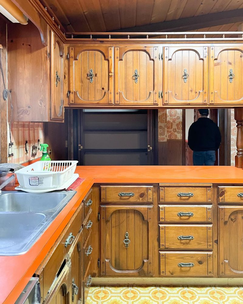
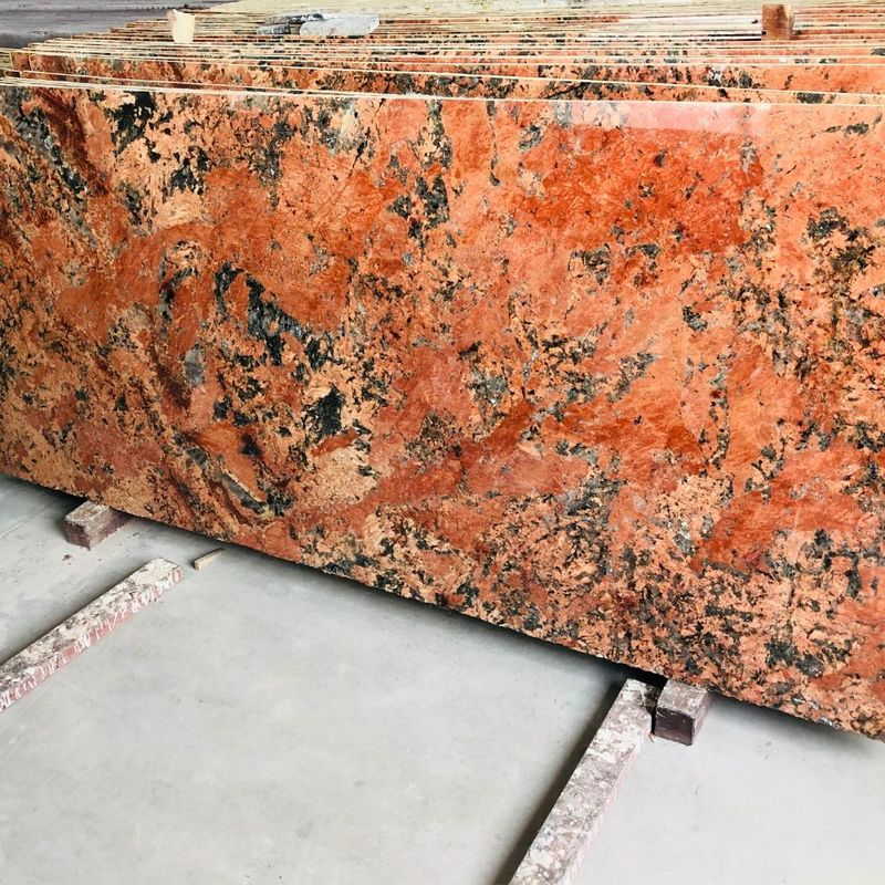
24. Burnt Orange
Burnt orange countertops remind us of the cozy 70s, but their time has passed. This color, once embraced for its warmth, now feels like a relic from a bygone era.
Designers find burnt orange difficult to integrate with the clean lines and cool tones prevalent today. It tends to dominate the space, making it hard to achieve the minimalist look that’s in demand. If you’re yearning for warmth, consider more contemporary warm shades like terracotta or soft browns.
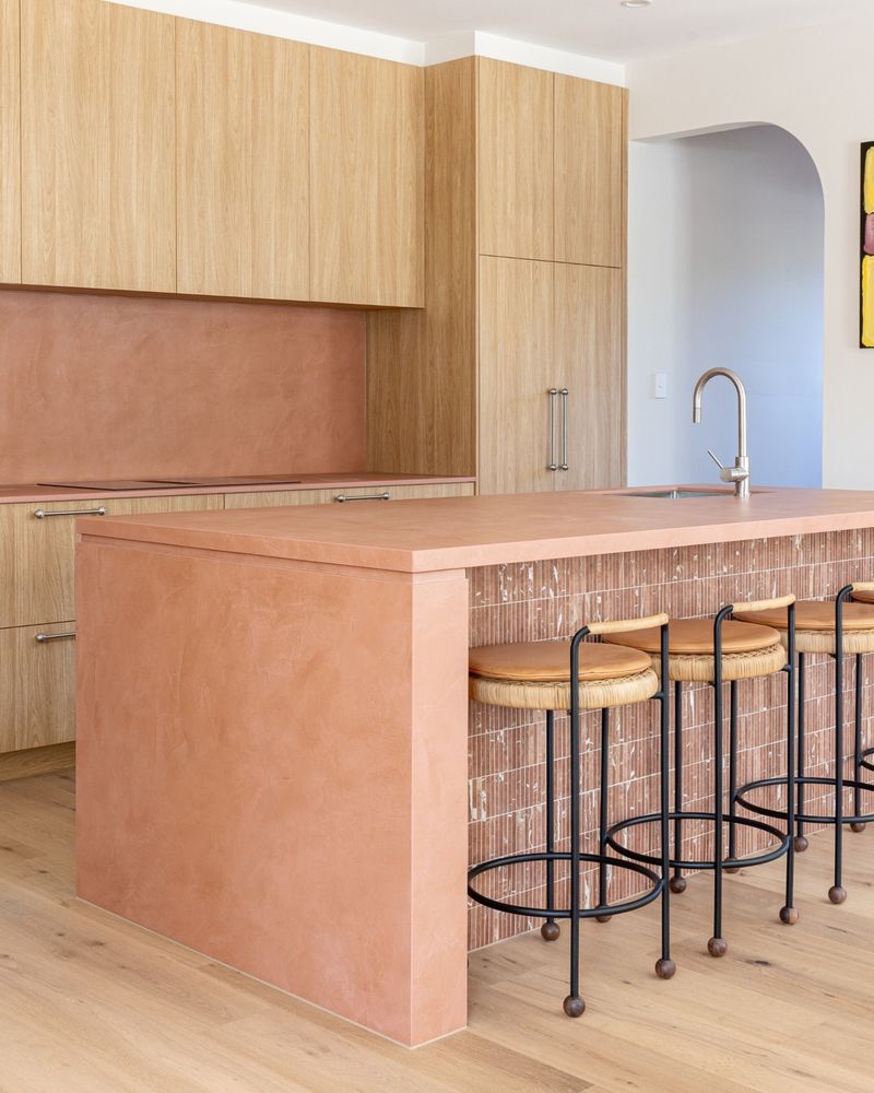
23. Terracotta
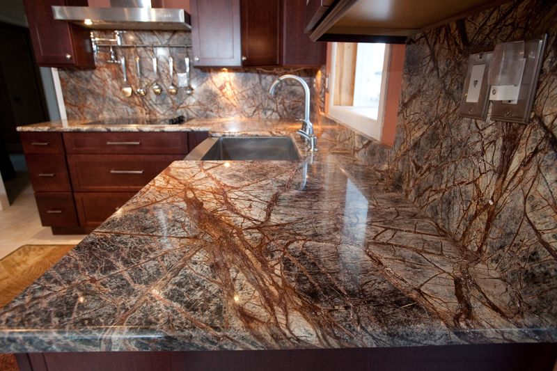
Terracotta was a staple in Mediterranean-style kitchens, but now it feels a bit dated. Once celebrated for its earthy warmth, it doesn’t quite fit the modern aesthetic.
The reddish-brown hue can overpower a room, making it challenging to pair with the sleek, clean lines popular in contemporary design. Designers recommend exploring more versatile shades that can adapt to changing trends while still evoking warmth.
22. Bubblegum Pink
Bubblegum pink countertops are fun, but they can make your kitchen feel like a time capsule. What was once vibrant and playful now seems out of place in sleek modern homes.
The candy-like hue struggles to complement the minimalist or industrial styles that are trending. Designers suggest this shade might limit your design possibilities and advise opting for neutral tones that can be enhanced with pops of color elsewhere.
21. Chocolate Brown
Chocolate brown countertops once promised warmth and coziness. Today, designers find them too heavy and reminiscent of the past.
This deep shade can make kitchens feel dark and cramped, especially if paired with equally dark cabinetry. It’s a challenge to achieve the light, airy feel that so many homeowners now desire. Instead, consider lighter, more reflective surfaces that can brighten your space and open up your kitchen.
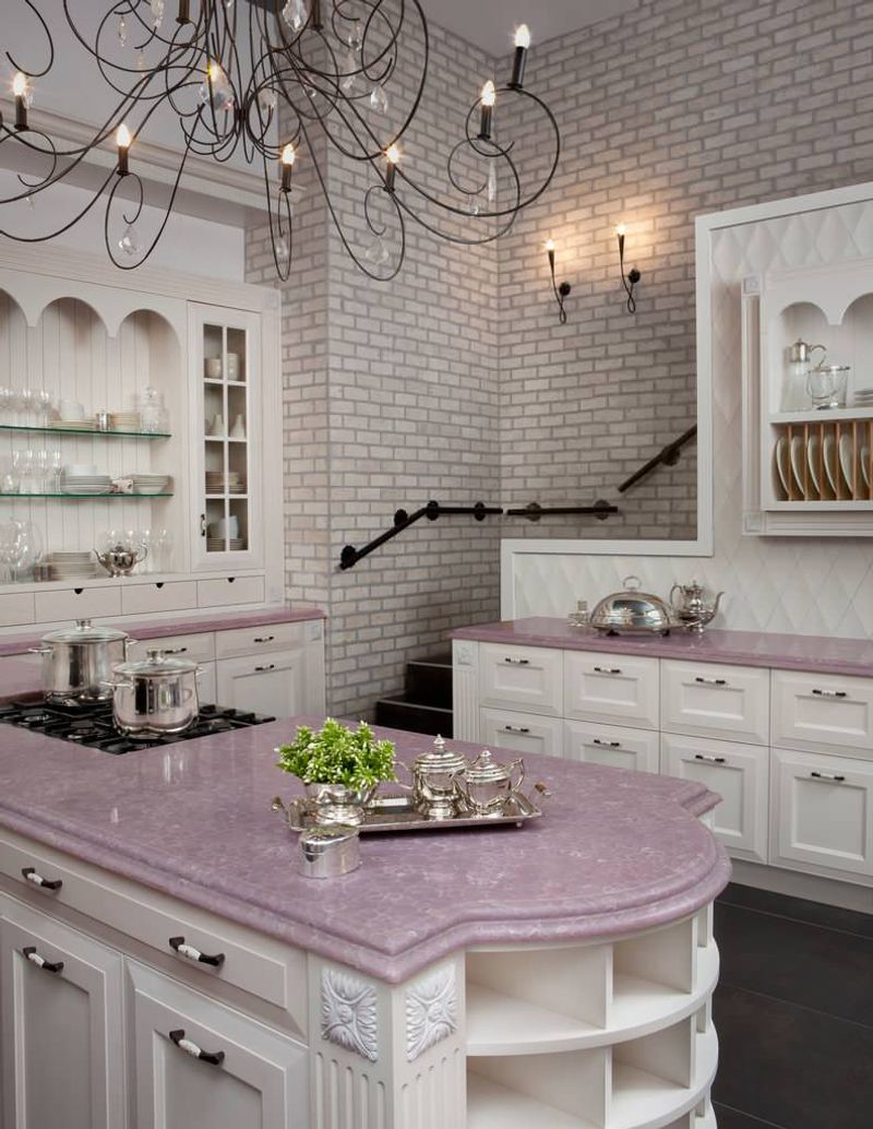
20. Lilac
Lilac countertops once whispered elegance and softness, but today they might feel out of touch. The gentle purple hue struggles to fit with the bold, contrasting color schemes that are trending.
Designers often see lilac as limiting, trapping you in a specific palette that may not adapt well to changing trends. If you love this color, consider incorporating it in smaller, decorative elements that can easily be replaced as styles evolve.
19. Rust Red
Rust red countertops once added a bold, industrial edge to kitchens. However, their time in the spotlight has waned.
This intense hue can dominate a room, making it hard to balance with the softer, earthy tones that many designers now favor. It can feel overwhelming rather than inviting. If you’re drawn to rich colors, try using them in accents or accessories for a more adaptable and modern kitchen.
18. Ivory
Ivory countertops were once the epitome of luxury, but now they can seem lackluster. This off-white shade is often perceived as a relic from the past, lacking the crispness of modern whites.
Designers suggest ivory lacks the visual impact that contemporary styles demand. It may blend into older themes rather than standing out in a fresh, clean way. If you crave a light and airy kitchen, consider purer shades of white that offer a crisp backdrop for any decor.
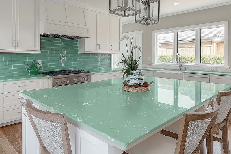
17. Seafoam Green
Seafoam green countertops bring a sense of calm, but in today’s kitchens, they’re more akin to a nostalgic nod to the past.
The soft green can be challenging to integrate with the bold and neutral palettes that are currently popular. While seafoam evokes tranquility, it can clash with the vibrant pops of color that define modern kitchens. Designers recommend using seafoam in accents rather than as a dominant color.
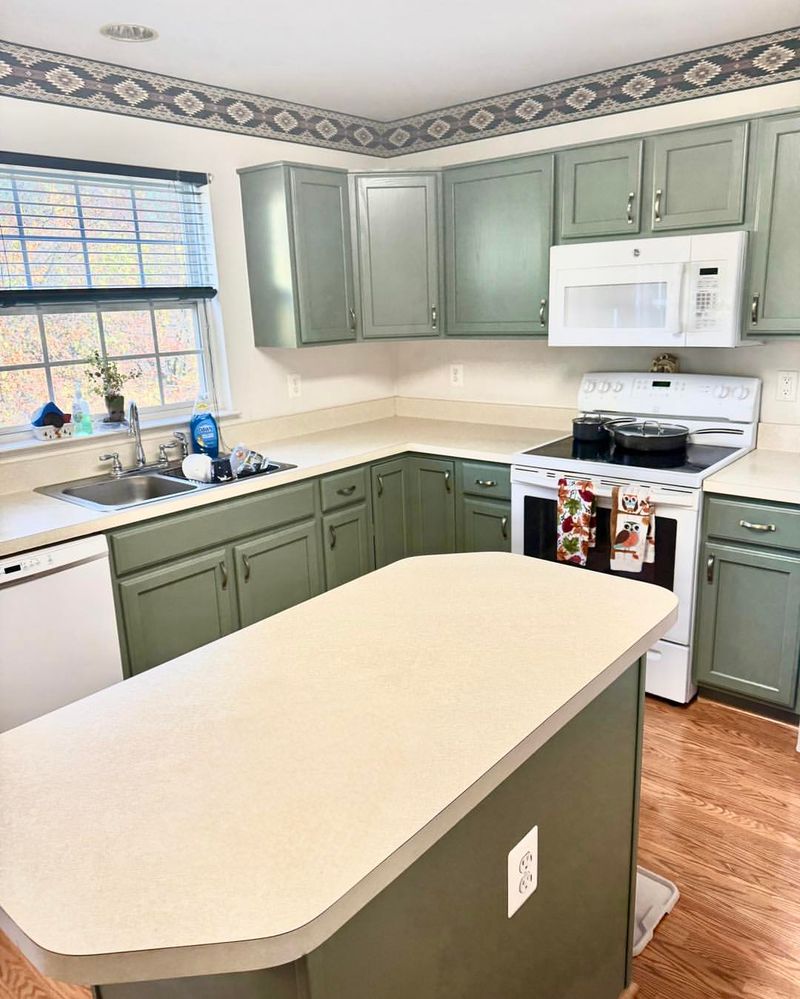
16. Olive Drab
Olive drab might have been trendy back in the 1970s, but today, it can make a kitchen feel dreary and outdated. This color often clashes with the sleek, modern designs that dominate contemporary kitchens.
Instead of blending seamlessly, olive drab countertops tend to stand out in a way that’s less than appealing. They can make a space feel smaller and more enclosed.
For a fresher look, designers recommend opting for lighter, more neutral tones that can open up a space and complement current styles.
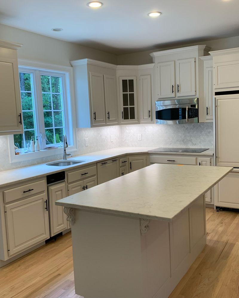
15. Off-White
Off-white countertops seemed like a safe bet, offering a neutral base for various styles. However, they now appear less vibrant against the stark, clean whites favored today.
This shade can feel dull and uninspired, lacking the crispness that many homeowners seek. Designers suggest opting for brighter whites that can provide a fresh, open feel to your kitchen, allowing other design elements to shine.
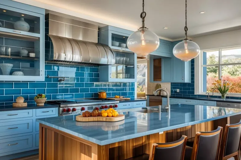
14. Dusty Blue
Dusty blue was once a sophisticated choice, but now it often lacks the vibrancy seen in modern kitchens. This color can make a kitchen feel flat and uninspired.
The muted tone doesn’t align well with the bright, airy feel that many homeowners prefer in their kitchens today. It can also limit the choice of complementary colors.
Designers now suggest brighter blues or completely neutral shades that can add a fresh, dynamic touch to a kitchen space.
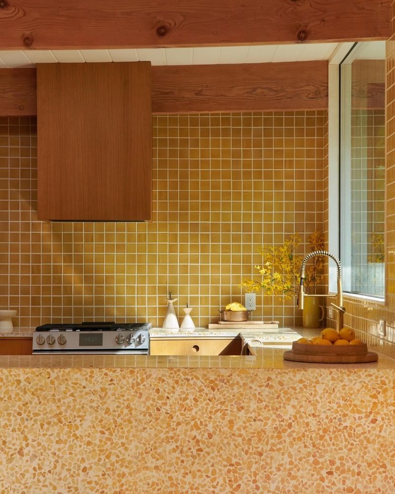
13. Mustard Yellow
Mustard yellow countertops were once the zest of kitchen decor, but today they’re a bit too retro. This bold shade can overpower a space, making it challenging to achieve the balanced look that’s in demand.
Designers find it hard to pair with modern, subdued palettes. If you’re drawn to vibrant colors, try incorporating them in smaller doses where they can add personality without overwhelming the space.
12. Periwinkle
Periwinkle countertops once added a touch of whimsy, but today they feel out of place in modern kitchens. The soft blue-purple hue struggles to align with the bold, crisp lines that dominate contemporary design.
Designers often see periwinkle as limiting, making it hard to update your kitchen without a complete overhaul. If you love this color, consider using it in accents that can evolve with your style.
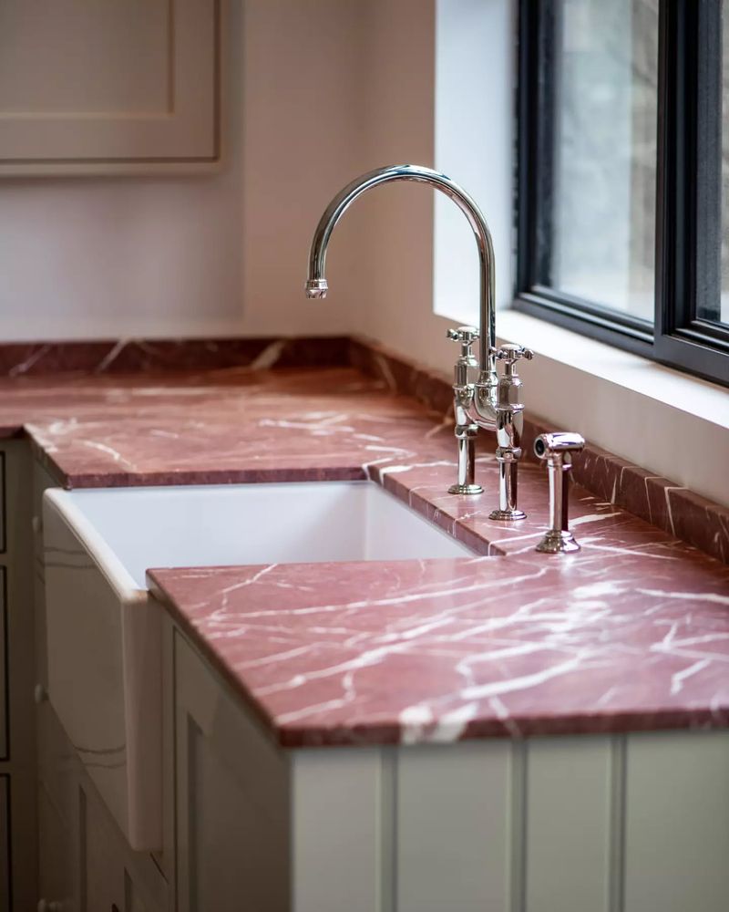
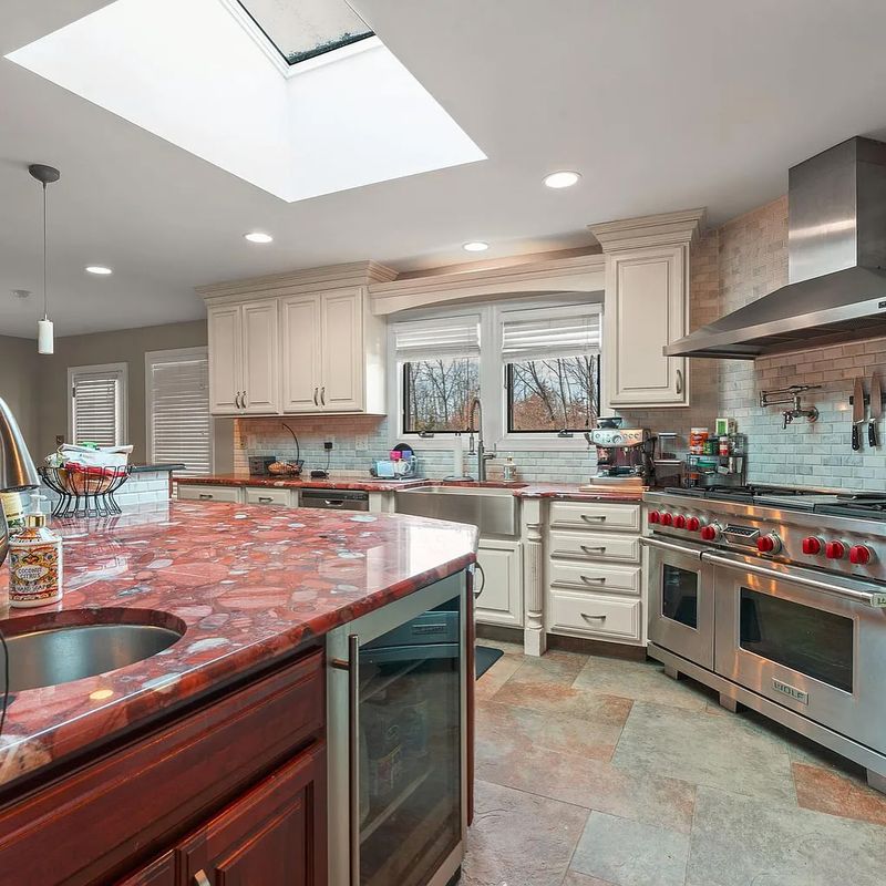
11. Brick Red
Brick red countertops evoke a rustic charm, yet they’re not quite in tune with current trends. The deep, earthy red can dominate a space, making it hard to incorporate more modern design elements.
Designers suggest that it can feel too heavy and overpowering, limiting your design flexibility. For those who love rich colors, consider using them as accents to enhance rather than overshadow your space.
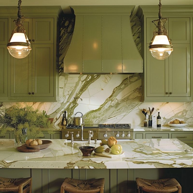
10. Hunter Green
Hunter Green, while once a popular choice for creating a dramatic, natural look, now seems out of place in the contemporary kitchen landscape. This deep, dark green can overwhelm smaller spaces and struggle to harmonize with modern minimalist decor.
The allure of Hunter Green was its association with nature, imparting a sense of calm and richness. But as kitchens move towards lighter, more neutral tones, this color has been left behind. Designers advocate for transitioning to more versatile greens like olive or sage.
These shades offer a softer, more adaptable palette that can easily integrate with various styles. Whether you’re seeking a subtle update or a complete makeover, stepping away from hunter green opens up new possibilities for design.
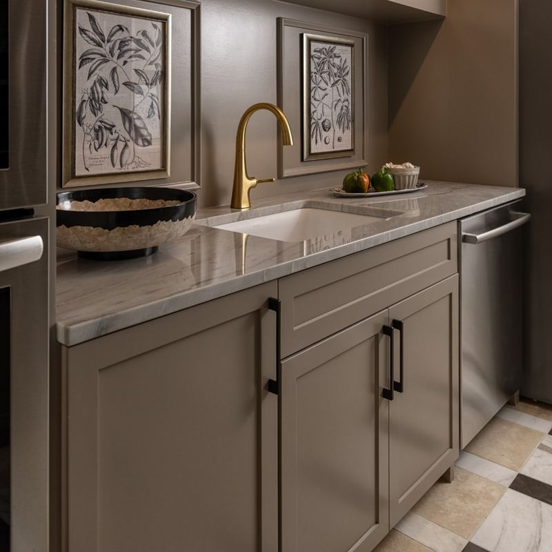
9. Taupe
Taupe countertops once promised versatility, yet today they can appear uninspired. This neutral shade often lacks the punch of more vibrant or crisp colors that are favored now.
Designers find taupe can blend into the background rather than stand out. If you desire a neutral palette, consider shades that offer depth and richness to complement modern design elements without feeling dull.
8. Sky Blue
Sky blue countertops once evoked calm and serenity, but they now seem a bit too soft for contemporary kitchens. The light blue can feel at odds with the bold, dynamic colors that are trending.
Designers often find this hue challenging to integrate with modern, minimalist designs. If you love blue, consider using a deeper, more vibrant shade that adds dimension and interest to your space.
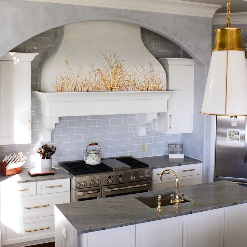
7. Light Gray
Light gray countertops once seemed like the perfect neutral, offering a backdrop for any decor. However, they now appear too bland in comparison to the dramatic contrasts celebrated today.
Designers suggest that while gray is versatile, it can lack the warmth or boldness needed to stand out. If you prefer gray, choose shades with more depth or consider pairing with bolder elements to create a more dynamic space.
6. Eggshell
Eggshell countertops once exuded classic charm, but now they might feel too subtle. The creamy off-white hue can seem outdated against the crisp whites and bold colors favored today.
Designers find that eggshell can blend into older themes rather than enhancing modern designs. If you’re looking for a timeless look, consider purer whites or add contrast with bold accents to keep the space fresh.
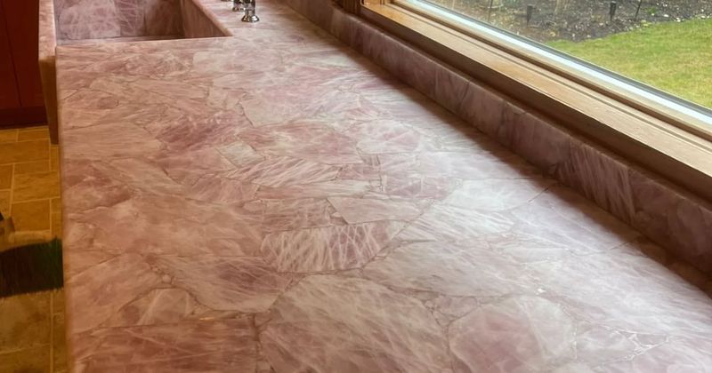
5. Rose Quartz
Rose Quartz, once hailed for its gentle and romantic vibe, is now considered too saccharine for the modern kitchen. This pale pink hue, reminiscent of a bygone era, struggles to complement the sleek, minimalist designs favored today. Designers suggest moving away from this overly sweet tone.
The popularity of Rose Quartz was partly due to its ability to evoke warmth and comfort. However, it’s now seen as being out of sync with the crisp lines and bold statements of contemporary kitchens. For a fresher look, think about incorporating shades like muted terracotta or soft sage.
These alternatives not only modernize your kitchen but also ensure that the color palette remains inviting and chic. They provide a subtle backdrop that allows for creativity and personalization in other areas.
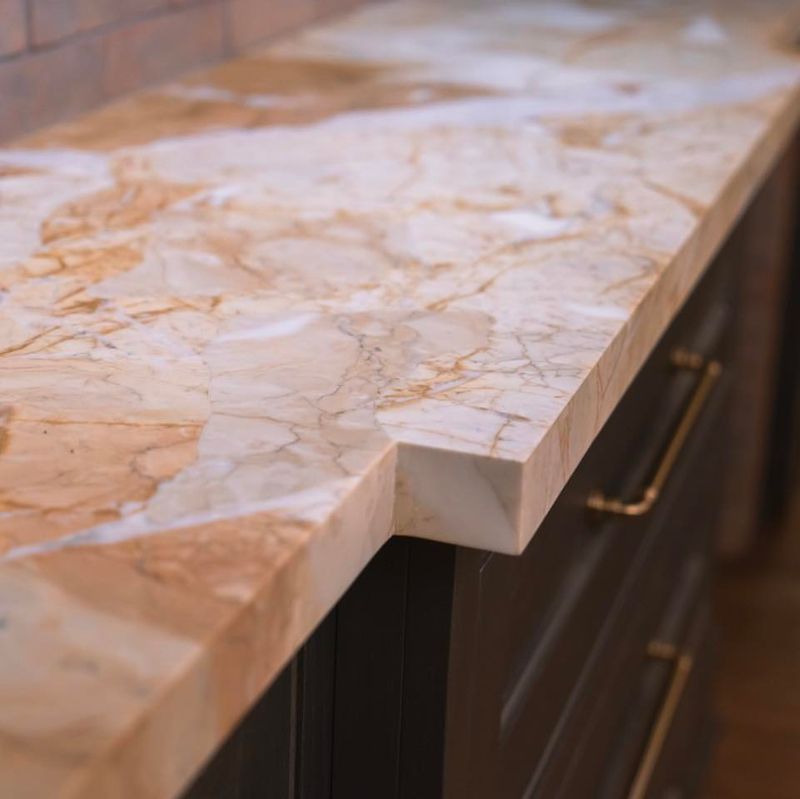
4. Sandstone
Sandstone countertops once brought a touch of the outdoors inside. However, their earthy tones now seem too muted for the vibrant, dynamic styles that are in vogue.
Designers find that sandstone lacks the crispness and contrast celebrated in contemporary design. If you love natural textures, consider incorporating them in more modern hues or as accents to add interest without overwhelming the space.
3. Teal
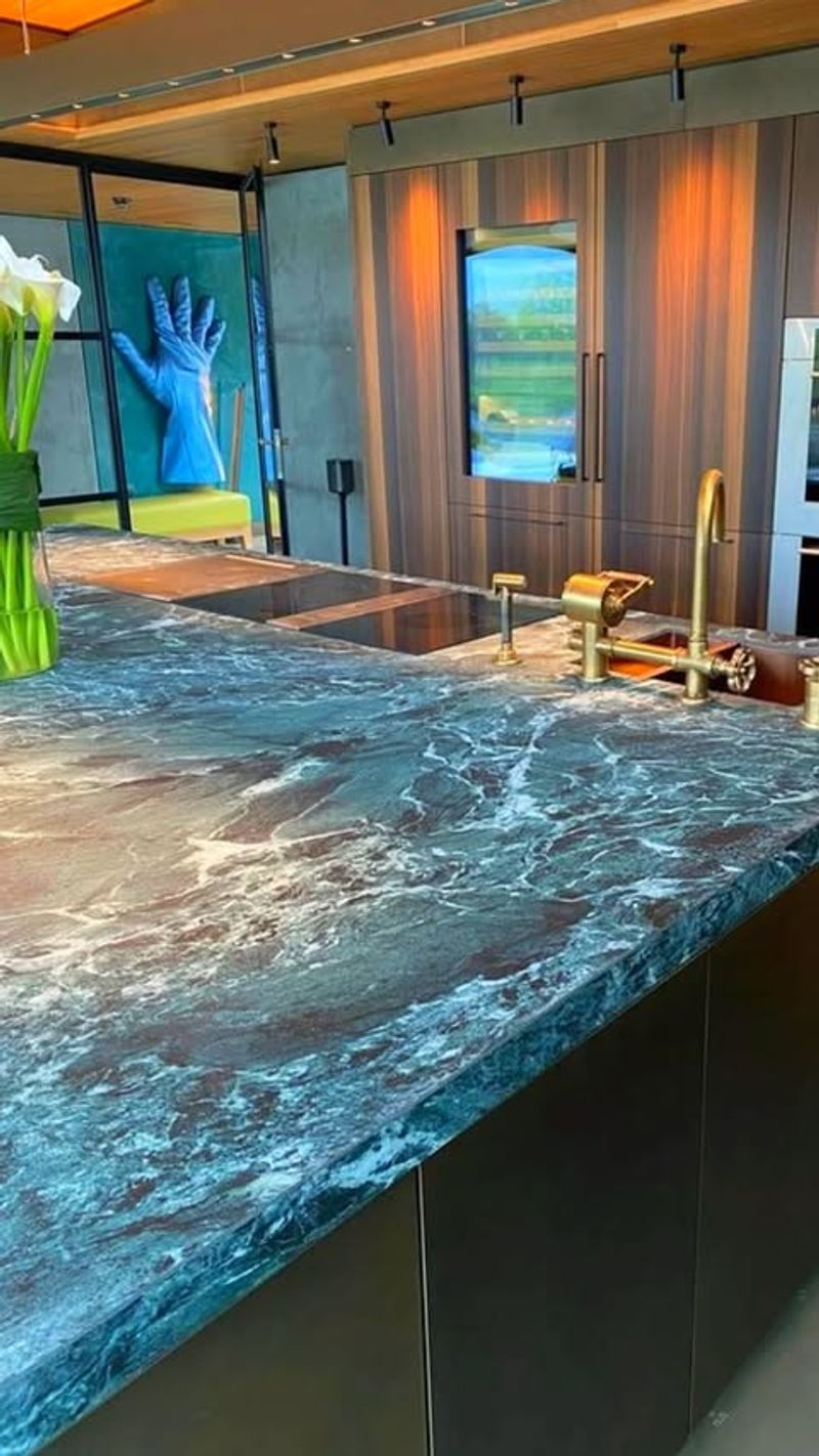
Teal countertops once introduced a playful splash of color, but now they might feel out of sync with modern trends. The rich blue-green hue can be hard to pair with the simpler, neutral tones that are in demand.
Designers suggest that while teal can be striking, it often limits design flexibility. If you adore this color, consider using it in accessories or smaller elements that can be easily swapped out as styles change.
2. Champagne
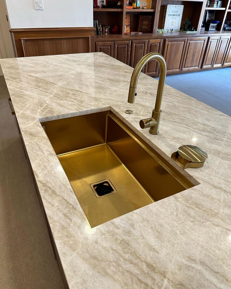
Champagne countertops once added a touch of elegance, but today they might feel a bit too subdued. The soft, warm hue can struggle to shine against the crisp whites and bold contrasts that are trending.
Designers often find champagne a bit too safe, lacking the impact needed to stand out in a modern kitchen. If you desire elegance, consider more vibrant tones or contrasting elements to create a striking space.
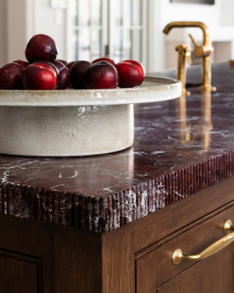
1. Cranberry
Cranberry countertops once added a festive flair, but now they may seem too bold for everyday elegance. The deep red can dominate a space, making it challenging to adapt to a more versatile palette.
Designers suggest that cranberry can feel too specific, limiting your design options. If you love rich colors, try using them in smaller doses or accents to keep your kitchen adaptable and fresh.
