These Are 10 Benjamin Moore’s Most Serene Paint Colors For A Soothing Space
I never realized how much paint color could impact my mood until I swapped out a too-bright wall for something softer, and suddenly, my whole space felt calmer.
Benjamin Moore has become my go-to for finding that perfect balance. Their shades aren’t just pretty; they create a sense of peace that’s hard to put into words.
Whether you’re revamping a bedroom or just freshening up a hallway, the right tone can turn chaos into calm in a single weekend. These ten colors have helped me create spaces that actually feel like home, and I think you’ll love them too.
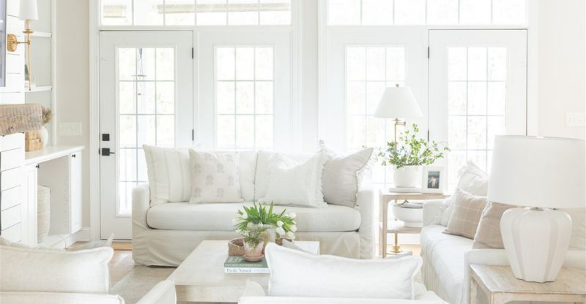
1. Pale Oak OC-20
The paint equivalent of a cashmere sweater! Pale Oak wraps your walls in a warm neutral that’s neither too beige nor too gray.
Morning light makes it glow with subtle warmth, while evening brings out its cooler undertones. This chameleon-like quality makes it perfect for open floor plans where you need consistency without monotony.
Fun fact: Despite its name, this shade contains no actual oak derivatives, just the gentle essence of nature’s most reliable tree.
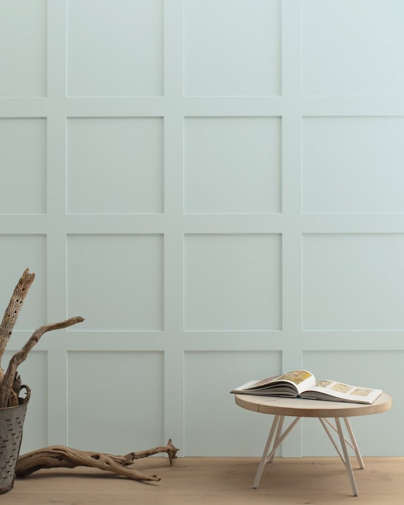
2. Quiet Moments 1563
Imagine bottling the color of ocean mist on a cool morning. That’s what Benjamin Moore achieved with this blue-green-gray masterpiece.
Rooms painted in Quiet Moments seem to whisper rather than shout, creating a backdrop that encourages deep breaths and slow conversations. It pairs brilliantly with natural wood tones and crisp white trim.
The color got its poetic name after a designer noticed how it seemed to hush a noisy test room during color trials!
3. Gray Owl OC-52
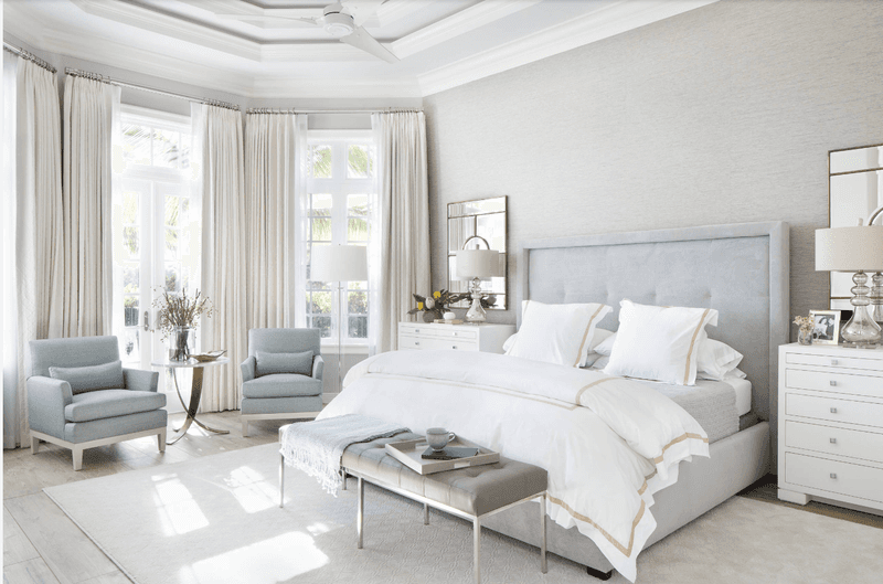
Not too warm, not too cool – Gray Owl is the Goldilocks of neutral paint colors. This light gray carries subtle green undertones that keep it from feeling flat or boring.
Professional designers grab this shade when they need something that plays well with both modern and traditional furnishings. Its versatility means you won’t tire of it, even as your decorating style evolves.
Gray Owl brightens up north-facing rooms that might otherwise feel chilly with other gray paints.
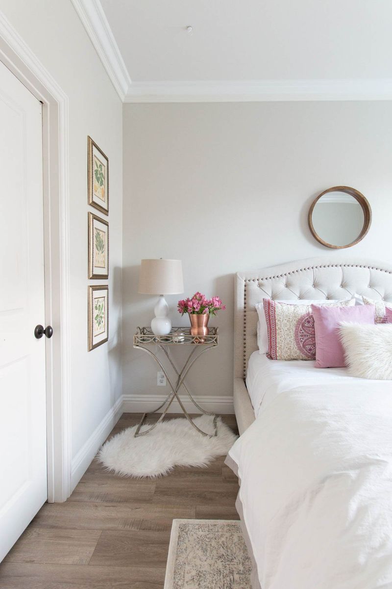
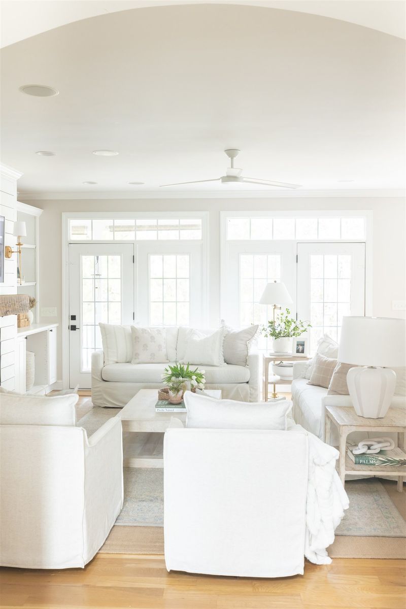
4. Revere Pewter HC-172
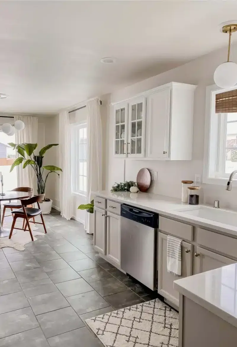
The rock star of Benjamin Moore’s lineup! This greige (gray-beige hybrid) has achieved cult status among homeowners for good reason.
Revere Pewter manages to be both cozy and sophisticated without committing too hard to either gray or beige. It shifts throughout the day, keeping spaces interesting without being distracting.
Paint professionals joke that they could retire if they had a dollar for every gallon of Revere Pewter sold during the 2010s housing boom – it’s that popular!
5. Woodlawn Blue HC-147
Channel the breezy vibe of coastal homes without going full-on beach theme. Woodlawn Blue delivers a historical blue with just enough gray to keep it grounded and sophisticated.
This shade has the magical ability to make ceilings appear higher and rooms feel more spacious. It’s particularly stunning in bathrooms, where it creates a spa-like atmosphere that promotes relaxation.
The color was reportedly inspired by a historic plantation home where it adorned the ceiling of a famous veranda.
6. Edgecomb Gray HC-173
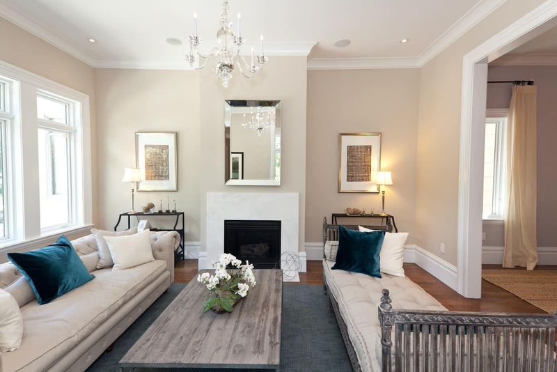
Meet the friendly neighbor of Revere Pewter! Edgecomb Gray leans more firmly into the beige family while maintaining enough gray to feel current rather than dated.
This color creates spaces that feel naturally bright without being stark. It’s the unsung hero of open-concept homes where you need a foundation color that won’t compete with your furnishings or artwork.
One designer calls it “the Switzerland of neutrals” because it refuses to pick sides between warm and cool, getting along with everything!
7. Silver Satin OC-26
Think of the softest silver shimmer caught in morning light. Silver Satin delivers a whisper of color that’s neither white nor gray but something magically in-between.
This luminous shade reflects light beautifully, making it perfect for spaces that need brightening. Unlike stark whites, it has enough depth to create definition against white trim without feeling heavy.
Photographers love rooms painted in Silver Satin because it creates a flattering backdrop that makes both people and furnishings look their best!
8. Balboa Mist OC-27
Named after California’s misty coastal mornings, this color lives up to its dreamy title. Balboa Mist floats between gray, beige, and the faintest lavender, creating walls that seem to breathe with you.
It’s the chameleon of Benjamin Moore’s collection, shifting dramatically with lighting conditions. Morning brings out its warmer tones while evening enhances its cool sophistication.
Designers call it a “whole-house color” because it transitions beautifully from room to room without becoming monotonous.
9. Sea Salt CSP-95
Don’t confuse this with Sherwin-Williams’ version! Benjamin Moore’s Sea Salt is the gentler, more mysterious cousin – a soft green-gray that channels foggy coastlines rather than bright beaches.
This color creates rooms that feel naturally clean and fresh without resorting to clinical whites. It’s particularly magical in kitchens and dining spaces, where it subtly enhances food presentation and appetite.
A chef once claimed his restaurant’s reviews improved after painting the dining room Sea Salt – coincidence or color psychology at work?
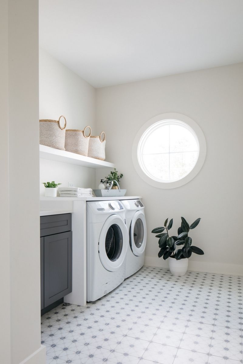
10. White Dove OC-17
The supermodel of white paints! White Dove manages to be bright without being blinding, warm without yellowing, and soft without looking dirty.
Its magic lies in the perfect balance of undertones that keep it from falling into the sterile territory of stark whites. Rooms painted in White Dove feel clean yet inviting, like freshly laundered sheets rather than a hospital corridor.
Benjamin Moore sells more White Dove than almost any other color in their lineup – proving that finding the perfect white is worth its weight in gold!