HGTV’s Biggest Stars Suggest You Leave Behind These Outdated Home Trends
We’ve all heard the jokes about overdone shiplap and sterile all-white kitchens, but HGTV’s top designers are going way deeper than the usual Instagram trends.
They’re calling out outdated home choices that go beyond a passing fad and actually make your space feel stuck decades in the past, think full-on ’80s vibes or early 2000s cringe.
I know it can feel overwhelming to update those features, but the good news is many of these pros share easy, affordable swaps. Consider this your cheat sheet for giving your home a fresh, stylish upgrade without needing a massive renovation.
1. Dave And Jenny Marrs: Wave Goodbye To Millennial Gray

Whether it’s a reaction to the bright colors of the early 2000s or just a sign that Millennials crave simplicity, one thing’s for sure: Millennial Gray is on its way out.
Dave and Jenny Marrs agree, saying gray tones feel cold and outdated. Instead, they’re leaning into warmer, more inviting colors that add personality to a space.
Jenny loves greens of all kinds, from mossy to muted shades, and has used deep hues like Farrow & Ball’s Treron and Benjamin Moore’s Dark Olive in their own farmhouse renovation.
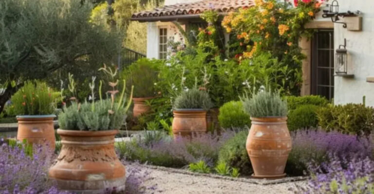
2. Jeremiah Brent: Pampas Grass Just Shouldn’t Exist
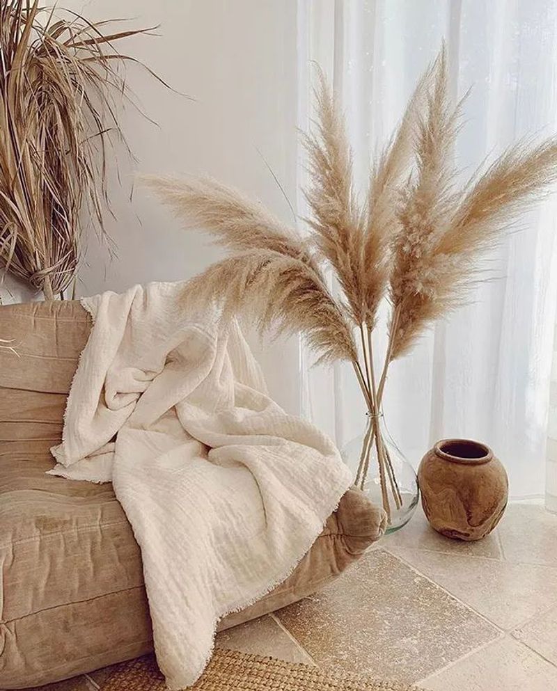
Once the darling of boho-inspired homes, pampas grass has officially lost its charm, at least according to Jeremiah Brent. He told Dream Baby Press he can’t stand it in any room of the house.
Originally popular in the 1970s for its airy, whimsical look, pampas grass just doesn’t cut it anymore. Instead, Brent recommends bringing in real plants.
A tree in your living room adds life and freshness, or for something easier, try a small succulent garden for a simple yet stylish upgrade.
3. Jonathan Scott: No More Mirror Walls
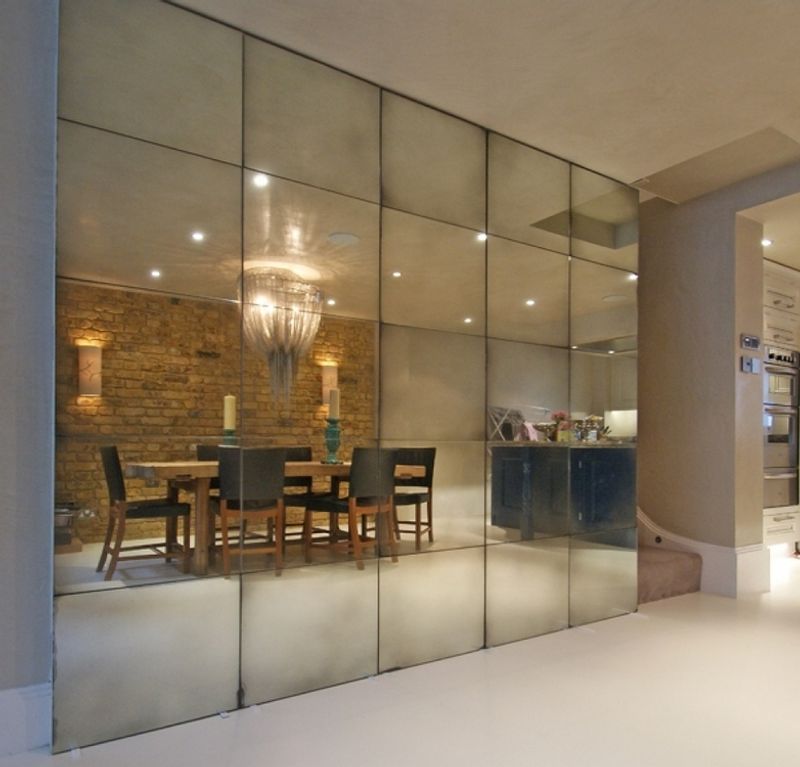
A big mirror can do wonders for checking your outfit or making a room feel airy and bright. But covering an entire wall with mirrors? That’s a dated look best left in the 1980s, according to Jonathan Scott.
Floor-to-ceiling mirrors make a space feel more like an old aerobics studio than a cozy living room. For a modern take, opt for a striking statement mirror instead.
Options like asymmetrical wall mirrors or full-length designs give you style and function without feeling stuck in the past.
4. Erin And Ben Napier: Get Rid Of Those Popcorn Ceilings
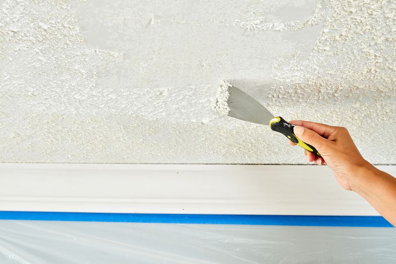
If you’ve ever scratched your head over why popcorn ceilings exist, you’re definitely not alone. Even Ben and Erin Napier can’t stand them, with Ben joking in a Facebook video that he hates popcorn in every form.
Popcorn ceilings took off after the 1950s as a quick way to hide ceiling flaws, but they’re now seen as outdated eyesores and can even pose asbestos risks.
Instead of scraping them flat, try adding warmth and texture with plaster finishes or wood paneling, like the Napiers’ beautiful lime-washed wood ceilings on “Home Town.”
5. The Property Brothers: Stay Away From Sunken Living Rooms
Sunken living rooms once stole the spotlight in home design, but they’ve proven to be more trouble than they’re worth.
Jonathan Scott joked on “Property Brothers: Forever Home” that they’re basically accident zones waiting to happen. Instead of lowering your floor and risking a costly remodel, try using an area rug to create the same cozy, defined space.
Jonathan and Drew suggest leaving 12 to 18 inches of floor between the rug and walls, which helps anchor your room beautifully without any of the dangers of sunken floors.
6. Erin Napier: Avoid Painting Wooden Furniture
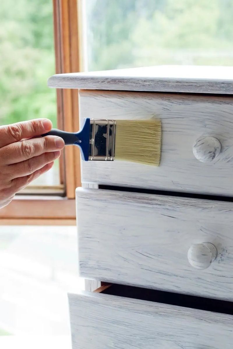
Erin Napier is passionate about the beauty of natural wood and hopes more people will embrace it instead of painting over vintage furniture.
She told PopSugar she loves seeing the unique patterns in wood grain, calling them a kind of art in themselves. If you enjoy thrifting or browsing Facebook Marketplace, Napier suggests enhancing the original wood finish.
Use a protective coat like Minwax Polycrylic for shine and durability, but first, strip away old paint and sand the surface smooth so you can fully appreciate the wood’s natural charm.
7. Nate Berkus: Formal Dining Rooms Don’t Always Work For Modern Living
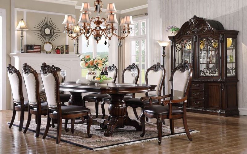
For many people today, the old-fashioned formality of a closed-off dining room doesn’t match how they actually live and gather.
On “The Nate and Jeremiah Home Project,” Nate Berkus tackled this by rethinking what a dining room could be. In one episode, he noted that a vintage home felt too stiff for modern life.
His team solved this by widening doorways to connect the dining area with the kitchen and living room, creating a flexible space perfect for both casual family meals and relaxed entertaining.
8. Jenn Todryk: Closed Floor Plans Don’t Always Have To Be Opened Up
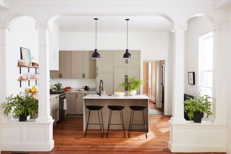
Open floor plans might be all the rage, but many older homes come with more defined layouts, and that’s not a bad thing.
Rather than rushing to tear down walls, designer Jennifer Todryk suggests embracing the original structure of your home. She told House Beautiful that people are starting to appreciate the charm of closed floor plans, which can preserve a home’s character and save on major renovation costs.
Plus, more walls mean more opportunities to hang art and personalize your space with unique gallery displays.
9. Joanna Gaines: Matchy-Matchy Interiors Can Hold You Back
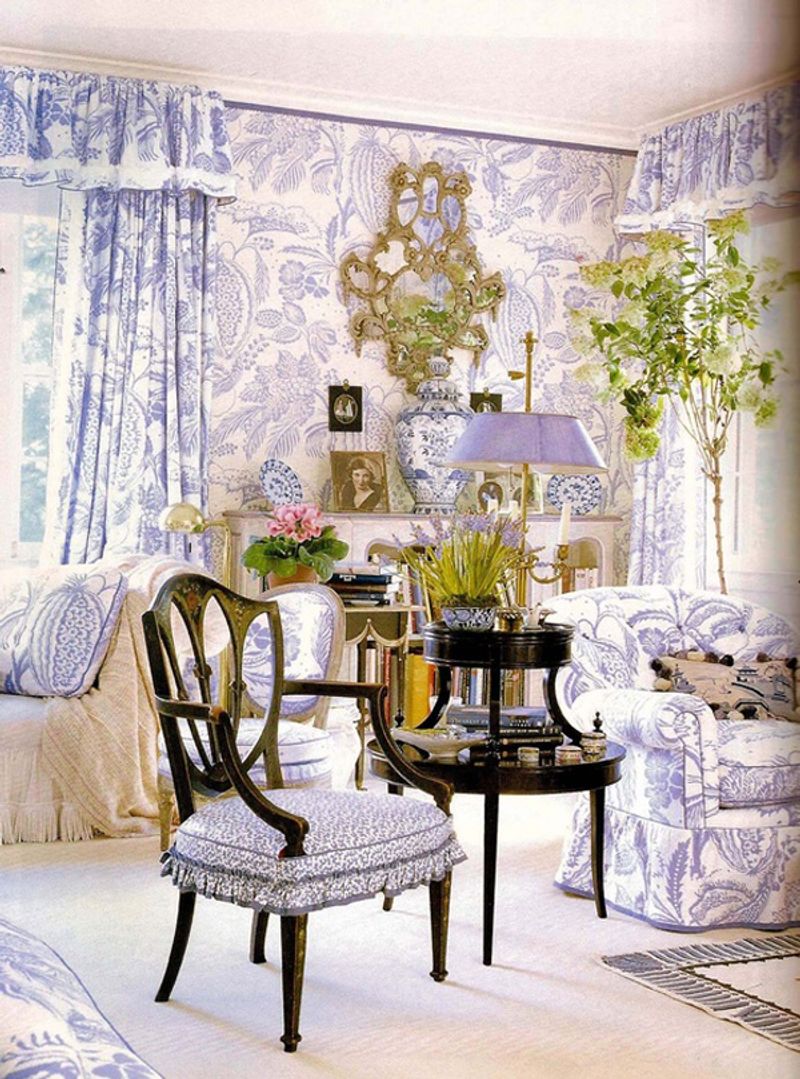
When you’re furnishing your home, it’s easy to think everything should match perfectly, but Joanna Gaines believes that approach can leave your space feeling more like a showroom than a cozy retreat.
She told Domino that mixing different styles and pieces you love creates a home that tells your unique story. Instead of sticking to one color scheme or buying a full matching set, try combining vintage finds with modern staples.
A leather sofa alongside a rustic coffee table and textured accent chairs can make your space feel collected, personal, and truly yours.
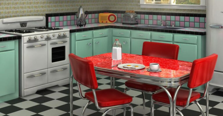
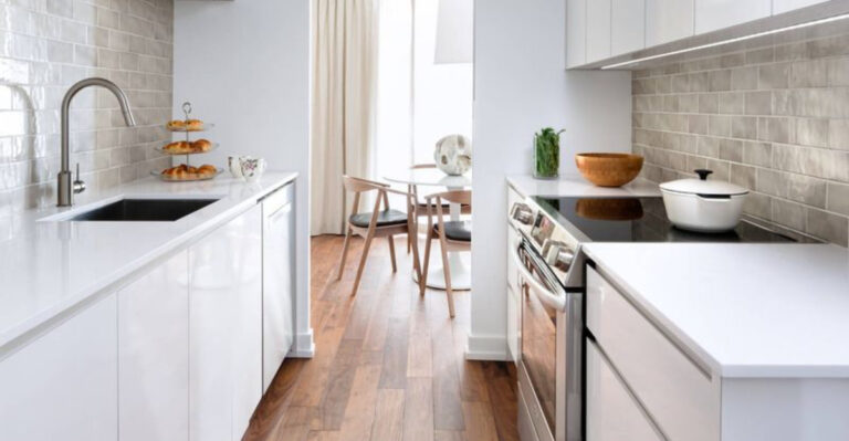
10. Christina Haack: No More Short Tile Backsplashes

In the early days of “Flip or Flop,” Christina Haack often paired colorful tile backsplashes with solid stone counters to give kitchens personality.
But on “Christina on the Coast,” she’s shifted toward a more streamlined look by extending the countertop material up the wall for a seamless stone backsplash.
She says this draws the eye upward and makes the space feel larger while showcasing beautiful veining. For a modern twist, consider using bookmatched slabs or running unique tiles like zellige all the way to the ceiling for added drama.