18 Times Interior Designers Completely Ignored Logic
I’ve always admired interior designers for their ability to turn dull rooms into dreamy spaces, but let’s be real, sometimes even the pros take a wild detour into what were they thinking? territory.
From carpeted bathrooms that give me chills just imagining the mildew, to kitchen layouts so awkward you’d think they were designed as a prank, these epic design fails remind us that creativity can sometimes go way off the rails.
Get ready to laugh, cringe, and maybe even breathe a sigh of relief knowing your own decorating missteps aren’t nearly this unforgettable.
1. Carpeted Bathroom Nightmares
Nothing says “I love mold” quite like wall-to-wall carpet in a bathroom. Yet somehow, designers occasionally think this moisture-trapping fabric floor covering belongs where water splashes daily.
Wet feet plus carpet equals a petri dish of bacteria. Not to mention the inevitable toothpaste stains and other bathroom spills that become permanent decorative elements.
The plush feeling between your toes comes with a side of fungus that no amount of cleaning can fully remove.
2. Shower Nonsense
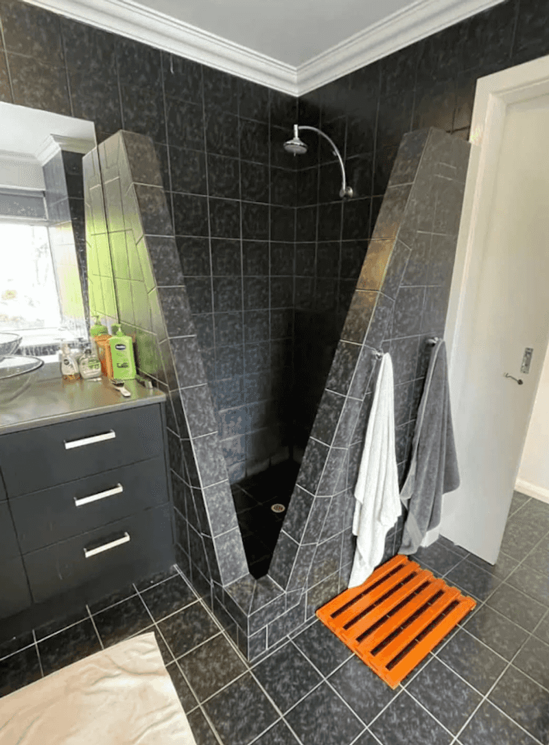
This shower design is wildly impractical, with its deep V-shaped entry that makes stepping in and out awkward and potentially dangerous, especially when wet.
The sharp angles reduce usable shower space, forcing you into a cramped corner to rinse off. Water is almost guaranteed to splash outside, soaking the surrounding floor and creating a slipping hazard.
Plus, cleaning those sharp, narrow edges would be a nightmare. Instead of a relaxing shower experience, this design turns daily routines into a constant hassle.
3. Transparent Bathroom Doors
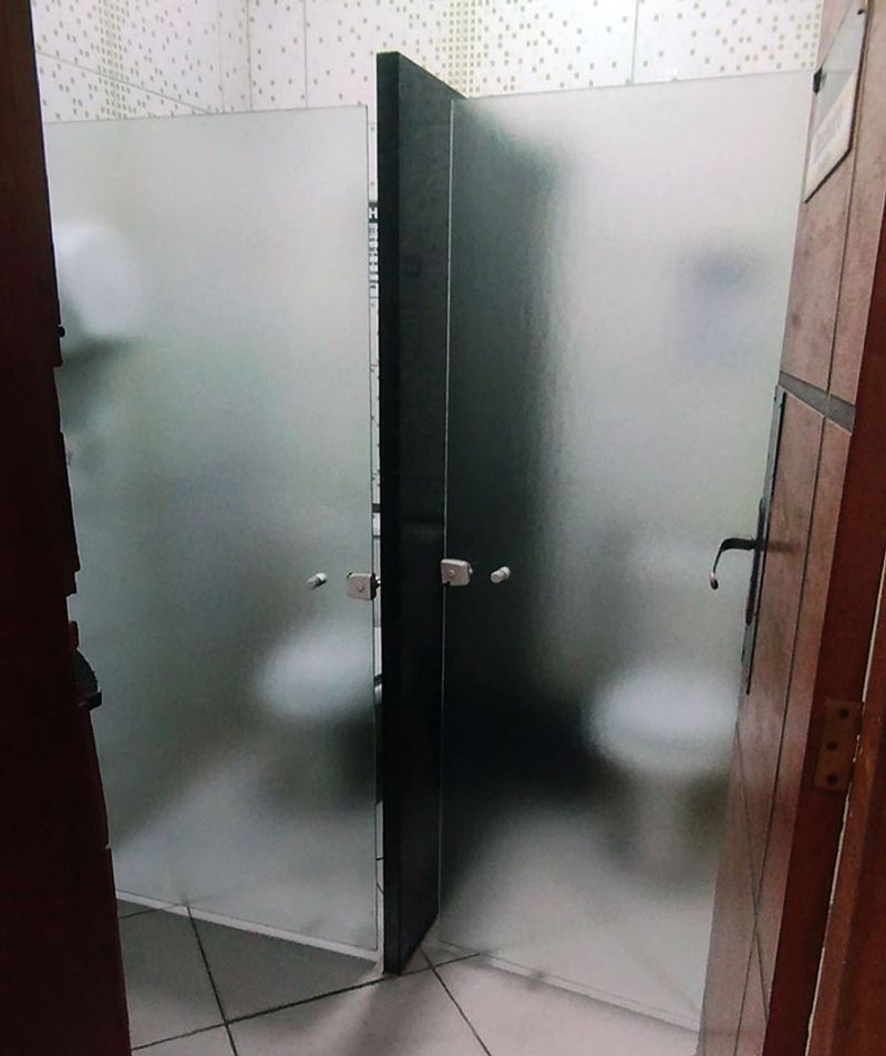
Privacy? Who needs it! Some designers install clear glass doors for bathrooms, turning private moments into potential public spectacles.
Nothing says “welcome to my home” like watching your dinner guests use the facilities. The trend reached peak absurdity when hotels began featuring see-through bathroom walls in bedrooms.
Imagine sharing a room with colleagues on a business trip with only a transparent barrier between you and their morning routine. Even couples appreciate boundaries when nature calls!
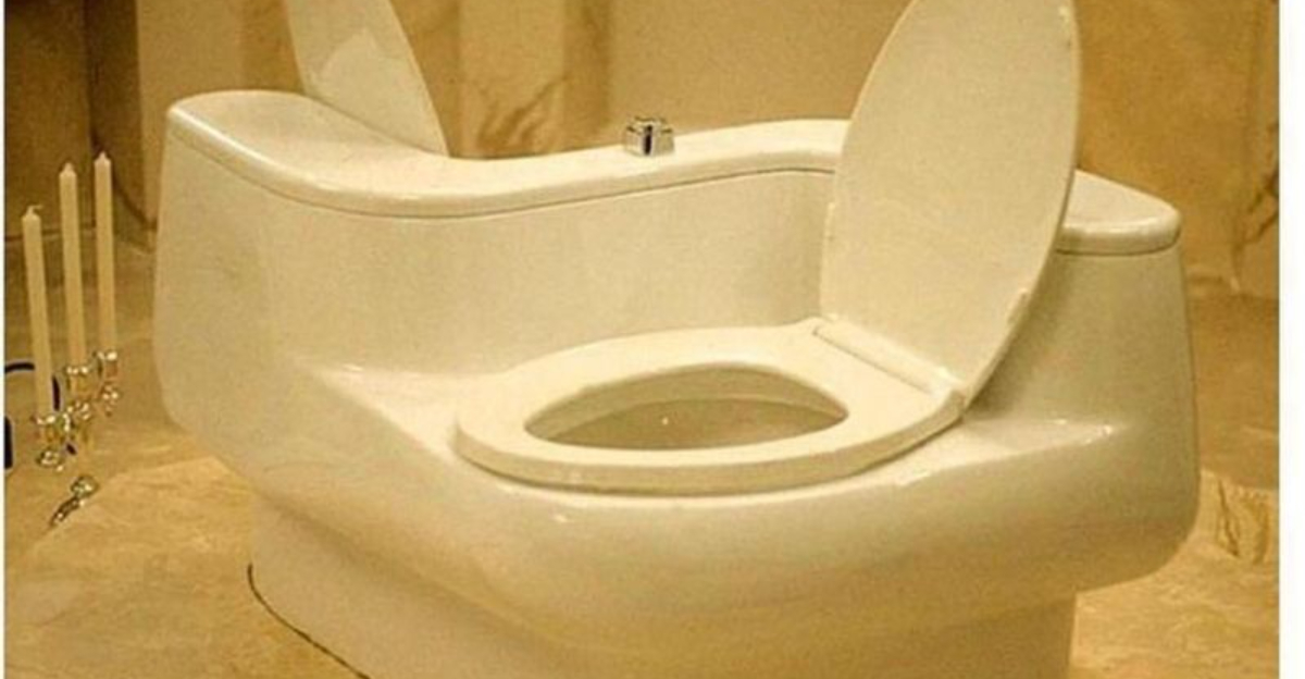
4. Overdoing The Toilet
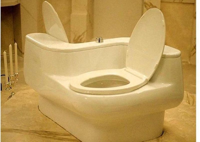
This double toilet design is offering zero privacy for what should be the most private activity in a home.
Sharing such an intimate moment with someone else is uncomfortable and unnecessary, turning a basic human need into an awkward experience. Cleaning around two seats and the odd shared base would also be a nightmare.
Plus, it takes up far more bathroom space than needed, making it inefficient and clunky in any residential setting where comfort and discretion are key.
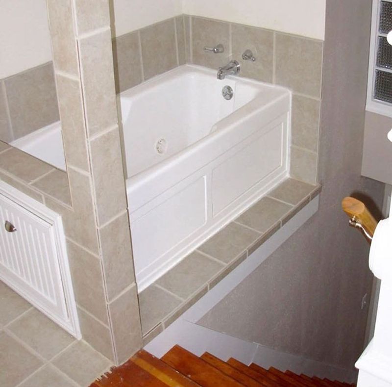
5. Stairs Without Railings
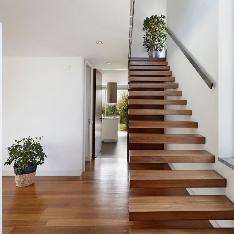
Minimalist design reaches dangerous territory when staircases lack handrails. These floating steps might look magazine-worthy, but they’re practically begging for accidents.
Children, elderly visitors, and anyone who enjoys having unbroken bones avoid these death traps. The clean lines and unobstructed views come with a hefty price tag of potential hospital visits.
Building codes exist for good reasons, but some designers view safety regulations as mere suggestions to ignore for aesthetic purity.
6. Fake Books As Decor
Nothing screams “I pretend to read” like shelves filled with color-coordinated book spines that don’t open. Designers sometimes fill entire walls with these literary props, creating the illusion of intelligence without the substance.
Books arranged by color rather than content transform literature into mere wallpaper. Even worse are those who buy books by the yard or hollow decorative tomes that hide storage.
Reading enthusiasts cringe at the thought of books selected solely for their spine color matching the throw pillows.
7. Unusable Tiny Sinks
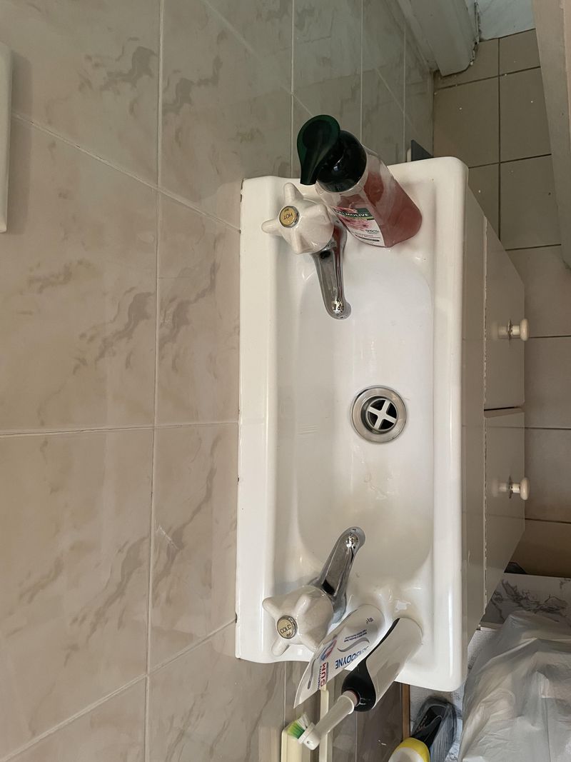
Powder room sinks the size of cereal bowls look adorable but create water disasters. These miniature basins splash water everywhere when you try washing hands larger than a child’s.
The trendy vessel sinks perched atop counters often measure mere inches across. Water cascades onto countertops, floors, and your clothing with every use.
Function sacrificed for form results in constant mopping and frustrated guests who just wanted to wash their hands without needing a change of clothes.
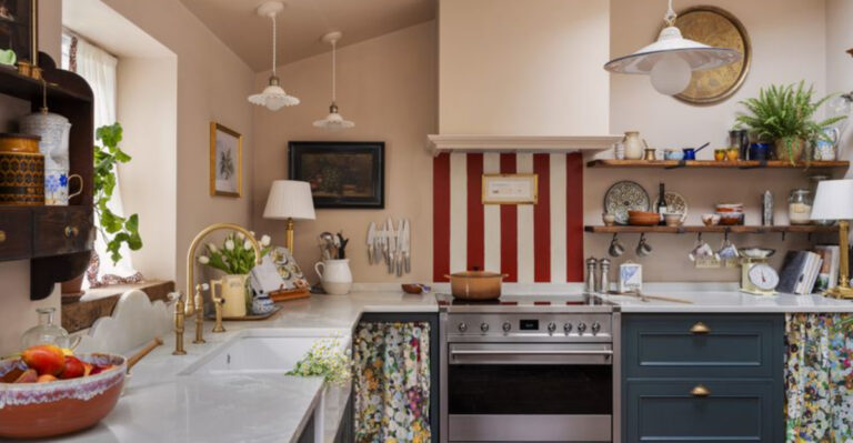
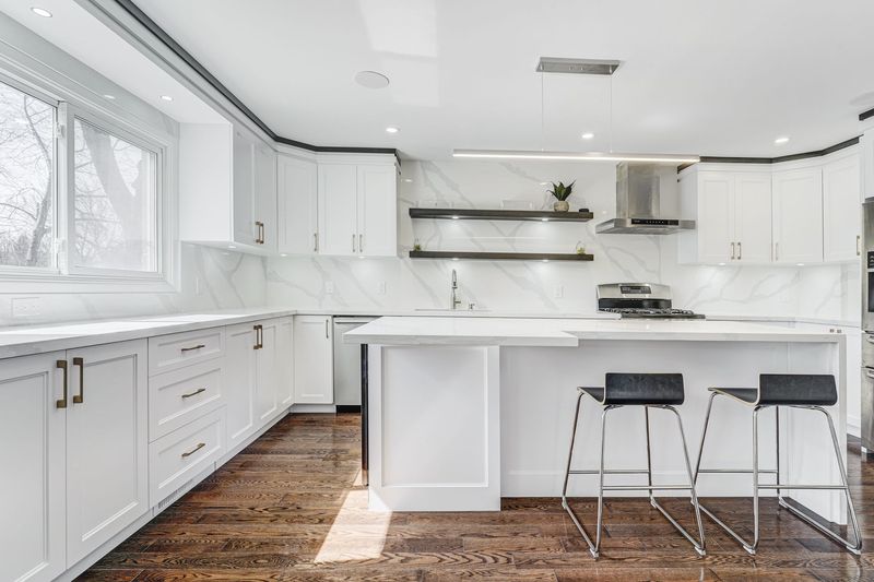
8. Crooked Kitchen
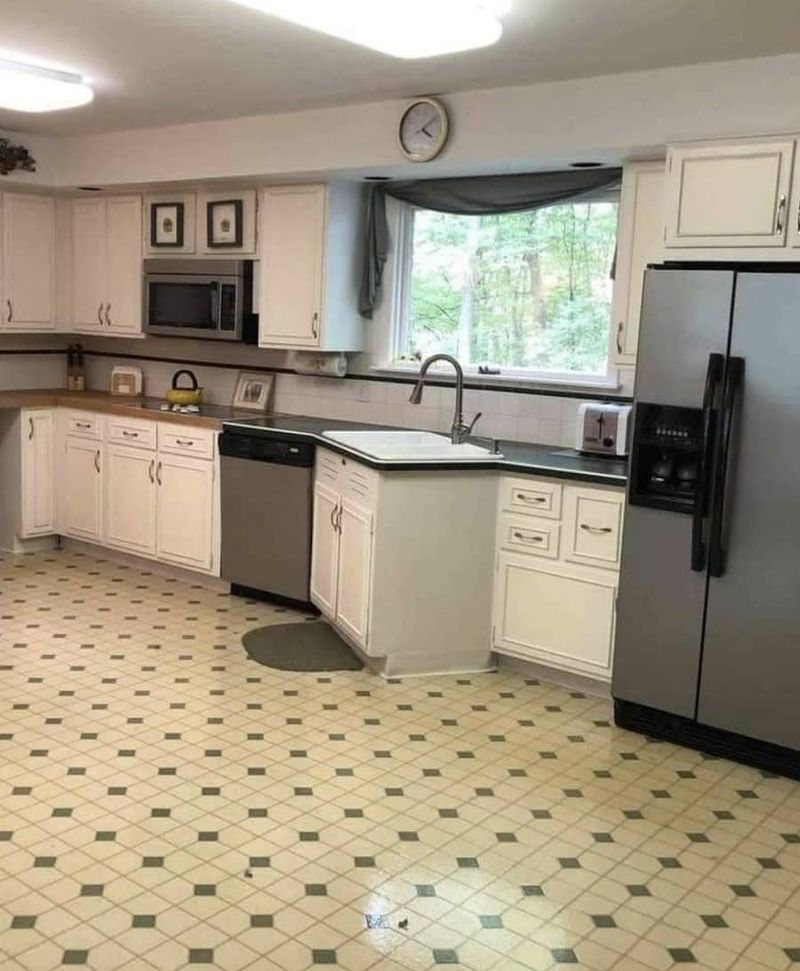
This kitchen layout is a recipe for frustration, with the sink awkwardly placed in a corner jutting out into the room, wasting valuable floor space and creating a clumsy traffic flow.
The sharp angle limits counter workspace and makes tasks like dishwashing uncomfortable. Plus, the odd placement near the dishwasher forces you to stand in a cramped spot, which could become a tripping hazard.
The poor design also disrupts the kitchen’s visual harmony, making the entire area look unbalanced and inefficient.
9. Chairs Nobody Can Sit On
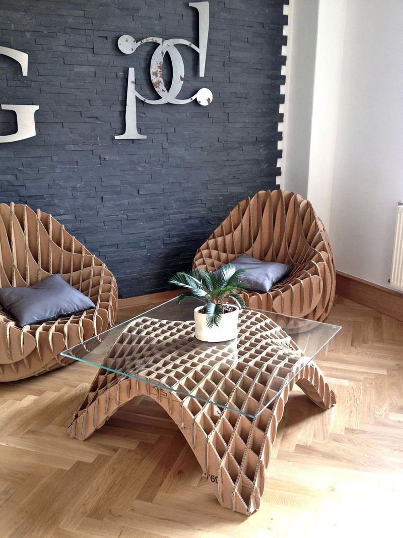
Art masquerading as furniture fills homes with seating that’s physically impossible to use comfortably. These sculptural pieces with jagged edges, precarious balancing acts, or materials that would collapse under human weight serve no practical purpose.
Guests hover awkwardly, unsure which chairs are for sitting versus admiring. The homeowner’s constant refrain becomes “Not that one!” whenever someone attempts to rest.
True furniture should support human bodies, not just human egos through avant-garde design statements that reject their primary function.
10. Chandelier Misplacement
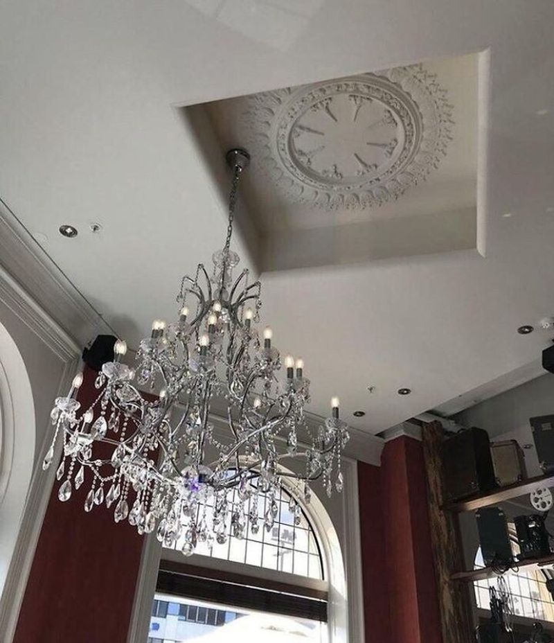
This ceiling design is a complete miss, with the ornate medallion awkwardly recessed and misaligned from the chandelier below.
Instead of elegantly framing the light fixture, the medallion is stranded off-center, making the entire setup look sloppy and unfinished. The gaping hole around the medallion also draws attention to the mistake, disrupting the ceiling’s flow and creating an eyesore.
What should be a grand, cohesive focal point ends up feeling like a careless afterthought that diminishes the room’s overall elegance.
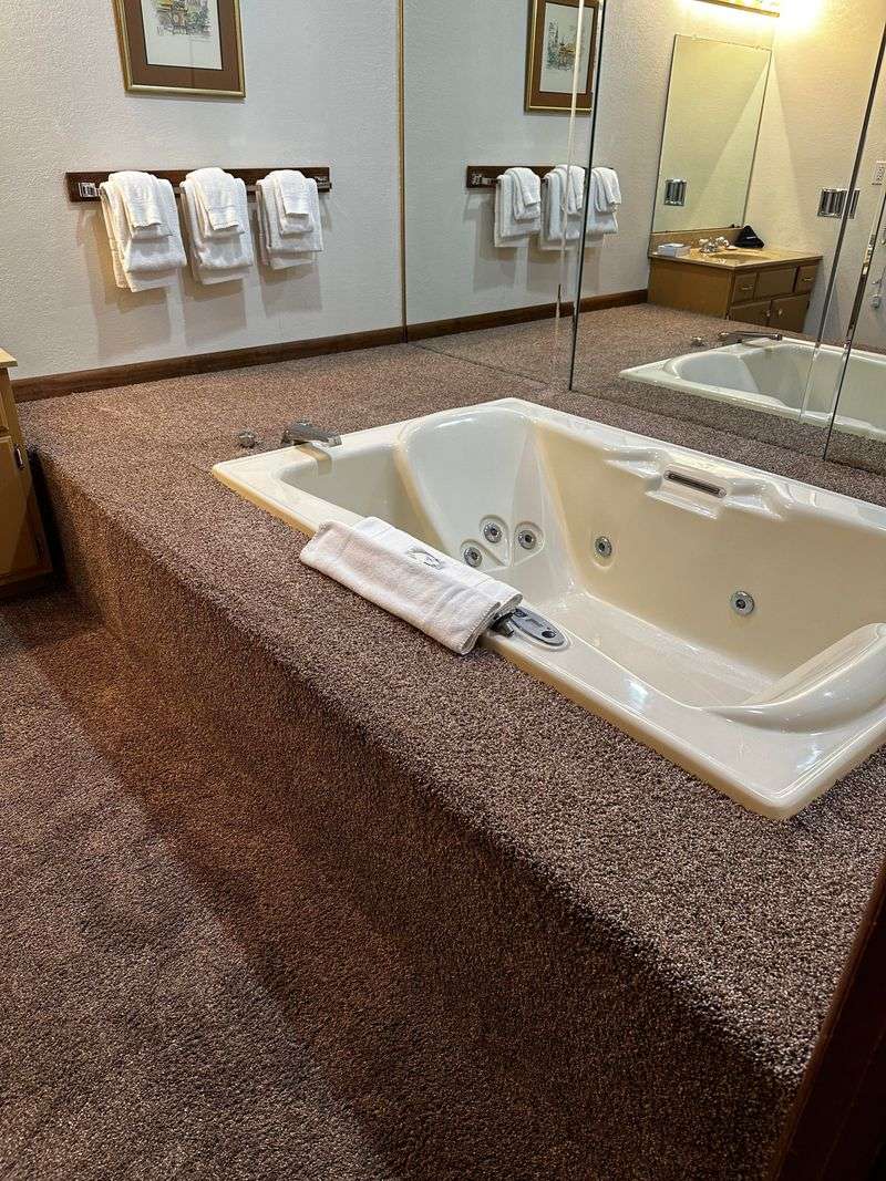
11. Bathtubs In Bedrooms
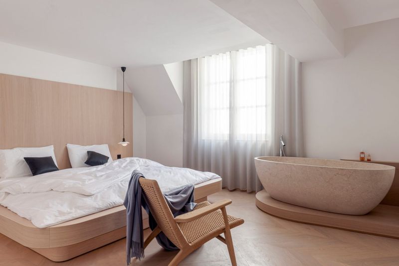
Luxury hotel designers started placing freestanding tubs in bedrooms, and home designers followed suit without considering humidity, splashing, or privacy. Nothing says romance like watching your partner brush their teeth while you’re trying to sleep.
These open-concept bathing arrangements create moisture problems for bedding, electronics, and furniture. The constant humidity can damage walls and promote mold growth.
Plus, most people prefer bathing without an audience, making these exhibitionist fixtures more awkward than luxurious.
12. Wallpaper In Shower Stalls
Some designers apparently believe regular wallpaper can withstand daily steam baths. These moisture magnets peel faster than sunburned skin at the beach.
Even “moisture-resistant” options eventually surrender to bathroom humidity. The resulting moldy, bubbling mess requires expensive removal and replacement.
The initial Instagram-worthy shower quickly transforms into a cautionary tale about materials appropriate for wet environments. Tile exists for a reason, but some designers insist on learning this lesson the expensive way.
13. Open Shelving For Everything
Displaying every mismatched mug and pot lid became trendy when designers decided cabinet doors were passé. Open kitchen shelving looks magazine-perfect until real cooking happens.
Grease particles settle on everything. Dust becomes a constant battle. The pressure to maintain display-worthy organization turns everyday living into a styling challenge.
Most homes aren’t showrooms, and most people appreciate hiding their unmatched Tupperware collection behind closed doors rather than curating their cereal boxes like museum exhibits.
14. Spots With No Access
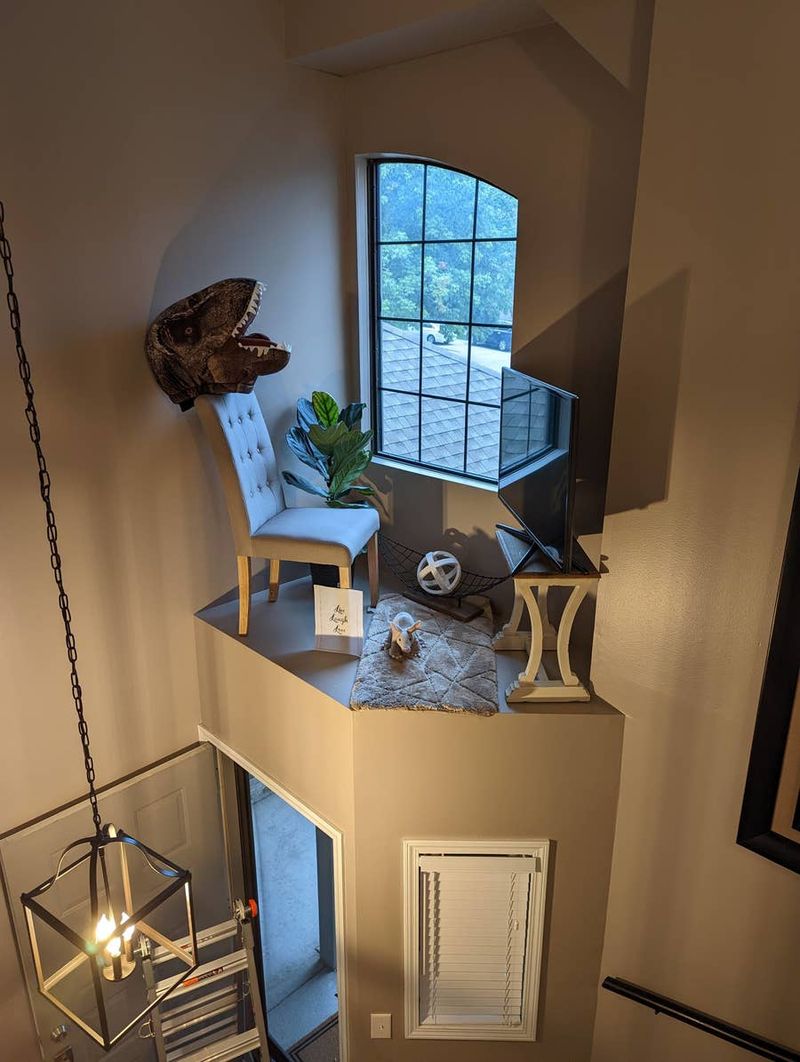
This bizarre loft setup is wildly impractical and unsafe, turning an awkward architectural ledge into a precarious “living space.”
With a chair, decor, and even a TV crammed onto a narrow platform high above the entryway, it’s both dangerous and uncomfortable. The lack of any railing makes it a serious fall hazard, especially if someone actually tried to sit or use the area.
Instead of adding charm, it creates a cluttered, confusing eyesore that looks more like a poorly staged display than a functional nook.
15. Fireplaces You Can’t Light
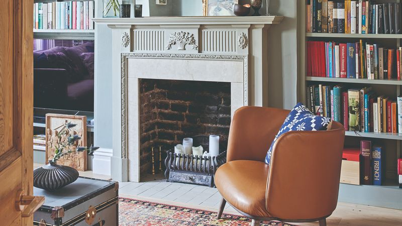
Decorative fireplaces filled with candles, books, plants, or art installations mock the very concept of warmth. These non-functional focal points tease with the promise of cozy fires but deliver only disappointment.
Some designers convert working fireplaces into purely aesthetic features, permanently blocking chimneys for displays. Others install electric or gas versions but fill them with decorative elements that would create infernos if ignited.
The primal satisfaction of a real fire gets sacrificed for a static visual that never delivers the crackling comfort we crave.
16. Outlets In Unreachable Places
Electrical planning sometimes takes a backseat to aesthetics, resulting in outlets hidden behind heavy furniture or placed in bizarre locations. Need to charge your phone? Just move that 300-pound bookcase!
Kitchen outlets installed far from countertops make appliance use an extension cord nightmare. Bedroom outlets positioned behind headboards require contortionist skills to access.
The designer’s desire to hide these necessary “eyesores” creates daily frustration for anyone trying to plug in a vacuum cleaner or laptop charger.
17. All-White Everything
The clinical all-white interior trend transforms homes into spaces that feel more like operating rooms than living environments. These sterile designs ignore the reality of children, pets, red wine, and tomato sauce.
White sofas become anxiety-inducing investments. White carpets require removing shoes, food, and possibly all bodily fluids at the door.
The pristine magazine look quickly becomes a spotty, stained reality unless the homeowners avoid actually living in their space. Practical colors exist for good reasons beyond boring design sensibilities.
18. Doorless Bathroom Designs
Open-concept fever reached its illogical conclusion with doorless bathroom designs. These privacy-free zones bring family togetherness to uncomfortable new levels.
Some designs feature toilets visible from dining areas or entrances without any visual barrier. Others remove shower doors, creating splash zones that extend well beyond the bathroom.
The concept ignores basic human dignity and the universal desire for private bathroom moments. No amount of architectural sophistication justifies exposing guests to your toilet activities.