15 Design Elements That Instantly Reveal An Amateur Decorator (Plus 5 Even Worse Design Elements)
I can’t count how many times I’ve walked into a space and thought, Oh no… someone really tried their best here. And hey, I’ve been guilty of the same thing.
Interior design seems easy until you’re standing in a room that somehow feels both bare and busy at the same time. The truth is, even with the best intentions, it’s easy to fall into those classic amateur traps.
But the good news? They’re fixable. Here are rookie design mistakes that give rooms that awkward vibe, and how to avoid them like a pro.
1. Matching Furniture Sets
Nothing screams “I bought everything from the same showroom display” like perfectly matched furniture sets. Those identical end tables, coffee table, and entertainment center create a showroom vibe rather than a lived-in home.
Professional decorators mix complementary pieces that share elements but aren’t carbon copies of each other. Try pairing that wooden coffee table with metal end tables or vice versa. Your space will instantly feel more thoughtful and collected over time.
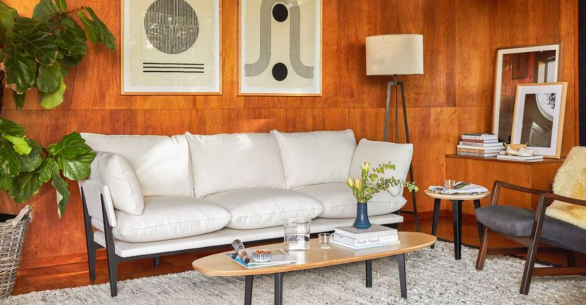
2. Pushed-Back Furniture
Rookie decorators love shoving every piece of furniture against walls, creating a weird dance floor in the middle of the room. This awkward arrangement makes conversation difficult and spaces feel disconnected.
Pull that sofa away from the wall! Create conversation areas where people can actually talk without shouting.
A floating sofa with a console table behind it adds depth. Even a few inches of breathing room between furniture and walls can transform a room’s feel.
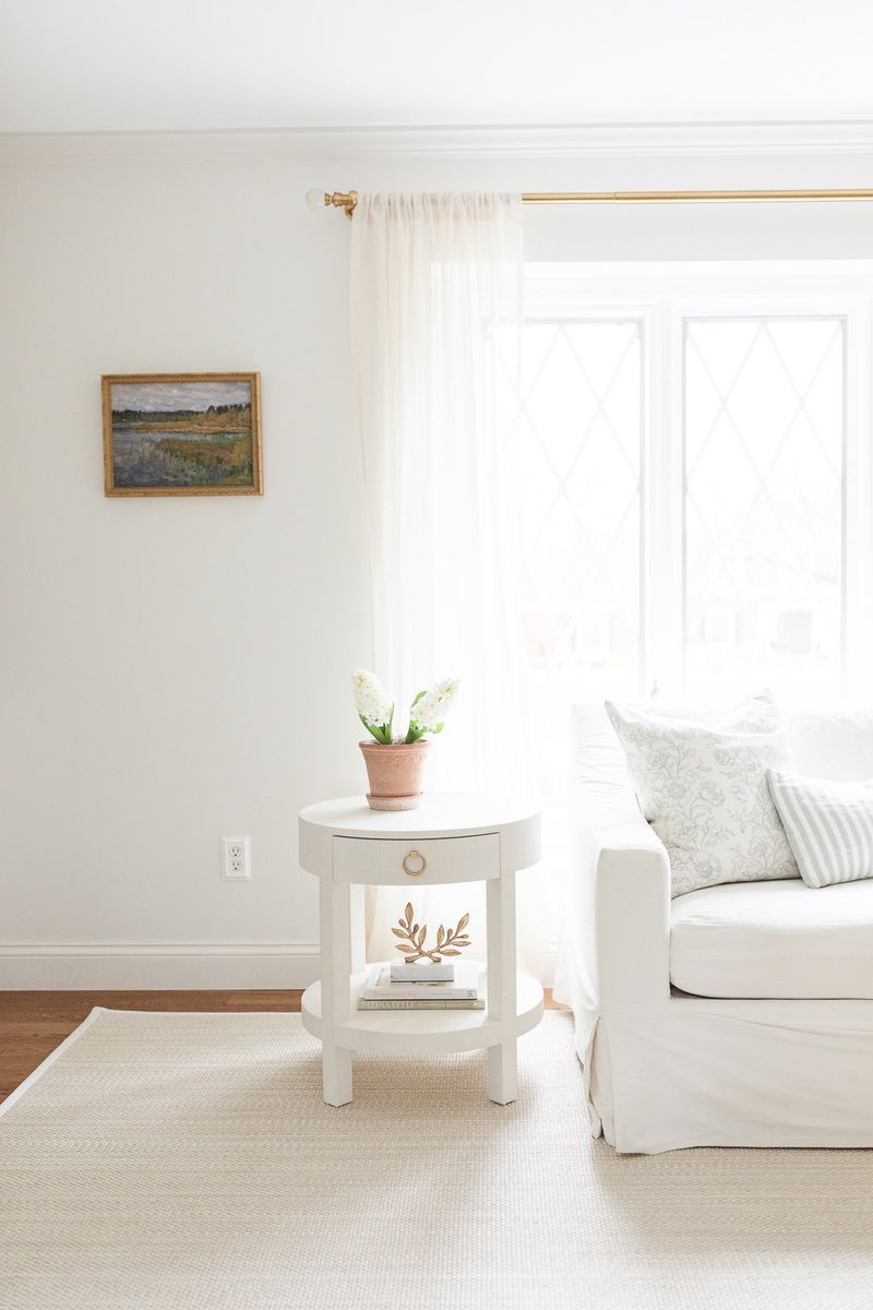
3. Too-Small Rugs
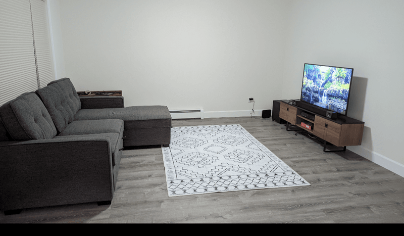
A postage-stamp rug floating in the middle of a room is basically wearing pants that are too short. It makes everything look off-balance and disconnected.
Rugs should be large enough for furniture legs to rest on them. In living rooms, at least the front legs of all seating should touch the rug.
In bedrooms, the rug should extend beyond the sides of the bed.
When in doubt, go bigger! A generous rug anchors the space and creates visual cohesion.
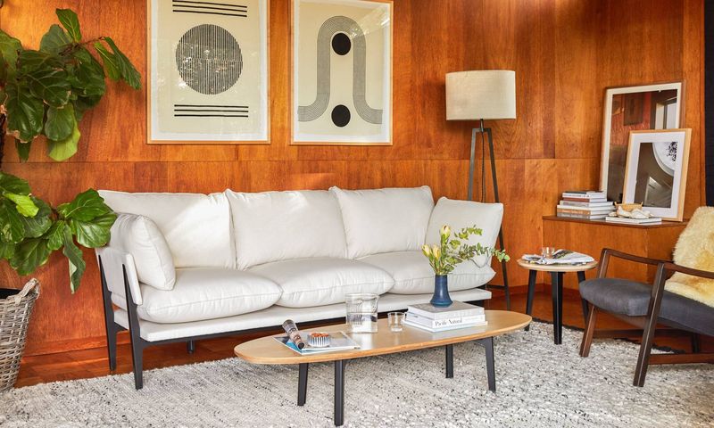
4. Wall Art Hung Too High
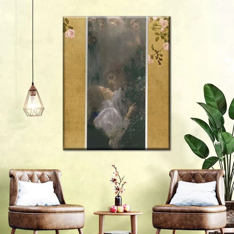
The mysterious case of the floating artwork! Amateur decorators often hang pictures at eye level while standing, creating disconnected walls where art hovers near the ceiling.
The pros follow a simple rule: hang art at eye level when seated, roughly 57-60 inches from the floor to the center of the piece. This creates visual harmony and actually allows people to see the details.
Group smaller pieces together to create impact rather than scattering tiny frames around the room.
5. Outdated Word Art
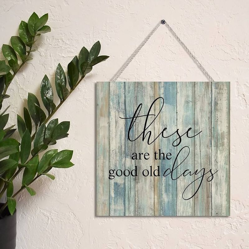
“Live, Laugh, Love” walked so “Gather” could run. Those mass-produced word signs from big box stores instantly broadcast “I don’t know how to decorate.”
They’re the decorating equivalent of using Comic Sans on your resume. Instead of telling guests to “Eat” in your kitchen (they know!), try personal photographs, vintage finds, or actual artwork.
Something with meaning beats generic platitudes every time. If words are your thing, try a framed quote that’s actually meaningful to you.
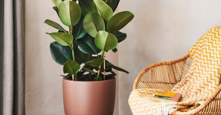
6. Fake Plants That Collect Dust
Those dusty silk flowers from 1995 aren’t fooling anyone. Faded, obviously fake plants with visible plastic stems scream novice decorator faster than you can say “artificial ficus.”
If you can’t keep real plants alive, today’s high-quality faux options look surprisingly realistic. Or embrace plant-free decorating!
A beautiful bowl, sculptural object, or stack of books works wonderfully where you might have plunked a sad fake plant. Just promise me you’ll dust whatever you choose.
7. All-White Everything
The all-white room isn’t minimalist—it’s a missed opportunity! Amateur decorators often fear color so much they create spaces that feel like unfinished 3D renderings or sterile doctor’s offices.
Even neutral lovers need texture and contrast. Layer in natural materials like wood, rattan, or stone. Add depth with different shades of the same color.
Introduce small pops of color through accessories that can easily be changed. Remember: even the most luxurious white spaces include contrast and texture to avoid looking flat.
8. Exposed Electrical Cords
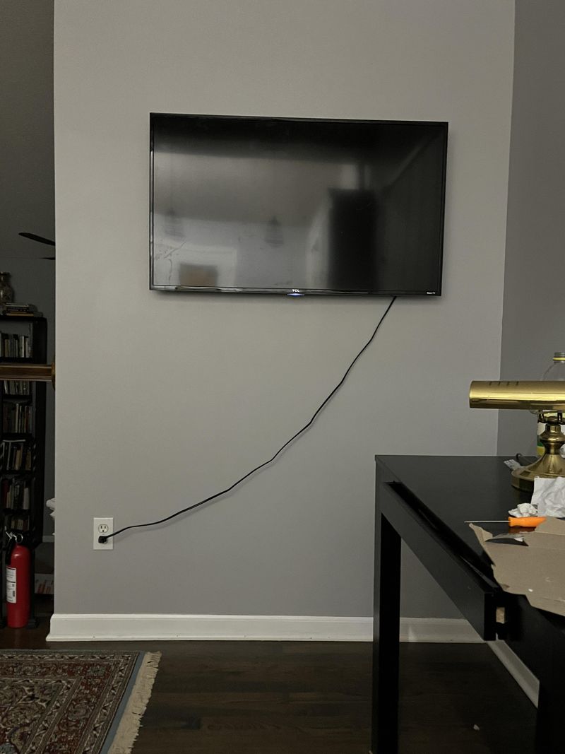
TV cords dangling like vines and lamp wires snaking across floors aren’t “industrial chic”—they’re just messy. This oversight immediately signals a decorator who hasn’t considered the finishing touches.
Cord covers, cord channels that can be painted to match walls, or strategic furniture placement can hide these eyesores. Cord management clips keep things tidy behind desks and entertainment centers.
For lamps far from outlets, consider having an electrician install a floor outlet or run wires under rugs with proper cord protectors.
9. Poorly Scaled Lighting
The tiny table lamp perched on a massive console table looks like a child playing dress-up in adult clothes. Scale matters, folks! Undersized lighting makes spaces feel unbalanced and awkward.
Table lamps should be proportional to the surfaces they sit on. Pendant lights should relate to table size—a small pendant over a large dining table looks stingy and provides inadequate light.
For ceiling fixtures, measure your room before shopping. Generally, add the room’s length and width in feet, then convert to inches for your ideal fixture diameter.
10. Furniture Blocking Pathways
Obstacle course living isn’t trendy! When you have to sidestep, shimmy, or hurdle furniture just to cross a room, you’ve got a flow problem on your hands.
Leave at least 30-36 inches for major walkways through rooms. Consider how doors swing open and where people naturally move. Draw a floor plan before arranging furniture to visualize traffic patterns.
Remember that the shortest distance between two points is a straight line—and your guests will want to take that line whether your furniture allows it or not!
11. Bathroom Rug Carpet Sets
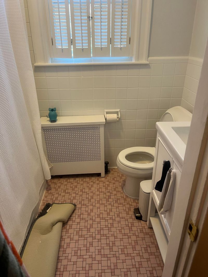
Those matching fuzzy toilet lid covers and contour rugs are the mullets of home decor—they should have stayed in the past. Nothing says “my grandma decorated this bathroom” quite like the toilet wearing a sweater.
Modern bathrooms feature a single bath mat or runner that complements the overall design. Natural materials like cotton or bamboo offer absorbency without the dated look.
If you’re feeling fancy, Turkish and Persian-style bath mats bring pattern and color while maintaining sophistication. Your toilet doesn’t need its own outfit!
12. Themes Taken Too Far
Your beach-themed bathroom with seashell soap dishes, lighthouse wallpaper, and towels embroidered with “BEACH” doesn’t transport guests to the ocean—it drowns them in kitsch. Thematic overuse is a classic amateur move.
Subtle nods work better than all-out theme parks. For a beach vibe, try blue walls, natural textures, and maybe one tasteful coral sculpture. The goal is suggestion, not screaming.
Professional spaces reference themes through color palettes and textures rather than literal objects plastered with obvious motifs.
13. Curtains Hung Too Low
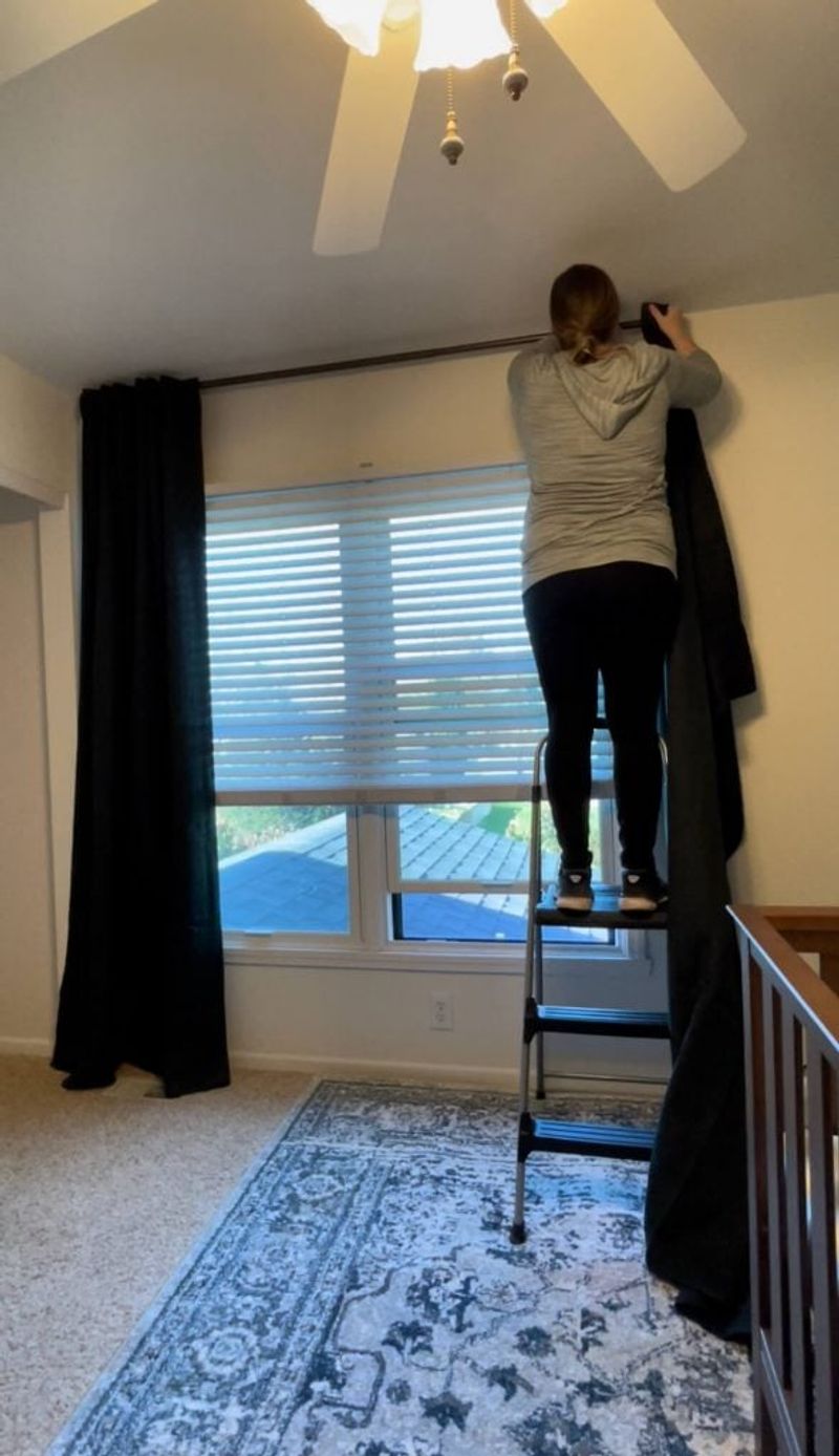
Short curtains hovering above window frames are wearing high-water pants and nobody’s impressed. This common mistake makes ceilings appear lower and windows smaller than they actually are.
Mount curtain rods 4-6 inches above window frames and extend them 8-12 inches beyond the sides. This simple trick makes windows appear larger and ceilings higher.
Curtains should either lightly kiss the floor or puddle slightly—never float awkwardly above it. This one change can transform a room more dramatically than almost any other decorating move!
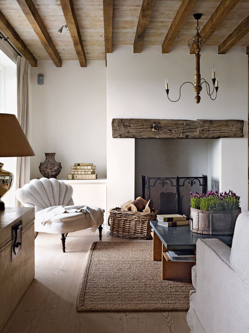
14. Accent Walls Without Purpose
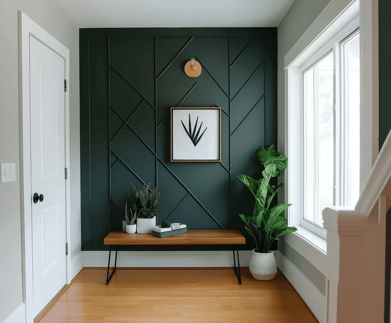
Random burgundy walls attacking innocent living rooms! Amateur decorators often create accent walls without considering which wall deserves emphasis or how it relates to the room’s architecture.
The pros choose walls with architectural significance—perhaps the fireplace wall or the headboard wall in a bedroom. Color should highlight something worth noticing, not just exist for its own sake.
If you’re doing an accent wall, make sure it’s the natural focal point of the room. Otherwise, you’re just painting yourself into a corner, design-wise!
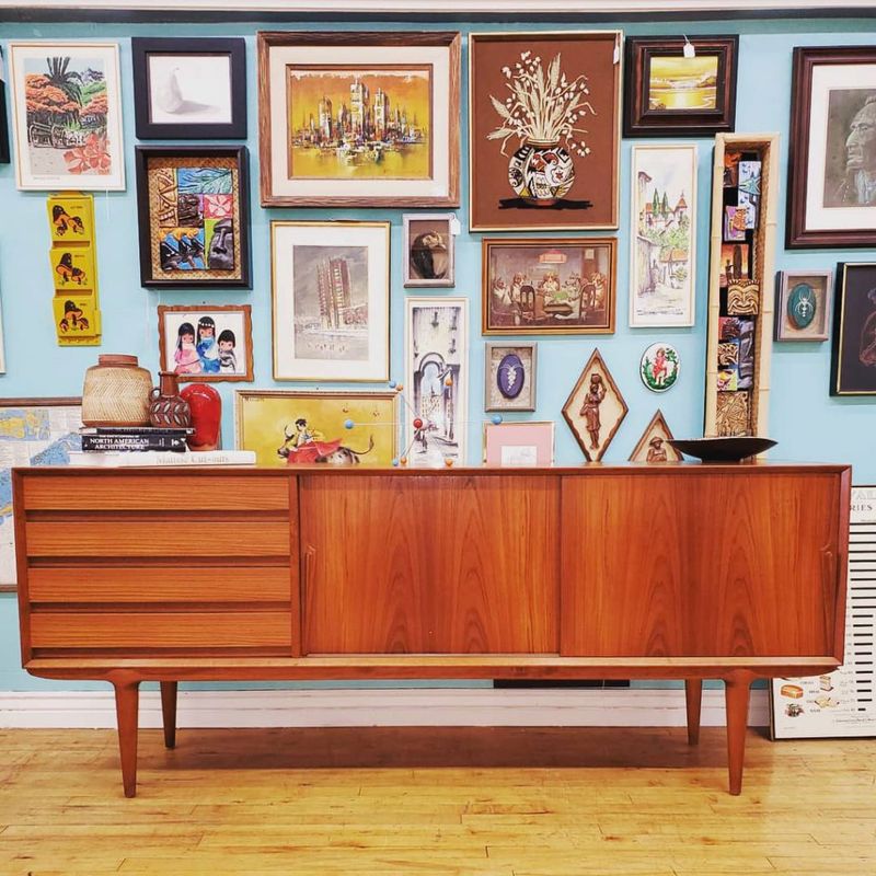
15. Mismatched Wood Tones
Six different wood finishes playing musical chairs in one room creates visual chaos. The oak floors fight with cherry tables while maple cabinets and walnut chairs join the brawl.
Wood tones don’t need to match exactly, but they should be intentionally coordinated. Choose woods with similar undertones—warm with warm, cool with cool. Limit yourself to 2-3 wood tones per room for a collected but cohesive look.
When mixing woods, create balance by repeating each tone at least twice throughout the space.
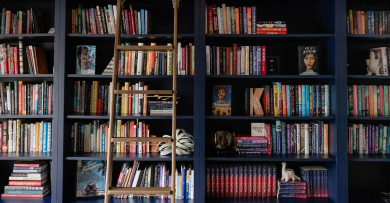
16. Pushed-Together Collections
Your precious figurine army isn’t making a design statement—it’s just creating a dusting nightmare. Amateur decorators often display collections by cramming everything together on one shelf, creating visual clutter rather than impact.
Collections shine when curated and given breathing room. Group similar items in odd numbers with varying heights. Consider displaying only part of a collection and rotating pieces seasonally.
The most sophisticated approach? Mount shelves specifically sized for your collection, allowing each piece to be appreciated individually while creating a cohesive display.
17. The Floating Furniture Island
Picture this: a lonely sofa and loveseat facing each other across a coffee table, floating in the middle of a vast room with nothing anchoring them to the walls or architecture. It’s the furniture equivalent of being stranded at sea!
Even floating furniture arrangements need grounding elements. Add a console table behind the sofa, flank the arrangement with floor lamps, or anchor it with a substantial area rug.
Large rooms might need multiple seating arrangements rather than one island lost in a sea of empty floor space.
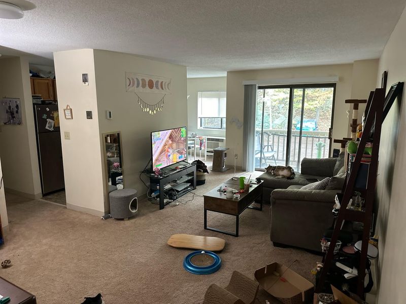
18. TV As Room Centerpiece
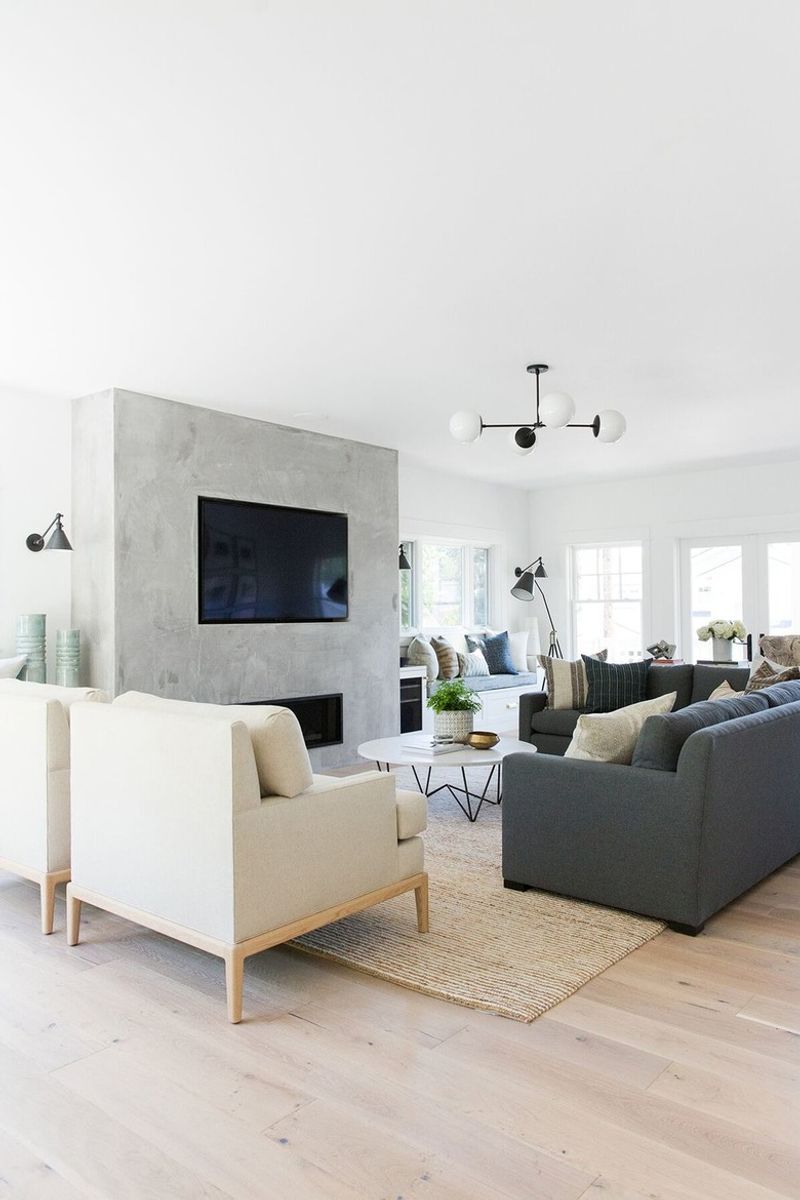
Arranging your entire living room like a movie theater with every seat pointed at the TV screams “I care more about Netflix than conversation.” The black void becomes the room’s focal point even when turned off.
Professional designers create rooms where conversation flows naturally, with the TV as a secondary element. Consider a layout where seating faces each other with the TV positioned to the side or in a built-in that minimizes its presence.
If the TV must be central, balance it with art, shelving, or architectural elements.
19. Refrigerator Magnet Gallery
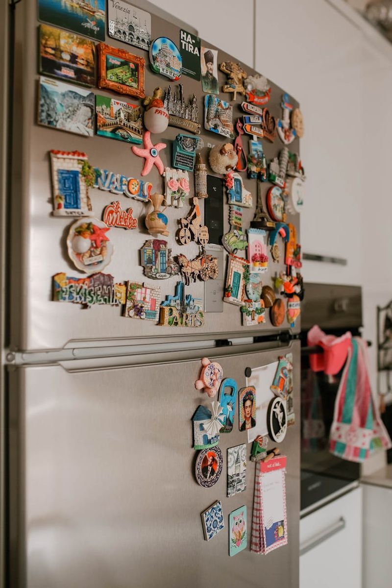
Your fridge isn’t an art gallery, vision board, or family photo album! Covering every square inch with magnets, children’s artwork, and expired coupons creates visual chaos in what might otherwise be a lovely kitchen.
If you must display items on your refrigerator, curate them thoughtfully. Consider a small magnetic board elsewhere for rotating children’s artwork or important reminders.
Modern kitchens treat appliances as clean, uncluttered surfaces that contribute to a sense of order rather than visual noise. Your takeout menus can live in a drawer!
20. Ignoring Scale In Art Selection
The tiny 8×10 frame floating in the middle of a massive wall looks like it’s being swallowed by quicksand. Scale is everything when it comes to wall art, and this mistake instantly broadcasts decorating inexperience.
Large walls need large art—or thoughtfully arranged gallery collections that function as one large piece. As a general rule, art should take up about two-thirds to three-quarters of the available wall space above furniture.
When in doubt, go bigger! Undersized art looks timid and creates awkward negative space.