The 10 Most Iconic Color Combinations That Always Work In Living Rooms (Plus 7 Combinations To Avoid)
I’ve learned the hard way that the wrong color combo can make even the nicest furniture look off. Picking colors for your living room isn’t just about what’s trendy, it’s about how everything feels together.
The right pairing can instantly make a space feel warm, balanced, and inviting. The wrong one? It’ll have you side-eyeing your walls every time you walk in.
I’ve been down that rabbit hole of paint chips and Pinterest boards, and it turns out, some combos just work. If you’re ready to make your living room feel like it finally fits, this guide will save you some guesswork.
1. Navy Blue And Crisp White
Picture walking into a room that feels like a breath of fresh ocean air. Navy and white create that perfect balance between cozy and clean.
This combo works because navy adds depth without being too heavy, while white keeps everything feeling open. Your guests will think you hired a professional decorator.
Plus, you can throw in almost any accent color and it’ll look intentional. Red pillows for patriotic vibes, yellow for sunshine, or coral for beachy feels.
2. Warm Gray And Soft Cream
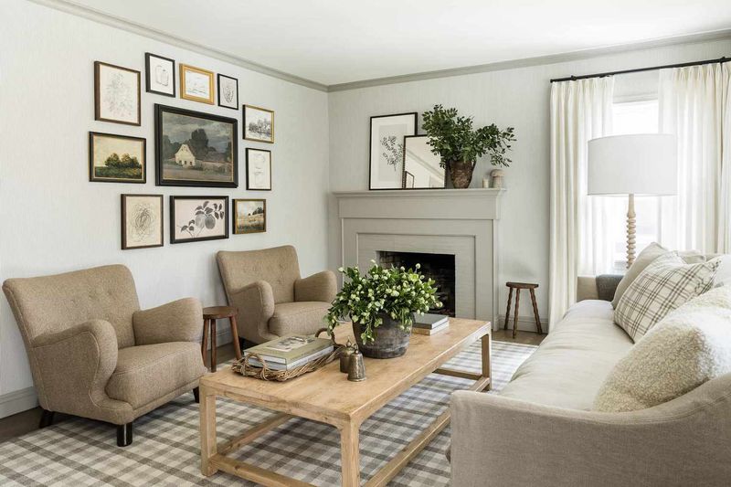
Forget boring beige forever because gray and cream are the new power couple in town. This pairing gives you all the neutral goodness without putting anyone to sleep.
Gray brings just enough coolness to keep things modern. Cream adds warmth so your space doesn’t feel like a doctor’s office waiting room.
The best part? You can layer in textures like crazy and everything still looks pulled together. Chunky knit throws, velvet cushions, whatever makes you happy.
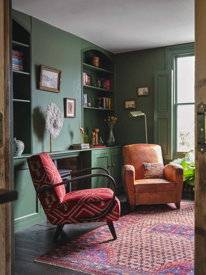
3. Forest Green And Natural Wood Tones
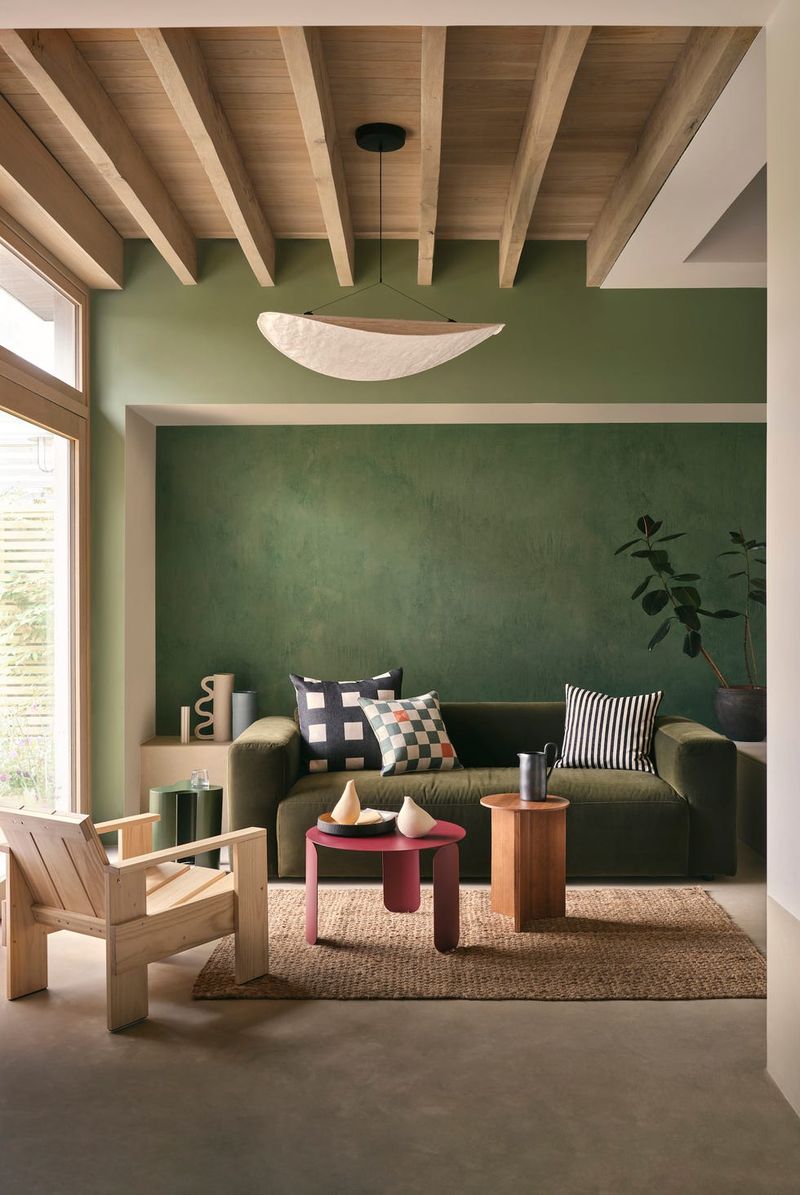
Mother Nature called and she wants her color scheme back. Green and wood tones create that perfect indoor forest vibe without any camping required.
Forest green feels rich and grounding, especially when you pair it with warm oak or walnut finishes. Your living room becomes an instant retreat from the crazy world outside.
Add some real plants and you’ve got yourself a mini jungle. Just don’t blame us when you start talking to your houseplants like old friends.
4. Dusty Rose And Charcoal Gray
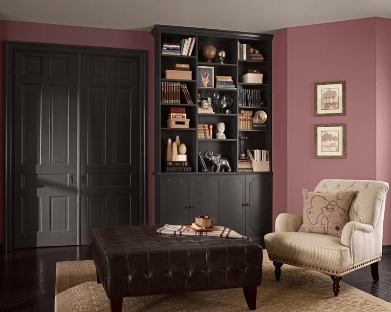
Who says pink can’t be grown up? Dusty rose paired with charcoal creates a combo that’s both romantic and totally sophisticated.
The gray keeps the pink from feeling too sweet or childish. Meanwhile, the rose softens the gray so your room doesn’t look like a storm cloud moved in permanently.
This works especially well if you love having fresh flowers around. Your real blooms will look like they were planned as part of the decor scheme all along.
5. Burnt Orange And Deep Teal
Ready for some serious color drama? Orange and teal are opposites on the color wheel, which means they create instant visual excitement when paired together.
Burnt orange brings warmth and energy without being too loud. Deep teal adds richness and keeps the orange from overwhelming your eyeballs.
This combo works best when you commit fully. Go big with one color on the walls and use the other for major furniture pieces. Half measures won’t cut it here.
6. Sage Green And Warm Beige
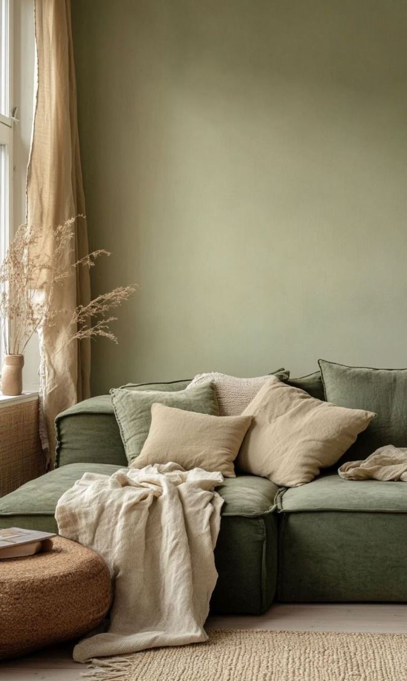
Sometimes you need a color combo that feels like a warm hug from your favorite aunt. Sage and beige deliver that comforting, lived-in feeling perfectly.
Sage green has this magical ability to make any room feel instantly calmer. Beige keeps things grounded and adds just enough warmth to prevent that cold, clinical look.
This pairing loves natural textures, so pile on the woven baskets, jute rugs, and linen curtains. Your stress levels will thank you later.
7. Midnight Black And Pure White
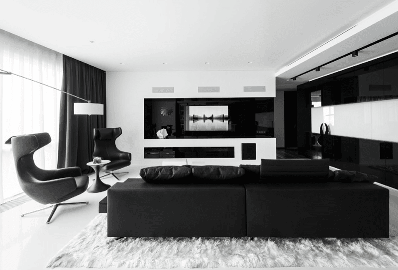
Nothing says drama quite like the ultimate contrast combo. Black and white together create a look that’s both classic and totally modern at the same time.
Black adds instant sophistication and makes everything else pop. White keeps the space from feeling like a cave and adds that clean, fresh feeling everyone craves.
The trick is getting the balance right. Too much black and you’re living in a dungeon. Too much white and it feels like a hospital. Aim for about 60-40 either way.
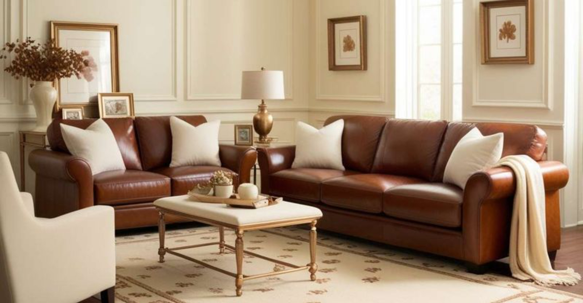
8. Caramel Brown And Ivory White
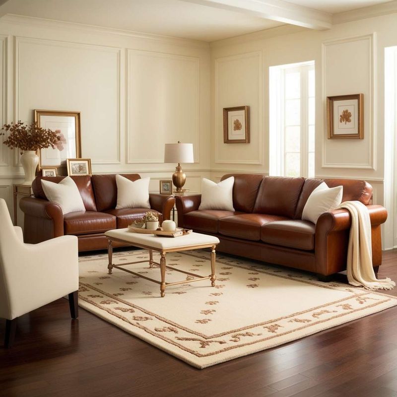
Coffee lovers, this one’s for you. Caramel and ivory create that perfect latte-inspired palette that feels both rich and comforting.
Caramel brown brings warmth without being too heavy or dark. Ivory adds lightness while still feeling warmer than stark white.
This combo practically begs for leather furniture and wooden accents. Think cozy cabin meets city apartment, where you can curl up with a good book and forget the world exists outside.
9. Soft Lavender And Light Gray
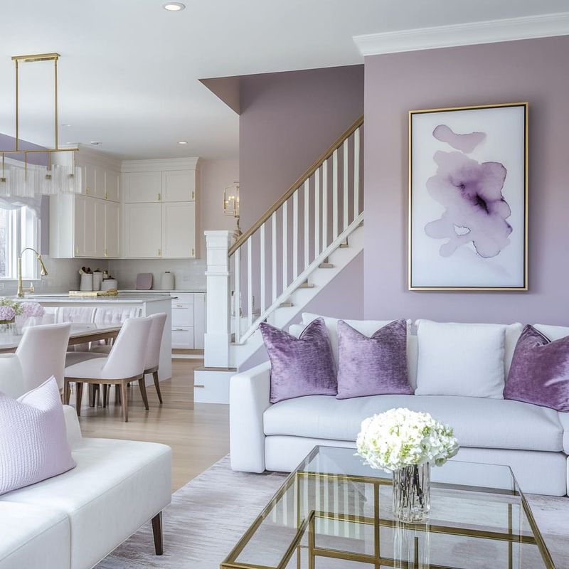
Purple doesn’t have to scream royalty to make an impact. Soft lavender with light gray creates a dreamy, peaceful vibe that’s perfect for unwinding after long days.
Lavender adds just enough color to keep things interesting without overwhelming your senses. Light gray provides the perfect neutral backdrop that lets the purple shine.
This combination works beautifully in rooms with lots of natural light. The colors seem to glow and shift throughout the day, creating different moods from morning to evening.
10. Terracotta And Cream
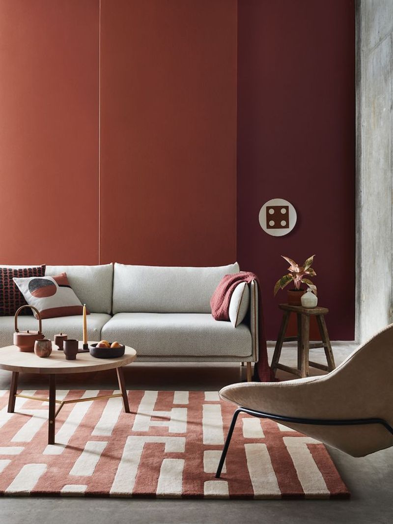
Channel your inner desert dweller with this earthy, sun-baked combination. Terracotta and cream bring that warm, southwestern charm without requiring a move to Arizona.
Terracotta adds richness and warmth that feels both ancient and totally current. Cream softens the intensity and keeps the space feeling bright and airy.
Add some woven textures and maybe a cactus or two, and you’ve got yourself a room that feels like a permanent vacation. Just don’t forget the margaritas.
1. Hot Pink And Lime Green
Unless you’re decorating a children’s play area or trying to recreate the 1980s, this combo should come with a warning label. Hot pink and lime green together create visual chaos.
Both colors are so intense that they compete for attention instead of working together. Your eyes won’t know where to focus, and headaches might become a regular occurrence.
If you love bright colors, try using just one as an accent with plenty of neutral space to breathe. Your retinas will thank you for the mercy.
2. Bright Orange And Electric Blue
Sports fans might love their team colors, but bringing them home can be a major decorating fumble. Bright orange and electric blue create sensory overload in living spaces.
These colors are both so energetic that they cancel each other out instead of creating harmony. The result feels more like a stadium than a relaxing home environment.
Save these combos for game day accessories that you can easily swap out. Your daily life doesn’t need to feel like a constant pep rally happening in your face.
3. Red And Green
December called and wants its color scheme back. Red and green together scream Christmas so loudly that your living room might start playing jingle bells year-round.
While these colors can work in nature, they’re tricky indoors because they’re so strongly associated with holidays. Your guests might wonder why you’re celebrating Christmas in July.
If you love both colors, try using deeper, more muted versions like burgundy and forest green. Or save the combo for seasonal decorating that you can change out.
4. Purple And Yellow
Complementary colors on the color wheel don’t always make complementary roommates. Purple and yellow can create such high contrast that your living room feels like a visual wrestling match.
Both colors demand attention, and when they’re used in equal amounts, neither gets to shine properly. The result often feels chaotic rather than balanced or interesting.
If you’re drawn to this combo, try using very pale versions of both colors, or use one as a tiny accent against lots of neutral space. Less is definitely more here.
5. Brown And Black
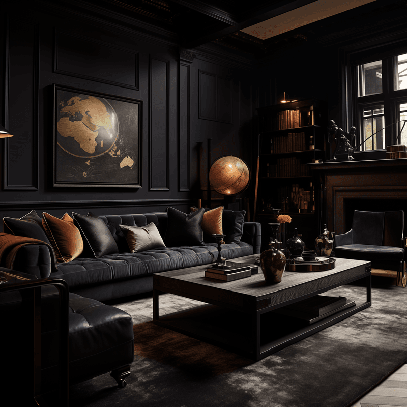
Two dark colors together can turn your living room into a cave where happiness goes to die. Brown and black create such a heavy atmosphere that you might need therapy afterward.
Without enough light colors to balance them out, these dark tones absorb light instead of reflecting it. Your space ends up feeling smaller, darker, and generally depressing.
If you love dark colors, pick one and pair it with something much lighter. Your mental health and your electricity bill will both improve when you’re not constantly fighting the darkness.
6. Neon Green And Hot Pink
This combination should come with a seizure warning. Neon green and hot pink together create such intense visual stimulation that your brain might go on strike.
Both colors are so saturated and bright that they fight each other for dominance. The result is exhausting to look at and impossible to relax around.
Save neon colors for tiny accents or workout gear where high energy is actually the goal. Your living room should invite relaxation, not require sunglasses for safe viewing.
7. Bright Yellow And Bright Blue
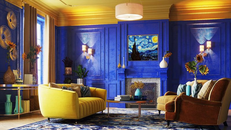
Primary colors work great in kindergarten classrooms, but they can make your living room look like a toddler’s playroom explosion. Bright yellow and blue together feel juvenile and overwhelming.
Both colors are so pure and intense that they create a cartoon-like effect. Your sophisticated adult living space suddenly looks like it’s waiting for someone to start finger painting.
If you love these colors, try using much softer, more muted versions. Think butter yellow with navy blue, or save the bright versions for kids’ spaces where they actually belong.