How To Choose The Best Paint Colors For Awkward Spaces (15 Expert Tips And Tricks)
Ever stared at that awkward nook or narrow hallway thinking, What on earth do I do with this? Trust me, I’ve been there, more times than I’d like to admit.
Some spaces just don’t play by the rules, and figuring out how to make them look good feels impossible. But here’s the thing: the right paint color can completely flip the script.
It can take a weird corner or cramped stairwell and turn it into something you actually love walking past. I’ve rounded up some of the smartest color tricks to help make even the strangest spots in your home shine.
1. Consider Light Sources First
Natural light drastically changes how paint appears on your walls. A color that looks amazing in a sun-drenched showroom might turn dull or weird in your north-facing nook.
Try sample patches in different parts of your awkward space. Watch how they transform throughout the day as sunlight shifts. Morning light brings out blue undertones while evening light enhances warm tones.
Pro painters actually recommend living with samples for at least 24 hours before making your final decision.
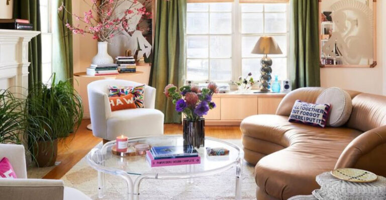
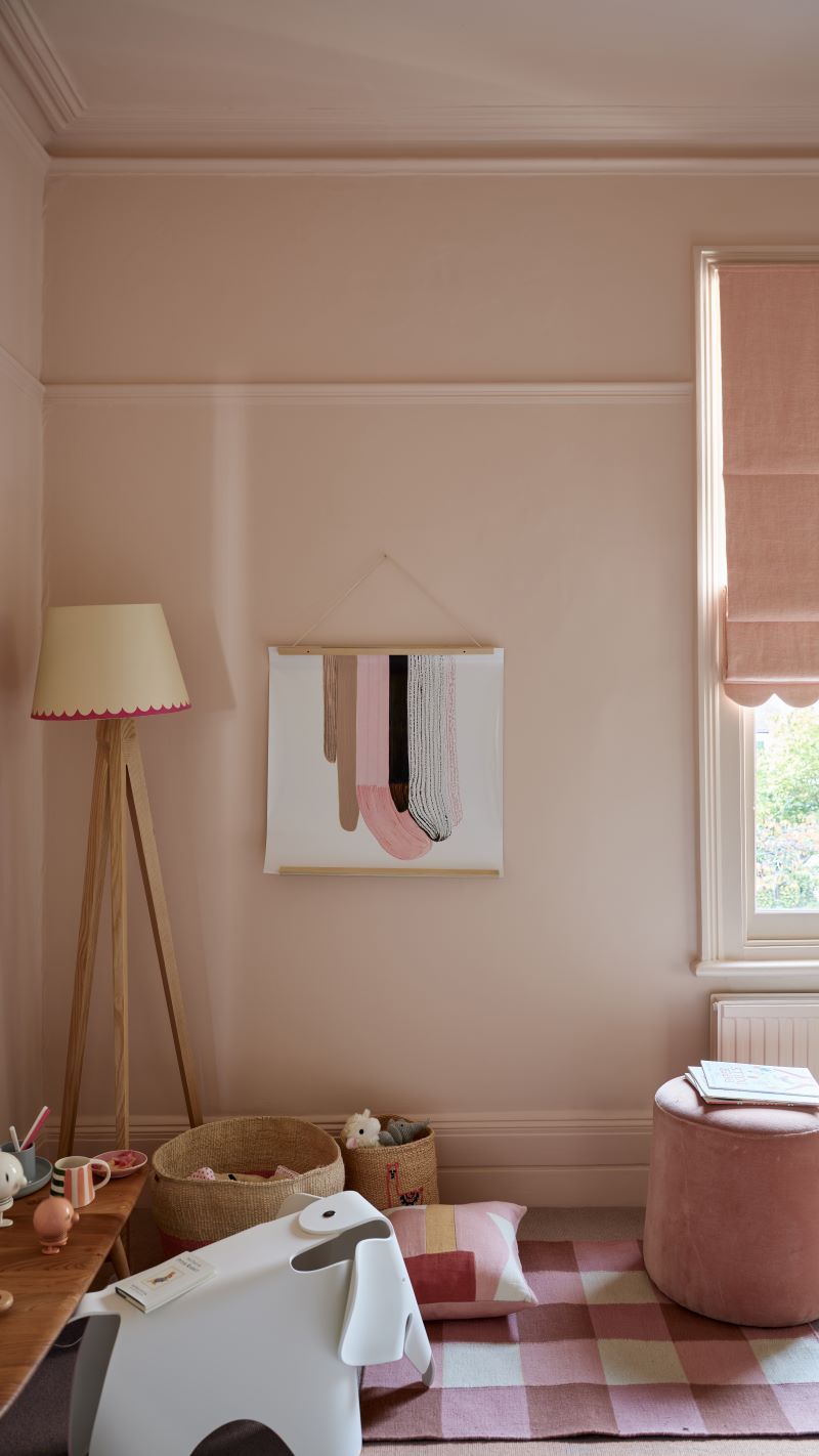
2. Embrace The Monochromatic Magic
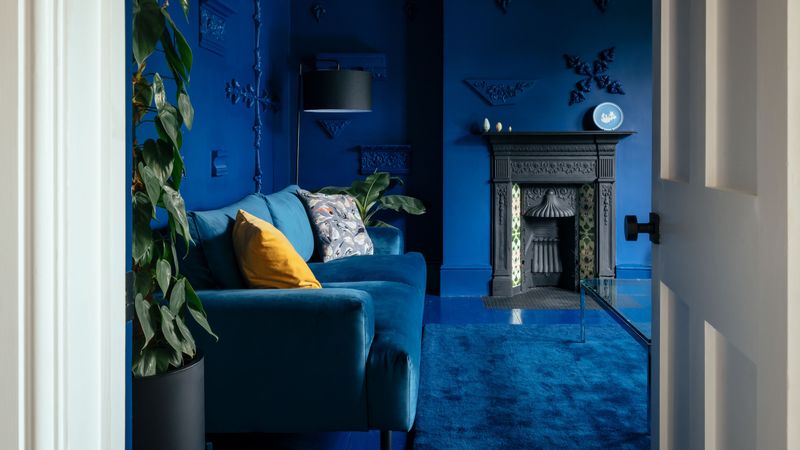
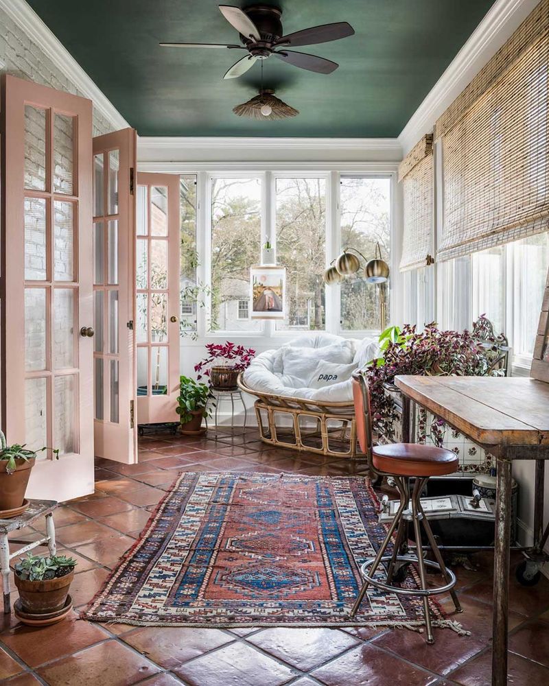
Painting walls, trim, and ceiling the same color creates an illusion of boundless space. This sneaky trick makes corners disappear and ceilings seem higher in cramped quarters.
Light neutrals work wonders here, but don’t be afraid of going bold! A small powder room wrapped entirely in navy blue can feel like a jewelry box rather than a closet.
The key is consistency – when everything wears the same color, your eye glides smoothly across surfaces without interruption.
3. Play With Perspective Using Stripes
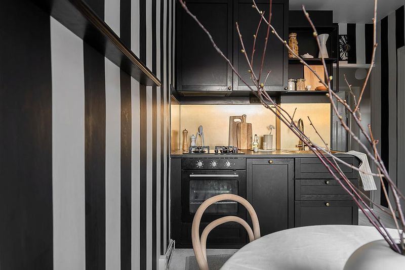
Horizontal stripes can make narrow rooms feel wider, while vertical stripes create the illusion of height in low-ceiling spaces. Not just for kids’ rooms anymore!
For subtlety, try tone-on-tone stripes using the same color in different finishes – matte and glossy alternating creates texture without overwhelming the space. Or go bold with contrasting colors for dramatic effect.
The trick is precise application – wobbly lines will only emphasize the awkwardness you’re trying to fix.
4. Lighten Up Those Corners
Dark corners are shrink space in already challenging rooms. Combat this by choosing lighter colors for areas that receive less natural light. Think of it as giving those gloomy spots a flashlight!
White isn’t your only option here. Soft pastels, pale grays, and light neutrals with warm undertones can brighten corners while adding personality.
Sometimes a glossier finish in these areas helps too – the slight reflective quality bounces what little light exists around more effectively.
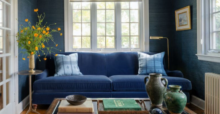
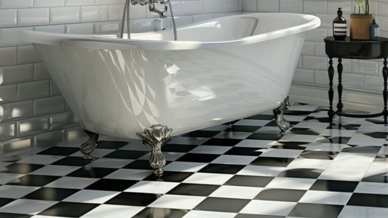
5. Go Dark For Drama
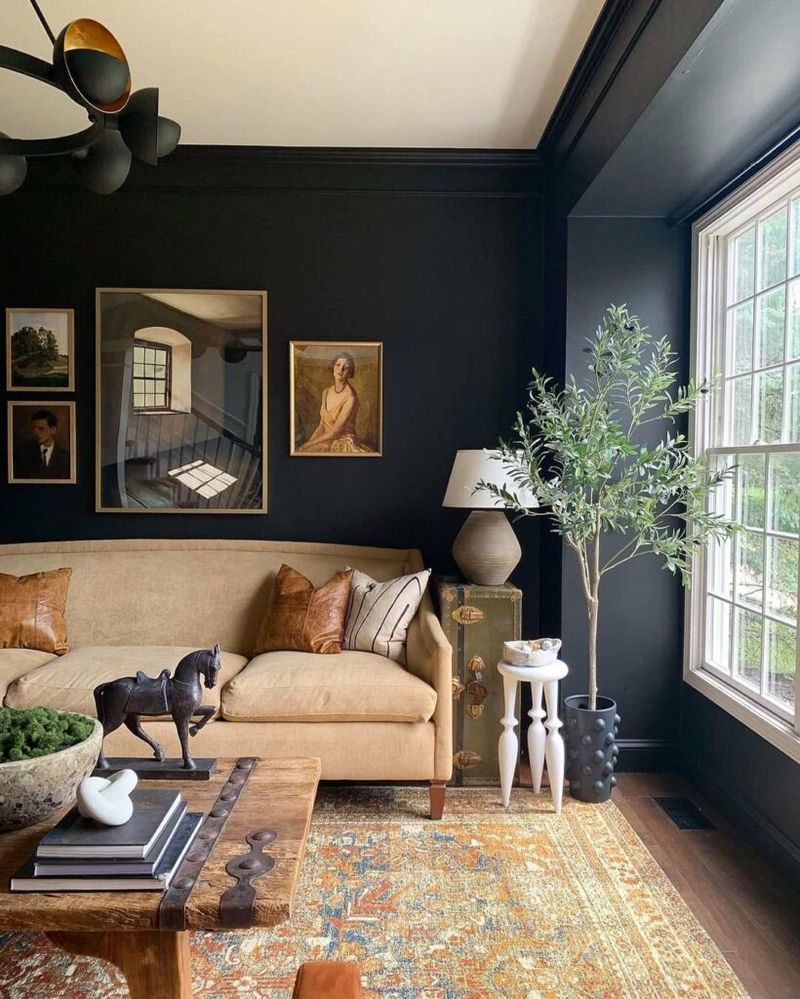
Contrary to popular belief, dark colors can actually make awkward spaces feel intentional rather than accidental. A rich charcoal or deep forest green transforms that weird alcove into a cozy reading nook.
The key is committing fully! Half-measures with dark colors often backfire. Paint all surfaces in that space – trim, ceiling, everything – for a cocoon-like effect that feels purposeful.
Balance is important though. Add lighter furniture or metallic accents to prevent your bold choice from feeling like a cave.
6. The Ceiling Is Your Fifth Wall
Most folks forget about ceilings when planning their paint strategy. Big mistake in awkward spaces! A thoughtfully painted ceiling can redirect attention and reshape perception.
For low ceilings, lighter colors than your walls create an airy feeling. For cavernous spaces, darker ceiling colors bring the height down to human scale.
Feeling adventurous? Try a bold ceiling color with neutral walls to draw the eye upward and away from awkward floor plans or unusual angles.
7. Create Zones With Color Blocking
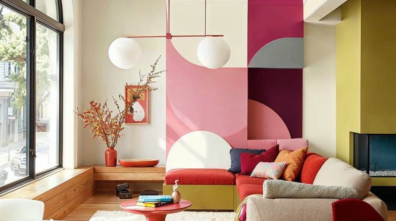
Large, oddly-shaped rooms benefit from strategic color blocking. Use different paint colors to visually separate areas according to function – one color for dining, another for lounging.
No need for harsh lines! Try blending colors where they meet using an ombré technique, or use molding as a natural divider between color zones.
This approach turns a room’s awkward layout into an asset by creating distinct “rooms within a room” without building actual walls.
8. Sample Before You Commit
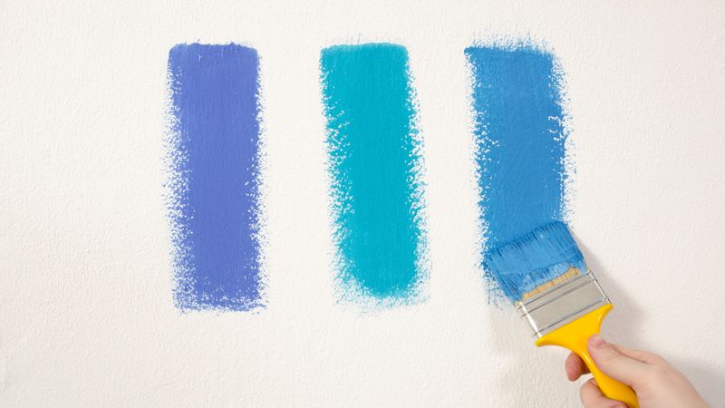
Those tiny paint chips from the store lie! Colors look completely different when splashed across your actual walls. Smart painters know to buy sample pots and test generously.
Paint at least a 2×2 foot square of each potential color directly on your wall. Move the samples around to different walls if possible, as lighting varies throughout the space.
Bonus tip: paint some sample boards you can move around the room throughout the day to see how light affects your color choices morning, noon, and night.
9. Use The 60-30-10 Rule
Balance creates harmony in chaotic spaces! The 60-30-10 rule gives you a foolproof formula: 60% dominant color (walls), 30% secondary color (furniture/trim), and 10% accent color (accessories).
This approach prevents visual overwhelm in already challenging rooms. Your dominant color anchors the space while secondary and accent colors add interest without fighting for attention.
For extra-awkward spaces, keep your dominant color light and neutral, then add personality through your secondary and accent choices.
10. Optical Illusions With Two-Tone Walls
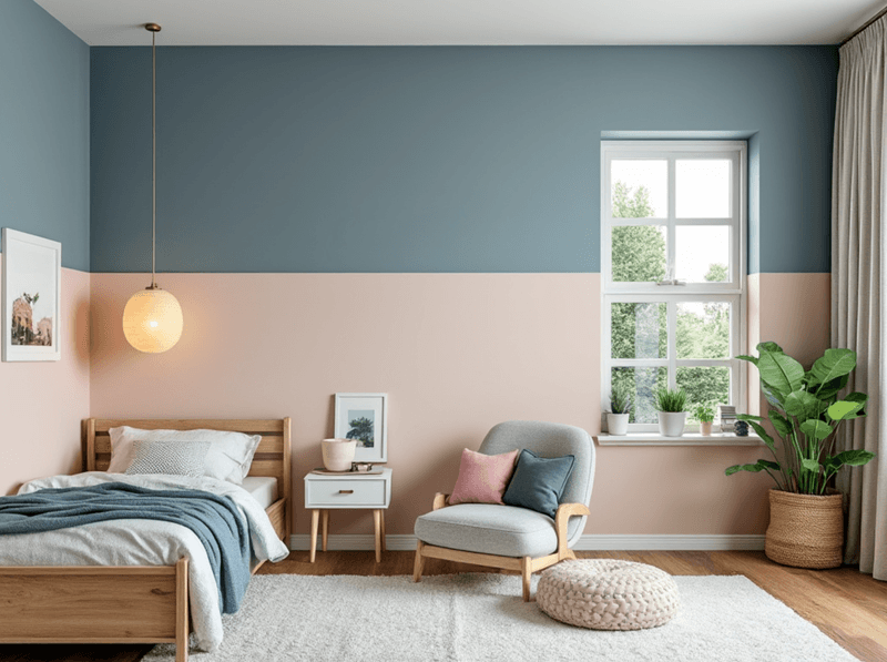
Two-tone walls work magic in rooms with weird proportions. Paint the bottom third darker and the top two-thirds lighter to ground a too-tall space. Reverse this for squat rooms that need height.
The dividing line doesn’t have to be horizontal! In asymmetrical rooms, try an angled division that follows architectural features like sloped ceilings.
For extra credit, add a thin stripe or molding at the transition point between colors. This creates a finished look that feels intentionally designed rather than awkwardly divided.
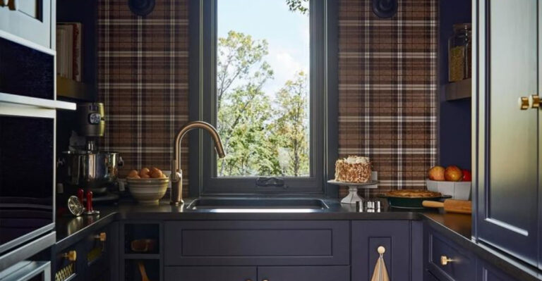
11. Match Paint To Fixed Elements

Already stuck with unchangeable features like tile, stone, or built-ins? Work with them instead of fighting them! Pull colors from these fixed elements for a cohesive look.
Use a color-matching app to find paint shades that complement existing materials. Focus on undertones – that subtle hint of yellow, blue, or red hiding in seemingly neutral colors.
When elements clash badly, try finding a bridging color that works with both. Sometimes a neutral with the right undertone can make peace between warring design elements.
12. Fool The Eye With Gradient Effects
Gradients create movement that distracts from architectural oddities. Try transitioning from darker at the bottom to lighter at the top to make ceilings feel higher.
You don’t need professional skills for this! The simplest approach uses three related colors applied in horizontal bands that softly blend where they meet. Or try the ombré technique with just two colors.
This works wonders in stairwells and hallways where traditional single-color approaches emphasize rather than minimize awkward transitions.
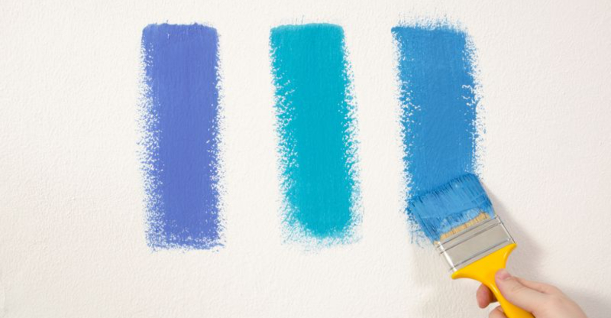
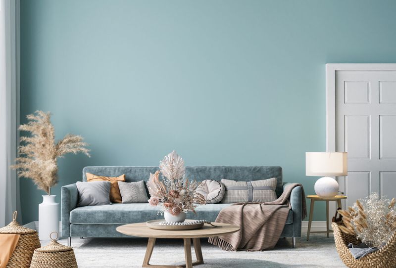
13. Warm Vs Cool: Choose Wisely
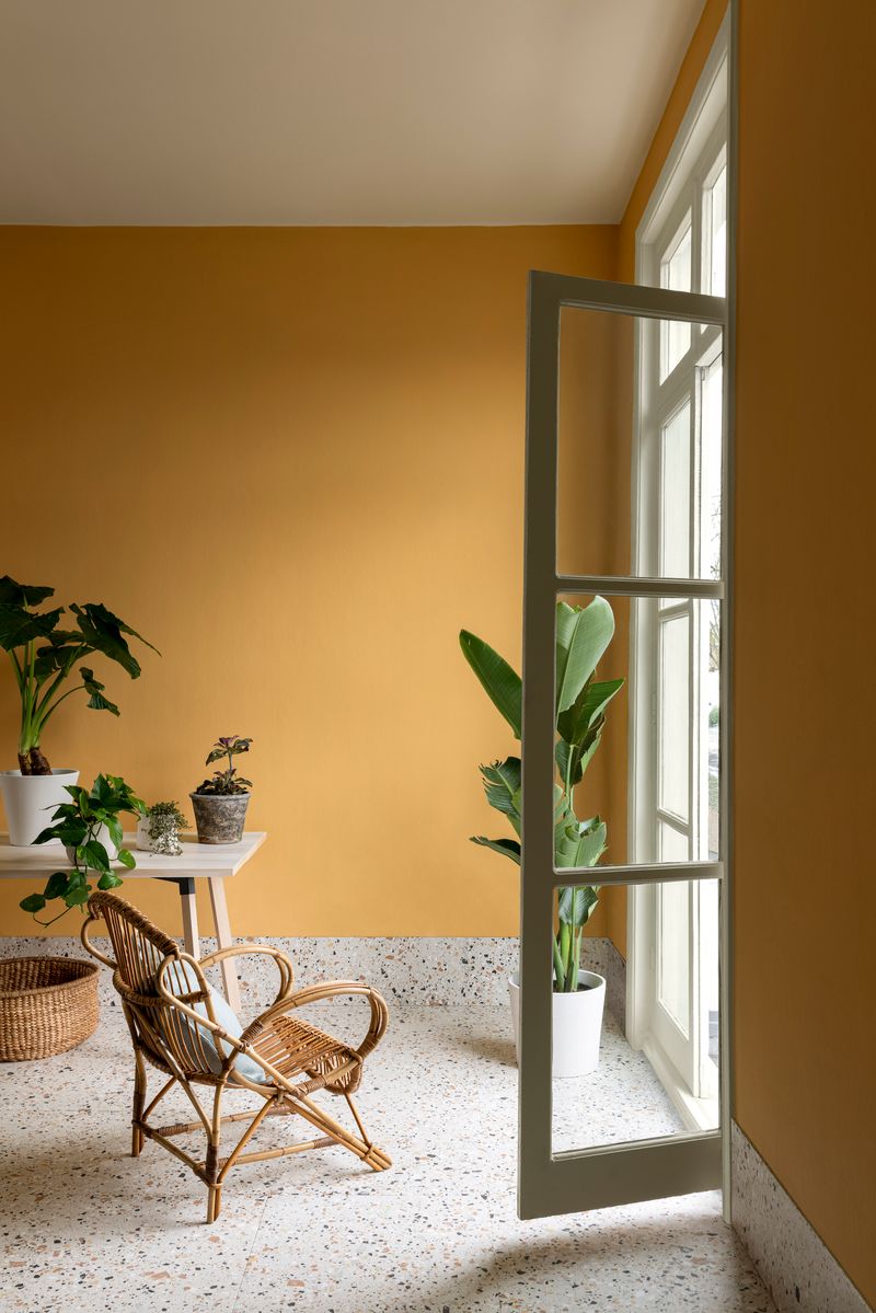
Temperature matters more than color in awkward spaces! Cool colors (blues, greens, purples) make walls recede, creating breathing room in cramped areas.
Warm colors (reds, oranges, yellows) bring surfaces forward, adding coziness to cavernous or cold-feeling rooms. They also flatter skin tones in spaces where people gather.
Not sure which way to go? Look at the room’s natural light. North-facing rooms benefit from warm colors to counteract cool light, while south-facing spaces often handle cool colors beautifully.
14. Unify Disjointed Areas With Color Flow
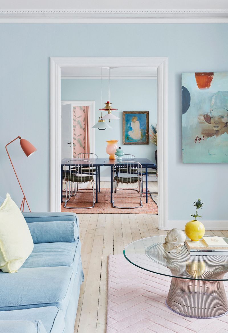
Houses with choppy layouts benefit from thoughtful color connections between spaces. Create flow by using related colors from room to room – not identical, but clearly from the same color family.
Think of it as a color journey! Each space can have its own personality while still feeling connected to adjacent areas. Try choosing colors from the same paint strip, moving lighter to darker as you move through the home.
This approach is especially helpful in homes with awkward sightlines where you can see multiple rooms at once.
15. Consider The Whole Home Context
That turquoise might look amazing in your powder room, but does it make sense with the rest of your home? Awkward spaces feel even more disjointed when their colors clash with surrounding areas.
Stand at various points in your home where you can see multiple spaces at once. Do the colors you’re considering play nicely with what’s already there?
You don’t need matching colors everywhere, but they should at least nod politely to each other across the hallway!