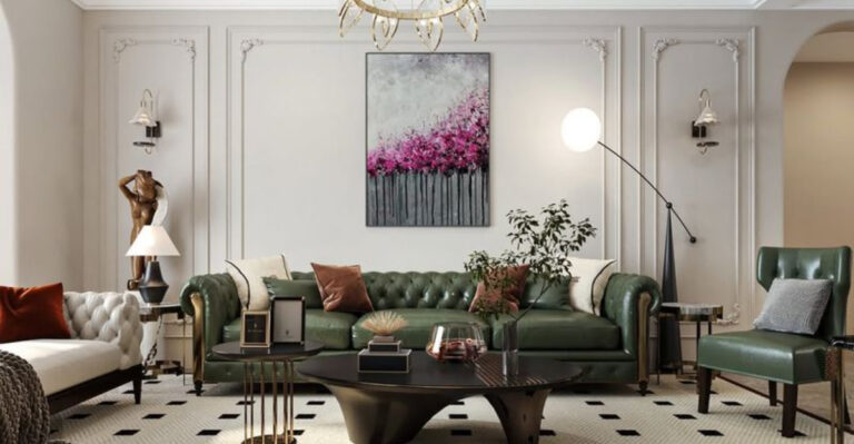
15 Blue-Green Paint Colors Designers Swear By
Looking to refresh your space with a touch of tranquility? Blue-green paint colors offer the perfect blend of serenity and style that designers absolutely adore.
These versatile hues bring the calming essence of water and sky indoors, creating spaces that feel both refreshing and sophisticated. Whether you’re painting a bathroom, bedroom, or living area, these designer-approved blue-green shades will transform your walls into something magical.
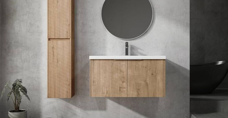
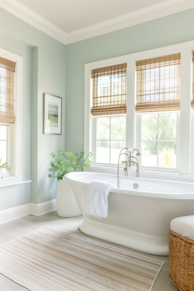
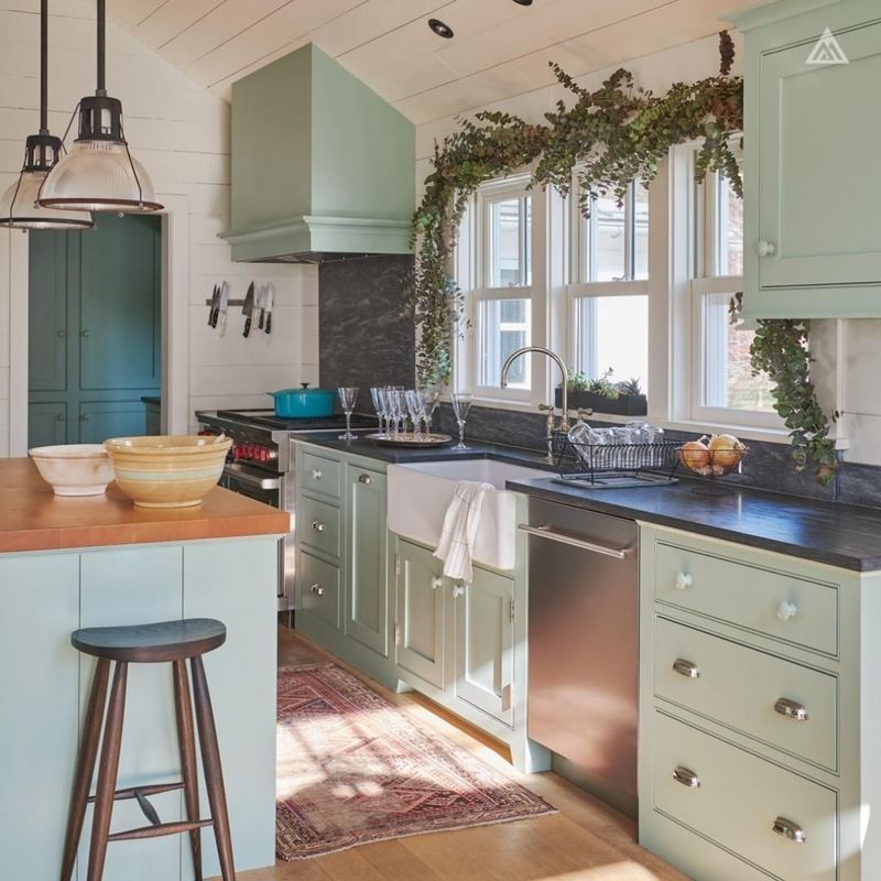
1. Sea Salt
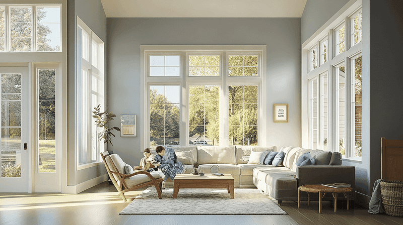
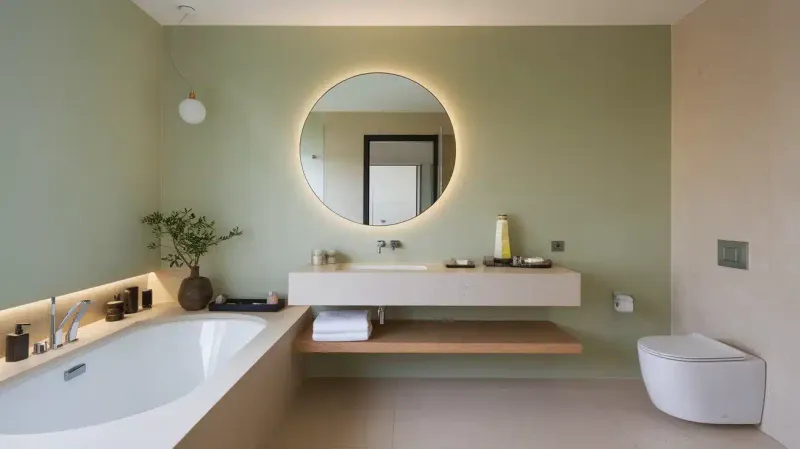
Imagine the gentle mist rising from ocean waves at dawn. This whisper-soft shade from Sherwin-Williams balances perfectly between gray, blue, and green, changing subtly throughout the day with the shifting light.
Interior designers frequently recommend Sea Salt for bathrooms and bedrooms where its chameleon-like quality creates an atmosphere of peaceful escape.
2. Palladian Blue
What makes this Benjamin Moore classic so beloved? The perfect balance of blue, green, and gray creates a historical feel with modern appeal.
When sunlight washes over Palladian Blue walls, spaces feel instantly more expansive and airy. Many designers pair this versatile hue with crisp white trim for a timeless combination that works in virtually any room.
3. Rainwashed
Ever noticed how colors appear softer after a gentle rain? That’s exactly the feeling Sherwin-Williams captured with this delicate hue.
Neither overtly blue nor definitively green, Rainwashed creates spaces that feel clean yet warm. The subtle gray undertones prevent the color from feeling too sweet, making it a designer favorite for spaces where sophisticated calm is the goal.
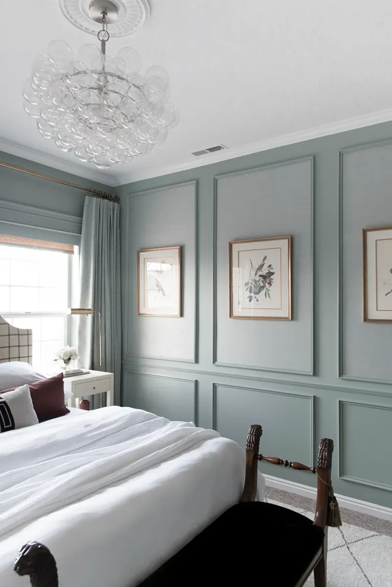
4. Stratton Blue
Heritage homes often showcase this Benjamin Moore gem to spectacular effect. The deeper blue-green creates dramatic impact while maintaining an understated elegance that never feels overwhelming.
Designers particularly love using Stratton Blue for cabinetry and built-ins. Against white walls, these painted elements become stunning focal points that add character without sacrificing sophistication.
5. Quiet Moments
Aptly named, this shade creates spaces where you can practically hear yourself think. The subtle gray-green-blue blend works beautifully in north-facing rooms where cooler light enhances its complexity.
Many therapists and wellness professionals select Quiet Moments for their offices. The color’s inherent tranquility supports relaxation and thoughtful conversation without being distractingly bold or trendy.
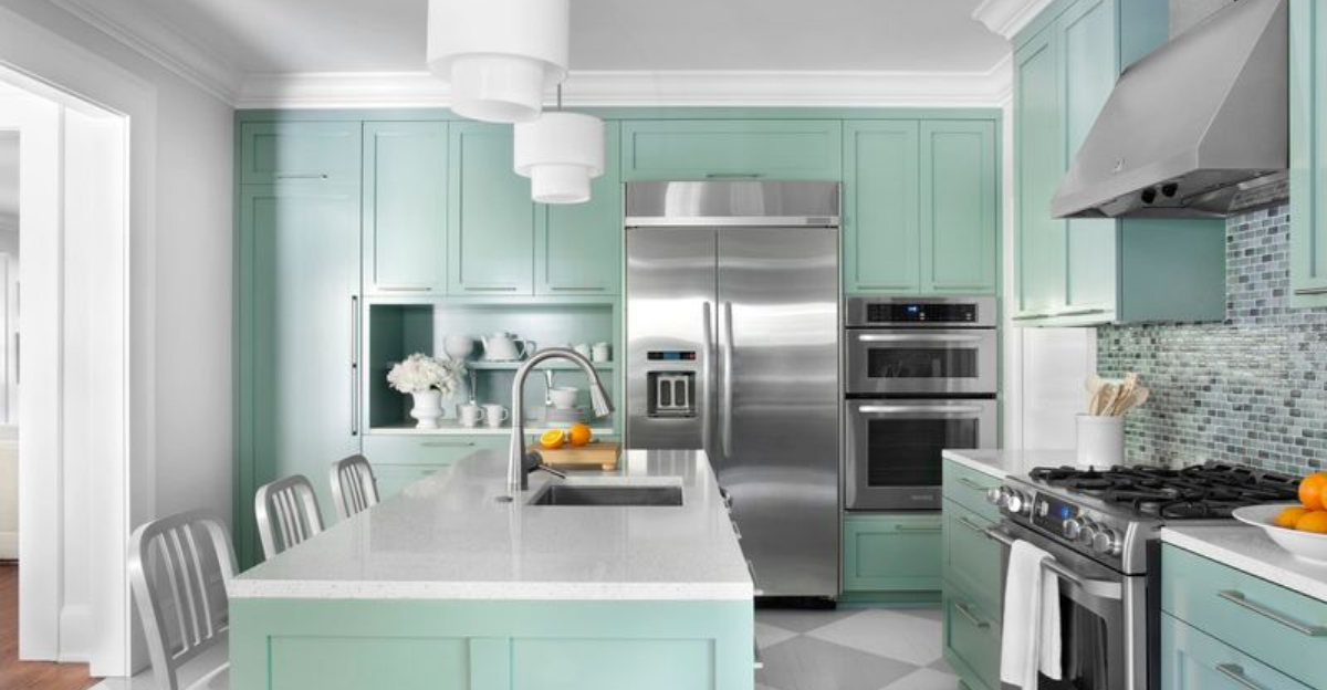
6. Waterscape
Stepping into a room painted with Sherwin-Williams Waterscape feels like entering an underwater sanctuary. This mid-tone blue-green creates spaces with remarkable depth and dimension.
Unlike some aqua tones that can feel childish, Waterscape maintains sophistication through its muted quality. Designers often recommend this shade for dining rooms, where its jewel-like richness enhances evening ambiance without overwhelming daytime gatherings.
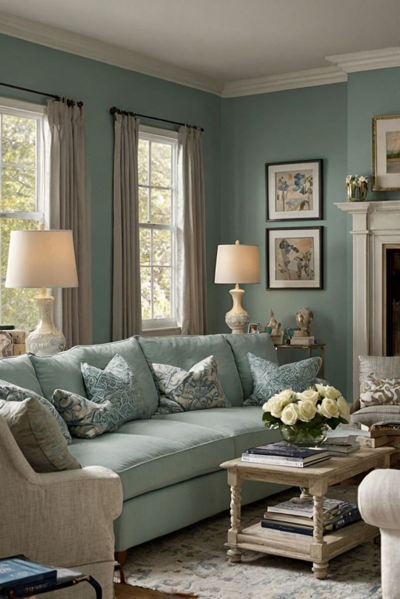
7. Boothbay Gray
Despite its name, this color leans decidedly into blue-green territory. The complex undertones create a chameleon effect that shifts between sage, seafoam, and slate depending on lighting conditions.
For homes with open floor plans, Boothbay Gray offers the perfect transitional color. Its versatility allows it to complement multiple design styles, from coastal casual to urban sophisticated, making it a go-to for designers working with diverse client preferences.
8. Oyster Bay
Coastal without being kitschy, Sherwin-Williams Oyster Bay evokes weathered driftwood and misty mornings. The color’s substantial gray undertones give it a sophisticated edge many lighter blue-greens lack.
Celebrity designers frequently select this shade for luxury vacation homes. Its ability to appear both relaxed and refined makes it perfect for spaces where high-end comfort is the primary goal.
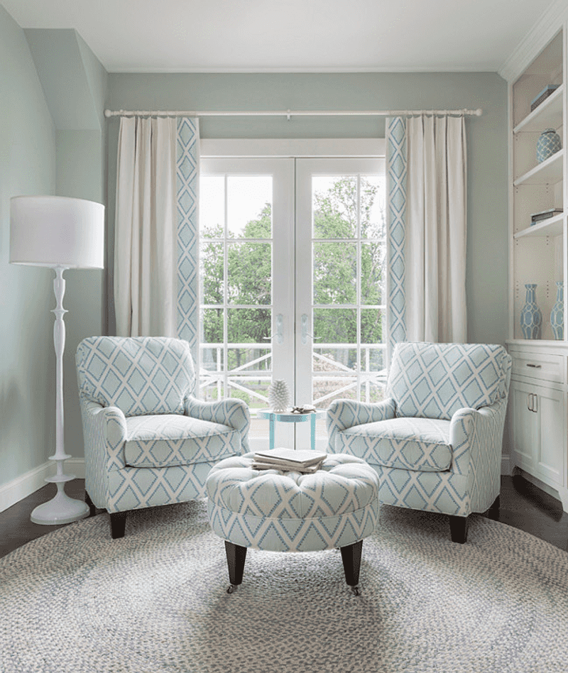
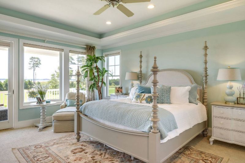
9. Antiguan Sky
Close your eyes and picture Caribbean waters meeting clear blue skies. Benjamin Moore’s Antiguan Sky captures that magical horizon line where aqua meets azure.
Unlike many tropical-inspired colors, this shade maintains sophistication through its slightly muted quality. Interior designers particularly value Antiguan Sky for spa bathrooms and primary bedrooms where its transportive quality creates genuine moments of everyday escape.
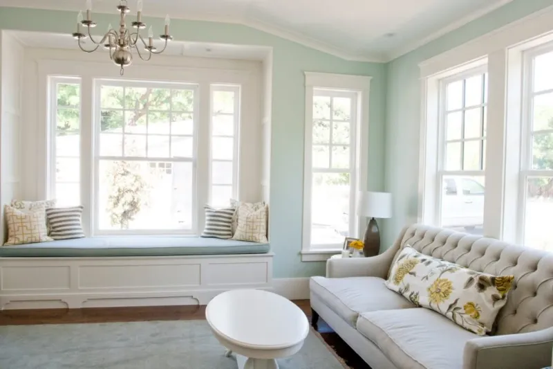
10. Drizzle
Sherwin-Williams created the perfect rainy day companion with this sophisticated blue-green. The color’s slightly steely undertone creates spaces that feel both cozy and refreshing simultaneously.
Architects frequently specify Drizzle for spaces transitioning between indoors and outdoors. The shade’s connection to natural elements makes it ideal for sunrooms, covered porches, and rooms with significant garden views.
11. Wythe Blue
Historical charm meets modern sensibility in this Benjamin Moore classic. Named after a street in colonial Williamsburg, this color brings authentic period feeling without looking dated or stuffy.
Wythe Blue’s popularity soared when it was named Benjamin Moore’s Color of the Year. Years later, designers still recommend it for clients seeking a timeless blue-green that works equally well in traditional and contemporary spaces.
12. Halcyon Green
Victorian elegance meets contemporary style in this Sherwin-Williams gem. The name references a mythical bird symbolizing peace and tranquility – perfectly capturing the effect this color creates in a space.
Halcyon Green’s muted quality makes it surprisingly versatile. Designers often recommend it for home libraries and offices where its historical roots create an atmosphere of established sophistication.
13. Blue Heather
Inspired by Scottish highlands at dusk, Blue Heather creates spaces with remarkable depth and character. The color shifts dramatically with changing light, revealing different facets throughout the day.
Designers who specialize in masculine interiors frequently turn to Blue Heather. Its substantial presence works beautifully in studies, dens, and bedrooms where color can create intimate, contemplative environments without feeling stereotypically gendered.
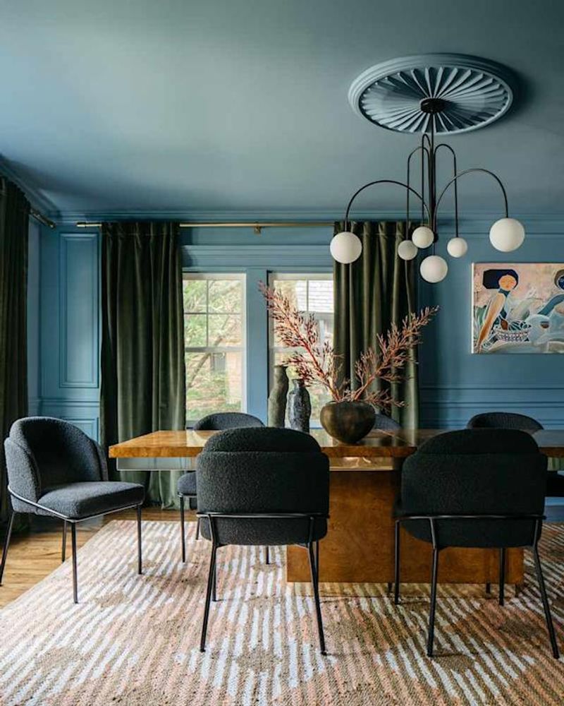
14. Rainstorm
Bold yet sophisticated, Rainstorm brings dramatic intensity to spaces that need architectural presence. This deeper blue-green creates instant atmosphere without requiring elaborate decorative elements.
Many designers recommend Rainstorm for powder rooms and dining spaces. The color’s inherent drama creates memorable moments in smaller spaces while its blue-green balance ensures it never feels oppressively dark.
15. Beach Glass
Remember finding those perfectly weathered fragments of glass along the shoreline? Benjamin Moore captured that magical translucent quality in this beloved shade.
Beach Glass maintains contemporary relevance through its subtle gray undertones. Designers particularly love using this color in bathrooms and laundry rooms where its fresh, clean quality enhances utilitarian spaces.