8 Colors To Never Pair With Blue (And 8 That Match It Perfectly), According To Interior Designers
Blue is one of the most versatile colors in interior design, bringing calm and elegance to any space. But even this popular shade has its enemies in the color wheel.
Interior designers have strong opinions about which hues clash with blue, creating jarring combinations that can make a room feel uncomfortable and which ones fit her so incredibly well.
Before you grab that paintbrush or order new furniture, check out these professional insights on which colors are a big no-no when it comes to blue and which are just excellent!
1. Bright Orange
Can you imagine walking into a room that practically screams at your eyeballs? When bright orange sits next to blue, the contrast can be so intense it creates visual vibration – that uncomfortable feeling where colors seem to buzz against each other.
Most designers recommend avoiding this combination unless you’re decorating a sports fan cave for a team with these specific colors. The pairing often feels chaotic rather than harmonious, making spaces feel less relaxing and more agitating to the senses.
2. Muddy Yellow-Green
Those murky, swampy yellow-green shades with names like ‘chartreuse’ or ‘olive drab’ create an instant fashion faux pas when paired with blue. The combination often reminds people of mold or decay – hardly the vibe most homeowners are aiming for!
Professional designers frequently note that these colors fight each other energetically, creating a confused atmosphere that lacks harmony. If you absolutely must incorporate both, keep them far apart in separate rooms or use one as a tiny accent only.
3. Bubble Gum Pink
While some pink and blue combinations can work beautifully, that artificial, saccharine bubble gum pink is not one of them. When paired with blue, this sugary shade often creates a space that feels overwhelmingly juvenile or dated.
Many designers cringe at this combination because it immediately evokes 1980s Miami Vice vibes or baby nursery stereotypes. The pairing lacks sophistication and makes a space feel less intentional and more like you’re living in a cotton candy machine gone haywire.
4. Burgundy Red
Remember those patriotic rooms that were popular in the 90s? That’s precisely why designers now advise against pairing burgundy with blue. This combination often feels heavy-handed and outdated, like you’re perpetually celebrating the 4th of July.
The rich depth of both colors competes for attention, creating visual tension rather than balance. Additionally, the combination can make spaces feel smaller and darker than they actually are, absorbing light rather than reflecting it throughout the room.
5. Neon Green
Nothing says “I decorated this room while wearing a blindfold” quite like pairing neon green with blue. This eye-searing combination creates such intense visual contrast that it can actually induce headaches in some people!
Professional designers point out that this pairing makes spaces feel chaotic and unrestful. The electric quality of neon green fights against blue’s naturally calming properties, creating an uncomfortable tension that makes it difficult to relax in the space.
6. Mustard Yellow
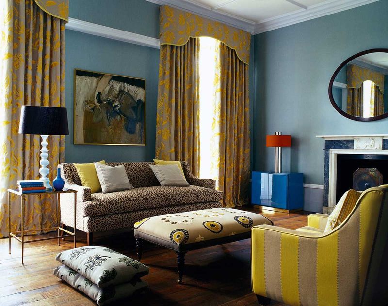
You might think this trendy shade works with everything, but when mustard yellow meets blue, something peculiar happens. The combination often creates a strange visual effect where the mustard takes on a sickly, greenish cast that’s far from appetizing.
Interior design professionals note that this pairing frequently feels disharmonious because the undertones fight each other. The warm, earthy quality of mustard clashes with blue’s cool, airy nature, creating a space that feels unbalanced and visually confusing.
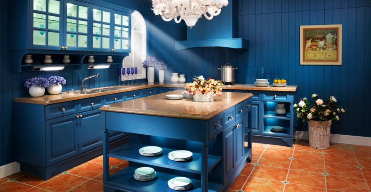
7. Chocolate Brown
Who doesn’t love chocolate? Well, blue certainly doesn’t! When chocolate brown and blue join forces, they often create a surprisingly depressing atmosphere that can feel heavy and dated.
Many designers point out that this combination was overused in the early 2000s, giving it a distinctly outdated feel today. The dark nature of both colors can make spaces feel smaller and more confined, while their competing undertones (warm vs. cool) create a subtle but persistent visual tension.
8. Coral
Surprising but true – coral and blue might seem like a natural pairing (ocean vibes, right?), but most high-end designers actually avoid this combination. The problem lies in coral’s complex undertones, which can make blue appear dull and lifeless by comparison.
This pairing often creates what designers call a “beachy motel” effect – that mass-produced, touristy look that lacks sophistication. While it might work for vacation rentals, it rarely translates to elegant home interiors that stand the test of time.
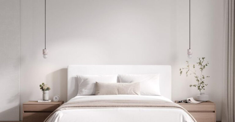
1. Crisp White
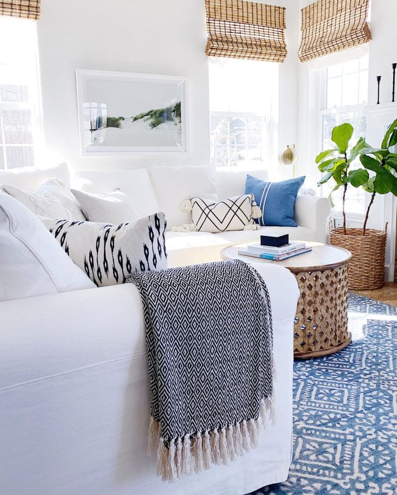
Nothing creates a fresher, more timeless look than pairing blue with crisp white. This nautical-inspired combination brings immediate brightness to any space while allowing blue to take center stage.
For a modern twist, try incorporating different textures in your whites—matte walls against glossy white trim can add subtle dimension while maintaining that classic blue-and-white magic.
2. Soft Sage Green
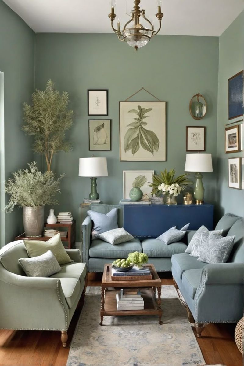
Sage green alongside blue creates a nature-inspired palette that feels both refreshing and grounding. This combination mimics the natural world—think blue skies above sage-colored meadows—bringing outdoor harmony inside.
For best results, consider a dusty blue with muted sage for a cohesive, calming effect that never feels overwhelming. Add natural wood elements to complete this earthy aesthetic.
3. Metallic Gold
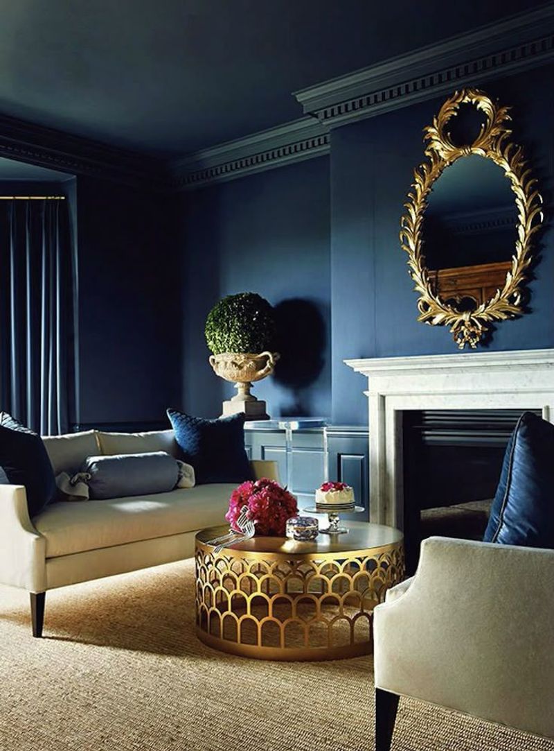
Gold accents against blue backgrounds create instant luxury! This regal combination has historical roots in royal decor but feels surprisingly modern in today’s interiors. The warm metallic tones of gold pop dramatically against cool blue backgrounds.
The key to success with this pairing is restraint—let gold serve as the jewelry to blue’s elegant outfit. This combination works wonderfully in dining rooms and powder rooms where a touch of glamour is welcome.
4. Charcoal Gray
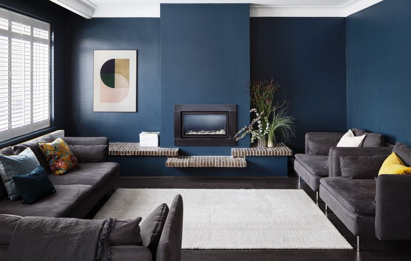
Sophisticated and unexpected, charcoal gray creates depth when paired with blue. This combination offers a contemporary alternative to traditional blue-and-white schemes while maintaining a clean, cohesive look.
The gray acts as a neutral anchor that allows blue to shine without competing for attention. This pairing excels in home offices and living rooms where you want a focused atmosphere with character.
5. Blush Pink
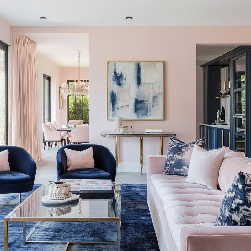
Forget gender stereotypes—blush pink and blue create a surprisingly sophisticated palette that feels fresh and balanced. The warmth of blush softens blue’s coolness, creating visual harmony that works across many design styles.
For maximum impact, use blue as your primary color with blush as an accent through textiles, artwork, or small furniture pieces.
6. Emerald Green
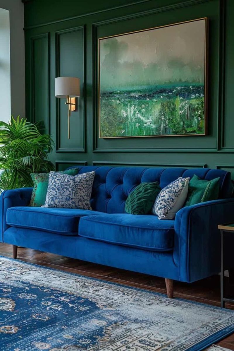
Bold and confident, emerald green alongside blue creates a jewel-toned paradise that exudes luxury and drama.
This color combination recalls peacock feathers and tropical settings—perfect for those seeking a statement-making interior. Add brass accents to enhance the luxurious feel of this rich color combination.
7. Terracotta
Earthy terracotta brings unexpected warmth to cool blue spaces, creating a Mediterranean-inspired palette that feels both timeless and on-trend.
This combination balances cool and warm elements perfectly. Add natural materials like rattan and linen to enhance the organic quality of this color combination.
8. Lavender
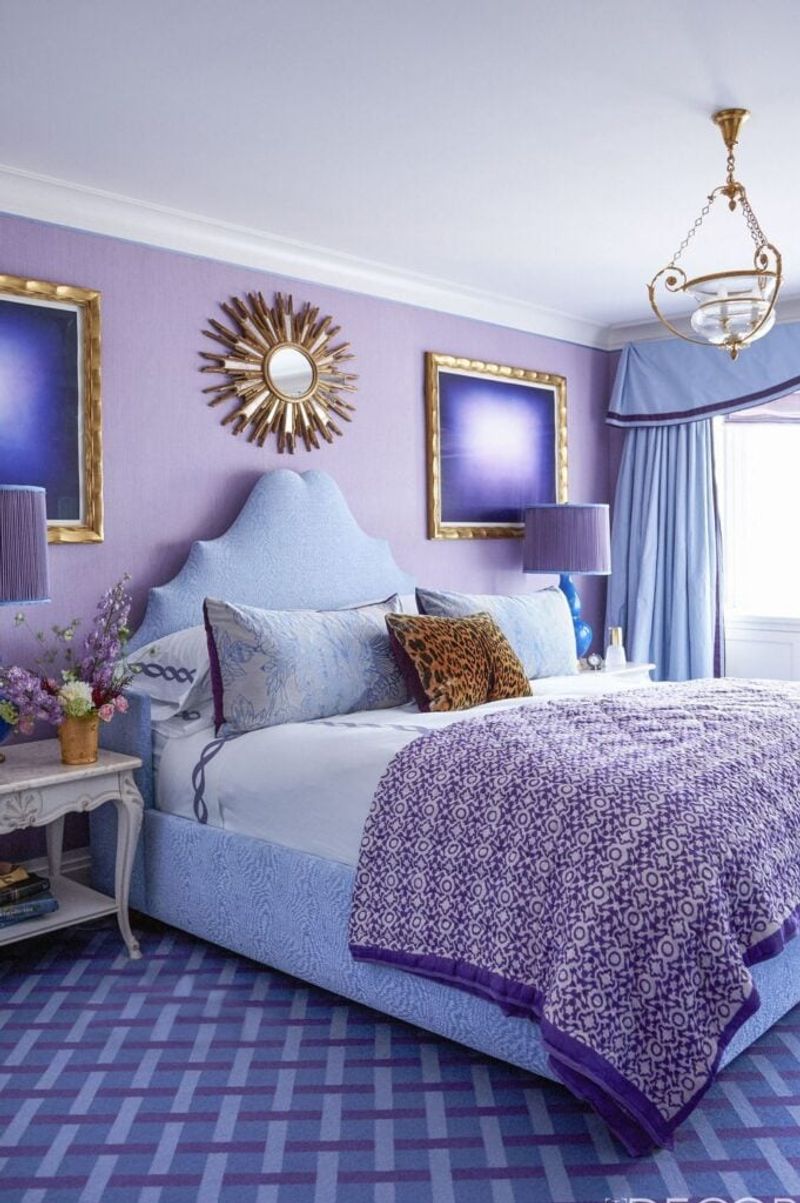
Unexpected yet harmonious, lavender and blue create a dreamy, almost ethereal quality in interiors. This color combination feels sophisticated and unique—perfect for those seeking something beyond traditional pairings.
Layer different shades and textures to create depth, and consider adding silver accents to enhance the ethereal quality of this color pairing.