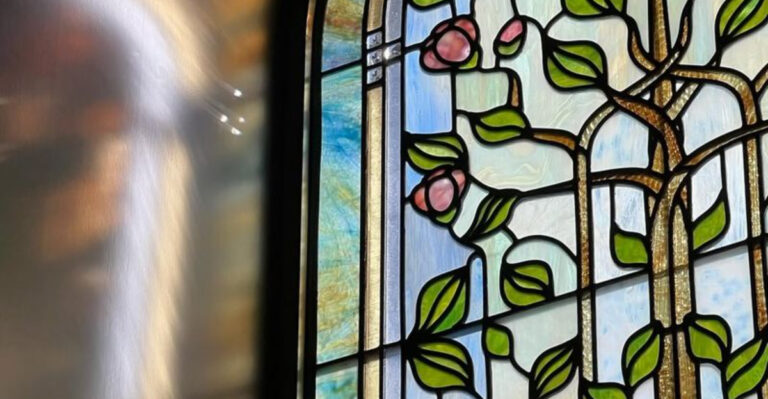
15 Design Trends Experts Are Already Over In 2025
Design moves fast, and what’s hot today can feel dated tomorrow. As we navigate through 2025, designers are already leaving certain trends behind in favor of fresh approaches. These once-popular styles have saturated our visual landscape to the point where experts are ready for something new. Let’s explore which design elements professionals are saying goodbye to this year.
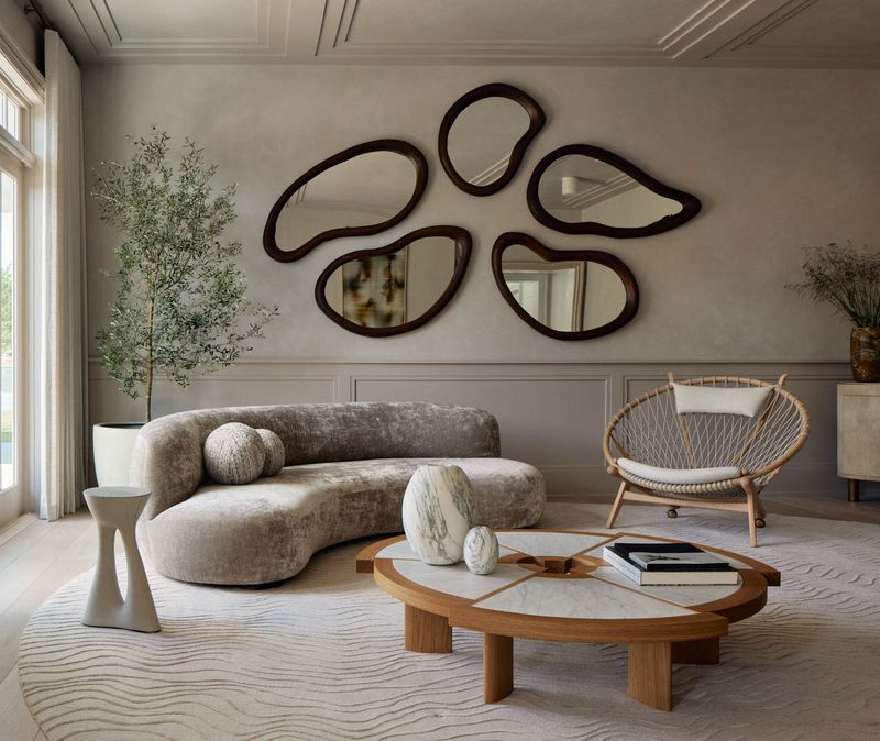
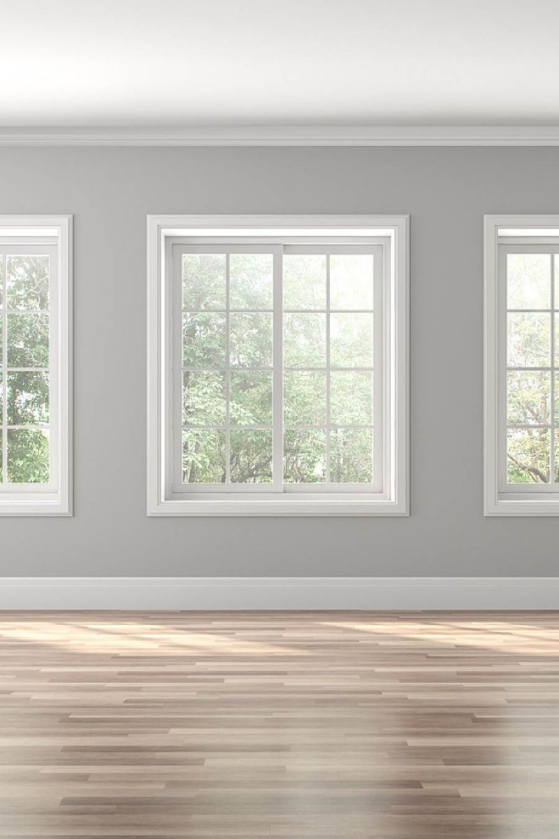
1. All-White Minimalist Interiors

Remember when every Instagram-worthy home looked like a white cloud? Those stark, clinical spaces have lost their appeal. Design experts now crave warmth and personality in living spaces.
Homeowners are embracing color again, introducing rich earth tones and textural elements that make spaces feel lived-in rather than museum-like. The pandemic changed our relationship with our homes, highlighting the importance of comfort over showroom perfection.
Even minimalism itself is evolving, with a focus on thoughtful curation rather than emptiness. The new approach balances clean lines with personal touches that tell a story about the inhabitants.
2. Millennial Pink Everything
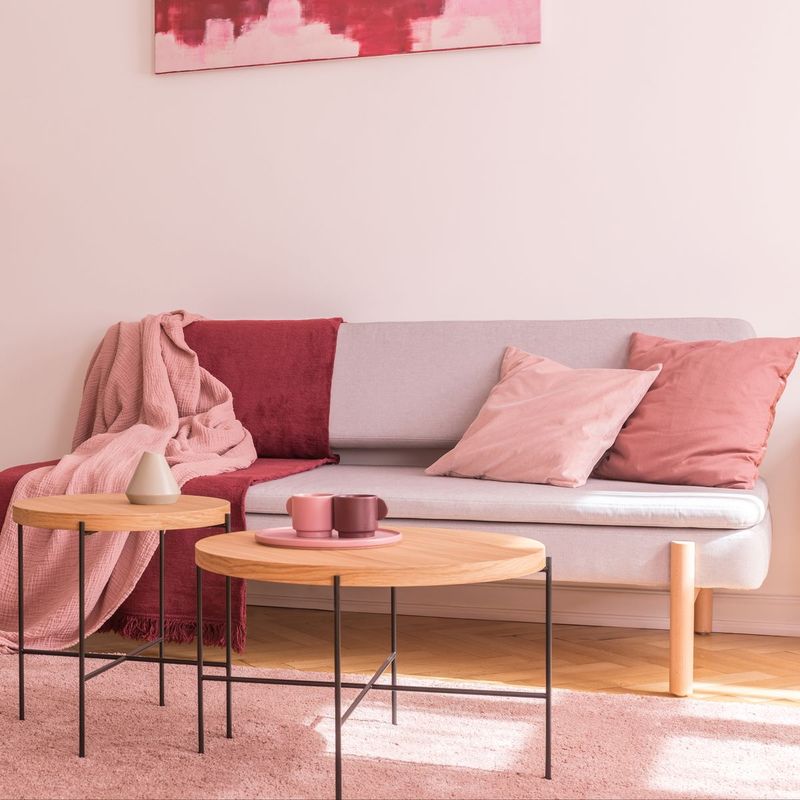
Once the darling of design, millennial pink has finally reached saturation point. This dusty rose shade dominated everything from furniture to phone cases for nearly a decade, but designers are now seeking fresher color stories.
Replaced by more nuanced palettes, we’re seeing deeper terracottas, ochres, and unexpected color combinations taking center stage. The evolution reflects a maturing aesthetic sensibility and desire for more sophisticated expression.
Brands that built their identity around this iconic shade are pivoting to more versatile color strategies. While not completely gone, millennial pink has been demoted from ubiquitous trend to occasional accent.
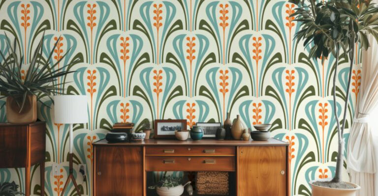
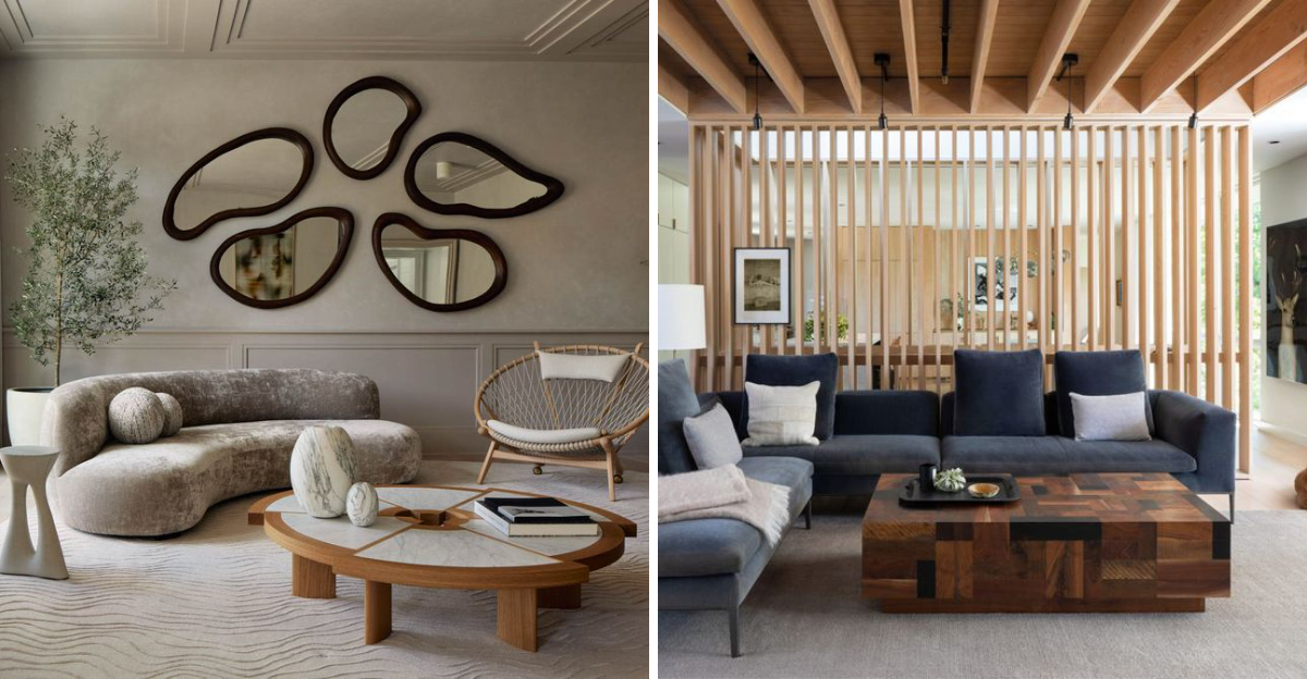
3. Geometric Pattern Overload
Triangles, hexagons, and bold geometric patterns dominated walls, textiles, and accessories for years. Now, designers are stepping back from these rigid forms in favor of more organic shapes and flowing lines.
The shift represents a return to nature-inspired design elements that feel less manufactured and more intuitive. Consumers grew weary of the visual noise created by competing geometric patterns throughout their spaces.
Softer curves, irregular forms, and hand-drawn elements bring a human touch that was missing from the precision of geometric trends. This doesn’t mean clean lines are gone – they’re simply being balanced with more natural influences.
4. Open Concept Everything
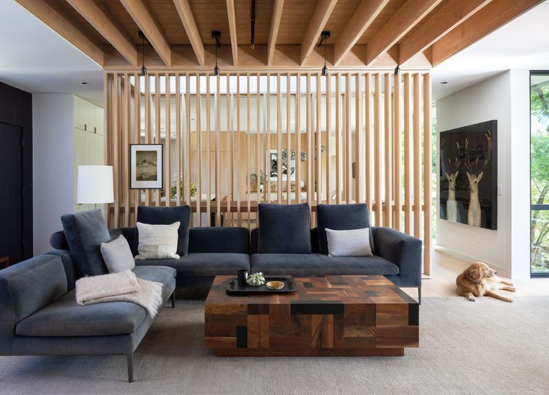
The pandemic permanently altered our relationship with space. Open concept floor plans, once the hallmark of modern homes, have fallen from grace as people rediscover the value of privacy and defined spaces.
Homeowners now seek flexible areas that can transform according to needs – work, relaxation, or entertainment. Clever room dividers, sliding doors, and thoughtful zoning create multi-functional spaces without sacrificing the sense of flow.
Acoustics have become a priority too, as families juggle video calls, online learning, and entertainment in shared spaces. The new approach balances openness with practicality, acknowledging that sometimes walls serve an important purpose.
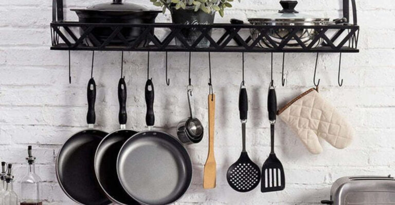
5. Fast Furniture Frenzy

Cheap, disposable furniture designed for quick turnover has lost its appeal. Consumers have grown weary of particleboard pieces that fall apart after a move or two, creating both waste and disappointment.
Quality and longevity now trump immediate gratification. Young consumers especially are willing to save for well-made pieces or hunt for vintage finds with character and craftsmanship. Environmental concerns have accelerated this shift, with buyers questioning the true cost of disposable design.
Even budget-friendly retailers are responding with more durable offerings and repair programs. The future of furniture lies in pieces worth keeping, whether newly crafted or thoughtfully repurposed.
6. Word Art Wall Declarations
“Live, Laugh, Love” and its many variations have overstayed their welcome in home decor. These generic phrases plastered on walls once seemed inspirational but now come across as impersonal and clichéd.
Designers encourage more authentic forms of expression through actual artwork that resonates personally. The shift represents a broader move toward individuality in design, with cookie-cutter elements giving way to meaningful curation.
For those who love typographic elements, the trend is evolving toward more subtle integration of text in artwork or vintage signage with history and character. The key difference is choosing pieces with substance rather than mass-produced platitudes.
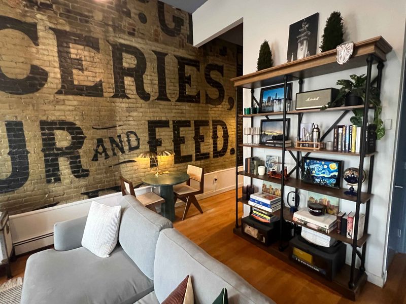
7. Forced Industrial Aesthetics

Exposed brick, pipe shelving, and Edison bulbs have become design shortcuts rather than authentic expressions. The industrial look, once fresh and edgy, now feels contrived when applied as a superficial style rather than honoring a space’s true character.
Designers are moving toward more nuanced approaches that might incorporate industrial elements where they make sense architecturally. The key is authenticity – using raw materials and industrial touches in contexts where they belong rather than forcing them into suburban homes.
Even in genuine industrial conversions, there’s a softer approach emerging that balances harsh elements with comfort and warmth. The future lies in thoughtful fusion rather than rigid adherence to an industrial checklist.
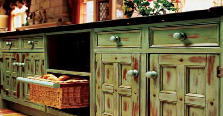
8. Farmhouse Fixation
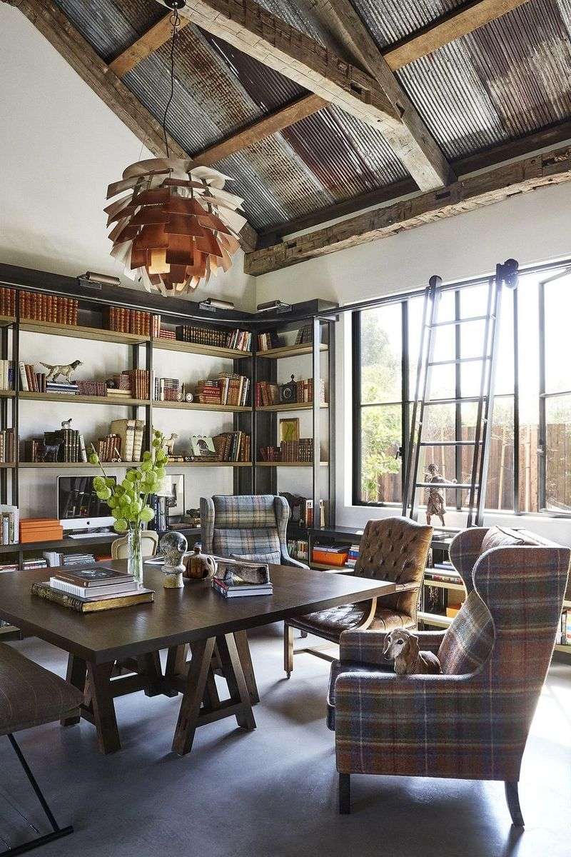
Shiplap, barn doors, and rustic signs have reached peak saturation. The modern farmhouse trend dominated American homes for years, but its mass commercialization has stripped away the charm that made it appealing in the first place.
Designers aren’t abandoning rustic warmth entirely – they’re just approaching it with more subtlety and authenticity. The evolution favors genuine antique pieces with history over mass-produced “weathered” items from big box stores.
Regional influences are becoming more important too, with designers considering what farmhouse actually means in different landscapes. The one-size-fits-all approach to farmhouse style is giving way to more thoughtful interpretations rooted in place and personal history.
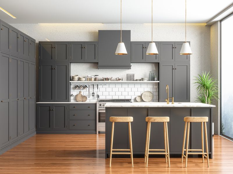
9. Gray-on-Gray Monotony
The safe, neutral gray palette that dominated the 2010s has finally lost its grip on interiors. Once considered the height of sophistication, all-gray spaces now read as timid and lacking imagination.
Color has made a triumphant return, with even neutral lovers embracing warmer tones like taupes, beiges, and soft whites with character. Gray hasn’t disappeared entirely – it’s simply being used more judiciously as part of a varied palette rather than a one-color solution.
Even in commercial spaces where neutrals reign supreme, designers are introducing bolder accent colors and materials with natural variation. The monochromatic gray box is officially out of fashion.
10. Terrazzo Takeover
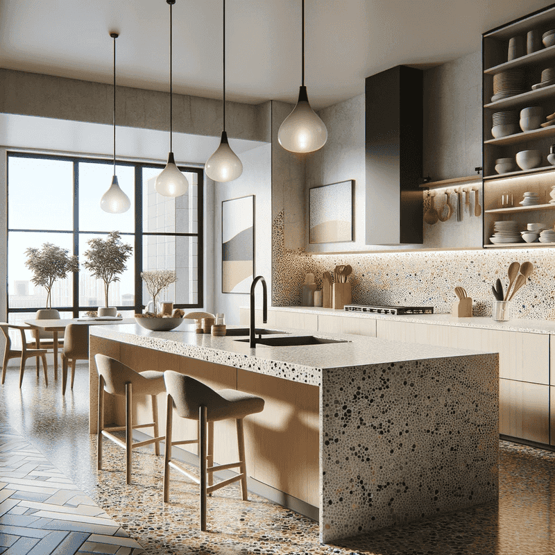
Terrazzo experienced a massive revival that quickly spiraled into overuse. The speckled composite material appeared on everything from floors to furniture to phone cases, diluting its impact and unique character.
Authentic terrazzo remains a beautiful, durable option when used appropriately. The backlash is primarily against the printed terrazzo patterns and cheap imitations that flooded the market.
Designers still appreciate composite materials but are exploring new aggregates, colors, and applications that feel fresh. The future of terrazzo lies in custom applications with meaningful material choices rather than generic patterns applied to every surface possible.
11. Accent Wall Addiction
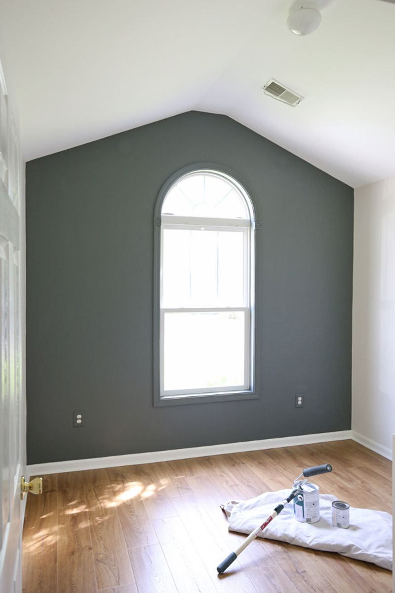
The lone accent wall – that single surface painted in a bold color or covered in dramatic wallpaper – has lost its impact. Once considered a safe way to introduce color and pattern, this half-hearted approach now feels dated and timid.
Designers are embracing more cohesive approaches, either committing fully to color throughout a space or using it strategically in ways that make architectural sense. When pattern is used, it’s more likely to wrap a small room entirely or highlight specific architectural features.
The evolution reflects growing color confidence and a more sophisticated understanding of how to use pattern effectively. Rather than isolating boldness to one wall, the new approach integrates it more thoughtfully throughout a space.
12. Fake Plants Everywhere
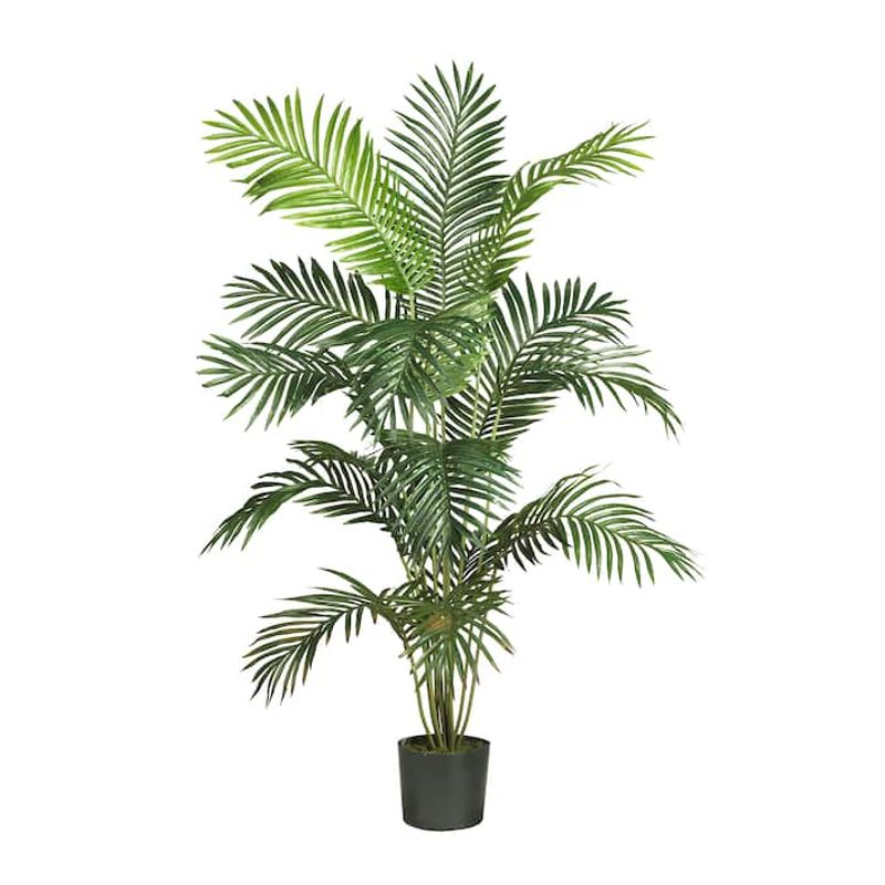
Artificial greenery once seemed like a practical solution for plant lovers with black thumbs. But as environmental consciousness grows, these plastic imposters are falling out of favor – they never quite capture the living energy of real plants.
Advances in low-maintenance plant varieties and smart self-watering systems have made real plants more accessible than ever. Designers are helping clients find appropriate living plants that match their lifestyle and light conditions rather than defaulting to faux options.
For spaces where living plants simply won’t work, high-quality preserved plants or botanical artwork provide more sophisticated alternatives to dusty fake ferns. The emphasis has shifted to authenticity in all forms of nature-inspired design.
13. Digital Distortion Overload
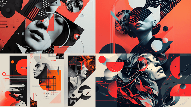
The glitch aesthetic, warped type, and digital distortion effects that dominated graphic design are fading fast. These once-edgy techniques have become visual clichés, overused to the point of losing impact.
Designers are returning to cleaner approaches with occasional digital elements used purposefully rather than as default effects. The shift reflects both aesthetic fatigue and practical concerns – distorted visuals often compromise readability and accessibility.
The new direction favors thoughtful typography, clear communication, and digital effects that enhance meaning rather than obstruct it. Even in youth-oriented design, clarity is making a comeback, with personality expressed through color, illustration, and concept rather than visual noise.
14. Chaotic Gallery Walls
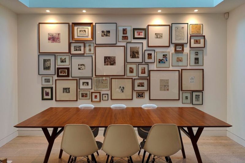
Haphazard collections of mismatched frames once represented bohemian creativity. Now, these busy arrangements often read as visually overwhelming and lacking curation.
The gallery wall isn’t disappearing entirely – it’s evolving toward more thoughtful composition with breathing room between pieces. Quality over quantity has become the guiding principle, with fewer, larger pieces making more impact than dozens of small frames.
Digital frames that rotate collections and projection art offer dynamic alternatives for those who love variety. The shift represents a broader move toward visual calm in home environments, with carefully selected pieces that truly resonate rather than walls covered in random acquisitions.
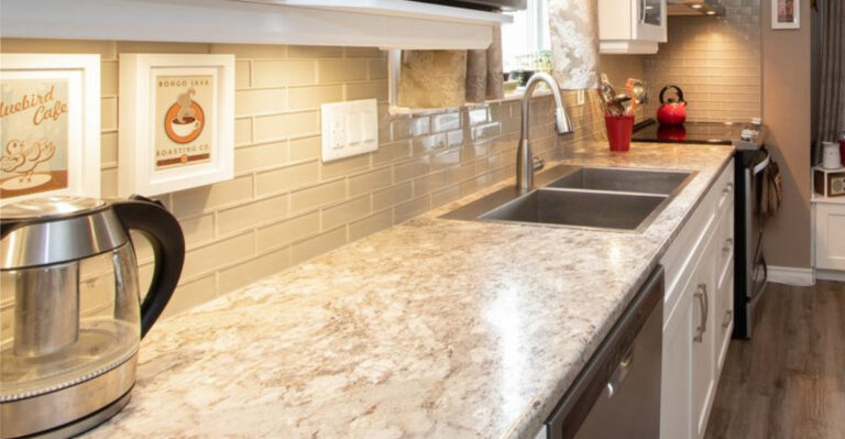
15. Faux Luxury Materials
Fake marble contact paper, peel-and-stick “subway tile,” and other imitation materials have lost their appeal. These quick fixes promised luxury looks on a budget but rarely delivered convincing results or durability.
Designers now favor honest materials used appropriately for each budget level. Rather than mimicking expensive materials poorly, the focus has shifted to finding inherent beauty in accessible options – real wood in simpler forms, actual ceramic tiles in basic formats, or genuine stone in smaller applications.
When budget constraints are significant, the new approach favors creative solutions that stand on their own merits rather than unconvincing imitations. Painted patterns, intentional use of humble materials, and thoughtful details create more satisfying results than fake luxury.